Lighting in CG is always a hot topic and video games are no different. Lighting is a complex subject which requires a delicate balance, not just from a visual perspective but from a performance perspective in games. You need to determine what parts should be well lit and how to use lighting to guide the player through the various levels in a game.
Let's discuss the six main areas in regards to lighting in games. While I will try to keep things software agnostic, examples shown will come from Unity 2019. More specifically we'll be using HDRP which is the High Definition Render Pipeline which contains more lighting settings that we can explore. It also provides for high-end visuals.
Getting started with game development in Unity? Watch our free tutorial series Unity Basics.
Understanding Color Space
It may be an odd thing to discuss first, but the color space you use can drastically impact the overall look of a scene. You could have the exact same lights and settings but with a different color space you may see more realistic colors. Within Unity we have the option to use Gamma or Linear color space. Gamma is the default used in traditional 3D and 2D game projects built in Unity. If you switch to HDRP you'll use Linear by default.
Gamma has a non-linear approach to light intensity and as such you may see inconsistent colors coming through. Some areas may be brighter, others darker. Linear, as the name implies does utilize a linear approach to light intensity and will result in more realistic looking lighting and colors. Some platforms are restricted to Gamma color space, while others can utilize Linear. Below is an example of the same scene utilizing a different color space.

If I switch to Linear color space without making adjustments to the lighting, I get this:

So if I adjust the light intensity to closely resemble a similar look to the Gamma color space up above we can see some differences in the colors and overall lighting of the scene.

Linear color space here looks much better overall. While the light intensity has been reduced quite a bit, we can still see everything just fine and we get more of a natural look. Now this looks more like a dusty wild West environment compared to the saturated color from the Gamma color space up above.
You can find this setting by going into Edit > Project Settings > Player > Other Settings

Note that after changing this you may have to recalculate lighting. It is recommended you use Linear for more realistic colors where possible.
What Lights Should I Use?
Now that we've given you a bit of insight into the color space, it's time to start looking at various lights and their use along with settings each may have. We'll be using lights found in Unity 2019 but most of these lights and settings may be common across many software.
Directional Lights
These will be included in a scene by default in Unity and typically acts like a sun. The key thing to know about these is that placement (position) of these lights does not affect it, only rotation. So this could be inside of a building and it would not affect how it lights the environment. Rotating this also works a procedural skybox, which can be useful for creating a dynamic sunset effect.

Spotlights
These are used in very specific cases to emit light in a cone format. Examples of this would be a flashlight, vehicle headlights or an overhead lamp. You can modify the cone shape of the light to increase or decrease it's radius along with it's range. Unlike a directional light, these can be moved around and rotated to shine light in a specific direction.

Point Lights
You will most often use point lights to add lighting within a room or to enhance the lighting within a spherical object. These shine light in all directions, think of these as a ball of light. Similar to the spotlights, you can control the range and size of these.

Area Lights
These will be used often to provide more custom light that shines in one direction. With an area light we'll get a rectangle that shines light along one side. These are useful for creating street lights or often times, "window lighting" to fake the effect of lighting coming in through windows in your scene.

Tube Lights
These are relatively new and can be used to mimic a cylindrical light. Think about fluorescent lights found in a store. These appear as a line in Unity and have a length property.

Want to take things to the next level? Build your own tower defense game in Unity with 3D models, C# and UI elements.
Emissive Materials
While lights provide direct lighting within a scene, there is often times elements that appear to glow. This glow can be emissive and mimic the effect of lighting coming off this object. Setting up emissive objects can be a bit confusing at first. Lets walk through some of the steps.
1. First, you need to provide a color for the emission. By changing this color alone we'll start to see the object look like it's glowing. This alone does not cast light.

2. Next we need to enable Emission, note that this may look different in a traditional 3d template in Unity, the screenshot shown here comes from the HDRP/Lit material

3. Once you enable this you'll see the option to make this a Realtime or Baked emission. You may notice that this still doesn't emit any kind of glowing light and that's because this object must also be set to Static. Meaning this object would not be moving at all.


Both the object emitting light and receiving this glowing light must be set to static. Once that is complete you should now see the light being emitted. If you have the emission set to realtime, you can utilize the glow even if you don't bake lighting. Baked will be nearly the same, but requires that Mixed Lighting be enabled within the lighting settings.
Great, so now we know how to use emissive materials, so how can we combine this with different lighting scenarios? Lets take a look at an example with a scifi panel. When utilizing textures on objects you may have specific parts of that texture that are used for emission.
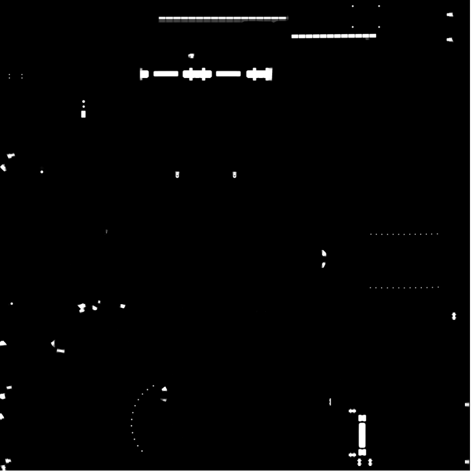
As a side note, when you create these emissive "masks" I would advise keeping them black and white. While you can utilize a a mask with color you'll be limited to the color range of that emission. While white can be "tinted" with the emissive color picker to provide a wide range of emissive colors.
Here is the example emission "mask" texture we'll be looking at. With this being black and white, we can apply any kind of color tint we want which will only apply the emission to the white portions of this texture. Anything that is black will not emit any kind of light.
With emission we also have the ability to use emission intensity, which is a separate checkbox, or use "intensity" from within the color picker on the emission color. By enabling the emission intensity we end up using LDR (Low Dynamic Range), but in the examples I'll opt to use HDR (High Dynamic Range) as we'll get some better looking lighting. You'll also notice because of HDR that we can get much brighter emissions which is what you want for light sources.
There is a limit though, too high and you'll lose the detail in that object and you also risk getting a blob of white . So we want to balance this. If we're using this glow to represent a custom light then we can add in an additional light to enhance the look. For this sci fi panel the emissive parts are embedded into the panel and are representative of a tube or rectangle light. For this we can use an area light to get a more accurate shape.
Here we can see the progression of how this was properly lit.

This scene looks very dark. Most of the objects here have what look like small lights. These have emission maps, but the intensity value is at 0 so they don't glow. Lets bump up the intensity to 3 within the color picker:

Here the intensity of the HDR emission color is bumped up to 3 for almost everything in here. The hanging lamp was a bit higher at a value of 4. Lights are very bright at their source so a higher emission intensity is needed. Notice that with just the emission alone we've been able to boost the perceived lighting in this scene. There are no lights whatsoever in this corner. Now lets take it one step further by adding an area light for the hanging lamp to truly turn it into a light source within the scene.
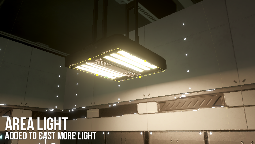
and here is the full shot showing the result of adding an area light. The emission allows the physical part of the lamp to look like it's casting light, while the area light is invisible to players but casts light from that same area down onto the desks below it.

Some notable things about the area are that I am using a color temperature which is a feature available with lights in HDRP. Here is what I have setup.

By enabling color temperature we can affect the mood of the scene. Closer to the orange and we get a warmer feel. This is something you'd use for something like the Sun or a halogen lamp. Closer to blue and we can invoke the feeling of a cold climate. This would also be used for more futuristic looking lights that don't burn as brightly like LEDs. This temperature would be great for all the panel lighting we have.
Explore the Fundamentals of Game Mechanics in this Unity tutorial series
Realtime, Mixed and Baked Lighting
Lighting in games can be tougher than traditional lighting of a 3d scene in that players will be exploring this world in real time. Players can look at an object from multiple angles, and more often than not will be performing all sorts of different actions. Lighting has to account for dynamic elements to create realistic shadows and properly lit environment props, but we also need to take into account the performance of these lighting calculations. You can find a mode setting on all lights to determine if they should be used for realtime, mixed, or baked lighting.

Realtime lighting is going to be the best overall, and will allow you to create dynamic shadows but they are also the most expensive to use. Real time lighting should be kept to a minimum and only when needed. How do you know when you need real time lights? If you have a specific mechanic in game that revolves around a light then use real time lights for that. An example would be a flashlight or the headlights of a vehicle. These can be turned off and on and are usually used to explore darker parts of a level.
Mixed lighting is the process of using realtime and baked lighting features. With mixed lighting we can utilize real time lighting on dynamic elements such as a moving character or animated object. These will cast real time shadows as well but we can still get some performance benefits by utilizing indirect lighting onto static elements. So it's a middle ground.
Baked lighting is the most performant but also the most limiting. Baked lighting allows us to take a "snapshot" of our lighting in game, then create a texture overlay of sorts of all the shadows and highlights calculated from the lights in the scene. This is performant as none of the lights get calculated at run time. This works if you have a largely static environment. If you have an environment the player will not interact with or you don't suspect lighting will reach dynamic elements, then opt to make lights baked only.
You'll typically use all three of these within a larger scene. Sometimes just using mixed lighting is the easiest solution. Lighting can be one of the most expensive aspects of game performance, so it's important to note how it affects your game. Bake lighting whenever possible, but also don't do it to the detriment of the gaming experience either.
Along the the lighting settings, you may also want to play around with some of the lighting settings. Go to Window >Rendering > Lighting Settings.

We won't discuss every setting here, but lets take a look at some key parts of this. First we have Realtime Lighting enabled. Leave this enabled if you plan on using any real time lighting within your scene. Same is true for Mixed Lighting below, which will allow you to bake lighting.
The Lighting Mode has three settings to choose from; Shadowmask, Baked Indirect and Subtractive. These three can be put in order of their most performant to least performant.
Subtractive is the most performant and something you'd use for Web GL or mobile. You won't get glossy highlights or dynamic shadows onto static objects.
Baked Indirect is somewhere in the middle performance wise and is useful for indoor scenes. The main limitation of Baked Indirect is that shadow rendering is based off a shadow distance value.
Shadowmask is the most expensive to use but also provides the best lighting features.
Jumping into the lightmapping settings, we'll see that we have sample values for direct and indirect samples. What does this refer to? Within lighting we have direct lighting and indirect lighting.
When a light shines onto an object, this is direct lighting. Think of pointing a flashlight at something, this is direct lighting.
Indirect lighting is what happens when light bounces off objects and casts light onto other objects. Think of light creating a ricochet effect to light an entire room up. A great example of this is from the movie The Mummy. Here is the scene in question:
Light shining directly onto one mirror would be direct lighting, while the light bouncing around other mirrors and lighting up the entire room provides indirect lighting.
Going back to the sample values, the higher the samples the most lighting information you'll gather and the better the lighting quality. If you do increase these values understand that you'll spend more time calculating and baking lighting. Keep these values low and increment them once you have everything in place, otherwise you could spend hours re-baking lighting for small changes.
Lastly lets discuss the Lightmap Resolution which by default will be set to 40 texels per unit. You don't need to go in depth with understanding what texels are to know how to use this. Like samples, higher values means more lighting data packed in. This value alone can determine how quickly you'll bake out lighting, so if you're just getting started I would recommend going down to a value of 2 to very quickly bake out lighting. To better understand how this setting is changing things in the scene, you can switch your render mode in the scene from Shaded to Baked Lightmap:
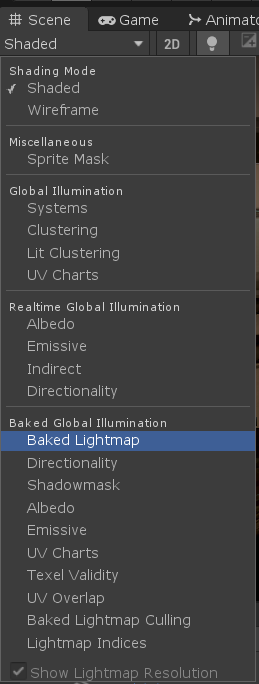
From here you'll see a checkerboard pattern appear on every object that is set to static. All these objects would receive baked lighting, so dynamic elements (non static) would not appear at all.. The size of this checkerboard is based off the lightmap resolution. I switched the lights to use purely baked lighting so that we can see the lights within the lightmap render. Lets look at a few examples:
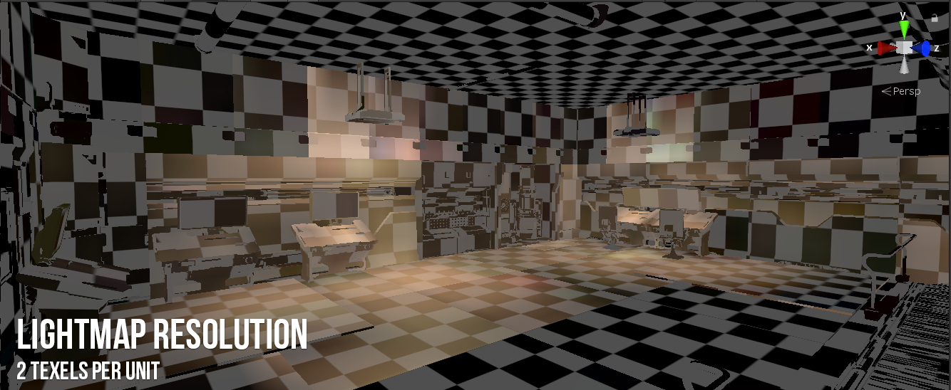
Here the lightmap resolution is set to 2 texels per unit and as you can see we have some very low resolution lighting and shadows that cut off abruptly. This is what it looks like with the shaded version:
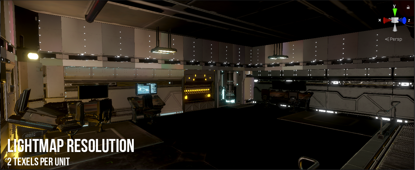
We can see that the lights and shadows seem to create a weird issue where certain panels are more lit than their neighbors. There just isn't enough lighting data included to create a smooth transition. From here we'll bump it up to 20 texels per unit.


As you can see here, by bumping it up to 20 we get a lot more definition in the shadows and highlights for the lighting. A nice gradual blending between the lit areas and darker areas. You'll also notice the checkerboard pattern is much smaller.
If you take a look at the scene you may notice that some areas have larger checkerboard patterns than others. The lightmap resolution is a global setting but each individual mesh also has their own lightmap scale setting. This is important if you want to fix issues where an object is not getting enough lighting detail because of it's scale within the lightmap. The inverse is also true. If you didn't need high resolution lighting on the floor but wanted to emphasize really high quality lighting on specific props, you could increase the scale in lightmap value for the props as such:

The surrounding objects have a lightmap resolution of 2, but by increasing the Scale In Lightmap value for this wall piece I get much higher resolution lighting being baked into that one area. I can pick and choose which objects should have better lighting.
That is a bit of an extreme case though and more often than not you'd want to have fairly uniform looking lighting.
Along with baked light, another contributing factor to ambient light is the skybox. By default in Unity you'll start off with a procedural skybox which is a gradient of different colors to mimic a sky. If you're aiming for realism I would switch this to a HDRI skybox. HDRI images can be found at places like HDRI Haven and can serve two purposes:
- Provide accurate real world lighting information
- Provide a visual sky for the environment
In the case of the scifi scene here, I used a space HDRI skybox. This provides realistic lighting based off that image, but also provides a great view of stars outside the windows. Creating a procedural skybox is useful for stylistic games, or games where you may not see the sky at all. Here is a view of the space skybox being used for this sci fi scene:

It provides the skybox I need but also provides realistic ambient lighting to the interior rooms of the environment.
Explore our tutorial series: Using Game Assets in Unity as part of building your own full game
Light and Reflection Probes
We've seen how the emissive materials can work to create glowing objects but as we discussed earlier, in order to receive lighting from emissive objects all these objects must be static. A playable character or animated object will not be static and thus will not receive this lighting. So how can we utilize glowing objects with dynamic elements? This is where Light Probes come into play. Lets take an example from our scene.

I removed all the nearby lights in this scene and dropped in a dynamic character robot. This robot would not be static, but should be expected to receiving realistic lighting from the environment. The glowing wall piece looks very bright and casting a blueish light onto nearby static elements, but the robot looks almost dark. In order for him to receive that blueish glow we'd need to implement light probes to sample that lighting for use on a dynamic character.
Light probes essentially sample the lighting within the empty space of an environment. You'll see a web of spheres, each of these spheres is used as a point to sample light in that specific area. The main use of these would be to apply lighting to moving objects within a scene. If I wanted my character to receive emissive light I would need to sample the light with a light probe group that the character could utilize. Light probes also work with Unity's Level of Detail (LOD) system.
Note that when using light probes it is recommend you cover an area with probes to provide better light sampling. If you place all your probes near a light source and have the player utilize lighting from those probes, they may appear brighter even if they are not near the light source. Placing probes further away from the light source to provide more realistic lighting for dynamic objects. Lets see how light probes (GameObject > Light > Light Probe) work with our robot character now:

Probes are added near the glowing parts, the spheres act as sample points and then provide more realistic lighting for the robot. A before and after:

With the small amount of probes available in the image above, if the character were to move further away he'd still be well lit from the emission because the probes are only sampling light close to the emissive object.

To fix this, we can add in a few more probes that propagate further around around the emissive source to get a gradual fall off.
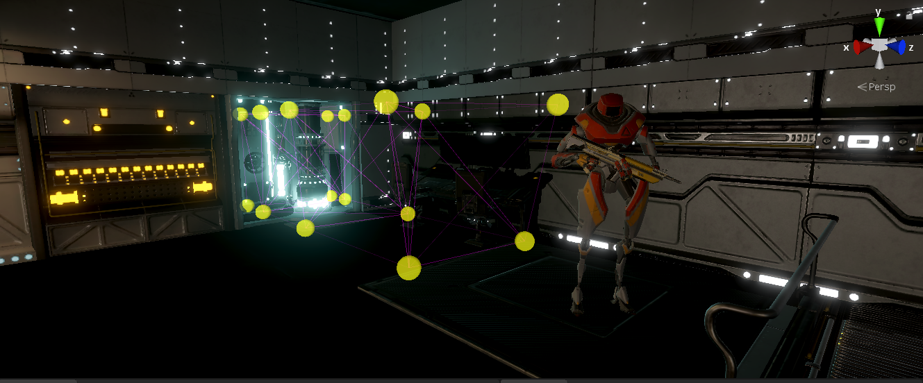
Now the robot character is getting proper lighting based off the distance from the emissive object because of the light probes. We can also use light probes for baked lighting. While mixed lighting allows us to use realtime lighting for dynamic objects, baked lighting can only be used on static objects. With light probes however we can receive lighting in a similar way to the emissive example above. Lets look at the lamp above the robot here. The area light attached to this lamp is set to a mode of "baked". As you can see the robot seems to be nearly in the dark even though he's under a light:

Same thing with light probes around the robot now. He does look lit, but unnaturally. Light probes don't take into account shadows.
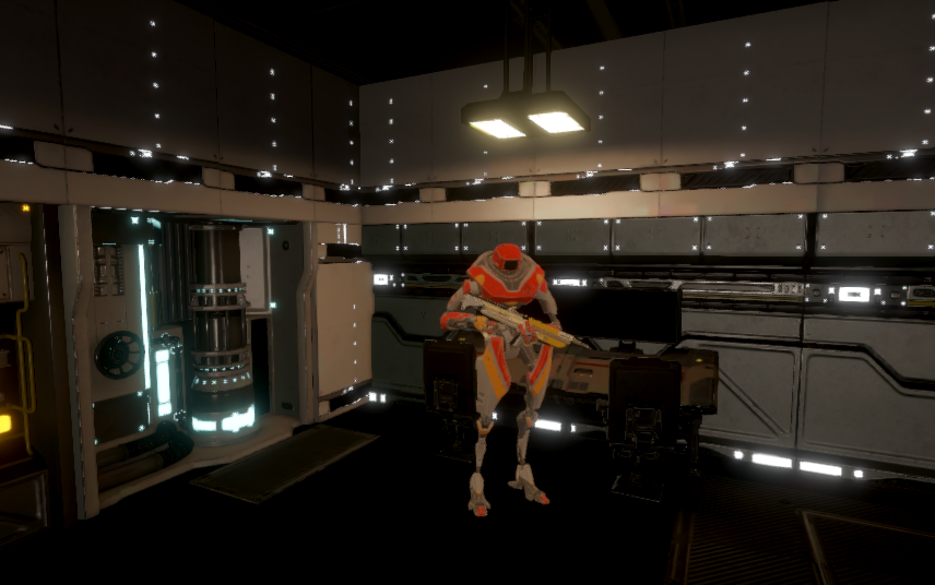
In general I would use light probes where needed (like emissive "lights") or large changes in lighting environments (entering a cave from a bright environment), but mixed lighting will produce much better results with less effort. Here is the same setup with the area light set up with mixed lighting (smoothness and metallic cranked up for added visual appeal):

The other type of probe available to use that is not technically lighting, but can effect how objects receive reflections. Reflection Probes allow objects to receive realistic reflections based off a "container". This container is used to "capture" surrounding information into a cube map, which is used to provide more accurate reflections within objects with a high enough smoothness value.
Lets take a look at an example:

In the center we have a holographic table that has two glass panels, one on the bottom and one at the top. If you look closely the bottom glass panel has specks of light in it, but nothing else is shown to be reflected. Now lets add in a reflection probe (GameObject > Light > Reflection Probe) to see how we can add some more realistic reflections:

While these reflections are not 100% accurate, they do provide reflections of nearby objects. Depending on the placement of the reflection probe itself and the size of the container will determine what is shown in the reflections. Since we're reflecting other objects that also have emission along with the glare of lights, it makes the scene look a little bit brighter even though we didn't actually add any more lights.
Post Processing
Post processing doesn't directly add anything lighting wise to our scenes, but they can affect the perceived look of a lit environment. Lets take a look at how Ambient Occlusion works.
First, what is Ambient Occlusion? From the Unity documentation we get this:
The Ambient Occlusion post-processing effect darkens creases, holes, intersections and surfaces that are close to each other. In the real world, such areas tend to block out or occlude ambient light, so they appear darker. Unity approximates Ambient Occlusion in real time as a full-screen post-processing effect.
With Ambient Occlusion we can bake this into your scene within the lighting settings as such:
Enabling Ambient Occlusion within the Lightmapping settings is possible, but requires objects to be static and mixed or baked lighting to be enabled. This may leave some objects without AO. So lets talk about how we can do this with a screen space effect known as Screen Space Ambient Occlusion (SSAO).
Within HDRP in Unity SSAO is enabled by default, and combined with the Ambient Occlusion post processing effect we can modify those values to our liking. Here we can see an example of Ambient Occlusion being modified for this scene:
Ambient occlusion helps to make objects feel connected to other objects. Use AO, but don't go overboard. Too high and everything feels dark.
Another post processing effect you can use that would effect the lighting look is Shadows, Midtones and Highlights.
Think of these three as a progression between an dark and light portions of your environment. To better understand how each of these improve the perceived brightness of your scene, take a look at this video.
Shadows are the darkest areas, so if you have very dark shadows you can use this setting to make them a bit brighter. Midtones are the halfway point and you'll see the biggest change here is near the sci fi door as it is not completely dark nor completely bright. Use this to boost the overall brightness of objects.
Finally highlights are the brightest portions in your scene. If objects appear to create too much glare or over power any details within your materials then you can use this to control how strong those are. These are not just a straight value either, we can apply colors to these. Shadows can be a light grey or purple, highlights can be changed to add different "mood lighting" and so on.
Bloom is another post processing effect that everyone loves to use and for good reason. It creates the glow effect around emissive objects and lights. While this doesn't increase lighting in the scene, the gradient effect coming off lights makes the scene look a bit brighter:
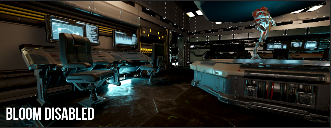
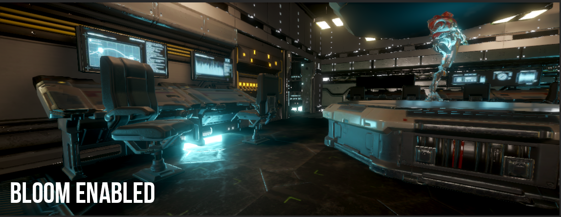
Bloom makes lights appear brighter, but don't go overboard as it can be quite annoying to see in game and can detract from the visual style. Don't turn your game into a lens flare meme.
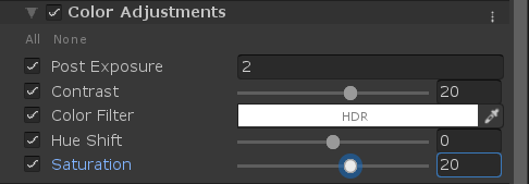
Lastly lets take a look at color correction or color adjustments. Depending on the type of post processing you use and the template you're working from will determine how these settings will work for you. in HDRP. In my case this is known as the Color Adjustments and they're quite simple:
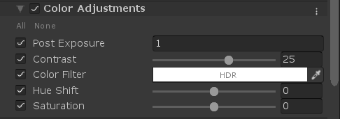
Post exposure can be used to brighten up or darken the entire scene. In my case I increased this to 1 from 0 to make it brighter. If you include much brighter lighting within your scene initially you may bring this down with post exposure value in the negative.
Contrast helps to increase the difference between the dark and light portions of your scene.
Color Filter is pretty self explanatory in that you can use this to apply a general color to the scene as an overlay. Similar to providing a color temperature except you can choose any color you want. With it set to white, I didn't apply any changes.
Hue Shift and Saturation can also be used to adjust the colors in the scene. Increasing saturation results in a more colorful scene, while the inverse feels more "drab". You might want to use one for a more cartoonish game while the other for a more serious game.
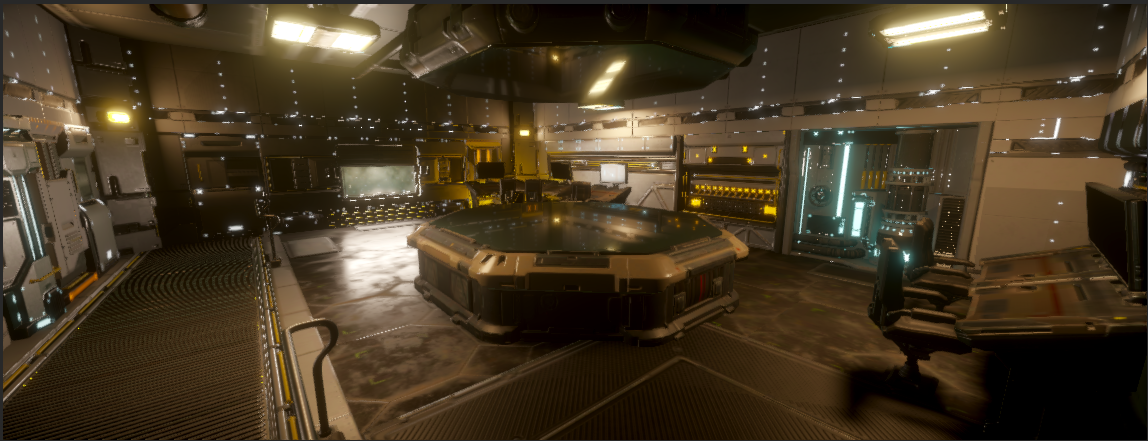
Lets look at the difference these small changes made to this scene here:
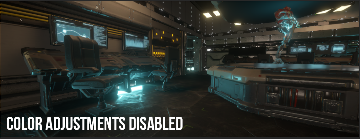
Looking a bit washed out in some areas. Now lets add some color adjustments, and really we're just adjusting the contrast and exposure here.
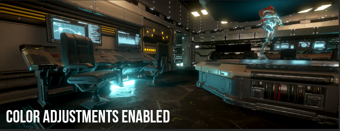
By adjusting the Saturation up a bit, we get more of the yellowish color coming from the lights which makes the scene feel warmer and more inviting:
Another useful post effect is Tonemapping. In older versions of the post processing system, Tonemapping was included within the color adjustments/grading in one, but is now separate in HDRP. I like to think of this as helping to "calm down" the visuals to look a bit softer. For this I use the neutral setting.

Again a before and after:
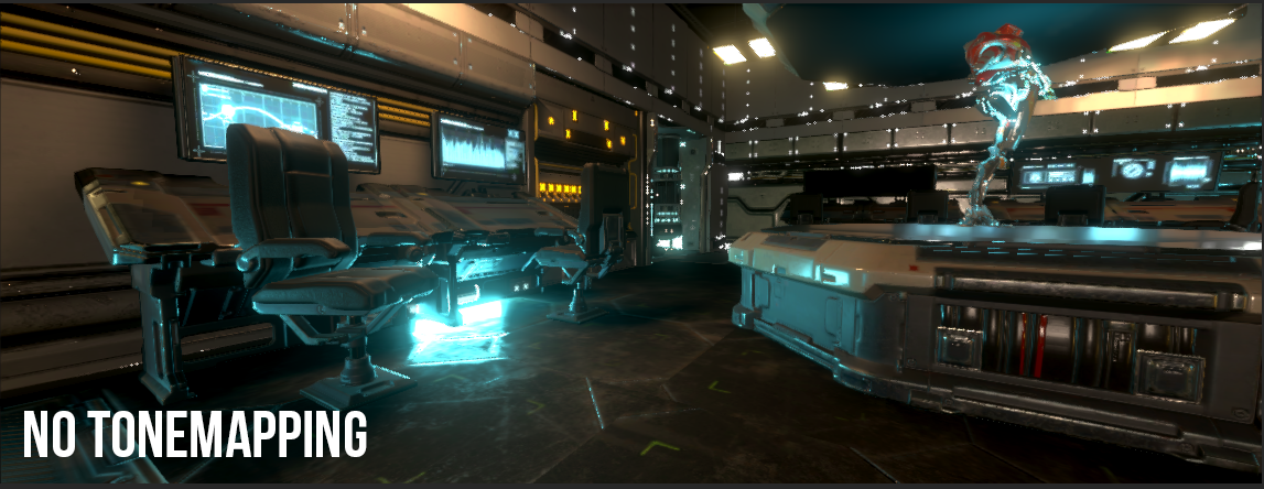
and again with tonemapping with neutral setup:

The biggest changes you see are that the very bright blue parts of the scene are a bit softer now. You could also use ACES for the tonemapping but you need to be careful to avoid having too harsh contrasting colors when using it. So adjust accordingly to get something that looks good.
Those post processing effects are the most common effects you're use for just about any scene. The other effects can be very specific to a certain type of scene or mechanic such as Depth of Field or Vignette.
Lighting anything in CG is an ever growing challenge, even more so when you aim for realism. Hopefully these tips and tricks will help improve your lighting. This article will be followed up by a course that will demonstrate a practical example of the scifi scene shown in the images to give you a more in-depth look at how lighting works in Unity with HDRP and how you can replicate those results in your own scenes.
Do you have any specific lighting tips you'd like to give? Let us know in the comments below!
