 Hi everybody,
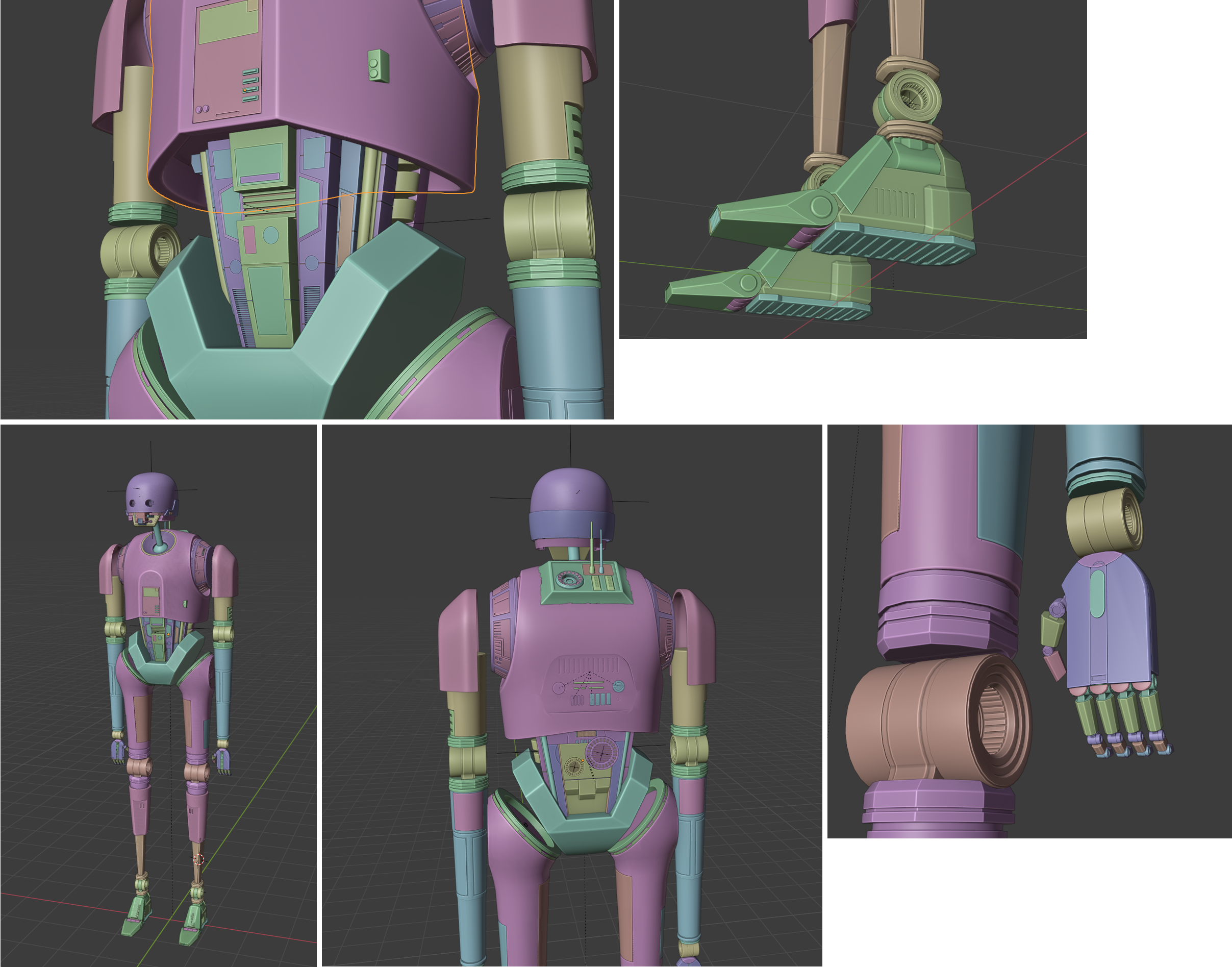
I have been working for some time now on a personal project : to make of model of the droid K2-SO as realistic as posible, and then texture it with Substance Painter.
It has been over a year know, and i have less and less time to practice Blender due to my job. That, and the fact that i became a mother July the 15th, my little boy leaving me almost no time to relax :).
Nevertheless, i intend to continue my project until completion.
Here is a collage of the work in progress.
I would appreciate if you could give me some feedback / tips on the parts you judge the worst.
Koala
Woah. I think it is looking good @koala
The panels could probably stick out or in a little more sense they feel a little flat with their details. But I am no expert for this droid so maybe that is how it is supposed to look.
I can't wait to see this in substance painter.
Thank you for your reply :) i will try to make them stick a little bit out, or try with enlarged "grooves" on their side to make them more visible.
Hi guys and gals,
I am encountering a specific problem with the back of the robot :
I fused the part of the back which protrudes from the top, since there is no separation between this part and the whole solid piece which constitutes the torso (commercial life size toy shown below)
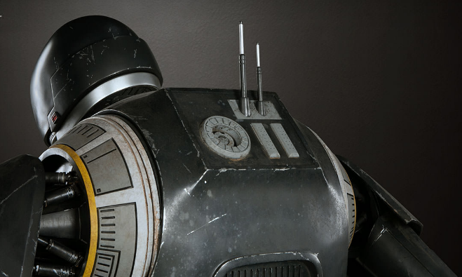
Since the torso piece is subdivided with the Subsurf modifier, this additional part has to be too (my model shown below)
Of course, i know have to achieve the squared and pinched cornes, such as shown in the first image.
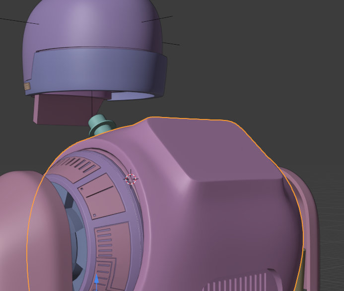
Adding other edge loops would ruin the overall shape of the subsurfed torso, so it seems to me that the only solution left is the creases.
You can see the result in the image below. It is ugly as hell :( :( :(.
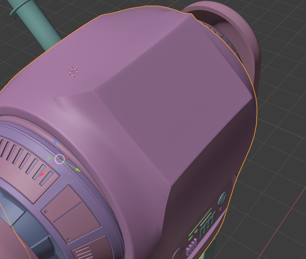
Does anyone have an idea on how to proceed to have the squared/pinched corners without the ugly shading artifact ?
To me that looks like a prime candidate for using some insets with some holding edges near the sharp corners (perhaps a smart use of bevel for along the sharp edges) that spread apart at the smooth transition.
@koala So, maybe something as simple as this.......
All it has is a mirror mod and a sub-d mod. I can adjust the pinching and smooth transition along that edge with the single vertices and using the edge slide tool or moving verts along a local axis to prevent any other distortion.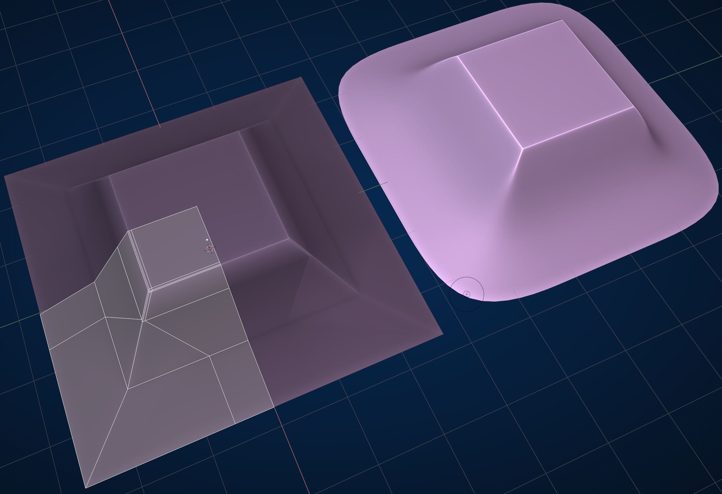
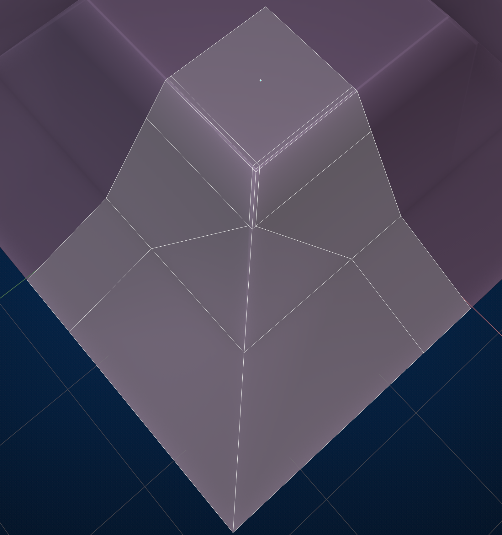
I did as you suggested and it worked out well :) Not perfect but good enough in my opinion.
Thank you !
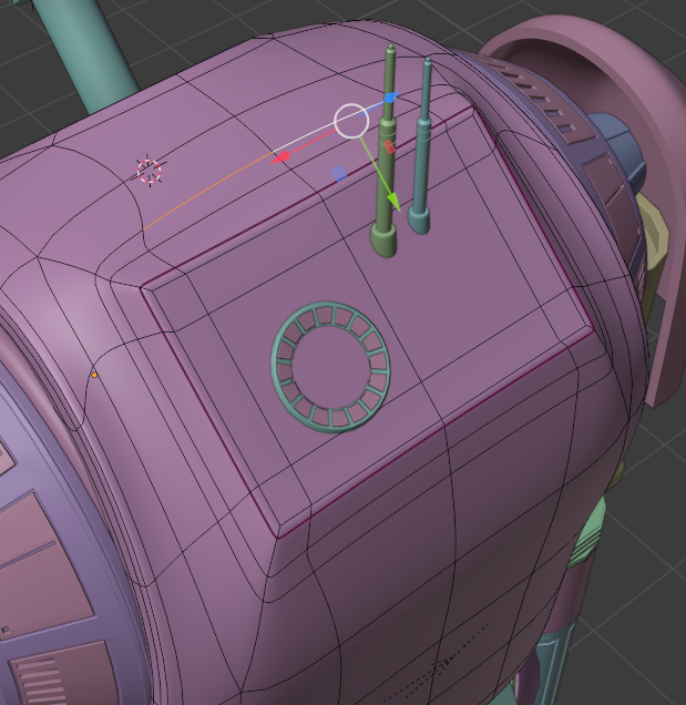
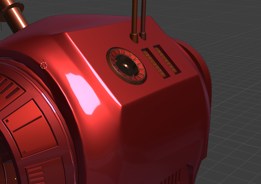
Hey if it works for you then I'm glad it helped. Sometimes the trick is figuring out when and where to use INSET and where and when to use BEVEL and when to use BOTH.
I agree that is looking better than before. If you need more then you can bevel those corners going out on an angle and spread the bevels out and remove a couple holding edges where needed but I think it looks good as of now.