Hi,
I did the sunset scene for the lighting course in cycles. I ended up using two sun lamps, The first lamp was at kelvin 3200, and I did 10 power, the second I did 1500 kelvin at 20 power. I wanted a bit more red to the lighting than was normal. Then I added a sky texture at 5 power, for just a bit of extra color.
I also did a volume cube at .05 volume around the whole room, to soften things just a tad and add some setting sun rays.
It's amazing how much lighting can change the feel of a scene. Also, great course so far. Though I really need a faster graphics card, lol. 15 mins for a render is too long.
Anyway, I'm pretty happy with the overall effect. But interested in hearing any feedback.
I haven't really rendered that much stuff, but isn't 15 minutes actually pretty fast?
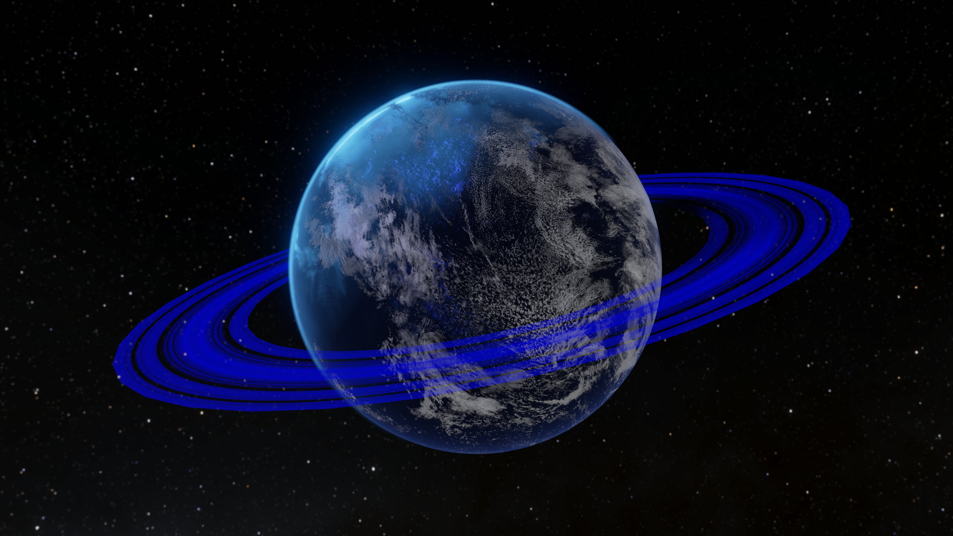
also, here are some of the images from the planets I created after doing the Space VFX series
this is the first one I made
and these were from the second one
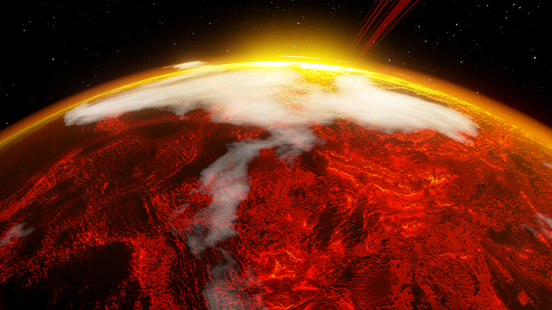
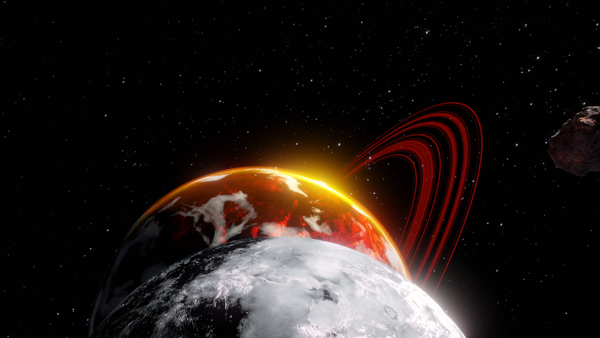
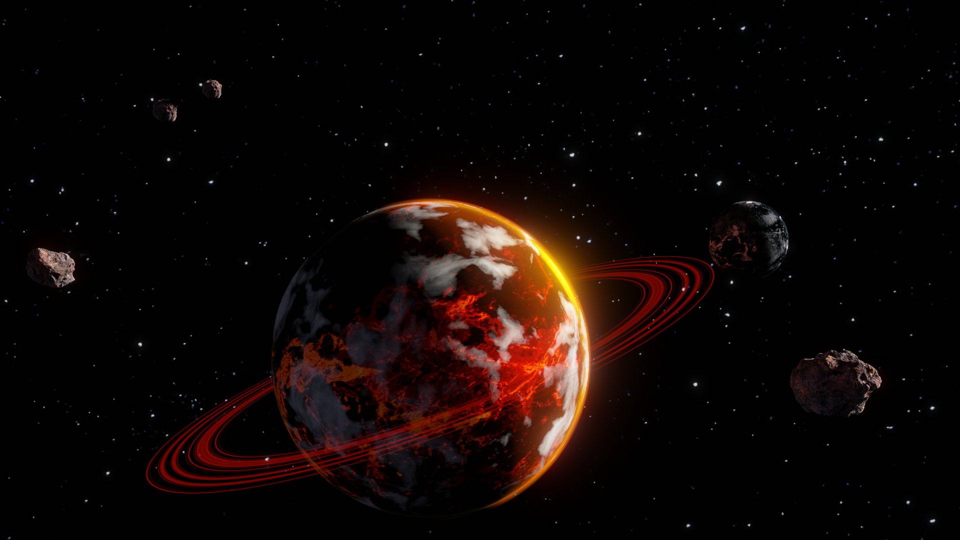
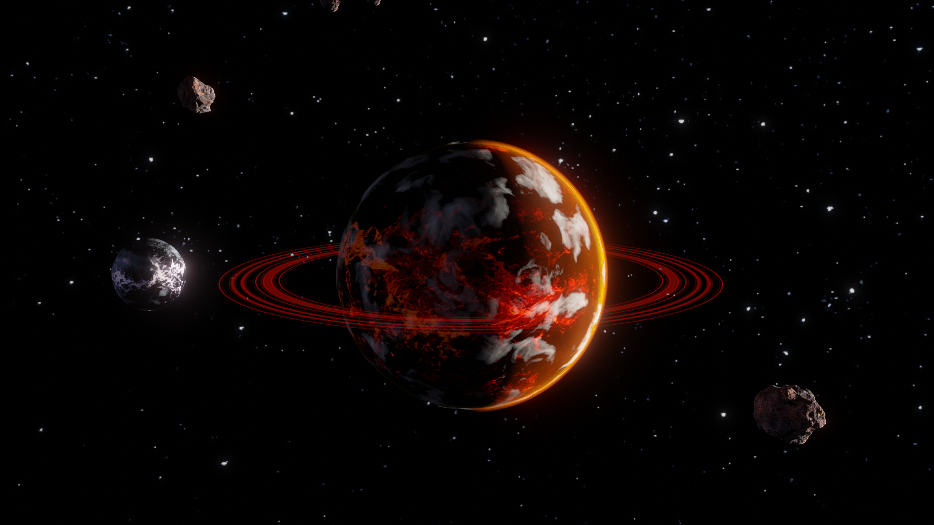
and finally a short video I put together of them
https://drive.google.com/file/d/1MMnyIAfsTHkUxgbX7qZjBLMuUW262Sit/view?usp=sharing
And this from the first rocket ship course. Wow what a difference two months make, I feel I learned so much
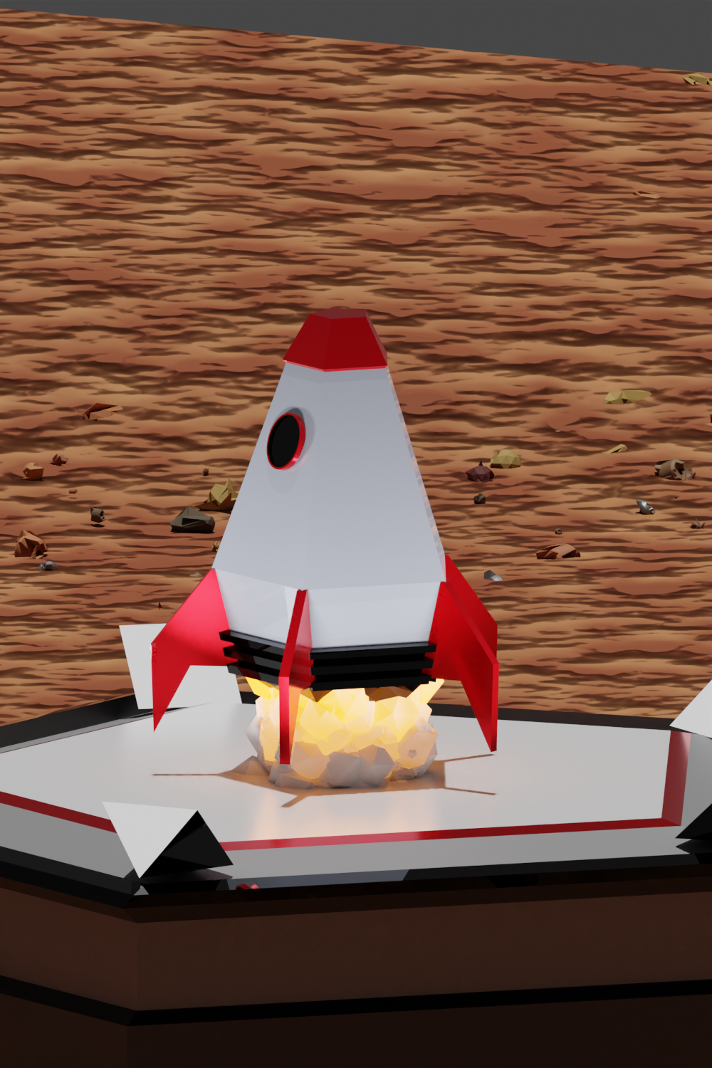
and the rocket video
https://drive.google.com/file/d/1JGkfooVTEmnTWAlAAi3WsuIwrYzDs4-D/view?usp=sharing
Here is the tank I did for the design a tank class. I based this on the M1A1 because I actually used to be a tanker about 20 years ago. For the environment, I used the physical based starlight app, along with some info from the lighting course.
Comments are always welcome.
Than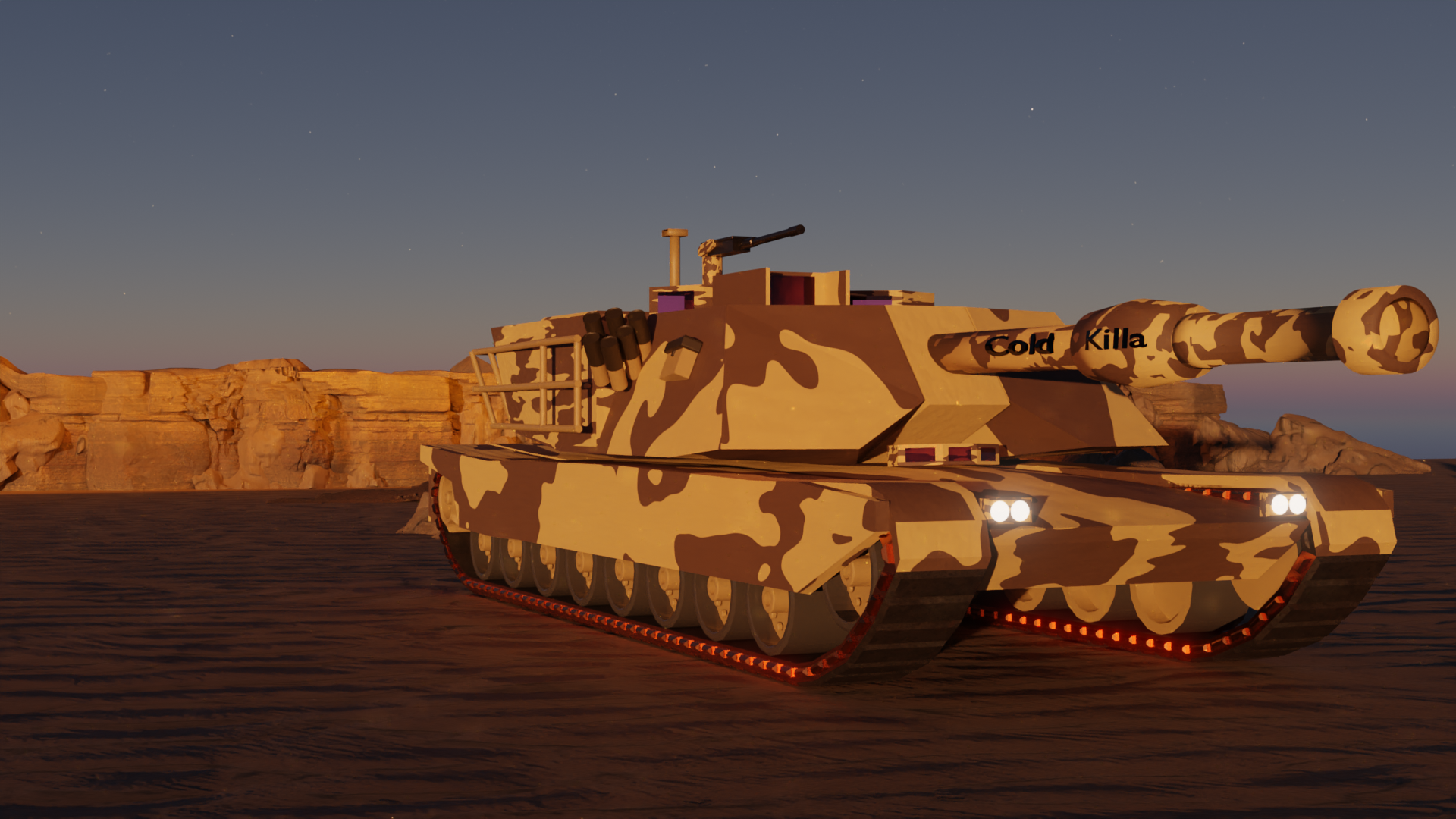 ks,
ks,
I just finished the treasure chest course. Another excellent course. Although my final render is a bit different.
For the treasure chest texturing, I decided to use Substance painter, it just seems to be a bit easier to get a really good result than painting in blender. I did create the wood and metal myself in there though. That's not just a smart material.
The sand and palm trees are from quixel megascans.
I actually created that water from scratch myself. I'm pretty happy with how that came out as well. Maybe next time I will try and do some white caps
The sky is a mix of the physical starlight/atmoshphere addon, and a sunset HDRI. I'm really happy with how that blended together. In addition, I just added a touch of glare in the compositor -.97 with a threshold of 1. But I'm really happy with how that sun looks on the water
Finally, I did two small area fill lights. The first on the front of the chest, the 2nd pointing at the gold to make sure it sparkled. I did both at 3200 with the blackbody converter (thank you lighting course).
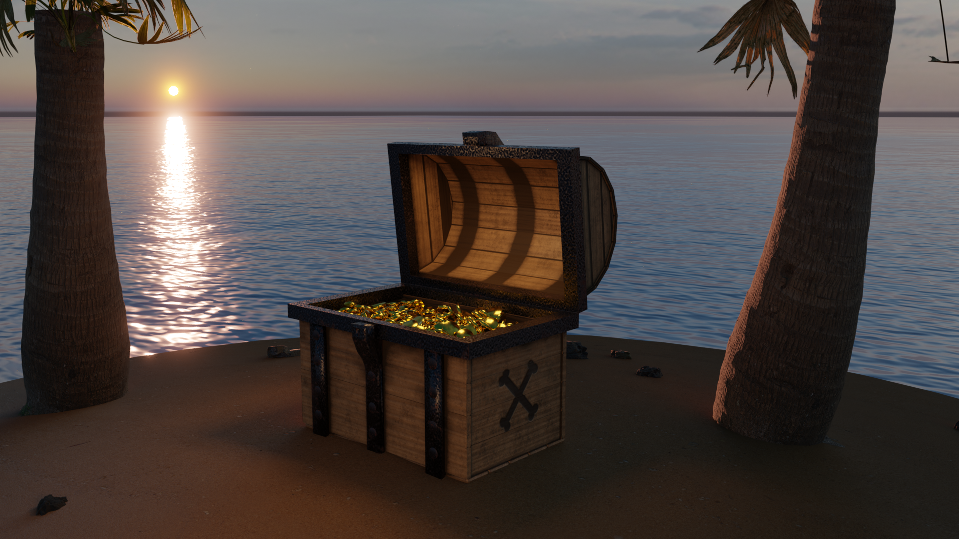
Anyway, here we go, comments/critiques are always welcome.
Hi,
Actually was a tank driver about 20 years ago, so I really wanted to make this nice. Though it is a bit of a challenge translating real life into 3d.
I textured this in substance painter after having some problems getting the procedural stuff I did in blender to upload.
Hope you like
https://sketchfab.com/3d-models/m1-tank-export-v6-411e270e37b642eab318e03f69566305
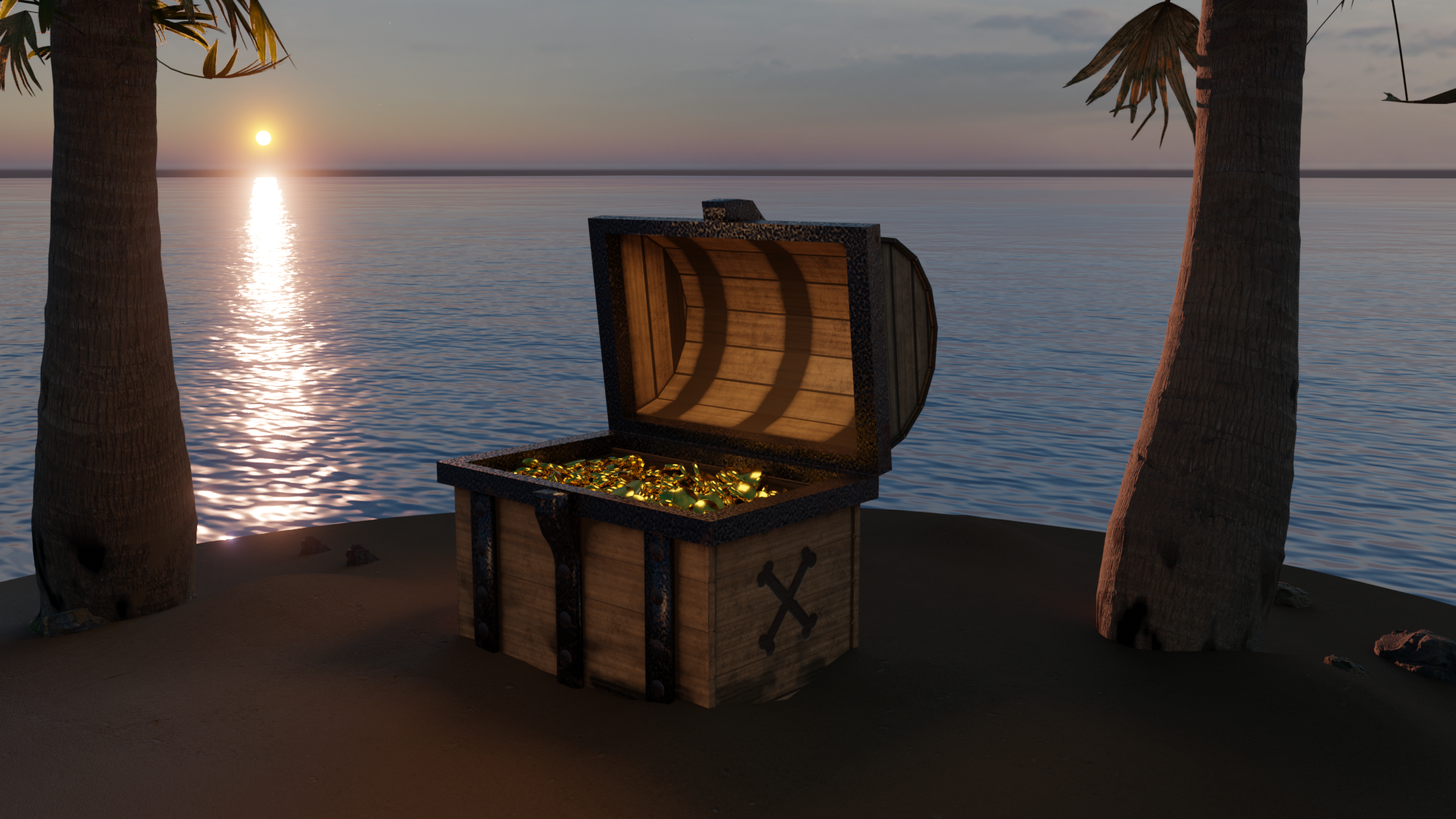
Nice work , I love the sun reflecting on the sea. Perhaps sculpt the sand up around the chest so it looks as if it is sunk into it a little. A chest that full and heavy on soft sand wouldn't sit on top of it like that in my opinion. Also , you can see at the top of the palm tree on the left where its trunk cuts off abruptly which looks a bit odd. Keep up the good work!
updated sand. I used the gradient and noise texture to add them to the bottom of the chest and trees. Also, I subdivided the island plane, and used proportional editing to make some sand ripples.
Here is what I did for the shader desk submission. I tried to get a bit fancier with some of the materials. Some of the parts I'm particularly proud of..
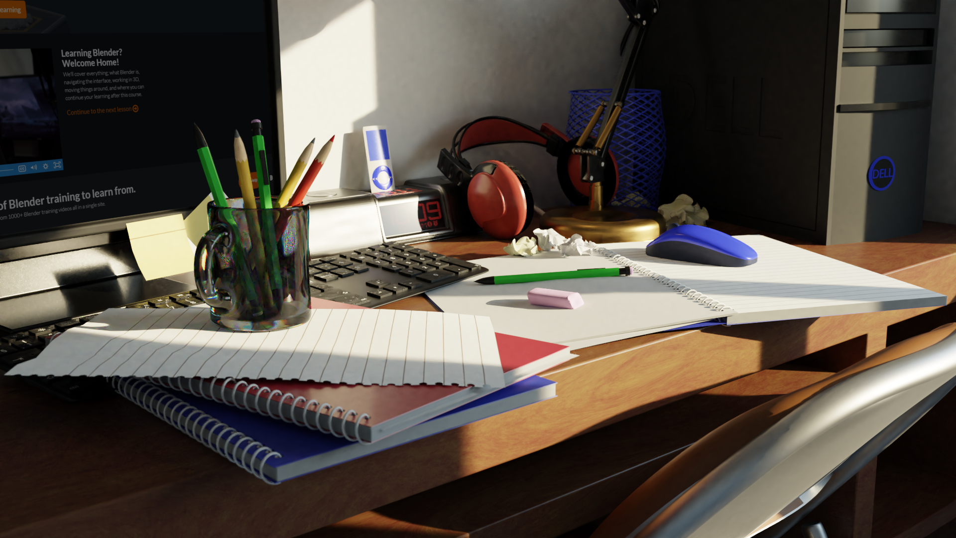
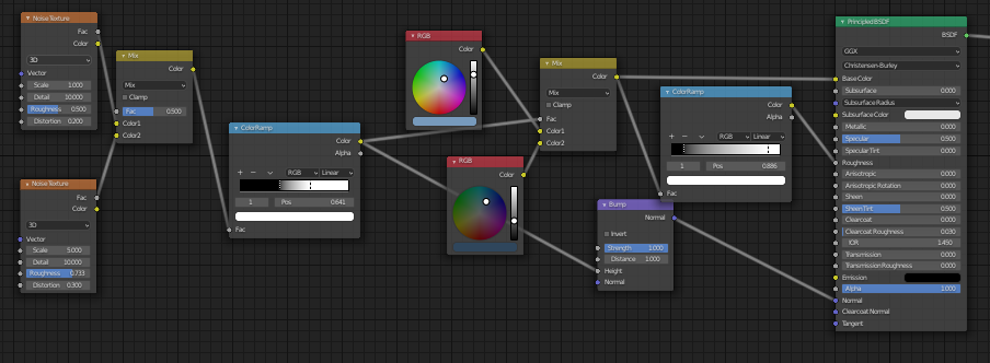
The wood desk is a custom shader, not just an image pic. I took a noise texture and stretched the scale on one axis a bit, I think it came out pretty good.
The notebook paper is custom as well. I took the vector input, and then separated into xyz. Then took just the Y, multiplied it and ping ponged it. Then I masked that to get the larger space at the top.
Finally, I did a reversed gradient sphere that was color ramped to be really narrow for the computer dell emission shader.
Most of the other stuff not to exciting, but I did try and put some variable noise in most of the roughness maps on most things. I've heard that goes a long ways towards believability
Hope you like, but criticism is always welcome.