I am working on the homework of the portrait reference and wanted to show all three, with their reference images. What do you all think? Hey @jlampel if you have time for some feedback I would appreciate it :)
All right, you 're asking...(I am still a beginner as far as lighting is concerned and haven't even done this exercise yet, although I'm looking forward to it!)
To make things clear, when I say the right side, I mean the right side of the picture, which would be the left side of the face/person...
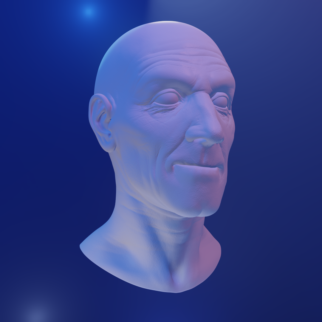
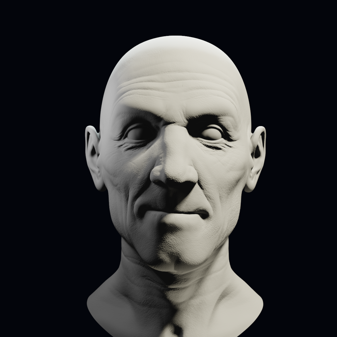
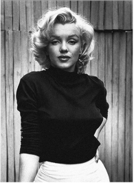
Let me start with the bottom two: the original appears to be lit straight from the front (middle of the face lit, sides in shadow) with a soft/diffused light (soft shadows) there also seems to be a weaker fill coming from the front right, especially visible on the nose, where the left side shadow is darker then the right side. And then there is a really strong back light, which not only lights the rim of the hair (saint-like?) but also light the back wall. You seem to have a key light coming from front right and a fill on the left and some highlight on the top of the head. Has a completely different look and feel to it. This pair is the most noticeable because there are no colors to distract from what's going on. Probably also the most difficult to get right...
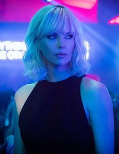
Now to the middle ones: the original, concentrating only on the head, has blue light coming from the left, with some yellow in it, and red/purple coming from the right. I think your red light is coming in a bit too much from the front, so that it 'spills' over to the left (left ear, below the eye...). Also, the jawline in the original is very pronounced, because it is in shadow, while yours is actually lit from below...
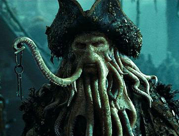
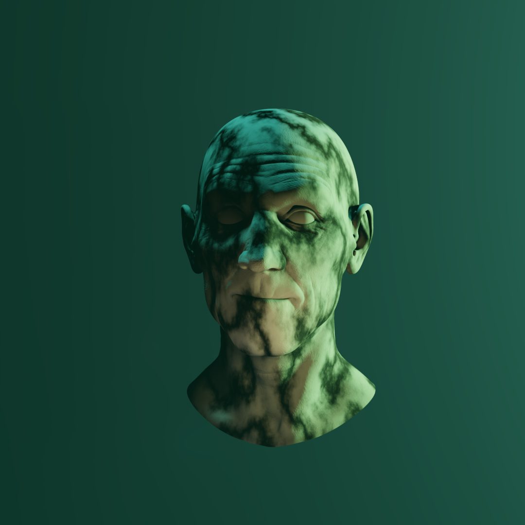
The top pair, I find really hard to judge; the main light is coming somewhere from the right, which you also have. I love the textured light and with those colors you really seem to capture the look and feel of the original. Maybe if you make the background a bit more like in the original (a little lighter, more blueish) to make the character stand out more and one extra white (point?) light on the right...
Lighting is really hard (and very important!); keep at it Kat! The main goal should always (not only with lighting ) be to get better each time, not to get perfect...
Hey there, thanks for critiquing. I agree with the Marilyn one (the bottom two) The light is from the right, I didn't do it from the front, not sure why, I think since it was the first attempt I was focusing more on getting the hot spots and shadows right while figuring out how to make sure how not to have light coming through the nose and not to blow out the face lol. As far as the rim light on that one, with the lack of hair it sort of failed a bit lol. I didn't want the top of his head to be glowing.
The 2nd one was hard because the lighting in the reference is rather flat, at least to me, there's not a lot of shadow play on her face. I was more trying to match the vibe of the club and match the colors while playing with volumetrics in an attempt to get the "hazy club" feel. I probably should have tweaked contact shadows more on it or something.
As far as Davy Jones lol, I put in the texture last minute to make up for the lack of tentacles lol. I am pretty happy with how that came out as it feels similarly creepy. The Atomic Blonde reference was probably not the best for a lighting exercise but playing with colored lights is fun.
Nice work Kat! Here are my thoughts, some of which may be the same as Spikey's.
Davy Jones
This is an interesting one because he has green skin! It's also very slimey, while the model I gave you is pretty matte. You could try increasing the clearcoat if you want to get that effect, but when it comes to lighting it is making a difference because you can tell from the highlights that the light is actually quite white and not that saturated. Not a big deal as you did great and got the same vibe by coloring the lights, but just to point that out as the effect will make a big difference. The hat is also making a big difference by casting a big shadow. I think you nailed it with what you had to work with. The texture certainly makes him look grimey!
Atomic Blonde
Working with color really is fun! The one big difference I see is on the left side under the cheekbone. In the reference it's darkened to emphasize the cheekbone while in the render it's lit too much from the bottom. The result is that it looks more washed out and shapeless. It also looks like the shadows are turned off for one or more lights, which is a good trick sometimes but here it's chasing away what should be occlusion in the nose and between the lips.
Marilyn
This one appears to be lit from the front (slightly off center to the right - notice the nose) with a very soft light, like Spikey mentioned. This gives it a sort of magazine cover look while the render looks almost evil.
Overall, awesome job! Keep up the good work :)
Thanks!!! I probably forgot to check if shadows were turned off on the Atomic Blonde one. SO MANY SETTINGS lol. I am glad you liked them overall though. I liked trying so many different styles to try to make it match. Thanks!