Hello!
Documenting my Blender progress here, comments and feedback welcome!
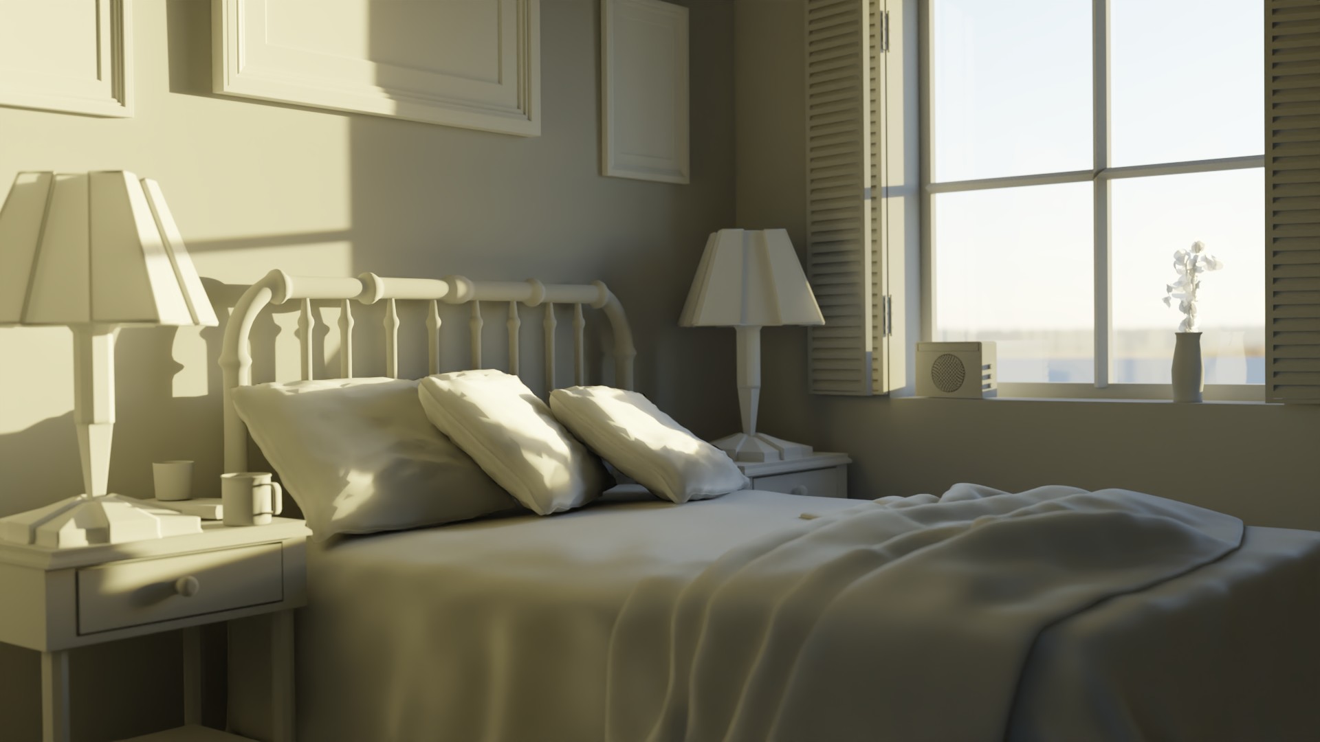
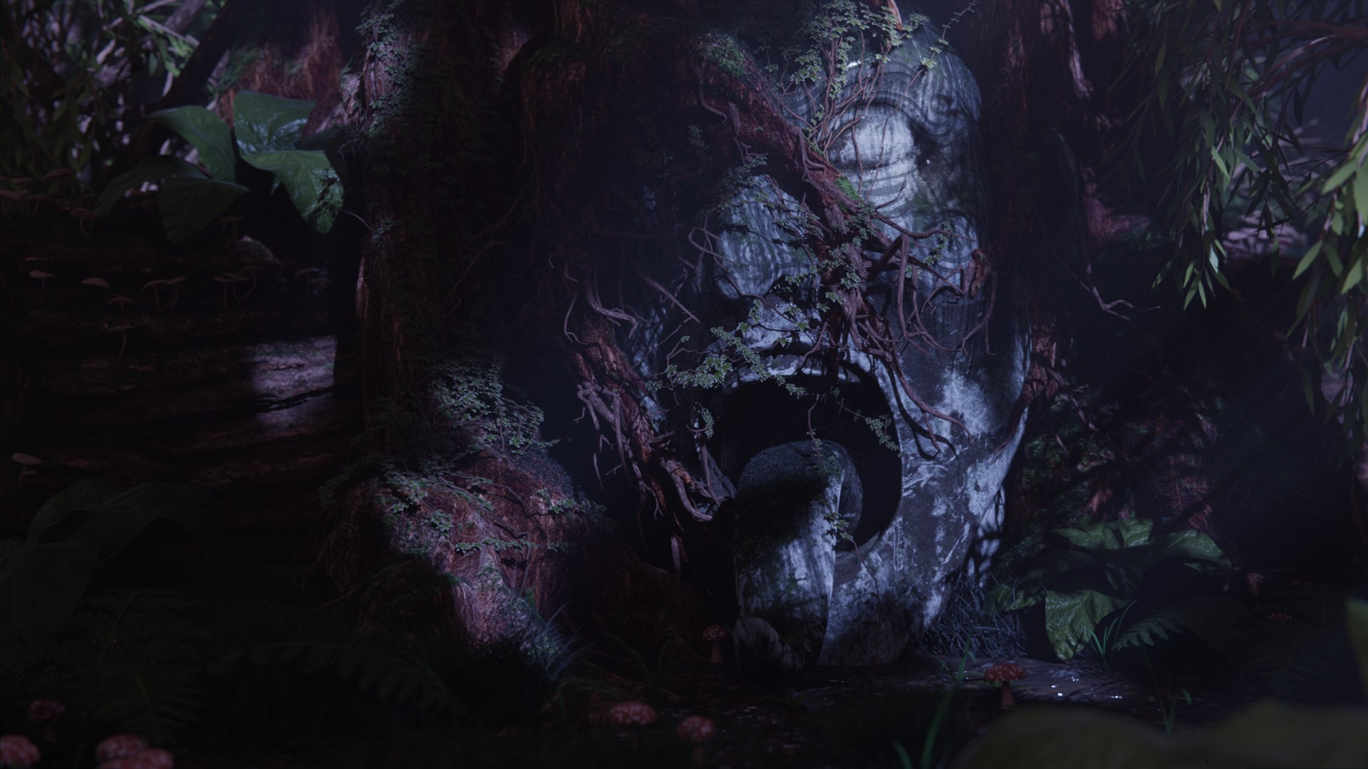
Working through Lighting Fundamentals, here are two scenes from the lessons before I tackle the assignments.
Sunset:

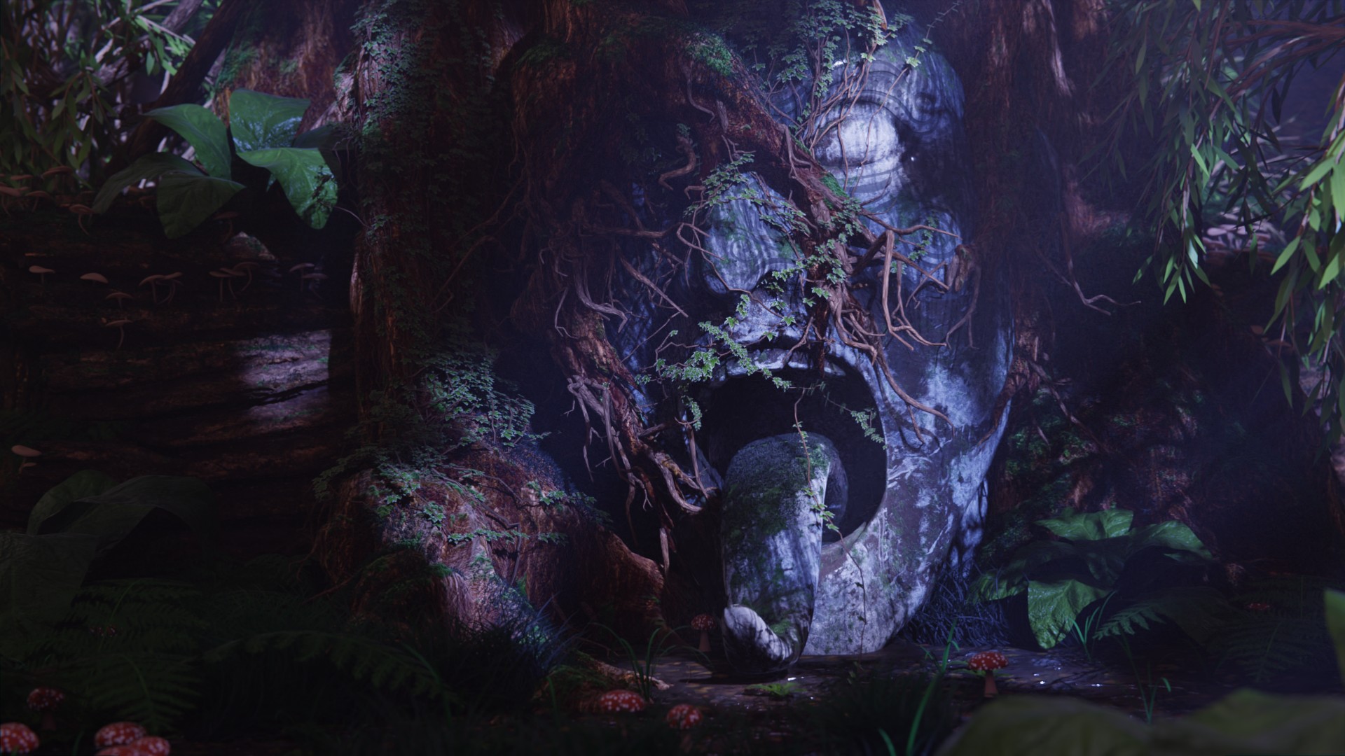
Forest at night:

Tweaked the camera DOF and played with a bit of volumetric here
Woohoo, nice work Cliff! That sunset looks great. For the forest, I think the volumetrics help quite a bit at night. Nice touch. It does feel a bit flat though, so perhaps a few other spotlights or something focused on different areas of the face could help fill it out a little more.
Thanks for the feedback! I see what you're saying about the flatness, was focusing on it being moody and it lost focus. I added some more spotlights to bring out some of the features and changed the exposure a bit to not wash out the shadow as much. 
@jlampel Portrait exercise in full!
Learned a lot trying to tackle this one, I think I had the most trouble with the more naturally lit example, the balance between the artificial and window light feels a bit off. Links to reference in order:
Byran Locantore - https://cdnb.artstation.com/p/assets/images/images/007/634/131/large/bryan-locantore-moana-stills2.jpg?1507500007
Yakun Wang - https://www.artstation.com/artwork/OgkPy
Roberto Delgado Webb - https://unsplash.com/photos/AxI9niqj_60
Kimson Doan - https://unsplash.com/photos/HD8KlyWRYYM
These are really good!
1. The right side is just about perfect but could use a little more blue coming from underneath. I think this is supposed to be moonlight light reflecting off the water, so it's very subtle and extremely soft. On the other side, part of what makes it interesting is the falloff across her jaw. Perhaps try and bright the light closer and make it much less bright (or use a spotlight with a good sized fade) so that it is strong right underneath the cheekbone but tapers off gradually and is gone by the time it reaches the corners of his mouth.
2. This one is especially tricky, and I think you did a great job capturing a near-impossible situation. I think the light is a bit farther down since you can see it reaches her chin just a little but doesn't reach the right side of her forehead. It also has an incredibly soft falloff. I think the only way to get that is to bring the light pretty close to the subject but make it fairly large. Notice how soft most of those shadows are. The light from underneath also highlights her chin a bit more but isn't lighting up her neck. Implausible, but it works compositionally.
3. You nailed the color choices here. I think there's maybe a bit less contrast between the right and left sides in this one than you have, and also there's less light from the environment coming from underneath (HDRIs tend to do that). The shadow underneath her jaw is a good gauge of where the differences are.
3. Again, excellent use of color. The front light is perhaps a bit softer, but beyond that I think most differences are due to the extreme change in face shape and skin material which you don't need to worry about.
I love how different all of your references are and I think you nailed the exercise! Excellent work 👏👏