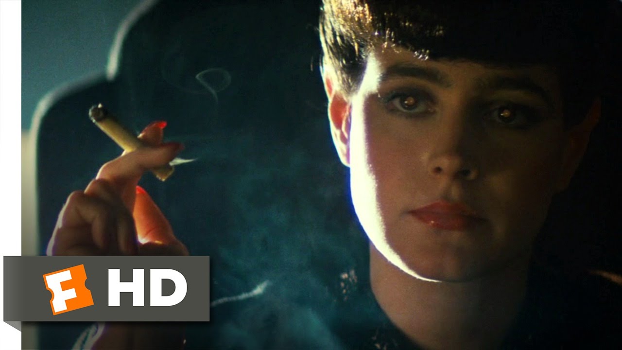
Hi @jlampel , thanks for the great course. I especially liked the artistic chapters. I universally suck at lighing in Blender, 99.9% of the time I just stick in an HDRI and there we go or use an add-on and this is probably the reason I am not happy with my final renders the same amount of percentage. This course was a godsend.
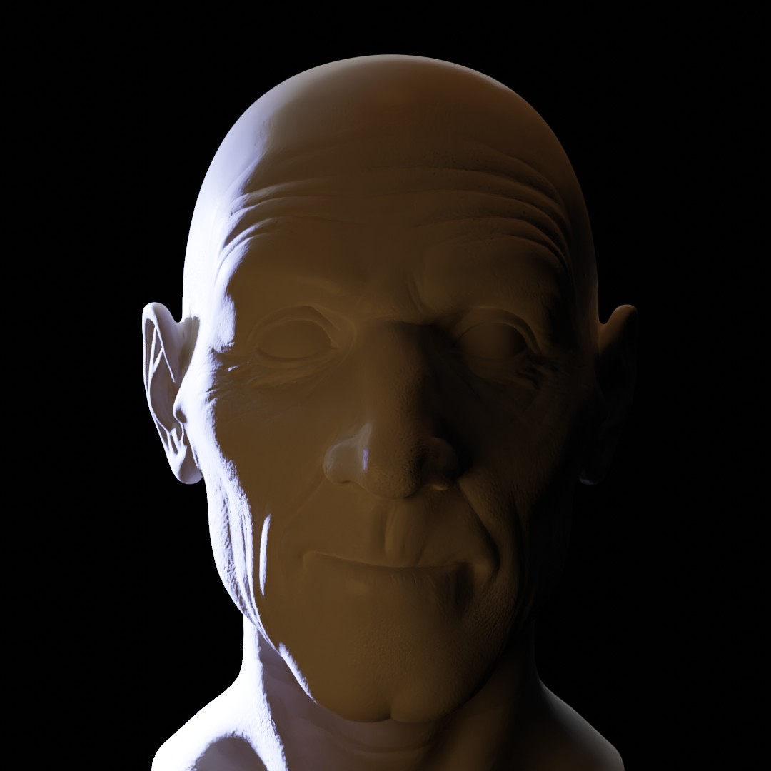
I am posting my progress with my reference as far as I am now. I chose the Replicant interview scene as my first and also my submission piece and am still deciding for the other 4 ones. I am faced with a bit of an issue, I have absoutely no idea if I nailed it or not. I'm just not sure how or where to look. I followed a process to get to the point where I am at now. I had some help with making of(the movie) articles and whatnot as to where to place the light roughly but in the end I kept moving all of them and changing setting for hours. But I am at a loss now. I intent to add volumetrics as well since the scene has it, but I just want to be sure the ligthing is about there.
Reference:

Before volumetrics:

Am I getting close and what can I improve?
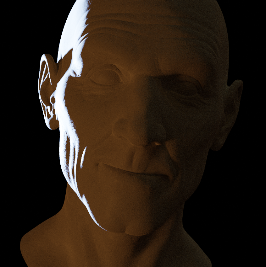
Nice one! I think you're very close. Just a few things to try:
Here's my attempt which isn't perfect but I think it shows those ideas.
