Hi! Jevlin asked a few years ago about how what we're seeing on our own screens may be far from what you have. I have the same issue, but maybe even worse than him/her, in Blender 2.8.
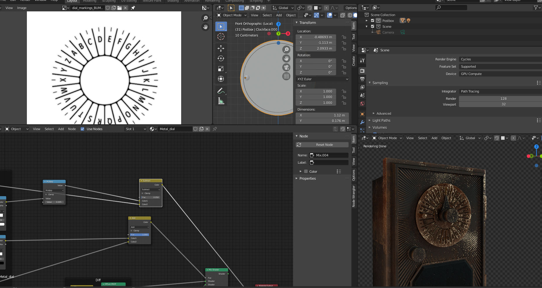
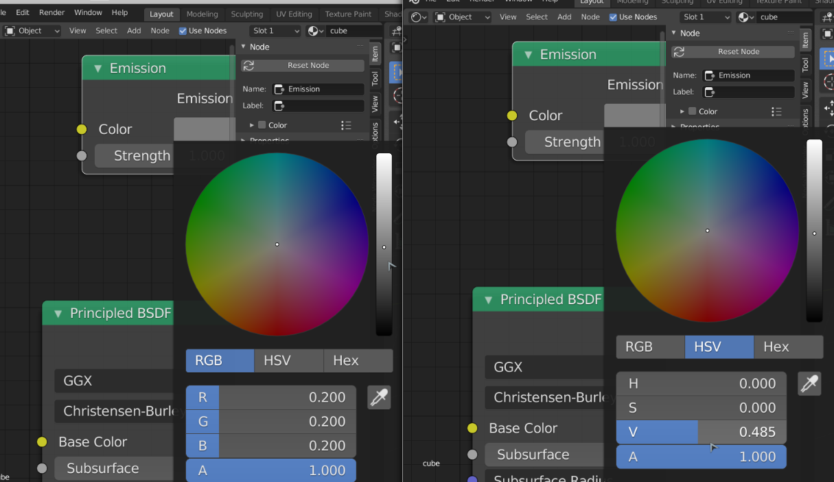
There are also things like when you type a value of 0.2 it is about a 50% grey, but when I type 0.2, in a color ramp, that is a 20% grey, or nearly black. Also I had to use subtract and not add on the rgbmix for the letters to indent and not push out. This took me a while to see though as my render window is sooo dark and muddy, and hard to read. I'm squinting constantly and feel like I'm working blind.
It renders for a while but stops at what you see below. I have a pretty ok laptop from 2020 with a dedicated GPU, which is probably weaker than what you used when recording this lesson, but maybe not by too much? Are there any tips on render settings and useful boxes to check just to get the real time render preview to look a bit more in the ballpark of what we're seeing in the video?
There are also things like when you type a value of 0.2 it is about a 50% grey, but when I type 0.2, in a color ramp, that is a 20% grey, or nearly black
This is true, they have changed this; when you used to type in a Value of 0.2, that would give a RGB of (0.2, 0.2, 0.2).

This was not correct and now a Value of 0.735 gives a middle grey and that is a RGB of (0.5, 0.5, 0.5), which is more natural.
It has to do with the fact that human vision is more sensitive to dark than to light. Danger (a tiger for instance) is more likely to be lurking in the shadows, so we need to be able to distinguish darker shades of grey better than lighter ones.
I'm not very good at explaining this, but basically: human vision is not linear.
It renders for a while but stops at what you see below
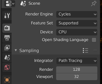
Under Sampling you have your Viewport Samples set to 32,

so it stops at 32 samples... Kent probably has that set a lot higher, hence the better quality viewport render...
Thanks for the explanation of the light value :)
So, after completing the course I have some observations:
- The scale of many of the values of the nodes seem to be off by a factor of 10 and even 100. The reason why my render looked so muddy was largely due to the model being waaay too bumped/rough. When everything got smoother the render time, and result, got way better.
- Moving the light and increasing the size, as done in the next video also made a much nicer render preview.
- I did not actually have to increase my preview samples from 32 to get a nice image.
I did not by far manage to copy Kent's result exactly but I got an image I found looked as good, or even better, in the end. Due to luck, taste, or because Blender has taken some huge steps since 2.70 I do not know :)
I did not by far manage to copy Kent's result exactly but I got an image I found looked as good, or even better, in the end. Due to luck, taste, or because Blender has taken some huge steps since 2.70 I do not know :)
Indeed Blender has changed significantly since 2.70. I'm just happy you made it through the course! I know it's tough following older tutorials with newer versions of the software. I hope you still learned some good nuggets along the way :)