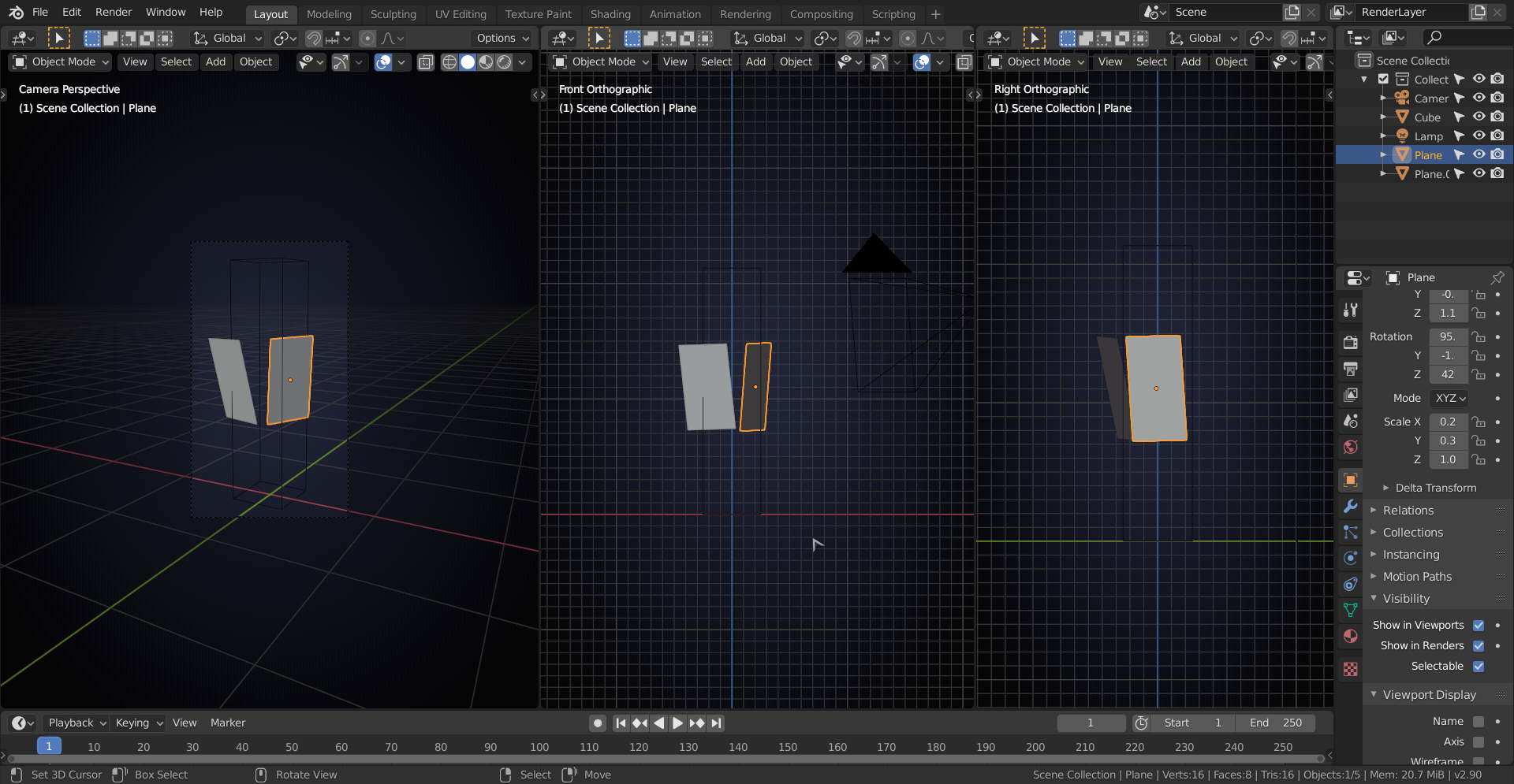
I have difficulties to sufficiently accurately align the first panel in perspective camera view and in orthographic right side view:

Link to my file:
https://www.dropbox.com/s/r1dq7r1d90q86ue/GameCharacterModeling_Trammell_16April2020_3.blend?dl=0
I think that what is tripping you up is the fact that the right orthographic view only shows the right leg!
And that not even super accurate compared to the camera view;)
Just looking at those pictures above, I'd read the two plates something like this:
Look at the feet in camera view to get an idea how the legs are positioned and rotated..
But I'm sure that Kent explains it all if you keep following along. (I didn't take this course yet, still on my- getting longer everyday- todo list...)
That's how Kent did it:
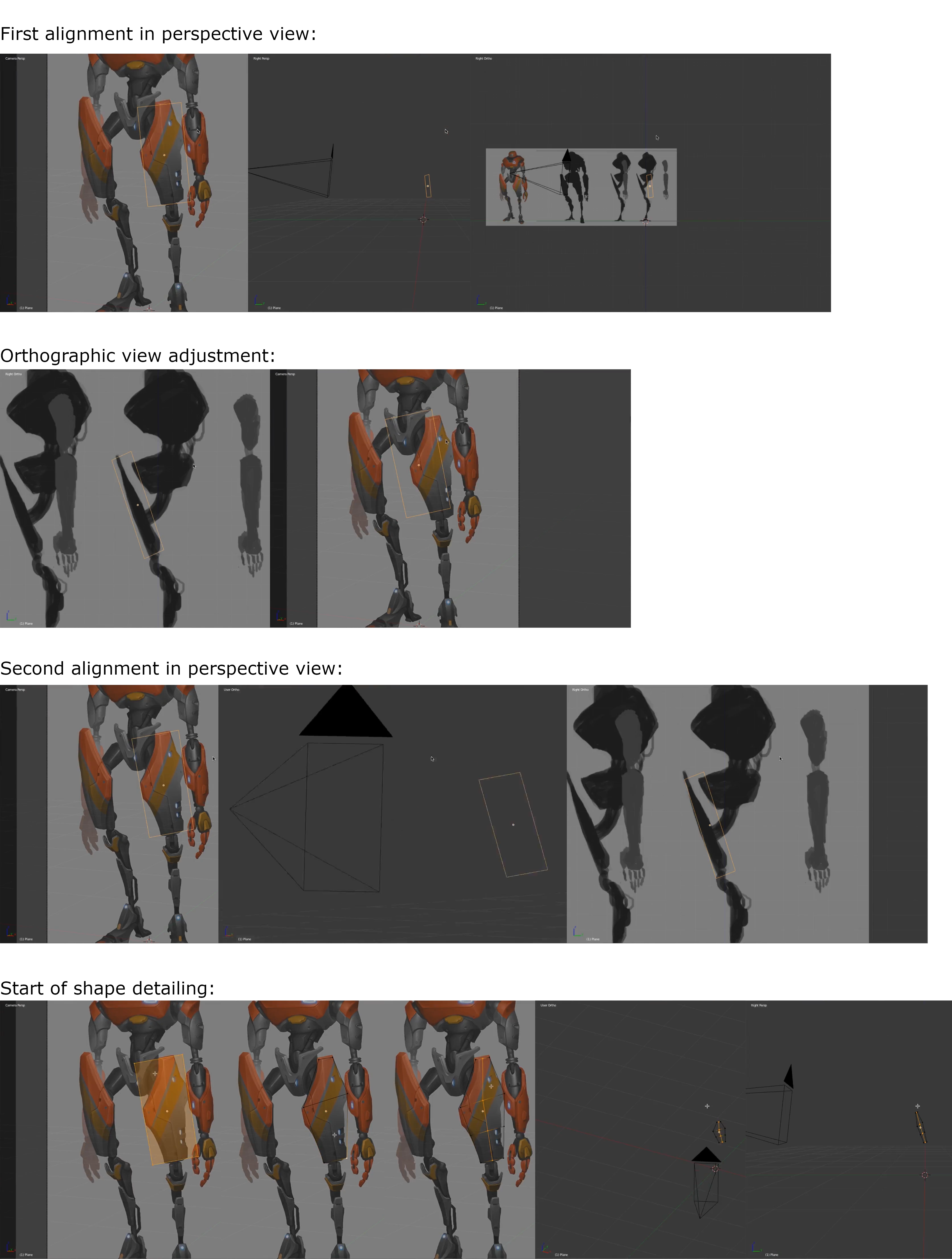
The plate seems to be tilted downwards like in orthographic right side view (according to Blender's terminology, but which is essentially the character's left side), whereas the perspective artwork rather lets me think at a plate that is tilted upwards (look at the shading which seems to be brighter in the upper part of the plate).
The perceived upwards tilt of the panel essentially is only a very slight one so that it doesn't make much difference. So I deceided for the downward tilt.
I also tried this alignment method when modeling the outline of the attachment part of the hub for the Caterpillar 434E in conjunction with the projection of extruded vertices on an accordingly aligned plane: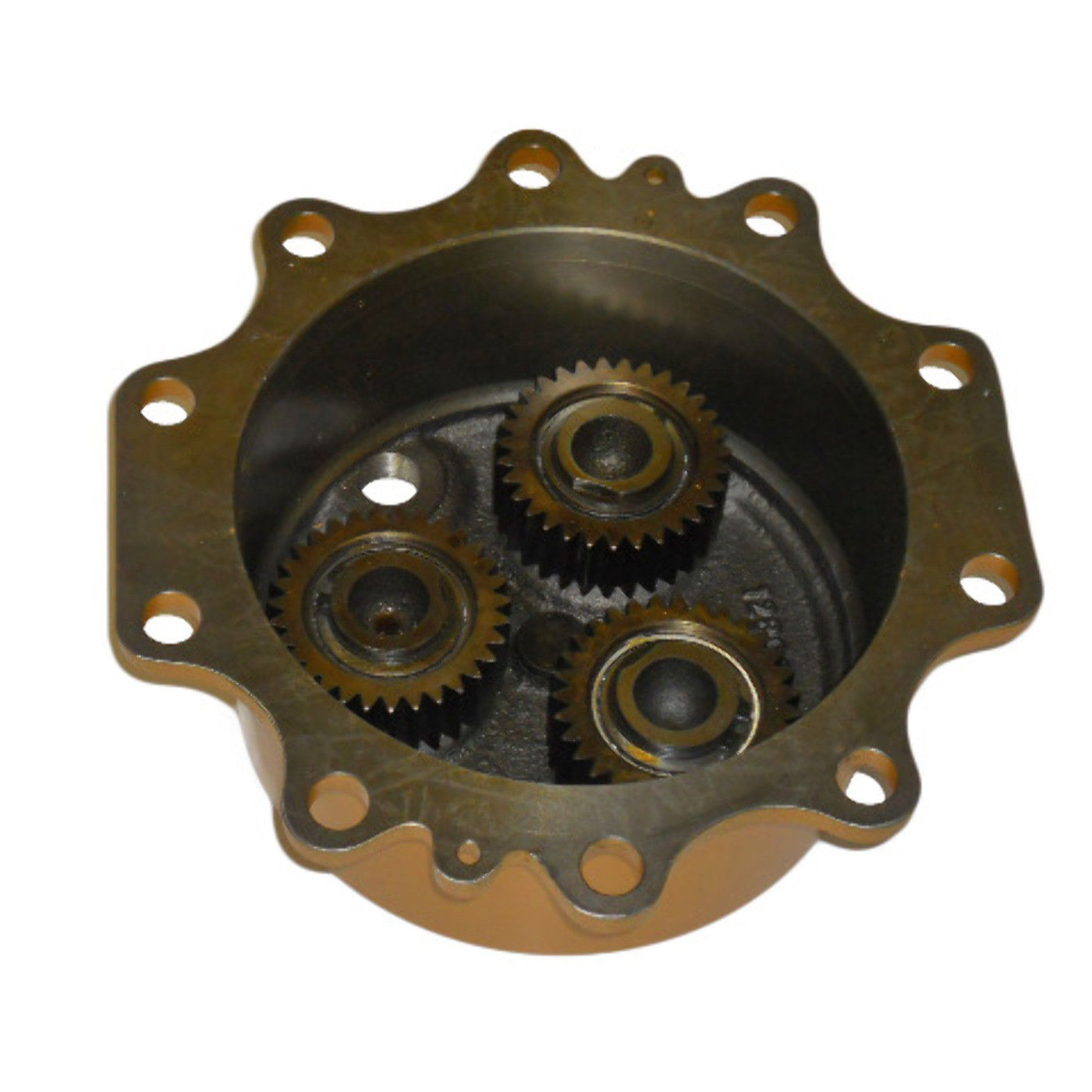 The difficulty here for me seems to be to match the camera settings this photo has been taken with. Using automated focal length analysis like "FSpy" probably won't get good results since the object is rather small.
An update to my panel blocking:
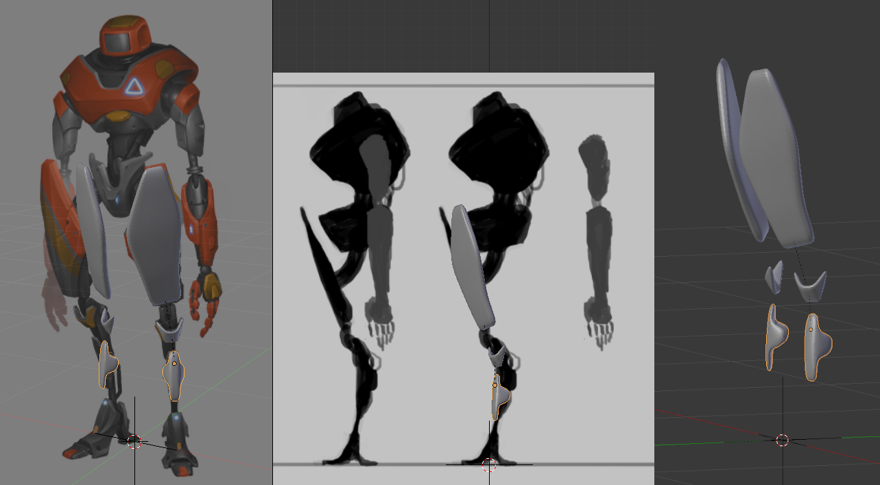
There're still some discrepancies, especially for the side generated by the "Mirror Modifier".
![]() duerer You can also use the mirror modifier as a means to best position the pieces. In your case, the mirror modifier reveals that perhaps the left thigh panel isn't quite right despite looking great by itself.
duerer You can also use the mirror modifier as a means to best position the pieces. In your case, the mirror modifier reveals that perhaps the left thigh panel isn't quite right despite looking great by itself.
You could move the thigh piece toward the camera (change transform orientation to "View" and hit G + Z + Z) which would make its mirror spread out like in the art.
BUT the reality is, again, art is never going to be perfect from different angels. Finding the middle ground is our goal as modelers. You're progressing nicely through this!
PS: It's your choice, but personally I think the "shin" piece orientation looks better in the 3/4 view than the side ortho. There's a slight "lean back" feeling in the side ortho where the 3/4 appears more balanced. Either way is valid; your choice 👌
@theluthier
change transform orientation to "View" and hit G + Z + Z
actually that behaviour has been changed (somewhere in the 2.80 version already if I'm not mistaken)! Now, if you change the Transform Orientation, G+Z uses the 'transform Z' and G+Z+Z makes it the Global Z again;)
So it depends, if someone is using pre-2.8 (for whatever reason) then use G+Z+Z, but from 2.80 onwards use G+Z.
Blender has become a lot more user friendly, but nowadays you have to explain everything several times; 'do this when you use 2.79, do this when you use 2.8 with LCS and do this when using 2.8 with RCS, and so on...
![]() spikeyxxx Oh no they did change that! Time for my muscle memory to get back in the gym.
spikeyxxx Oh no they did change that! Time for my muscle memory to get back in the gym.
Blender has become a lot more user friendly, but nowadays you have to explain everything several times; 'do this when you use 2.79, do this when you use 2.8 with LCS and do this when using 2.8 with RCS, and so on...
I couldn't relate more to this statement lol. It's so nice that you're on point with such changes though 🤘
@theluthier Thank you for the advice. I'll try it out. It sometimes feels like working on a machine where turning one screw changes the machine's behaviour somewhere else so that you have to turn a screw there which changes again the behaviour of your first screw so that you have to adjust it again. It goes back and forth until your machine behaves at least approximately as you intended it to do. I also find that the shin orientation in the 3/4 view looks better, somehow more dynamic. I already intended to change it but my focus here was rather on approximating the side generated by the "Mirror Modifier" as close as possible to the 3/4 view drawing.![]() spikeyxxx Yes, that's sometimes driving me crazy too, that the shortcuts have changed significantly between Blender 2.79 and 2.8, especially the selection with left click or right click so that I first thought at a bug, when I couldn't select as I was used to do. But I don't want to replace Blender 2.8 shortcuts because I find it clearer now and more consistent with other programs and because I think that it's better for discussions and teaching if all users speak the same language in terms of shortcuts. I only added the shortcut CTRL + SHIFT + MiddleMouseWheel for "Roll View" because it's easier to use than SHIFT + Numpad 4 or 6 which is now the only shortcut for that function in Blender 2.8 whereas Blender 2.79 had both shortcuts.
spikeyxxx Yes, that's sometimes driving me crazy too, that the shortcuts have changed significantly between Blender 2.79 and 2.8, especially the selection with left click or right click so that I first thought at a bug, when I couldn't select as I was used to do. But I don't want to replace Blender 2.8 shortcuts because I find it clearer now and more consistent with other programs and because I think that it's better for discussions and teaching if all users speak the same language in terms of shortcuts. I only added the shortcut CTRL + SHIFT + MiddleMouseWheel for "Roll View" because it's easier to use than SHIFT + Numpad 4 or 6 which is now the only shortcut for that function in Blender 2.8 whereas Blender 2.79 had both shortcuts.
So, this is the best compromise I can currently imagine between camera perspective, right side orthographic and free perspective view outside the camera: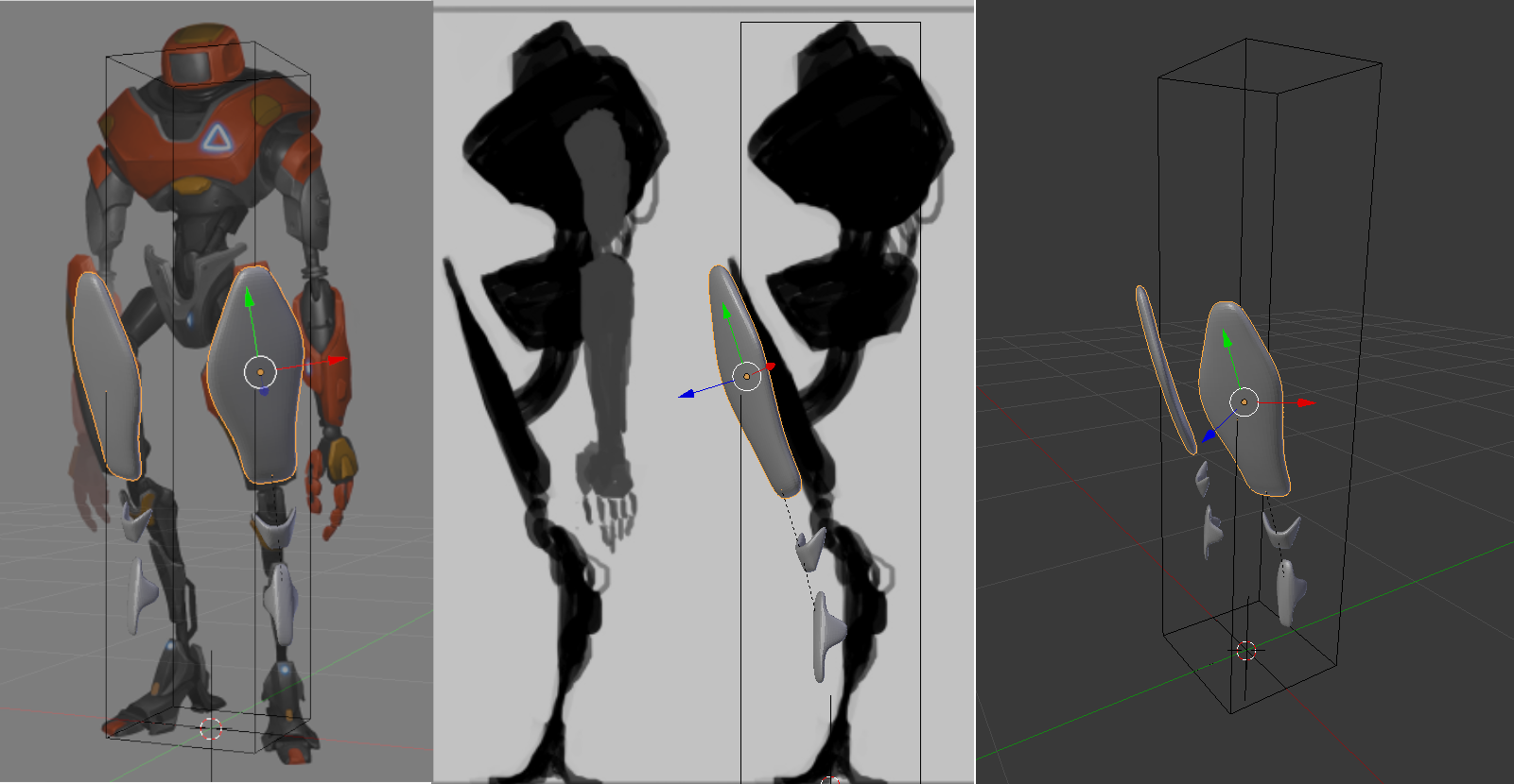 I've followed your advice, Kent, to move the leg along the "View" z-axis in order to get the thighs approximatively aligned with the 3/4 view drawing and an active "Mirror Modifier". I've also readjusted the camera view a little bit with the camera locked to the view. The thigh inclination is directed downwards and follows that of the robot's right side (left image half), the inclination of the shin follows that of the 3/4 view robot's left leg (right image half) in order to get a more dynamic pose and avoid the right side orthographic view's leanback. If there're no major concerns from your side, Kent and Spikey, I'll continue now with the blocking of the leg behind the shields.
PS: A link to my current file is here.
You're compromising like a pro! The thigh pieces look great imo. Since the 3/4 view is usually the most appealing view of a concept character, it's best that your pieces favor it. The fact that it looks most different from the side ortho is the right call imo.
While I probably wouldn't have opted for the shin placement as you have, your choice is valid and I think you should continue the way you have it. Some of the details from the side you'll have to eye-ball since your robot's right leg will be significantly off the mark in the 3/4 view. But you can always change the orientation later if it's a problem.
Keep up the good work, Ingmar!
@theluthier I think, the special thing about the thigh shield is that it is tilted forwards but the thigh itself is tilted backwards as it should be in a relaxed and stable pose of a human following the principle of counterbalance: head slightly tilted forwards, rib cage backwards, pelvis forwards, thigh backwards and shank slightly forwards.
So, after a few years coming back to an unfinished work. This is so far my blockout of the first three leg pieces and the best compromise I could reach after some trial and error (file is here).
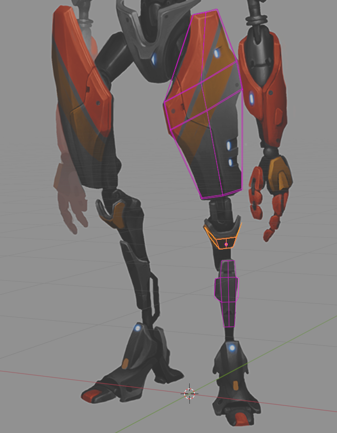
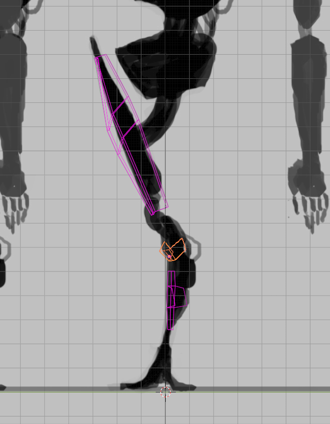
I focused on the 3/4 view and only took care that the parts aren't to much off in side view. Maybe I'll have to readjust it later in order to make the body mechanics work for animation. A run animation like in the Youtube trailer would be a great achivement for me!