Here's my sci-fi Crate. This is going to be my CGBlog, because it really seems a good idea to keep track of what I'm doing, any cc are welcome :)
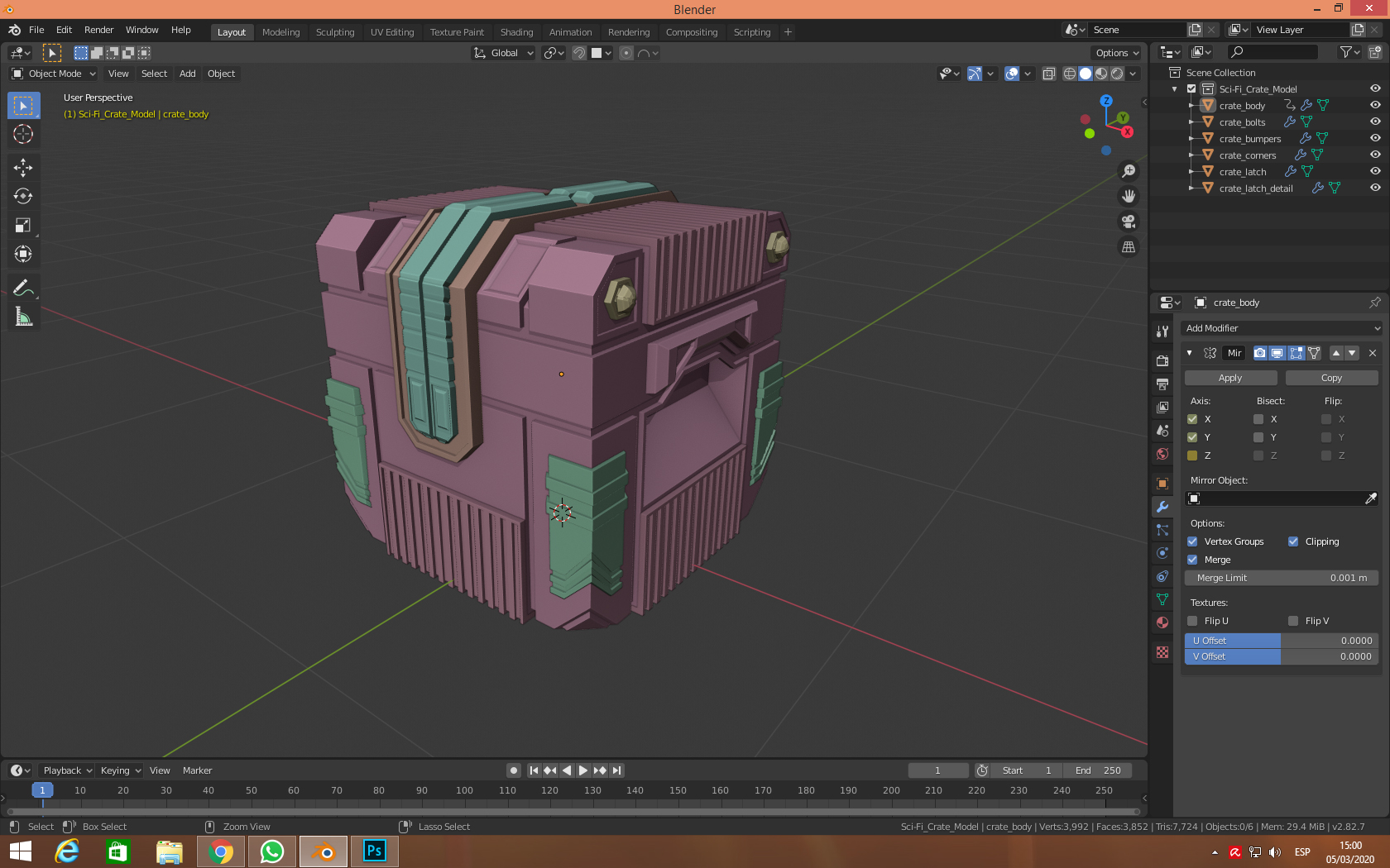
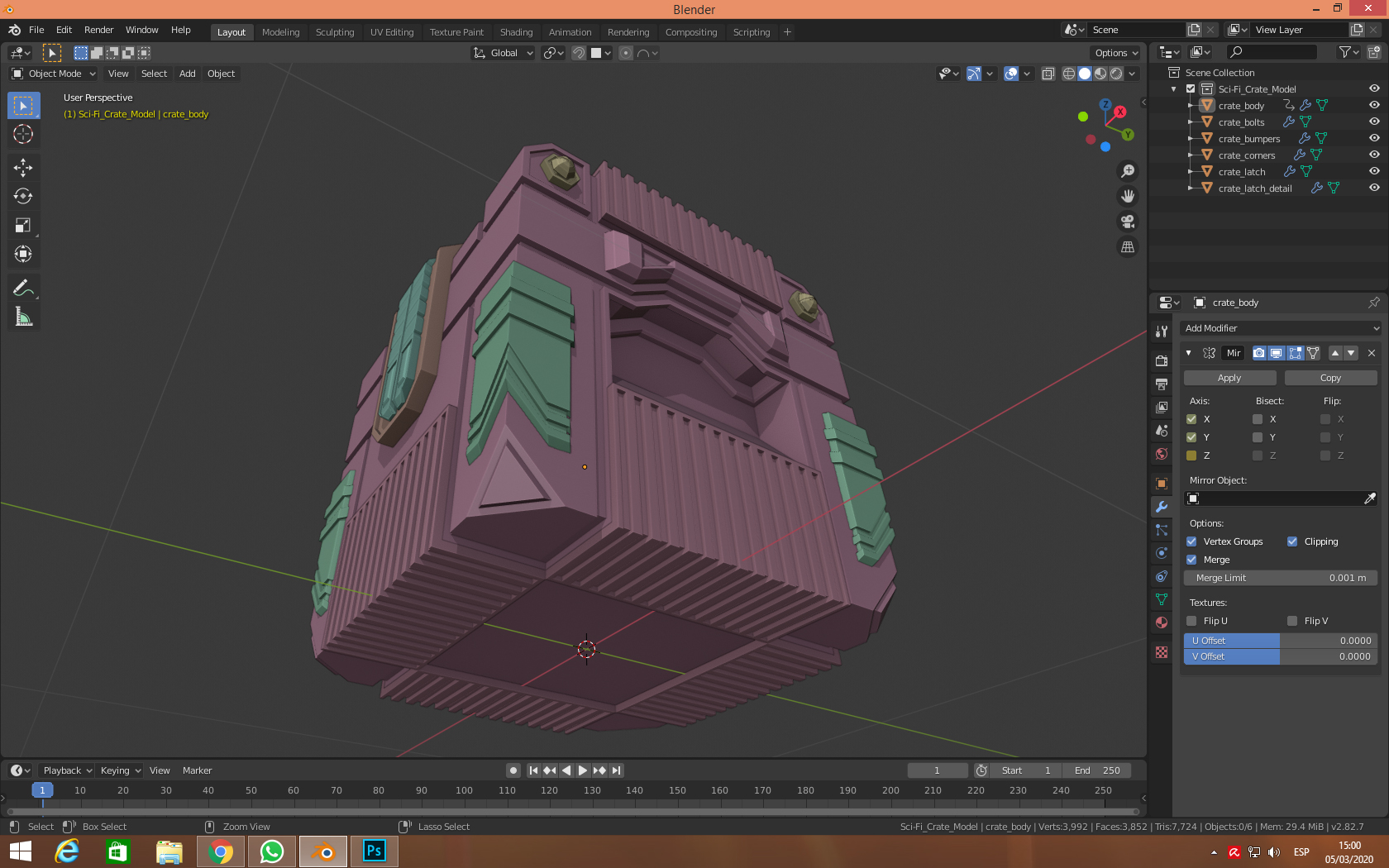
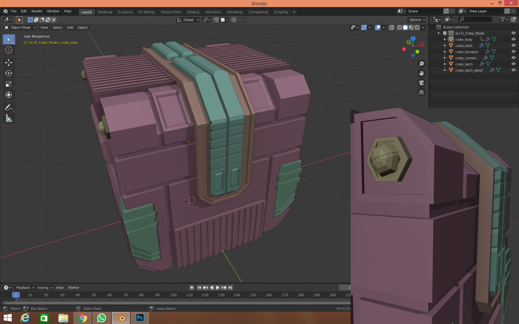
It's looking good, very good! Some nice hard surface work there. How about a bevel or two to make those edges stand out?
P.S. Why have you keyframed the axes of the mirror modifier?
ffreiredesign that is a nice amount of detail. I’m looking forward to more creations.
You are right! Some bevels do improve the shape a lot. I keyframed my mirror because I didn't know how to make a bolt or lock, but I followed your advice, thank you! ;)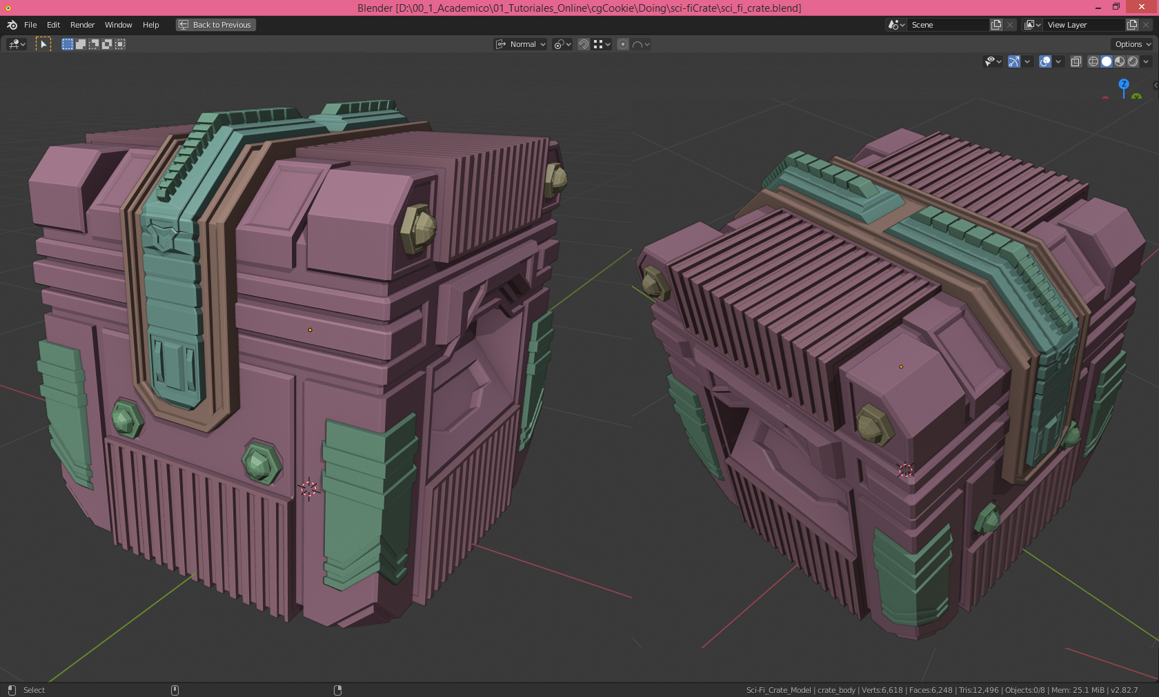
Thank you for your kind words :) Thanks to your encouragement and advice I feel like I'm truly making progress.
This community is amazing!!
Right now I'm working on my Low Poly Room exercise. I'll show you what I have and anything you feel can be improved, do please give me some clues, They are truly welcome and much needed!
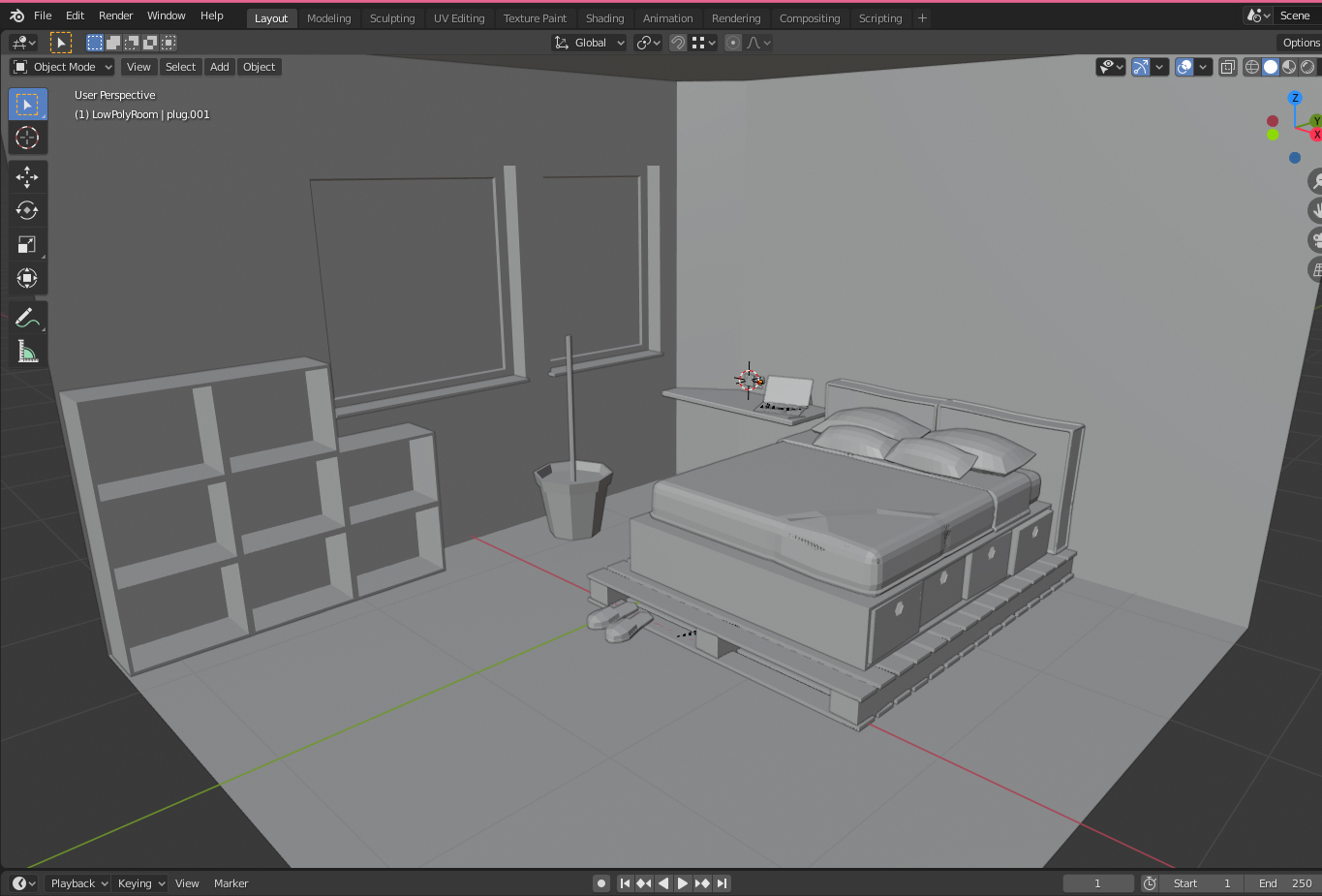
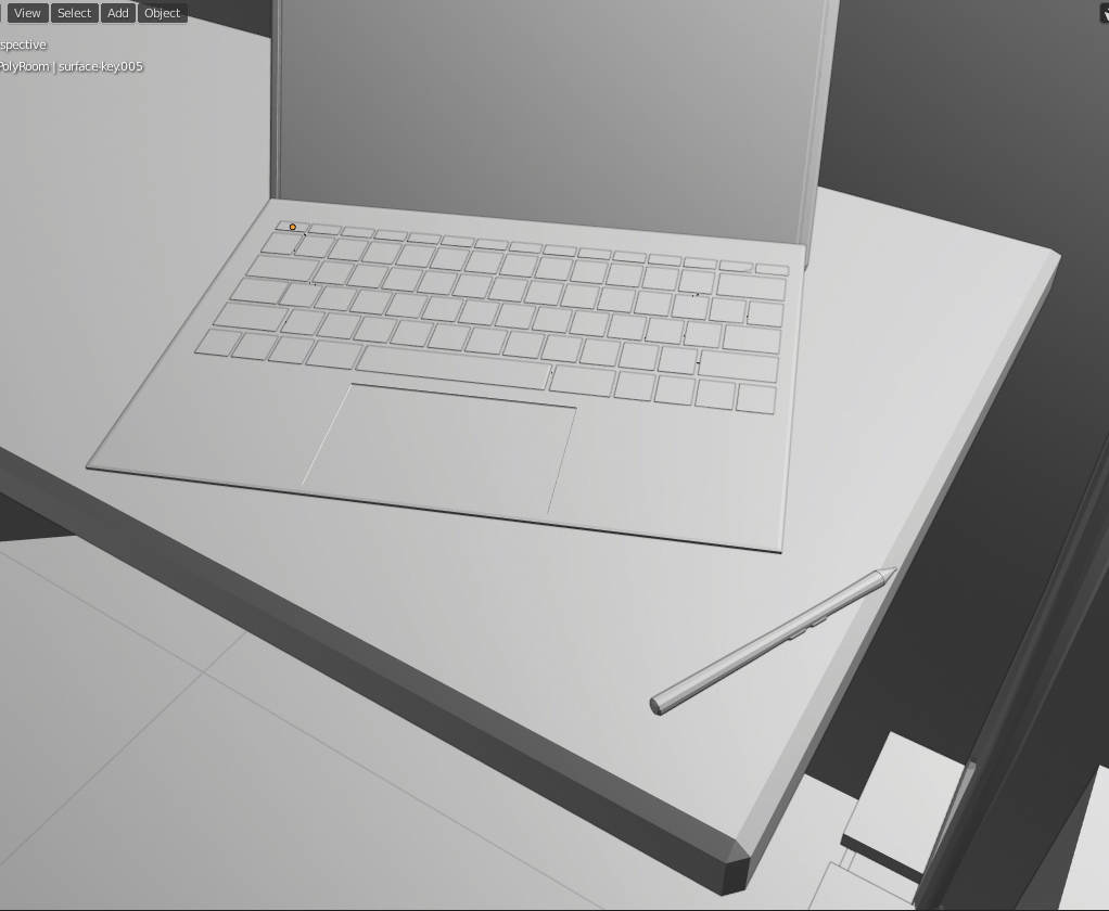
and below a detail of th laptop. I don't own a Surface Pro, but I admit I'd like to :D
i loving the details so far. Is that a wood pallet below the bed? Very interesting
I noticed the bed has some interesting buldges on the corner opposite the pillows Was that intentional?
And I had to laugh at the flower pot with the stick coming out of it. This is obviously an unfinished pot but my imagination goes a little off on a tangent sometimes and I imagined a stick in a pot filled with concrete. Lol.
Yes ![]() blanchsb it is a wooden palet. The stick in a pot with concrete filling... It definately picked my interest. I may try that for another atmosphere. Right now I stopped modelling and I'm going to shade as best as I can, which is not much, and render. Does anyone know why the faces of different objects seem to vanish? Is it because they are too near to each other, or is it a problem with the viewport?
blanchsb it is a wooden palet. The stick in a pot with concrete filling... It definately picked my interest. I may try that for another atmosphere. Right now I stopped modelling and I'm going to shade as best as I can, which is not much, and render. Does anyone know why the faces of different objects seem to vanish? Is it because they are too near to each other, or is it a problem with the viewport?
Works in progress... :D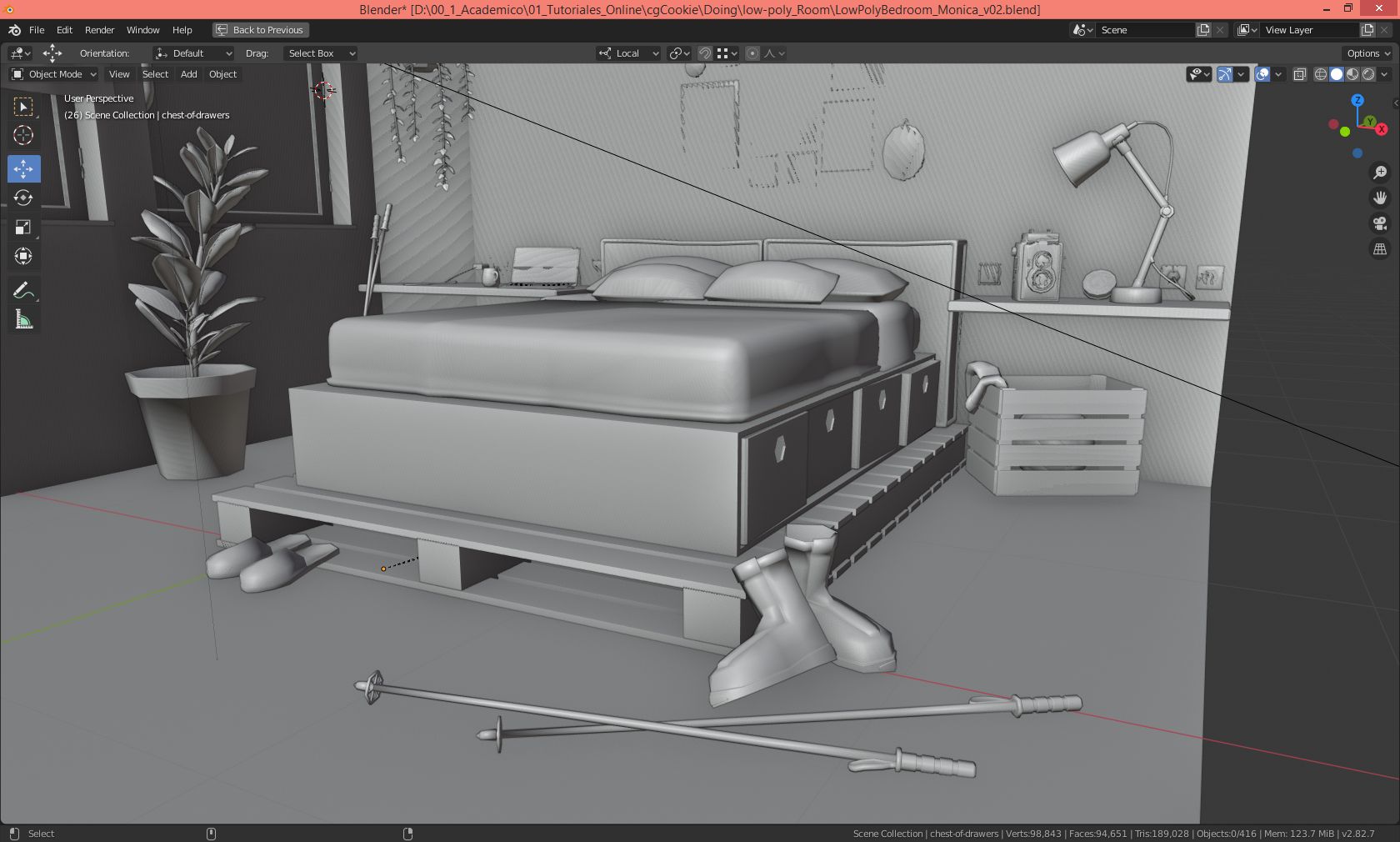
If you are talking about the back wall it looks like you have multiple “planes” in the same y depth. Planes that all share the same y coordinate all tend to interfere with one another. You could bring them in a little from the wall and that should fix it.
But if it is a different thing you are talking about perhaps you are referring to the backface culling
Or! If you are using @jlampel provided room from the fundamentals of modeling course then he set up the scene to enable backface culling (the camera only cares about faces that have the normal pointing outwards and ignores the other side so it appears “see through”). This is not a problem but you can turn off back-face culling (i believe it is in the header but I don’t have blender nearby)
Or! There may also be a problem with some faces that have normals flipped on some faces but not on others. You can hit A to select all daces in edit more and then Shift + N to flip all normals to match.
I've finished my Low Poly Room. Here are some renders. Hope you enjoy them and remember, I do welcome any ideas to improve, thank you!
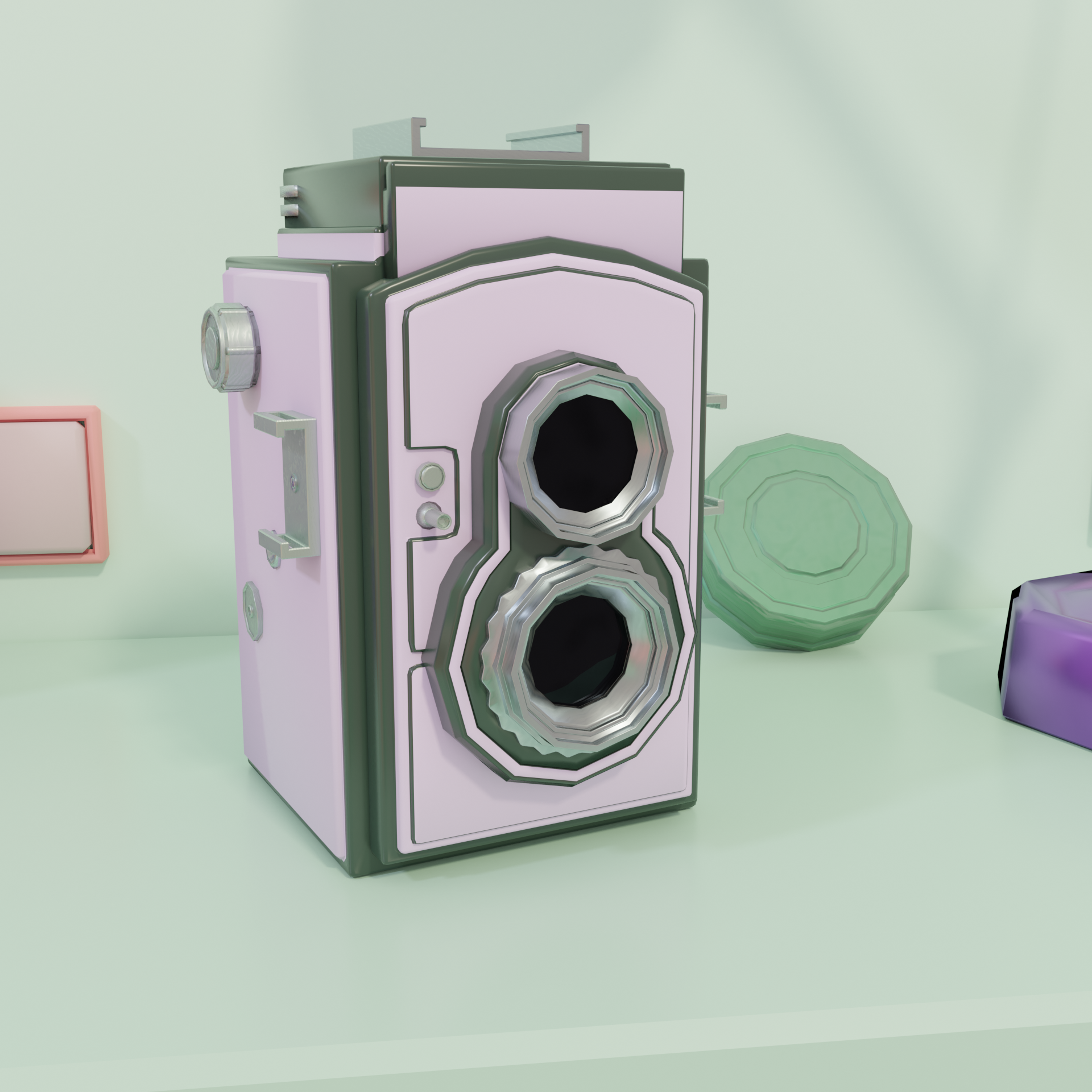
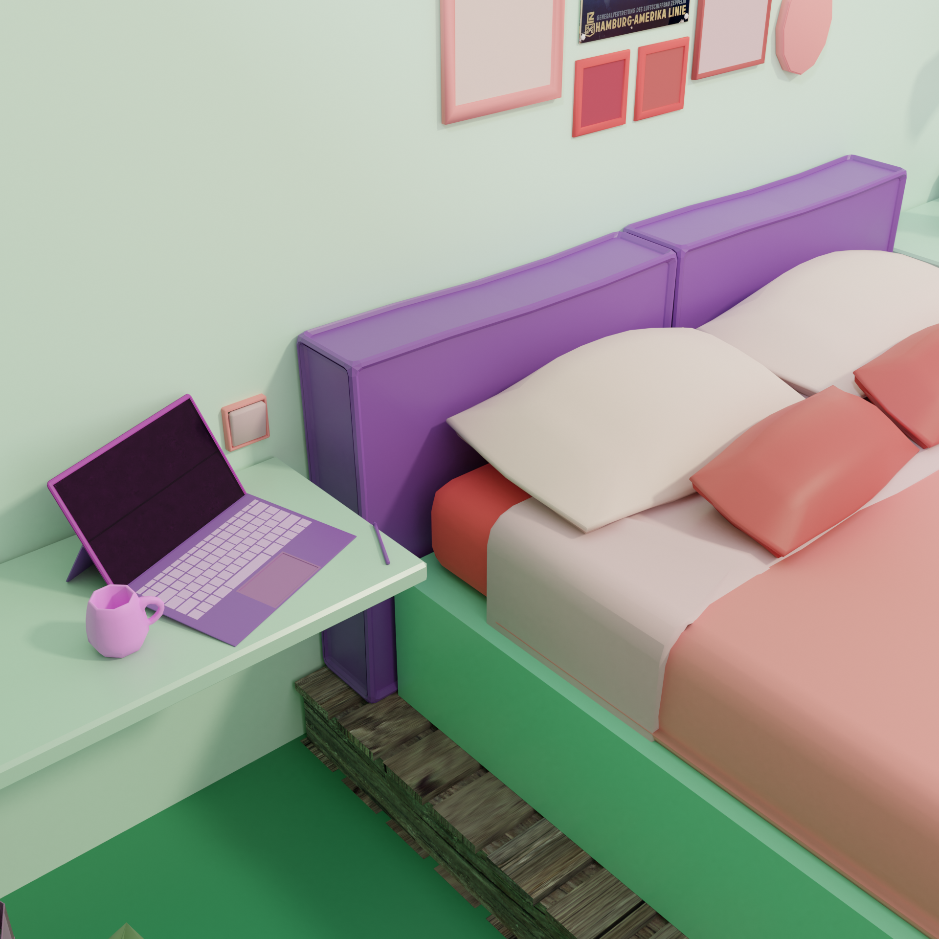
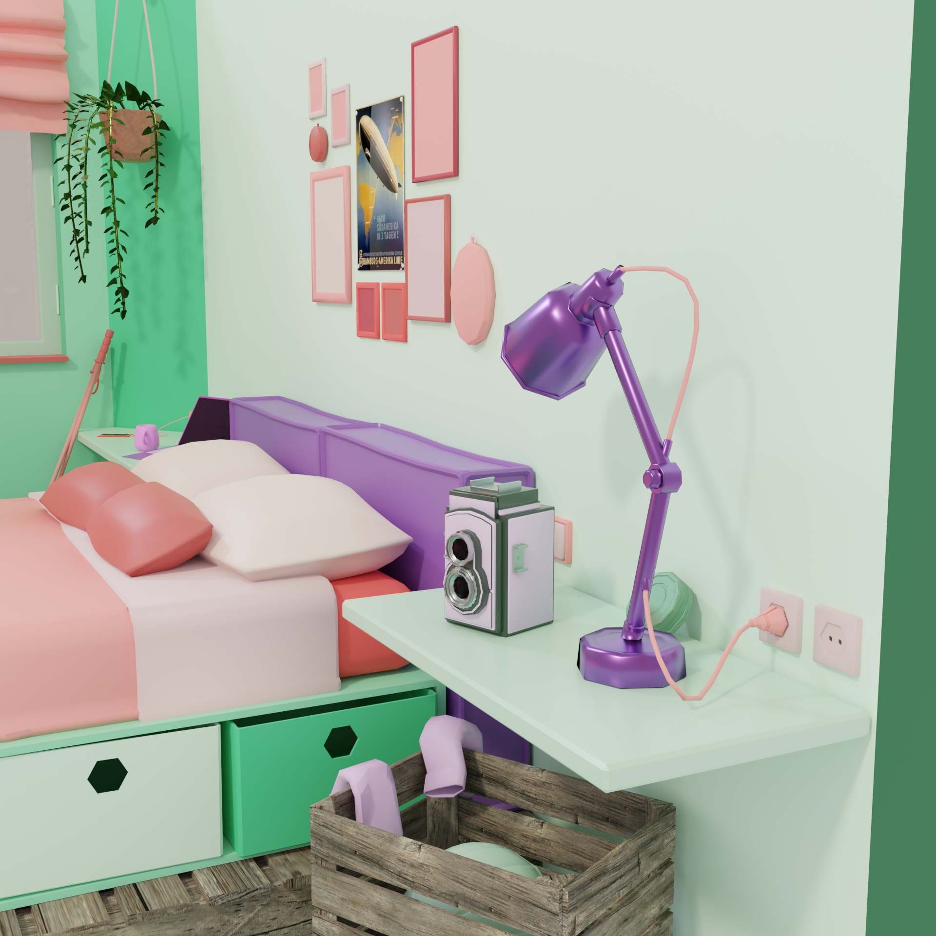
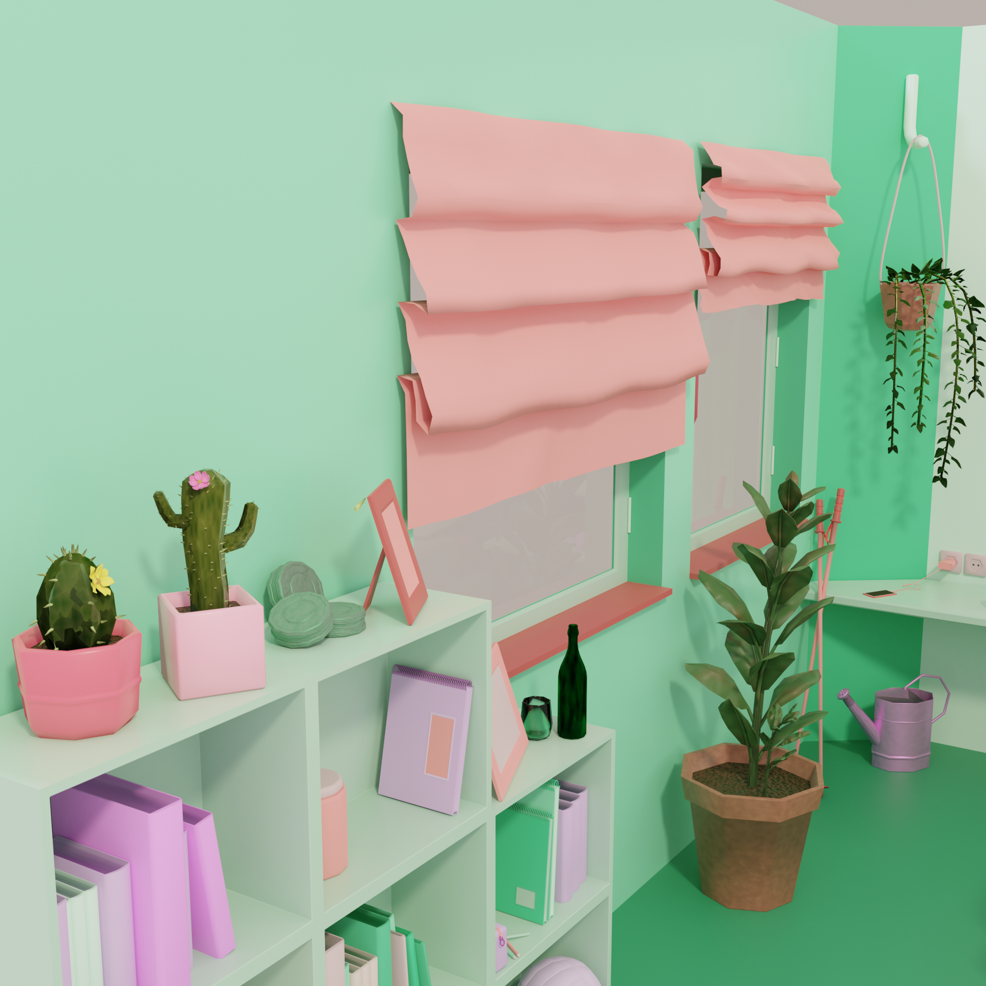
I love the color scheme and the variety of objects really makes for good eye candy.
Nice work!
Thank you ![]() blanchsb, I followed the Color course here on CgCookie and I ended up with this palette :) You were right about the bulges on the bed corner. They are intentional, but sadly my color scheme doesn't allow them to pop up
blanchsb, I followed the Color course here on CgCookie and I ended up with this palette :) You were right about the bulges on the bed corner. They are intentional, but sadly my color scheme doesn't allow them to pop up
Besides you were right I had several planes too near on Y axis. I just moved them as you advised and problem solved :D
Thank you all for your encouragement and tips!