A while ago I decided to start learning human anatomy and improve my sculpting, with the goal of being a character artist one day. So Im making this polybook to ocassionally post about by progress and hopefully get some feedback or advice or whatever you feel like writing here.
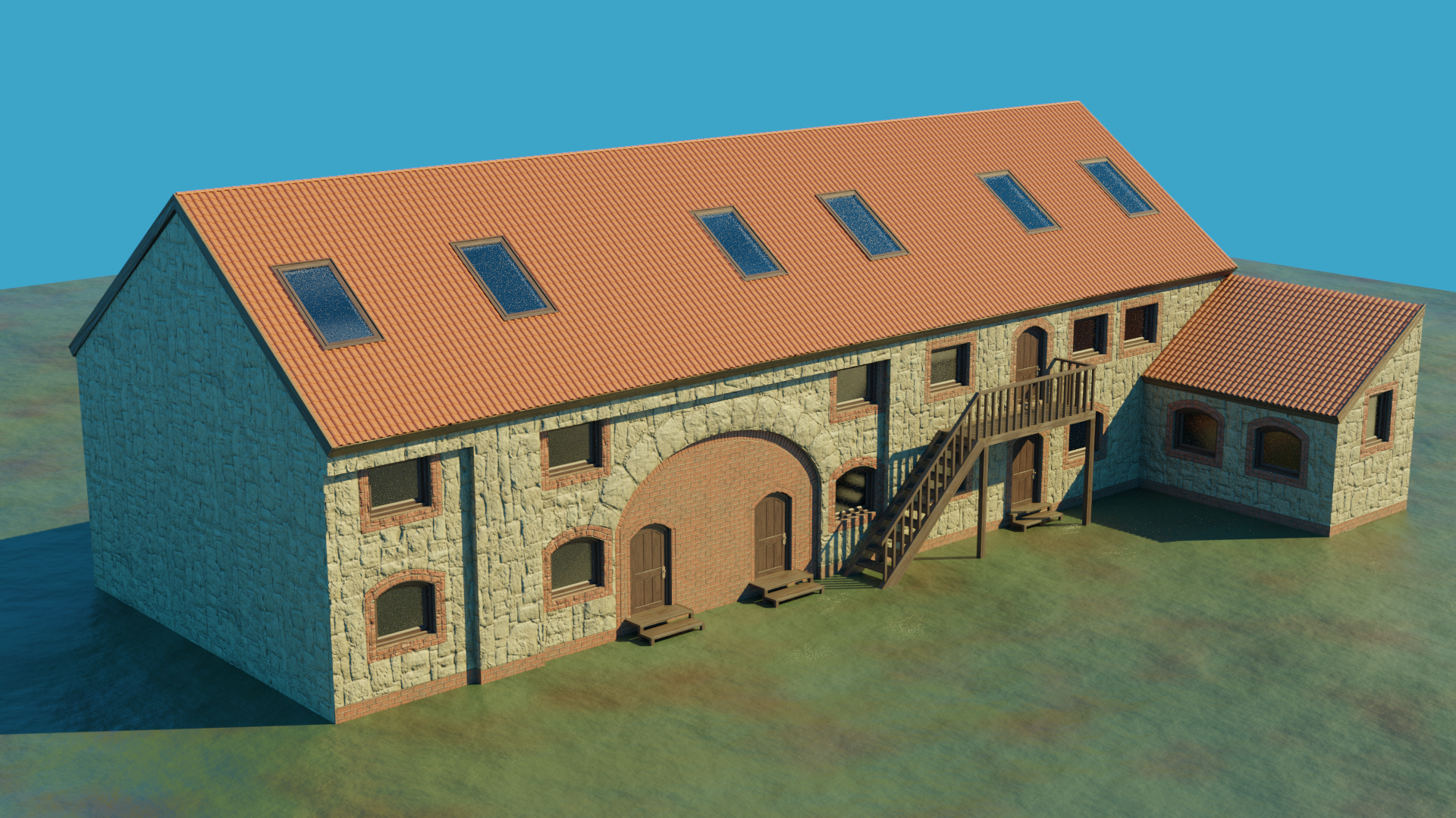
A model a made for a job, together with a friend we were creating a visualisation of an estate. This is currently an old ruin of a barn which the owner wants to renovate a build aparments in it. They want to keep the old brick structure, sice its hand made a looks a looks really nice. I modeled it blender and textured it in substance painter. I made the wall texture from photos I took in substance alchemist. My friend made the rest of the estate and the rendered it in a different software.
For some time I forgot to put anything here...anyway this is my latest work. I was making fish models during my internship and I wanted to make some nice renders to present them in my portfolio. Here's a humpback whale. 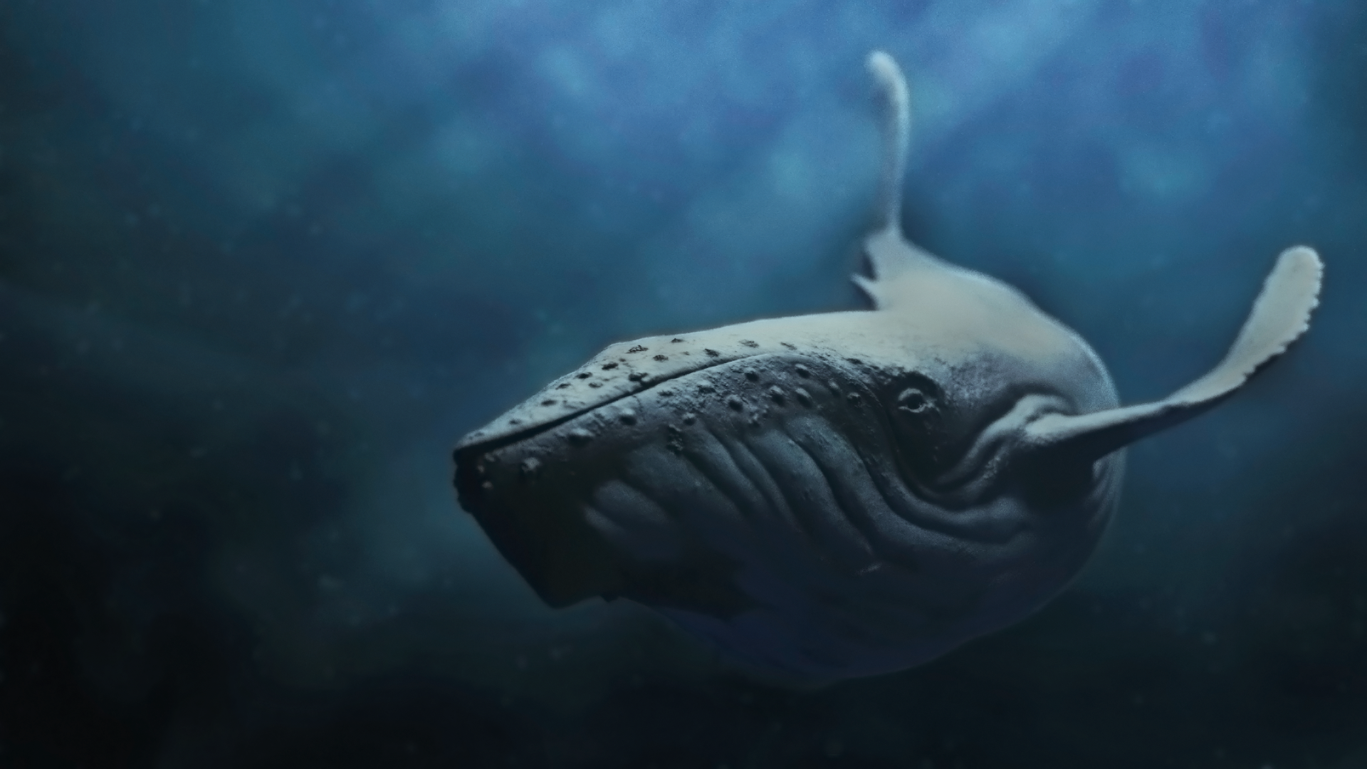
The whole thing is pretty much done in blender,the rays of light are done with volume and the background color are done with some simple nodes for environment and color variation in the volume. Then just some post in photoshop.
Any feedback is appreciated. Mostly about the compostion, colors, lighting, realism. Or anything else that comes to mind...I was going for a realistic looking whale in a slightly stylized sea. Or if not exactly stylized, just kind of vague and blurry to draw the attention to the whale.
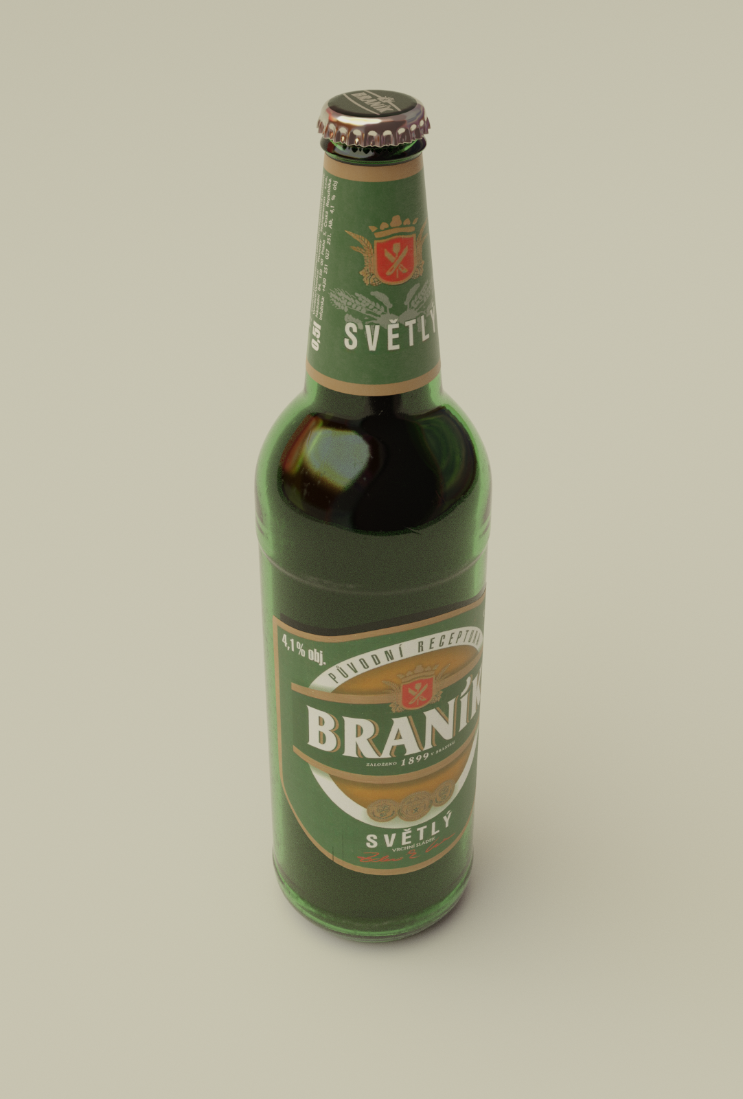
A small side project. I want to make a kind of still life render of this and a bunch more things :D . The glass needs some more work but ill do that in then end when i have the whole composition
Great, I especially love the crown cap!
Fluid in the bottle looks strange though, do you have the correct IOR? (A lot of people get this wrong.)
The IOR of water in glass is not 1.33, that is that is if the light goes from air to water. From glass to water it would be something like 1.33/1.5, which is about (4/3)/(3/2) = 8/9.
Otherwise the glass looks way too thick;)
Thanks a lot :) It was the wrong IOR. It didnt occur to me that I should calculate it like this :D Good point about the glass too, it was too thick.
Here's another in progress shot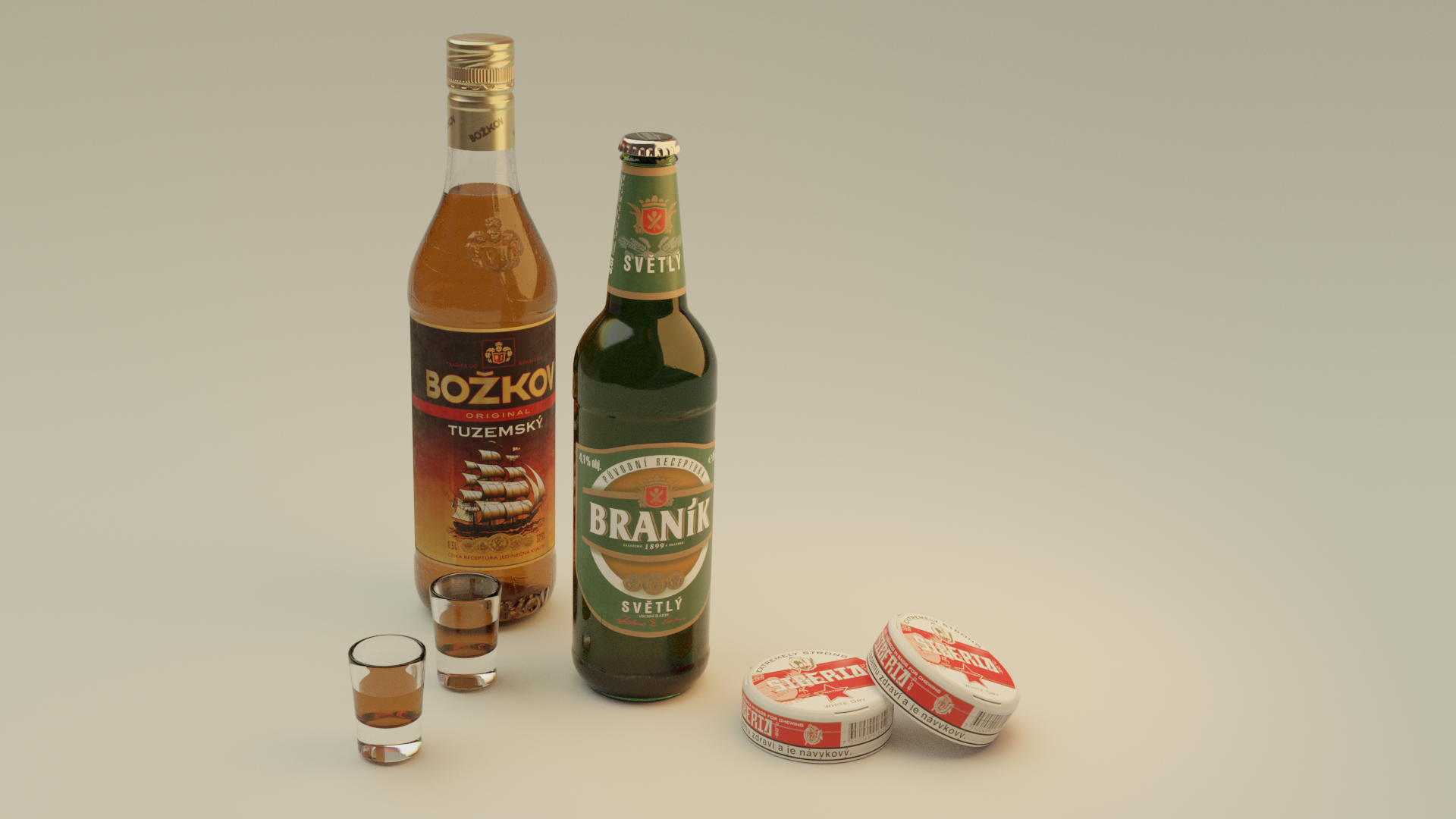
Wow!
The fluids look much better now;)
If you want to get rid of the 'ugly black edges' on the small glasses, (you can of course do that when you finish this) I can highly recommend watching this: https://www.youtube.com/watch?v=Sv2wqwsvx-8&list=PLa1F2ddGya_8Wzpajwu1EtiS8E1Exm82S&index=51&t=0s
Thanks again, I was wondering about those :) really cool and informative video...and the solution is so simple once you understand whats causing it. Just let the light out.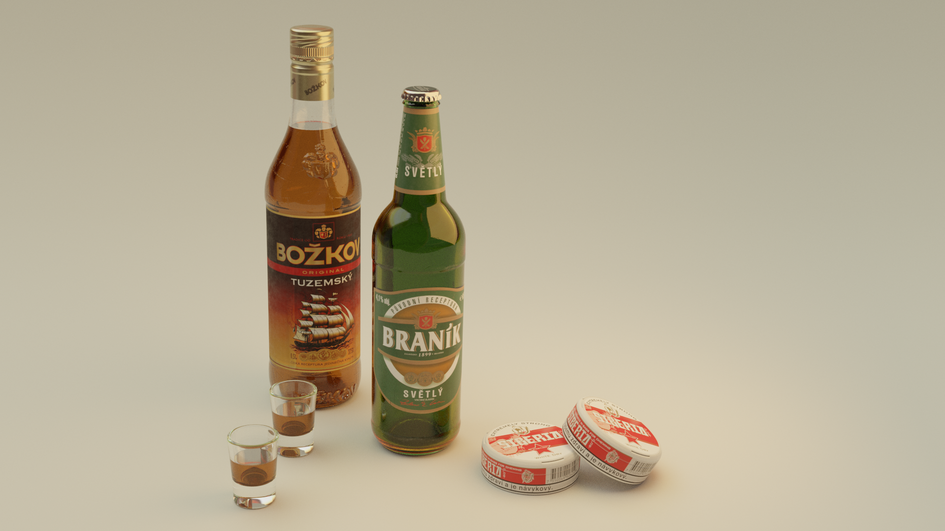
It also solved by problem with the beer, it was way too dark before. It might be too light now but that will be simple to tweak. Also I realized that the liquids had inverted normals since I duplicated them from the inside of the glass. So the surface of the rum didnt reflect anything. Rookie mistake :D
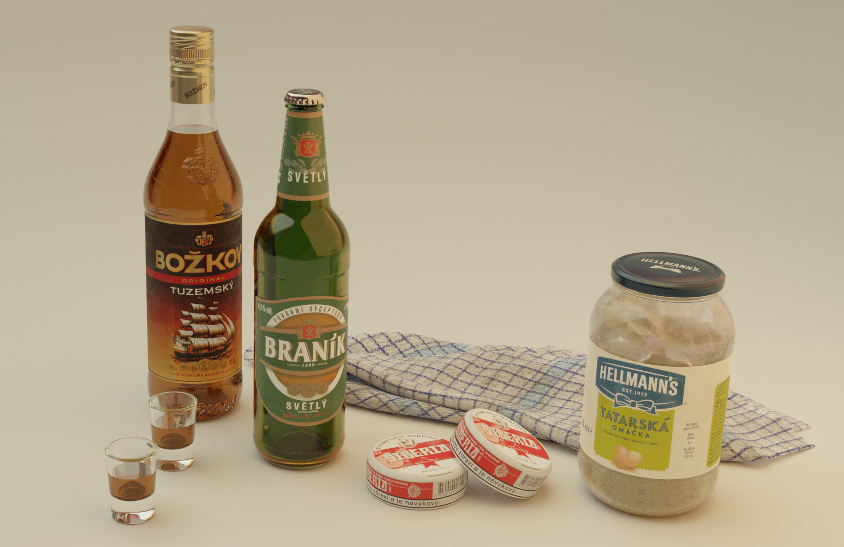
I think the assorment of crap for my still life composition is almost complete. Tommorow I will make some simple environment for it, light it up and see if I want to add anything else. I also have to figure out how to make the smudges inside the sauce jar more convincing...this is just some mask I painted on it and set it as a factor in a mix shader.
Its hard to find much information about setting up shaders for food though. When I try to look how to create a sauce in blender , strangely all I find are cooking videos....
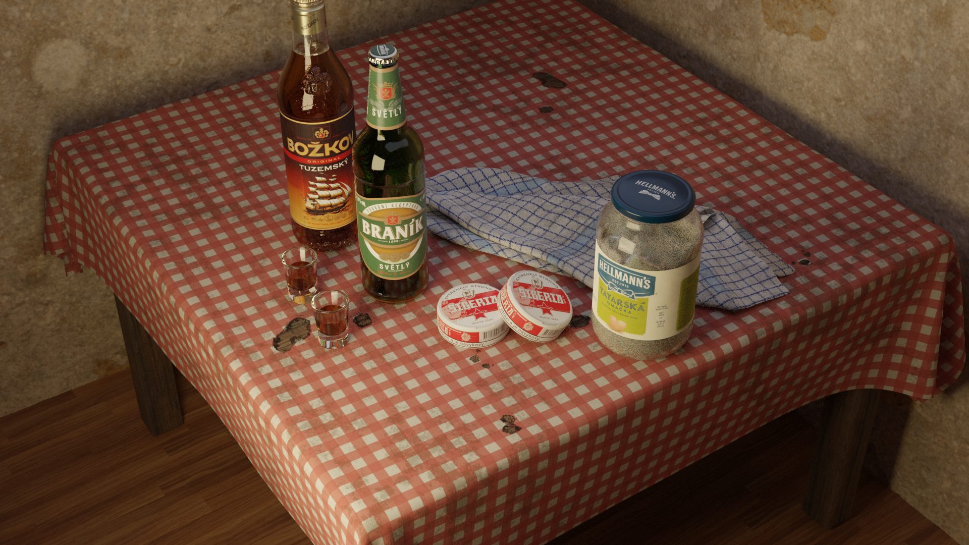
Made dirty old tablecloth with burnt holes. Its made with painted masks on a tiled texture. I probably didnt make it in the most efficient way. Basically I have 3 masks, one for dirt arount the hole, one for burnt bits, and one for the hole themselves, which I painted in substance painter. I now realize I should have done it with just one mask and make the dirt and burns by adjusting it with nodes.
The dirt is made with some grunge textures.
Looks fantastic, Tomas.
(Maybe add a skirting board between floor and walls and it will look photo-real.)
Thanks Spikey :) The floor will not be in the shot, this render is just to show the table cloth.
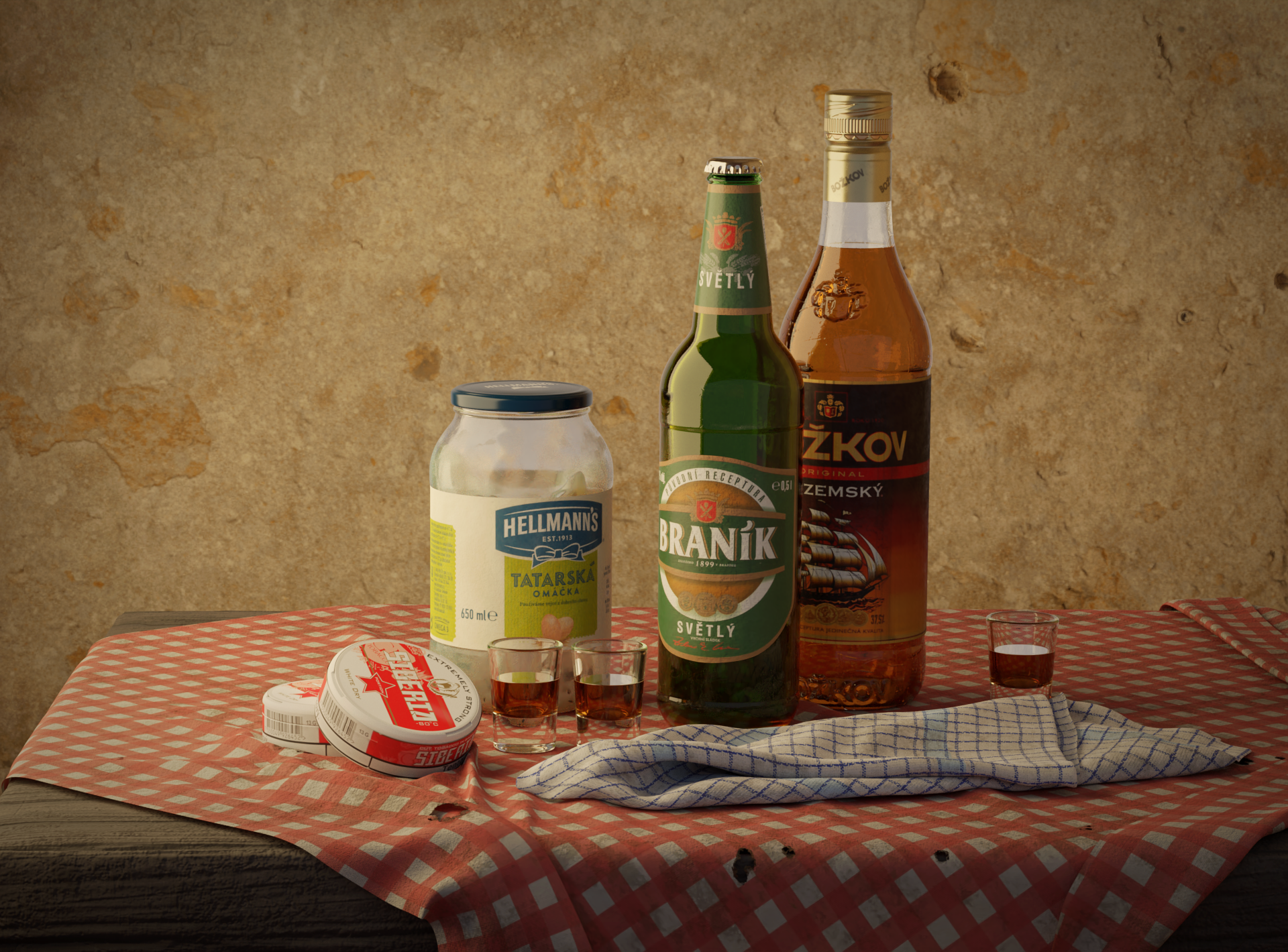
This is the progress so far.... I made some folds on the table cloth and came up with this composition layout. Im thinking I will also model some cigarretes so the burnt holes make more sense. Im also considering making a bunch more objects like some food or something to filll up the "canvas" and emulate those cluttered still life paintings...or maybe ill just keep it simple i havent decided yet.
I added a light in the back to create a soft rimlight, which I like how it turned out, except it also made the top of the rum bottle this milky white...So Ill have to solve that somehow. Or maybe Ill just get rid of the rimlight because it might look a bit artificial.
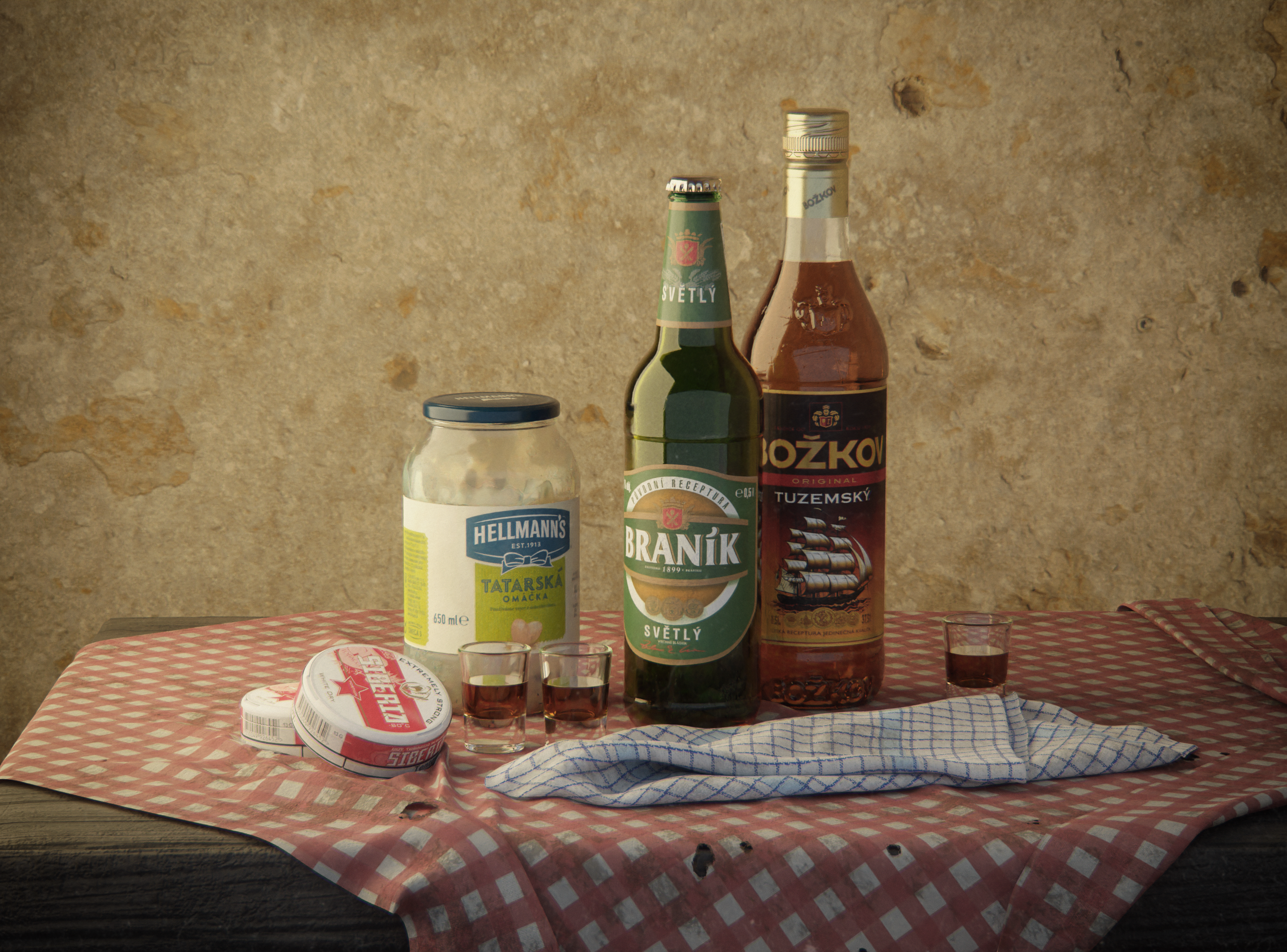
I have decided to leave it as it is :D I made some minor tweaks, but I like the simplicity...
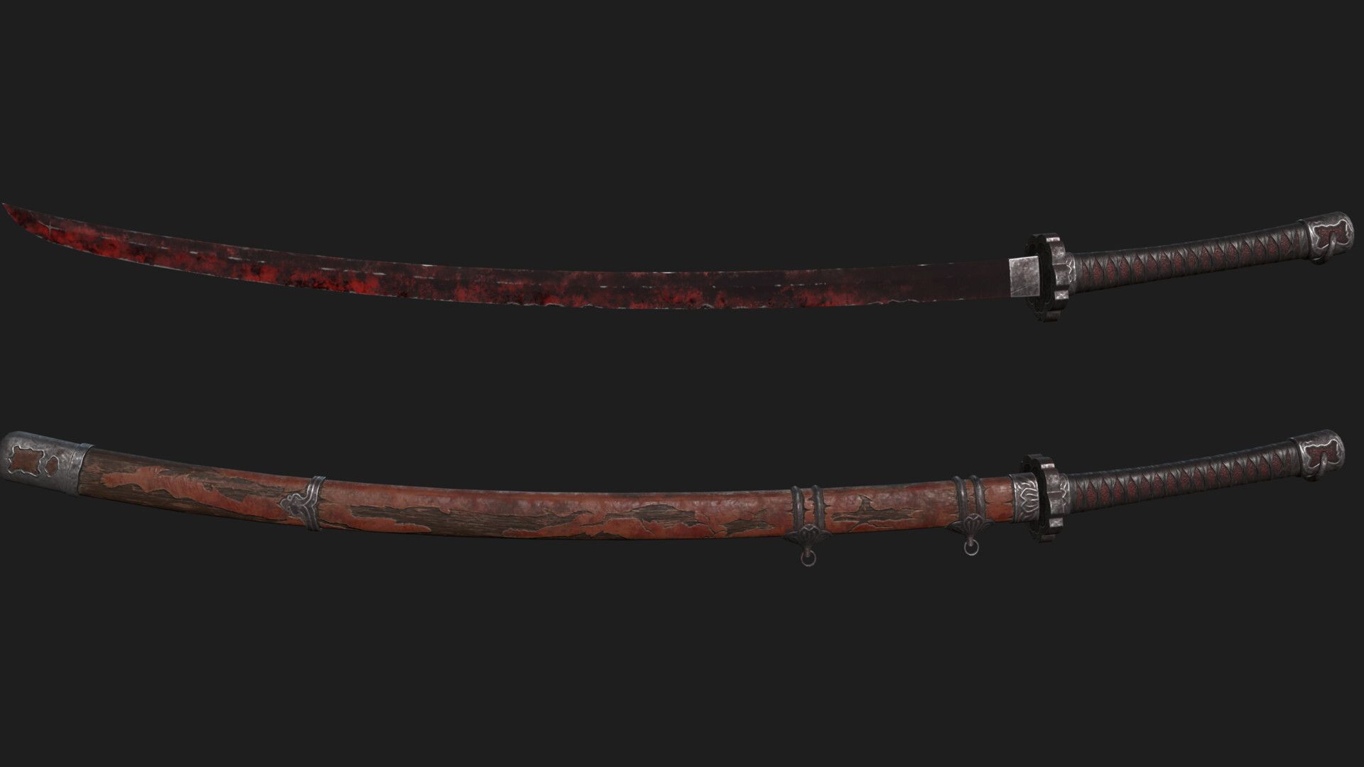
New project! Mortal Blade from Sekiro: Shadows Die Twice. I think its gonna be great practice of texturing and sculpting ornamental details. So far I made this blockout: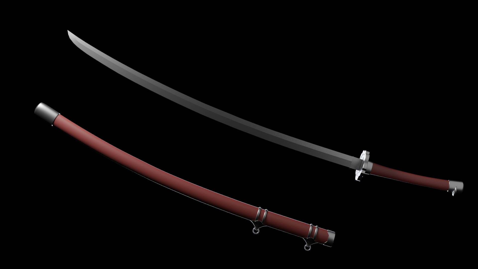
Next im gonna take it to zbrush to sculpt a high res version.
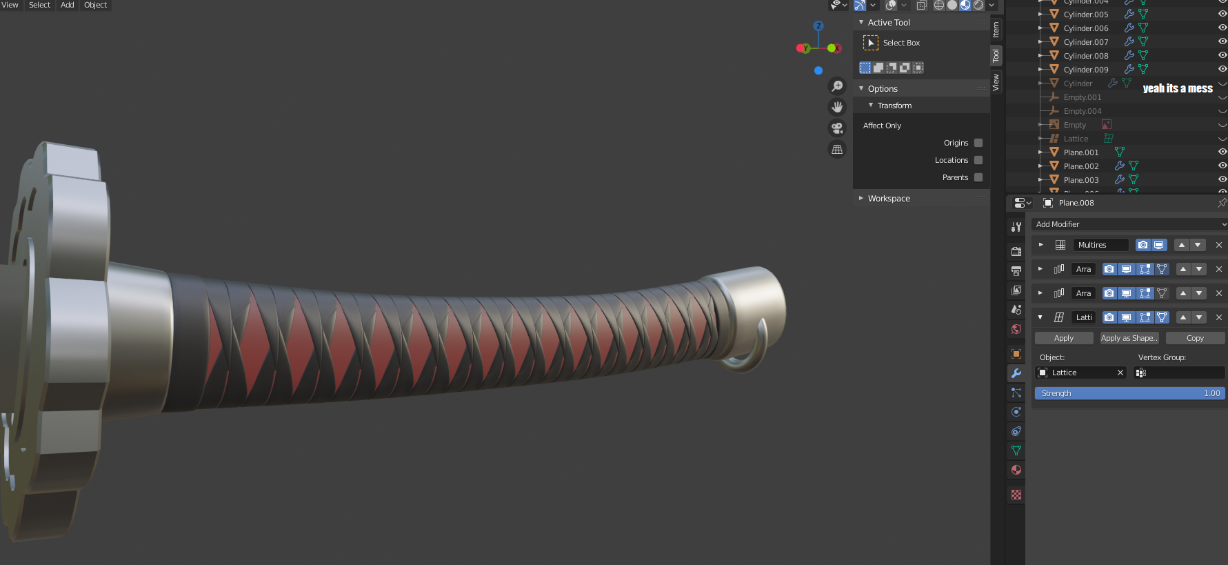
Today I made the handle wrap in a way that is pretty ... handy.
...
Basically I just modeled one segment on one side of the wrap made of two straps, and the tube of the handle is just a straight cylinder. It looks like this: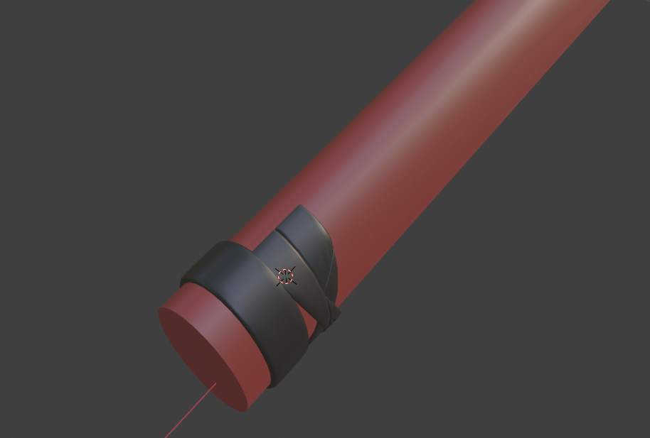
The wrap of the handle is "mirrored" to the other side with Array modifier with object offset. "Mirrored" in quotes because it is rotated 180 degrees around the center and offset by the width of one strap. That way the straps create two continuous loops around the whole length of the handle. So it is like the authentic katana wrapping technique...at least according to my research.
Another Array modifier repeats it along the whole handle.
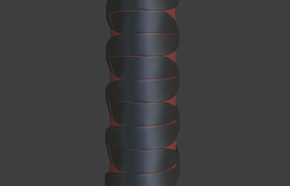
Next I put a Lattice modifer on both the wrap and the handle so that I create the tamper and slight bend non destructively.
What it all means that I can modify the shape of the wrap segments or the entire handle very easily. I can sculpt detail like folds on the wrap and and it will repeat itself all over the handle. I can also easily change the number of loops around the handle just by increasing the array count and then scaling it along Y axis so it fits the length.
When Im done, I can apply all of it and do another sculpting pass to create smaller detail and break the repetition.
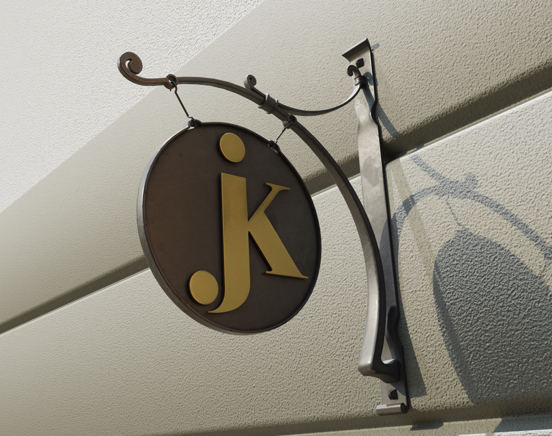
Today I made this this for my dad, whos a blacksmith, to propose this design to a client. Yeah the wall is ugly but there was not really a point in sinking more effort into it...
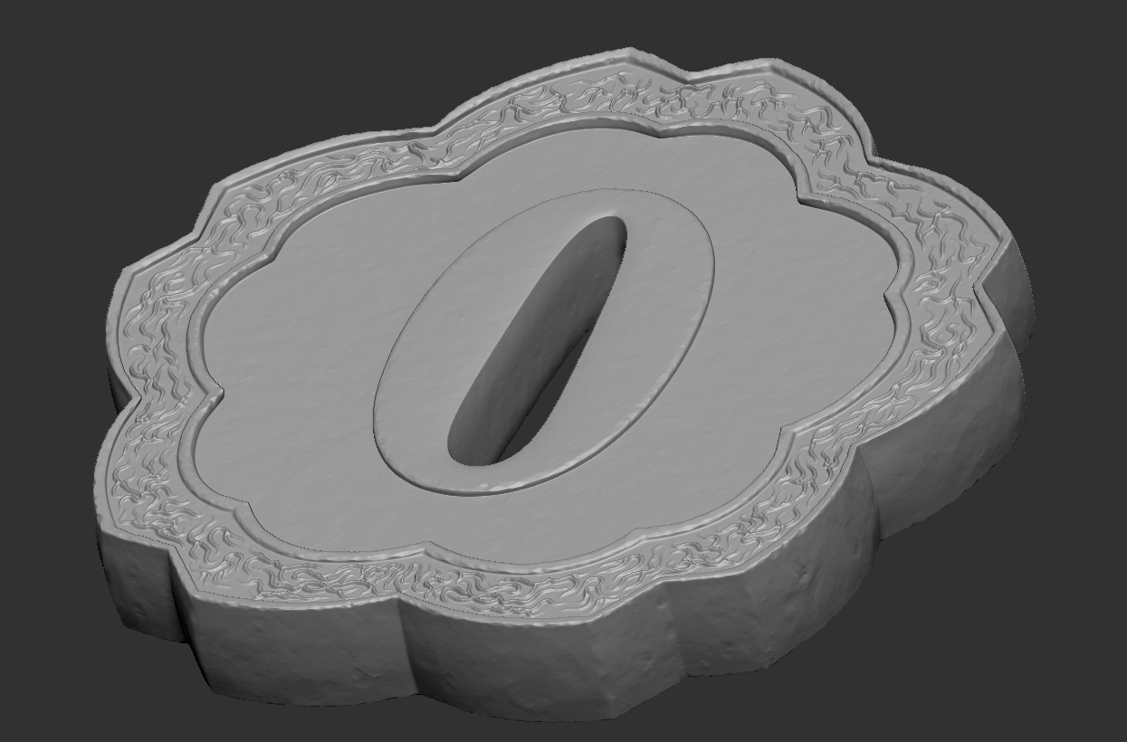
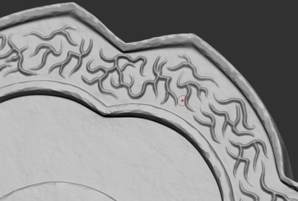
Finished detailing the guard. Doing these ornaments was a great practice for hand steadiness on the tablet :D
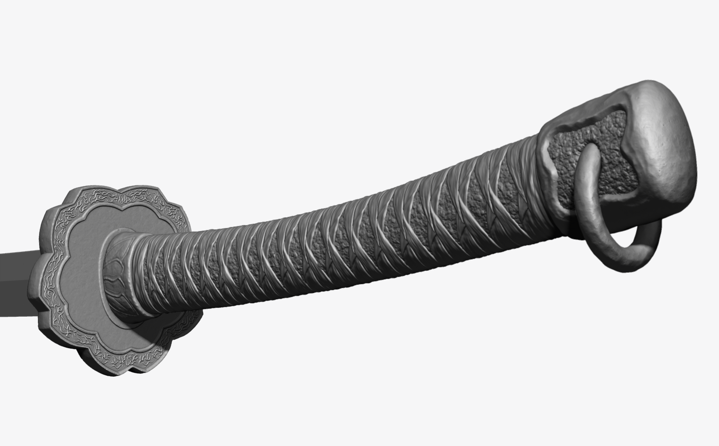 I think Im finished with sculpting the handle. Im not completely certain about the ornamentation around the guard, but Ill leave it for now and when Im done with the rest of sculpting, bake it and put some textures on it, Ill see if it looks ok...The sheath hopefully wont be so complicated :D
Really looking nice ![]() tomasplasil
tomasplasil
How did you get the 'battered metal' look and the end of the handle. Really great detail in my opinion. Did you make us of a brush texture ?
That's one of many areas that I am currently lacking, for now....(optimistic laugh).