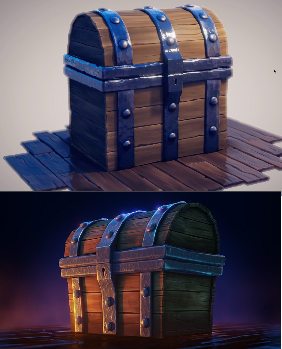
The final result of the render tutorial does not look like the teaser image for the course. I thought I will learn how to setup lighting and render a scene like that image. Pretty disapointing.

There is a free tutorial that deals with a coin explosion but also gives you a quick rundown on how to create something like the final render you refer to. I've linked it with the correct time stamp:
https://youtu.be/e3oDsomFjLM?t=327
While its not a complete tutorial you should be able to get the render to look like what you want with a little bit of effort and problem solving. :)
It does not look exactly like the teaser, but all the techniques are explained. The main difference I see is the background where I think some cloud texture and/or volumetric lighting has been added and a different camera angle was chosen. If you re-watch the lessons, these parts might be most interesting to change the look of your final render:
Compose image over background: https://cgcookie.com/lesson/rendering-presentation
Change the shape of the chest with a lattice modifier for appeal (first half of the video on the coin simulation): https://cgcookie.com/lesson/dropping-coins-with-rigid-body-physics
I understand how this seems misleading. The quick answer, as Jan-Willem points out, is that I recently taught about the trailer's light setup in another video.
But the longer answer is that I finished recording the entire course before creating the imagery for the trailer. Ideally they would have been perfectly aligned but also the lighting goals in the course were different from the trailer goals, where the course focuses on *model presentation* and the trailer focusing more on animation. With a finished course I started playing around with alternative lighting and stumbled into something more engaging for the animation I'd done.
Still, I apologize for the confusion but hope the new video solves it :)