Late to the party and trying to play catch up.
Homework Submission - Week 1
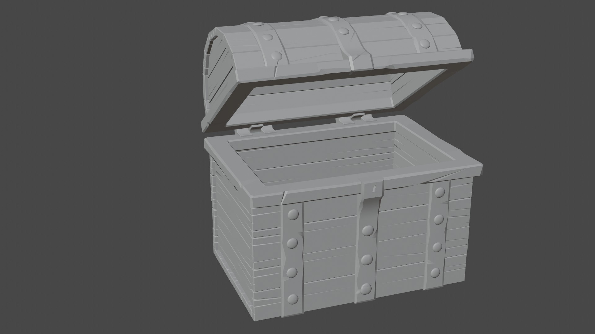
Started late and realized that I don't have enough time to finish this chest so I have decided to try something that doesn't have so many moving parts.
Homework Submission - Week 1 (Revised)

ppaulhaynes1955 nice solid modeling! If you get a chance to flip some of the planks on the front, that should help randomize the patterns. Now the fun continues with textures and materials.
![]() ullreym ... I flipped the boards and then moved a few vertices around on each one to break up the pattern. I think my big problem is by trying to keep the vertex count low I didn't put enough geometry in there to provide much variance. That and lack of imagination :)
ullreym ... I flipped the boards and then moved a few vertices around on each one to break up the pattern. I think my big problem is by trying to keep the vertex count low I didn't put enough geometry in there to provide much variance. That and lack of imagination :)
ppaulhaynes1955 Ha ha, sometimes I go out of my way not to make a pattern and I still wind up making one.
ppaulhaynes1955 Welcome to the class, Paul! Your off to a great start with the chest model. The metal looks good with the gashes and dents. I agree with Matthew that the wood splits in the boards is noticeably consistent. Breaking those up will help.
And my last suggestion is to globally tweak the proportions of the chest with a lattice modifier to stylize (de-straighten) everything. I demonstrate this in the last video of the course, which is admittedly out of order since I made the decision later in the recording process.
Homework Submission - Week 1 (Revised)
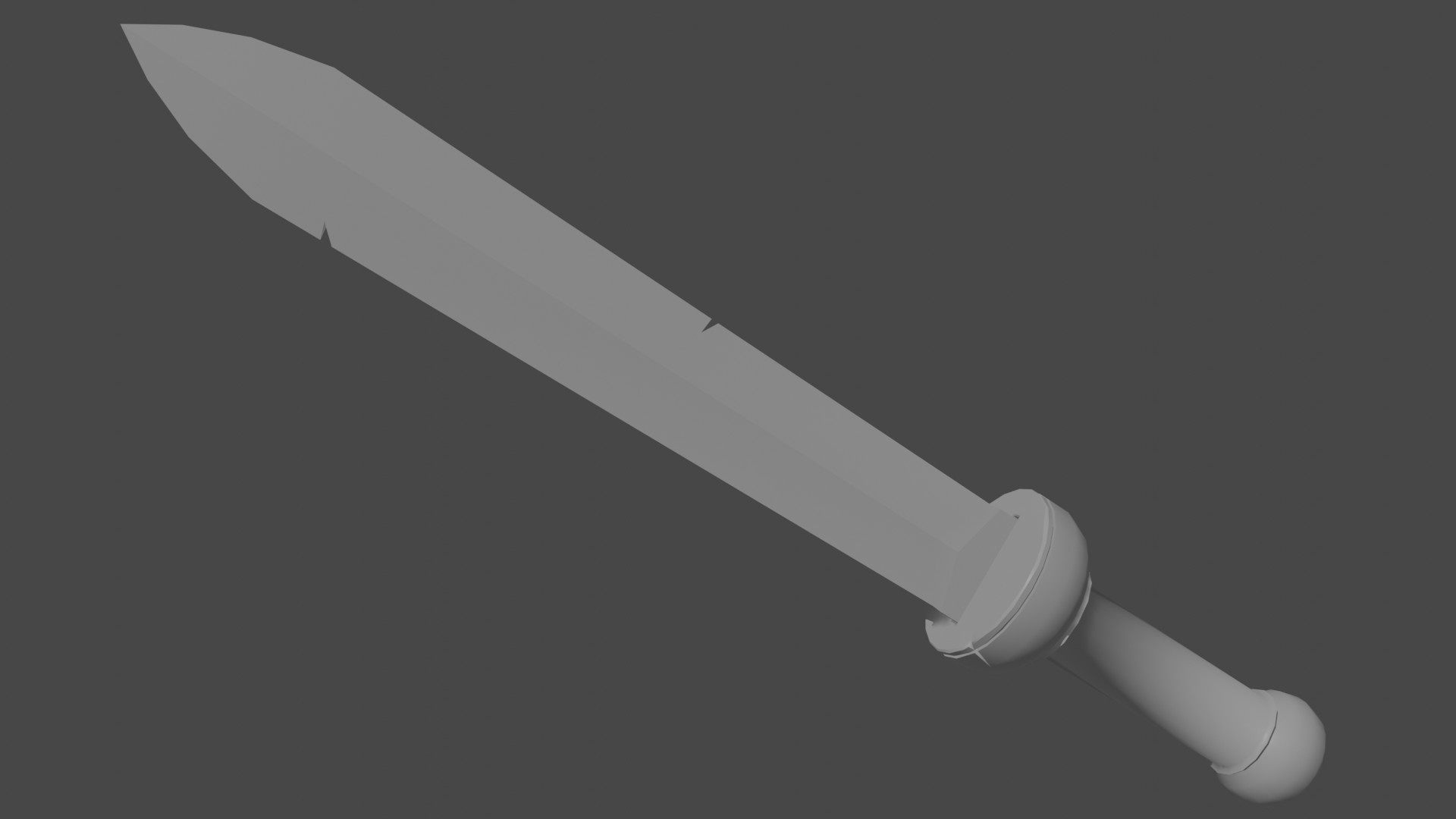
I'm switching gears on this. I just don't have the time to finish the treasure chest. Going to have to keep it a bit more simple (I hope).
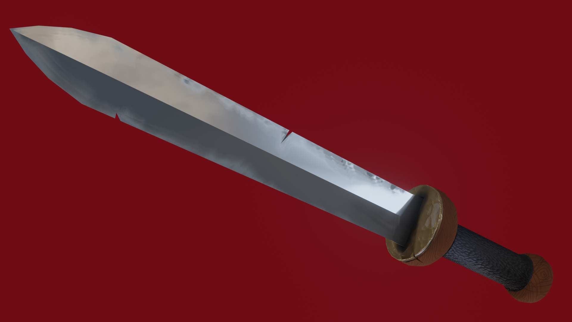
What a pain in the angles, but I managed to get something that looks blue in most places :)
Homework Submission - Week 3
The sword of Gluteus Maximus - a foot soldier in the rear guard of the Roman Legions. When on patrol, Gluteus was always the soldier to bring up the rear. He also brought up the rear in conversations. Seriously, he was obsessed with rears.

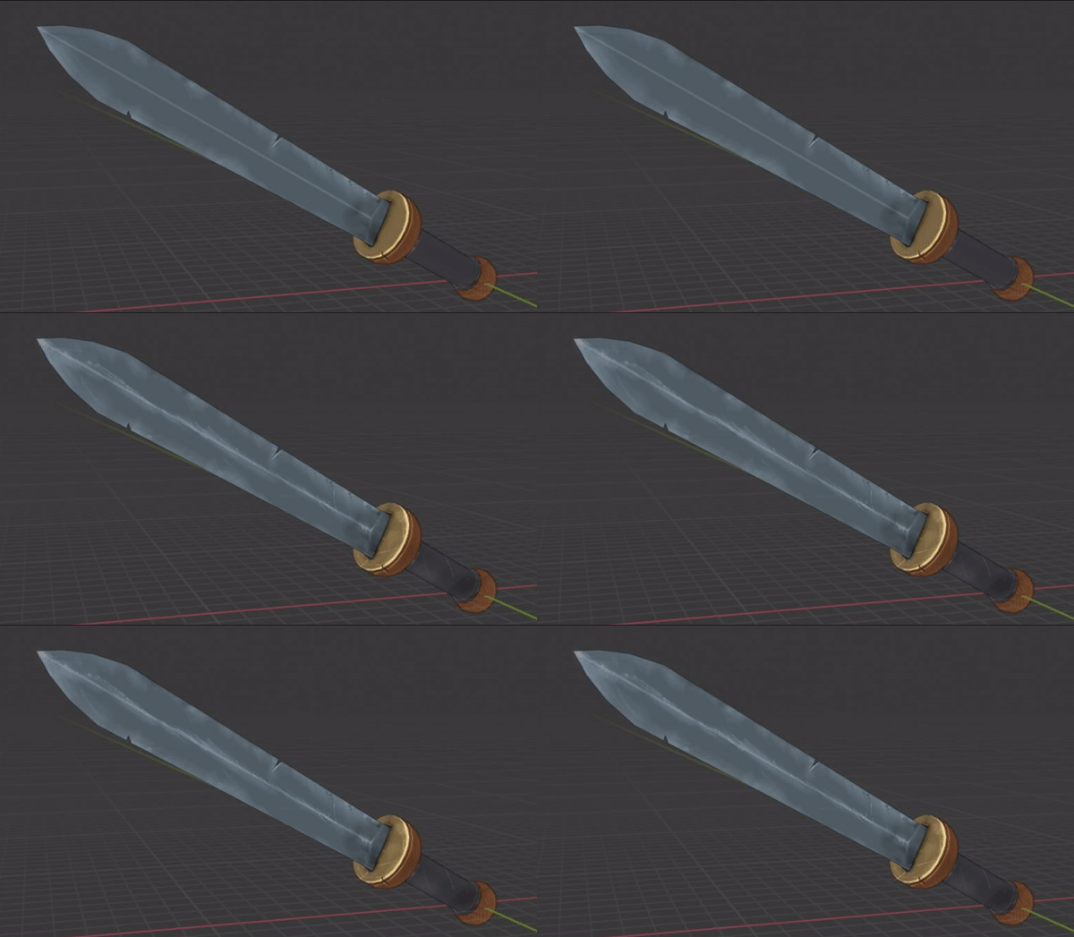
The sword of Gluteus Maximus...
ppaulhaynes1955 That backstory though 🤣 Since this thread is behind the others, I imagine most people have missed out on this laughter.
Week 2: Your texture looks good overall. I love the wood grain in the pommel and lower hemisphere of the cross guard. I give it a solid B+. I only have a few notes to offer:

Week 3: This is like week 2 for me: Good with room for improvement. Also a B+.
Thanks for participating, Paul, and congrats finishing out all 3 homework assignments! 👏