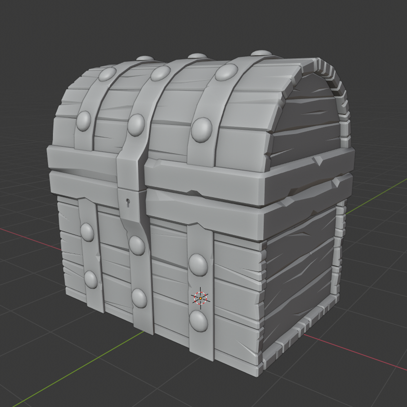
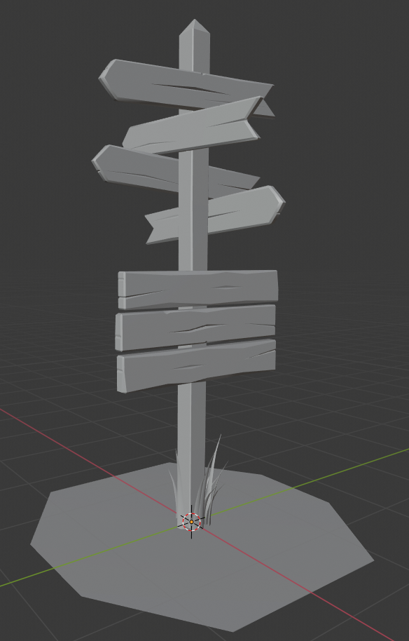
I've been working on the treasure chest exercise before the class started, so I decided to submit both it and the wooden sign in order to keep working. I've had my 3d modeling experience with 3DSMax and Maya in both classes and job experience and I moved to Blender off and on way back during the housing crisis.
Homework Submission Week One
 The chest was done exactly per the tutorial. I know it's not original, but I'm trying to focus on technique.

bbilladams Good work! The sign definitely benefited from those techniques you learned. You can add multiple cracks in groups in places, as well, to help break up the small repetition in your sign. Other than that, good effort!
Welcome to the class bbilladams! Excellent job on the treasure chest. It's very authentic to the tutorial. I'm glad to see you're working on the sign for the class.
Most of the key principles in the treasure chest course are present in your model: Appealing details, bevels, wooden splits - all the things that make up this fun lo-poly style.
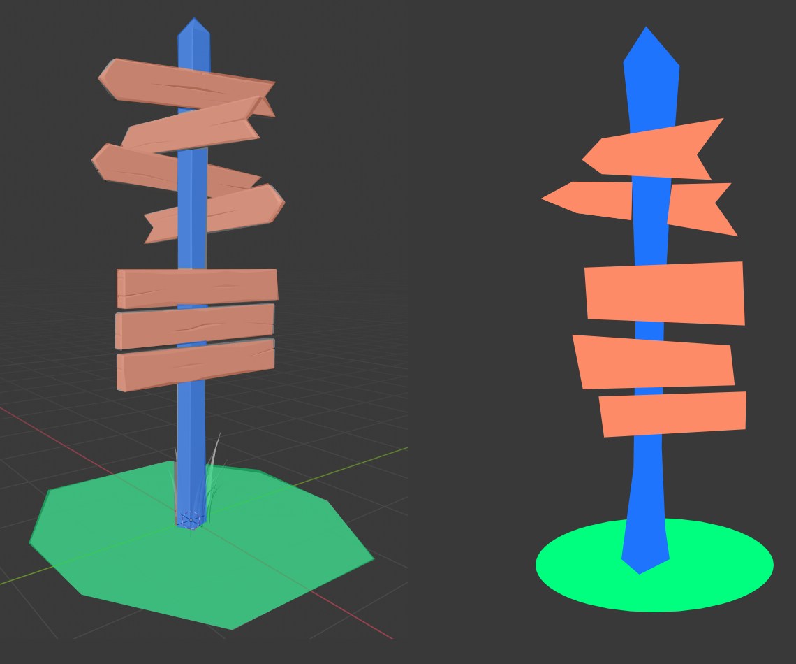
However one principle isn't quit as present. In the last video I opted to add a lattice modifier to eliminate the over-abundance of straight edges in the treasure chest. In the same way I recommend "un straightening" the post and sign planks for more exaggerated proportions. It should really hammer home the fun-loving lo-poly style. Hopefully this image is helpful:

I'd also go ahead and add a subsurf modifier to the ground circle (level 1 or 2) and apply it.
Overall it's a solid B+ from me. I really like the style of this sign! I'm looking forward to texture and shading for it 👍