After working on a project for 3 months straight* I was burned out but have been looking for a small(ish) project to ease myself back into blender. Watched Kent's fantastic treasure chest tutorial and noticed this course just starting. So I'm hopping in a little late but fortunately already viewed the videos so I don't feel too far behind. I'm modeling the aforementioned chest of treasure.
I've switched my username to my real name (pronounced "flew-it"). Some of you may know me by cthulusan.
*The project was a four minute animated music video which I decided to do in the 2.8 betas. Lots to love in 2.8 but boy did I have to work through some pain with those pre-release builds. Hoping to go back and do some revisions once I've had enough of a break from it.
Homework Assignment Week 1
Yeargh, me hearties! Tis a treasure to behold or beholding me treasure once I model all that bootie.
Made minor adjustments to exaggerate the wood cracks, splits and nicks to read better. In total this model took hours but definitely had a better handle on the low poly tedium the more I did it. Excellent tutorial @theluthier. Definitely hit it out of the park on this one. Paced well and what appeared to be mistakes (intentional or not) all ended in teaching moments. Brilliant.
Rendered the chest using the "Workbench" renderer in blender. Handy tool. I assume this replaced the opengl renderer? Anyone know if there is a way to hotkey rendering with different renderers? Like Shift-F12 to render workbench or something like that.
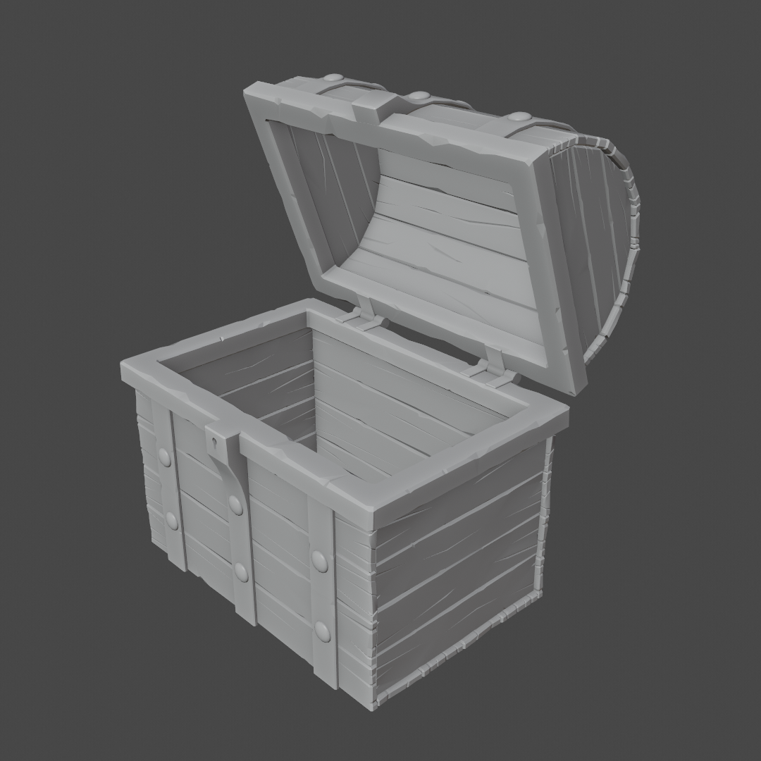
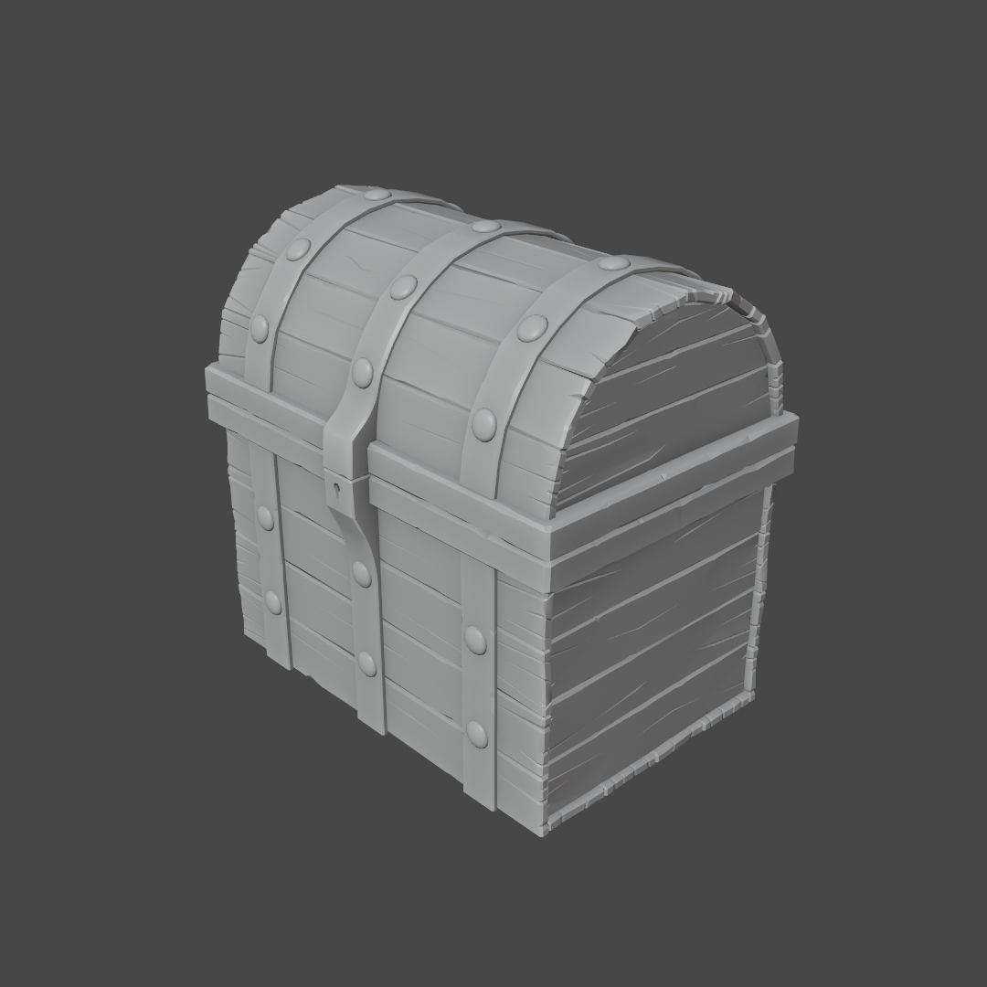
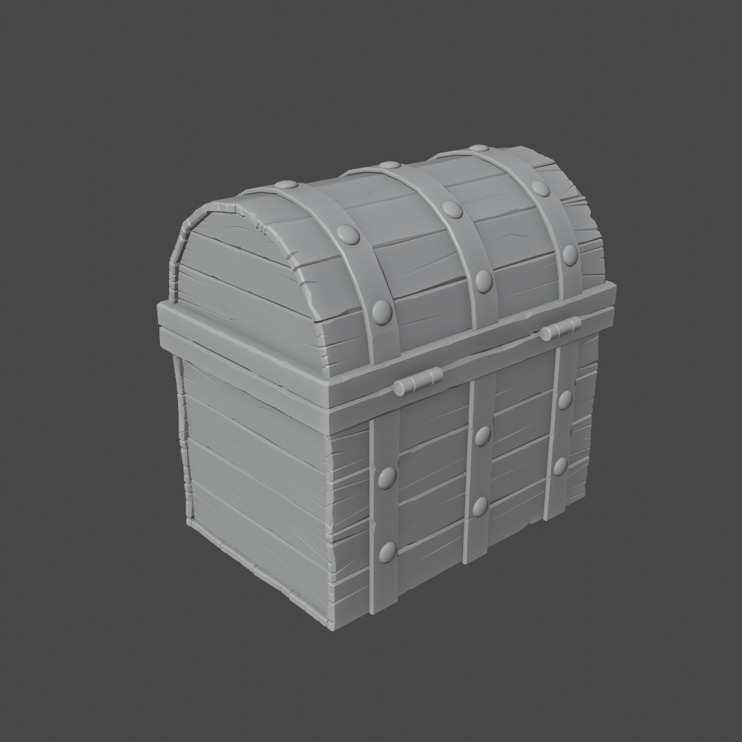
Always a pleasure to see you in class ccthulusan!
Excellent tutorial theluthier. Definitely hit it out of the park on this one. Paced well and what appeared to be mistakes (intentional or not) all ended in teaching moments. Brilliant.
I really appreciate that feedback 😊 Likewise, your result is a homerun. I see nothing to critique. Just looking forward to seeing it textured and shaded. It's a solid A in my book.
The project was a four minute animated music video which I decided to do in the 2.8 betas. Lots to love in 2.8 but boy did I have to work through some pain with those pre-release builds
Wayne Dixon and I have been working on a production with the 2.8 betas as well. We *feel* your pain deeply lol. As a rigger and first time Eevee renderer, Wayne is still feeling it I'd say. It's grown steadily more stable for the stuff I do (modeling, texturing, shading, rendering).
Week 2 WIP - Almost there. Inspired by all y'all making awesome unique models I decided to change mine a bit. I updated the locking mechanism and changed the look a bit. All unwrapped and mostly painted. Ran into some weirdness with unpaintable areas. Not sure if it is overlapping UVs or not. Haven't looked yet. Hopefully, I'll have time to finish this on Sunday. 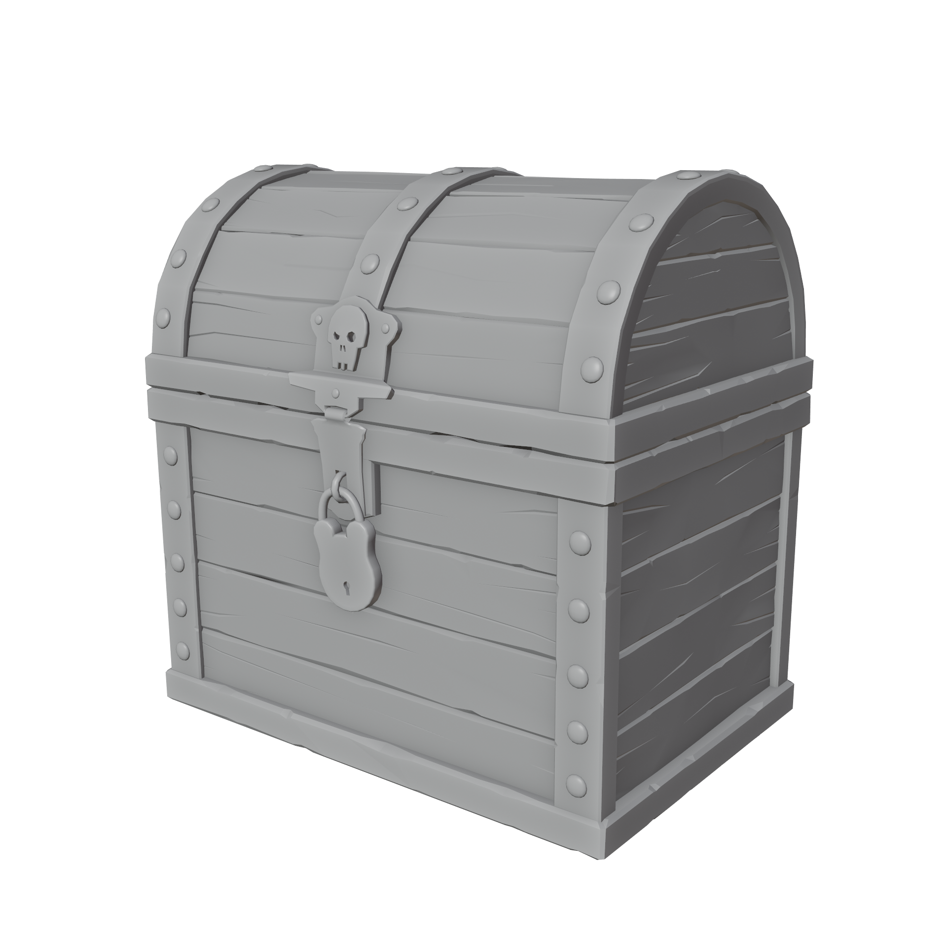
ccthulusan A little left to paint on the band and the hinges in the back. Haven't opened the lid yet so who knows what surprises remain to be painted in there.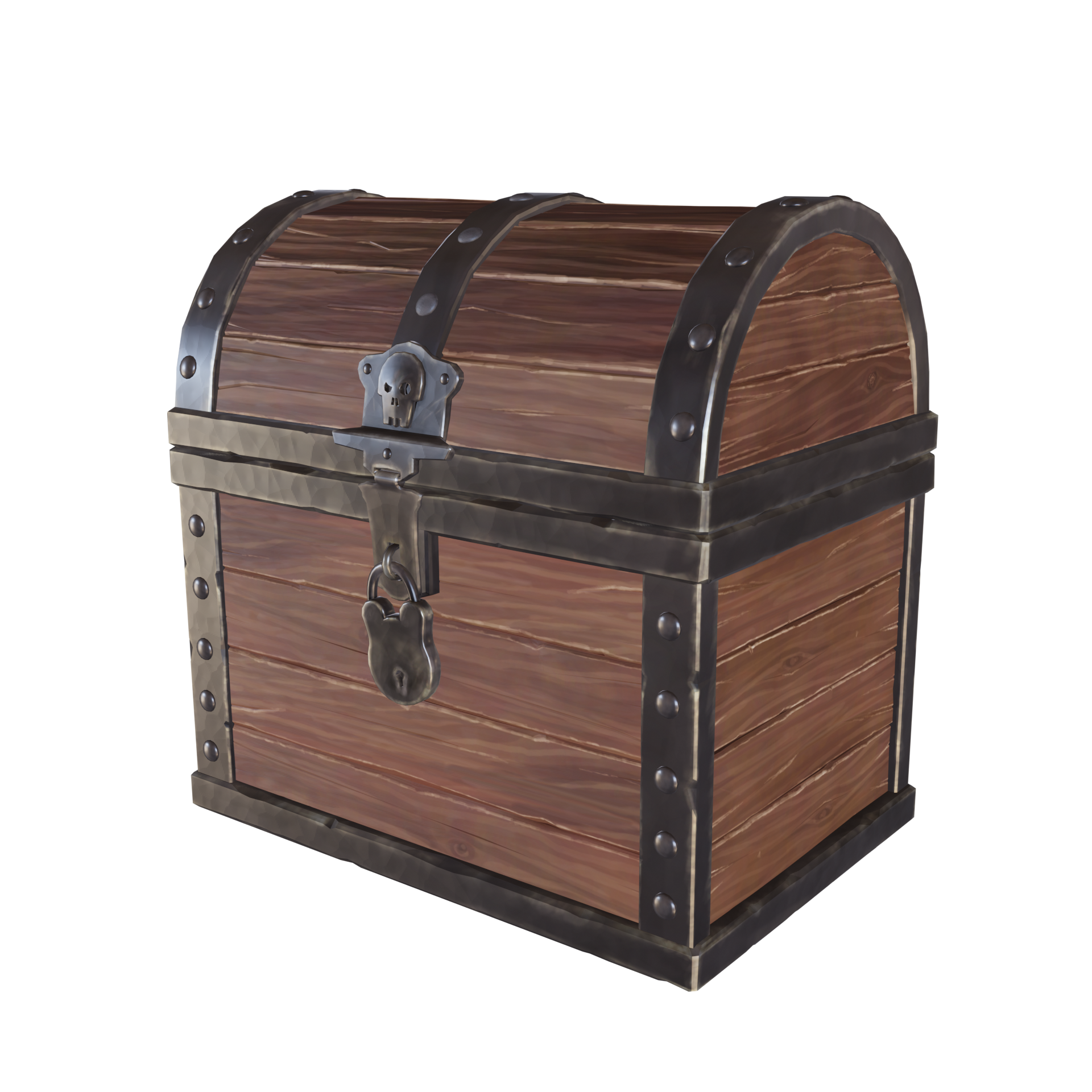
ccthulusan Painting looks really good, especially the wood, that looks amazing!
Maybe the padlock is a bit 'thin'? Imagine the key that would have to go in there...
Homework Assignment Week 2
Not sure what to upload so here's everything. Remodeled the locking device and metal trim to customize the look and give me some additional modeling practice. I realized I'm not that great riffing on modeling. I need reference and a whole lot more practice. I often find myself lost in mesh madness. Especially when building off a flat 2D reference. How do I fill in the mesh to be "good"?
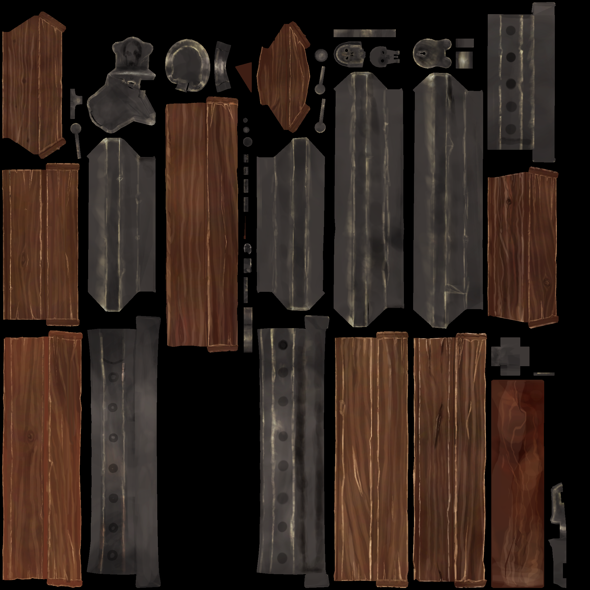
Painting was enjoyable if not tedious. I probably painted way too much detail but was enjoying it so why not. Took a while to get a feel for the paintbrush and different falloff types. Pretty far along I discovered I hadn't applied some mirror modifiers and wasn't sure if I did whether I would have to rebuild the entire atlas or if the UV map already took that into account. I can see one object has both sides in the atlas but only one side was painted. I also forgot to unwrap the bottom board so it looks funky. Not sure I can fix that but it doesn't show in the renders so...work smart not hard?
Final rendered result with some basic materials for wood and metal
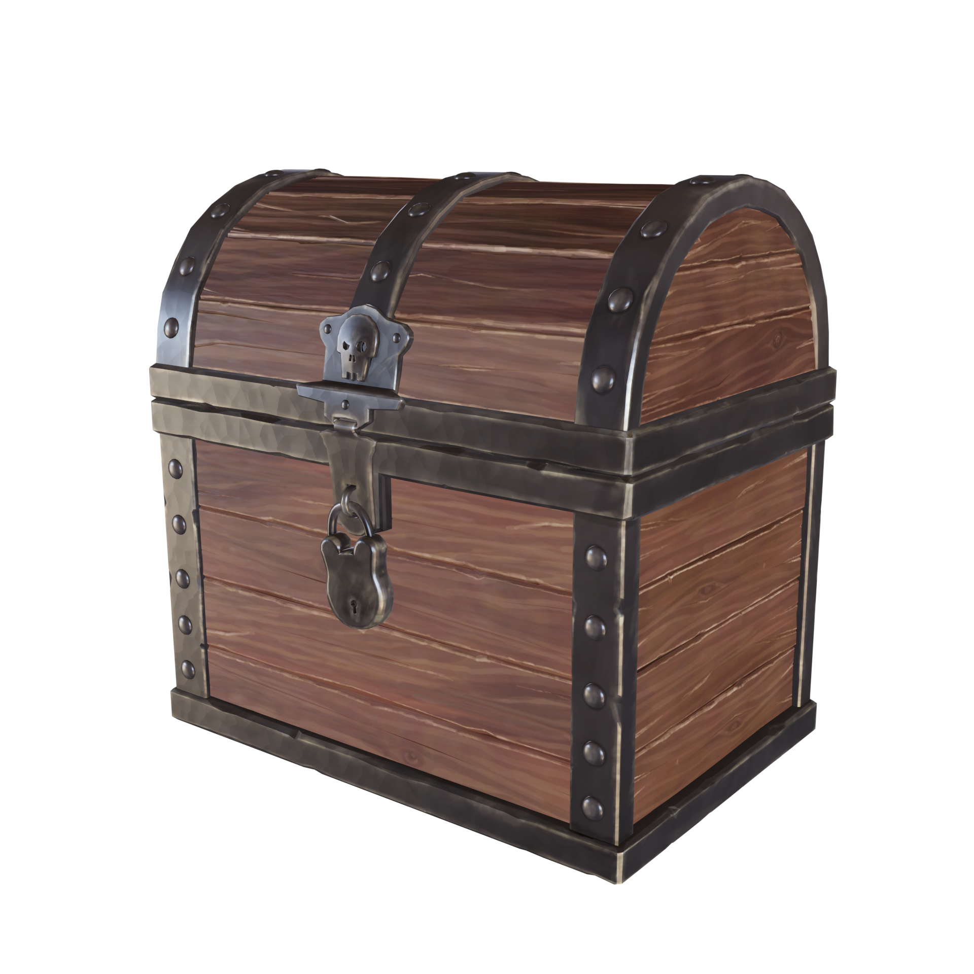
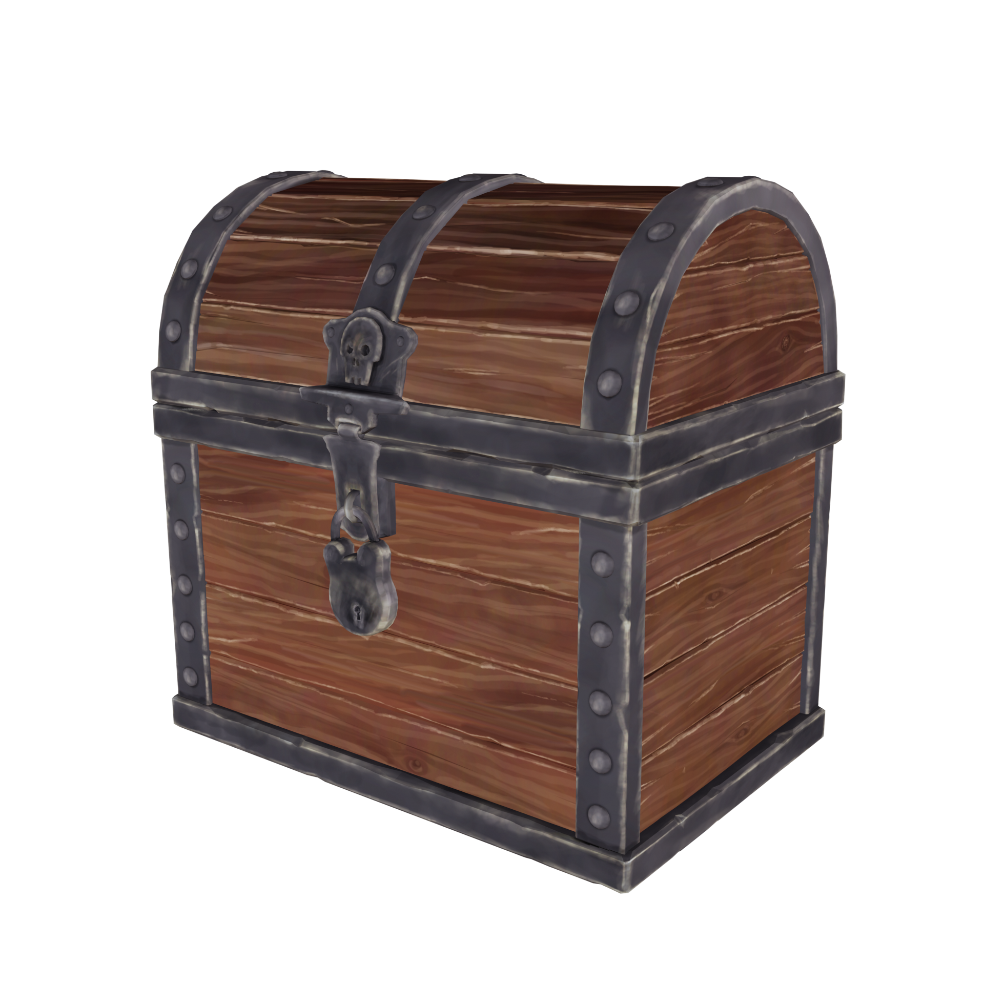
Diffuse only
UV Maps
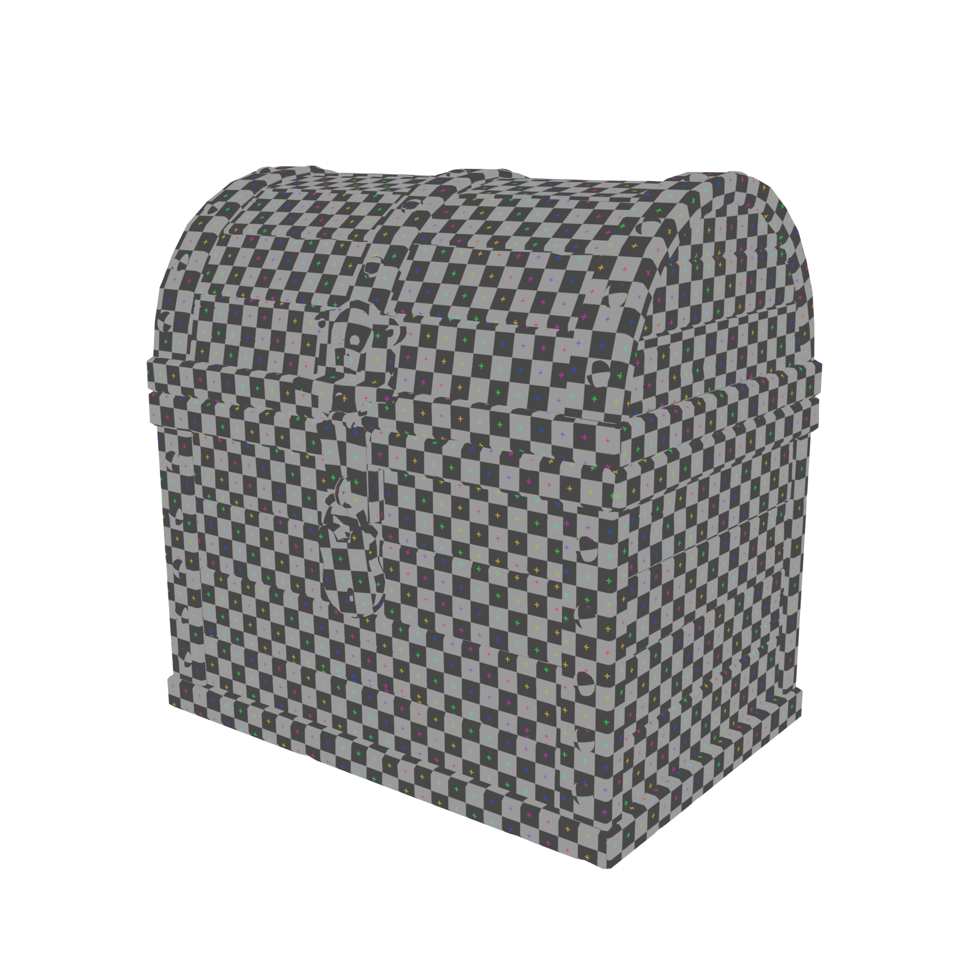
Texture atlas
ccthulusan Great work this week, John. Your texture turned out wonderfully.
probably painted way too much detail but was enjoying it so why not
It's definitely on the more detailed side but that's a good thing. We CG artists are major suckers for detail. Sometimes detail can be contrary to a particular style but I don't think this project is one of them. Looks awesome. It's an A this week from me.
My only note is that the highlights on the wood get a little too close to white in my opinion. Which works great for the metal parts, since it's an underlying grey color. But for the wood I'd recommend keeping it a lighter tone of brown rather than white. I say this more as a note for the future. I wouldn't say it's worth changing at this point because the texture workflow I've demonstrated for the class is destructive and not layer based. If it was a "highlight layer" you could simply change the blend mode + opacity of the layer. Besides you could possibly fix it with some shader trickery.
I applaud you adding more polish to your model! I've added a + to your week 1 grade (aka 5 points). I think you made good choices with those additional details.
I realized I'm not that great riffing on modeling.
I'm a member of that club too. Riffing without reference is tough. "Riffing" is a perfect term for it too. I'm going to use that from now on.
@theluthier Thanks for the critique (and bonus points). The white highlights were my ill-advised attempt to show worn wood edges. If you scrape some wood it often reveals clean, white wood underneath. Didn't work IMHO but I was committed.
ccthulusan Oooh interesting! I do a fair amount of carpentry as a hobby and I definitely know what you mean. However I only see this happen with new-wood projects, like if I paint or stain new wood. Then when wear and tear knocks the paint/stain off the edges it reveals the light color new wood underneath.
I suppose this could be a new treasure chest that's been stained/painted and the newer wood is being revealed, but that's not the typical narrative of an aged / water-logged / buried treasure chest.
I'm starting to ramble. Anyway, the narrative is your choice! It's not ill-advised though. I see your brain gears working and that's what matters most :)
Lighting work in progress. HDRi + area lamp to backlight it with blue. I did adjust the material to darken the bright highlights on the wood. Two things bugging me and not sure if they are related. The jagged normals in eevee are really noticeable if I make them stronger than they are right now. I realized my texture is 8-bit so it has banding issues if you get real close to it. Could this have anything to do with the jaggies? The normals are using a procedural noise pushed through a bump node.
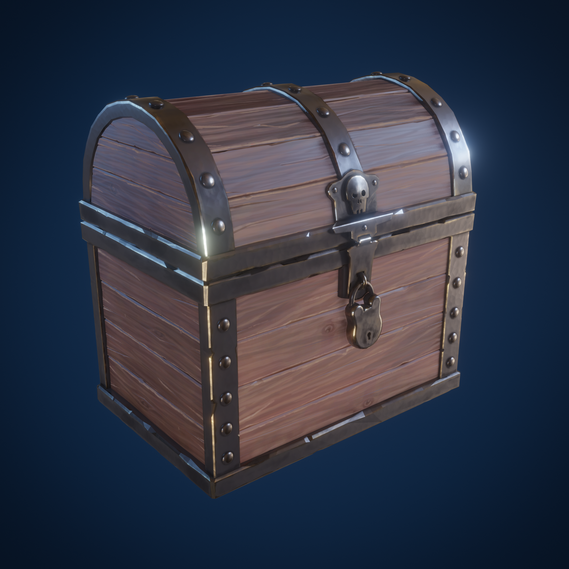
ccthulusan you can deal with the jagged like Kent is doin on the chest course. render a double the size of picture you want. then scale it down to the desired resolution.
Homework Submission - Week 3
Some minor tweaks to the materials. Went back and painted in dirt in the cracks so they stand out. Knocked down the white edges of the wood with an overlay layer. Could probably tune this for days but my wife is glaring at me so I should probably go get something else done. Thanks for a great class @theluthier. I learned a lot about texture painting which was new to me and tons of other tips.
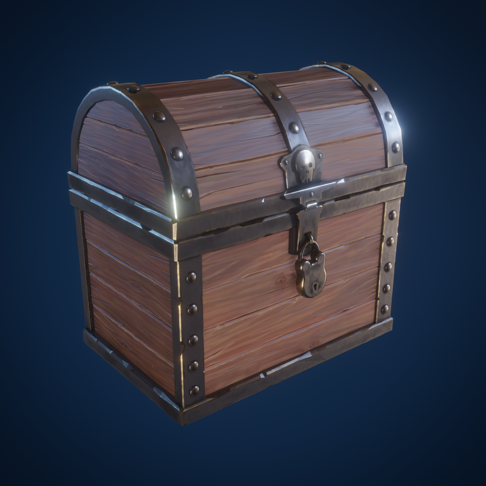
Could probably tune this for days but my wife is glaring at me so I should probably go get something else done.
ccthulusan Haha what a quote! I relate so much 😂
You've done a great job finishing your chest. It's got a consistent style and level of detail. The bloom effect is fitting and overall a lovely final render. I especially like the way the edge wear shows in the reflections:
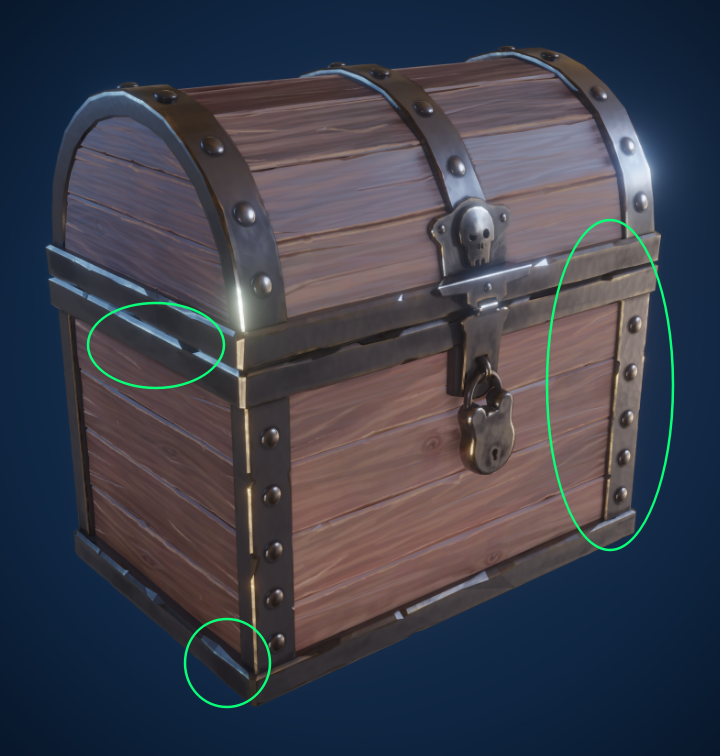
It's subtle but does so much for making the metal relatable in my opinion. it's a strong A from me. Excellent work this month, John 👏