I'm doing the chest. Probably biting off more than I can chew for a single week but I wanted to challenge myself. I've watched the chest video and I was already planning on going through it again to do the model so this was perfect timing.
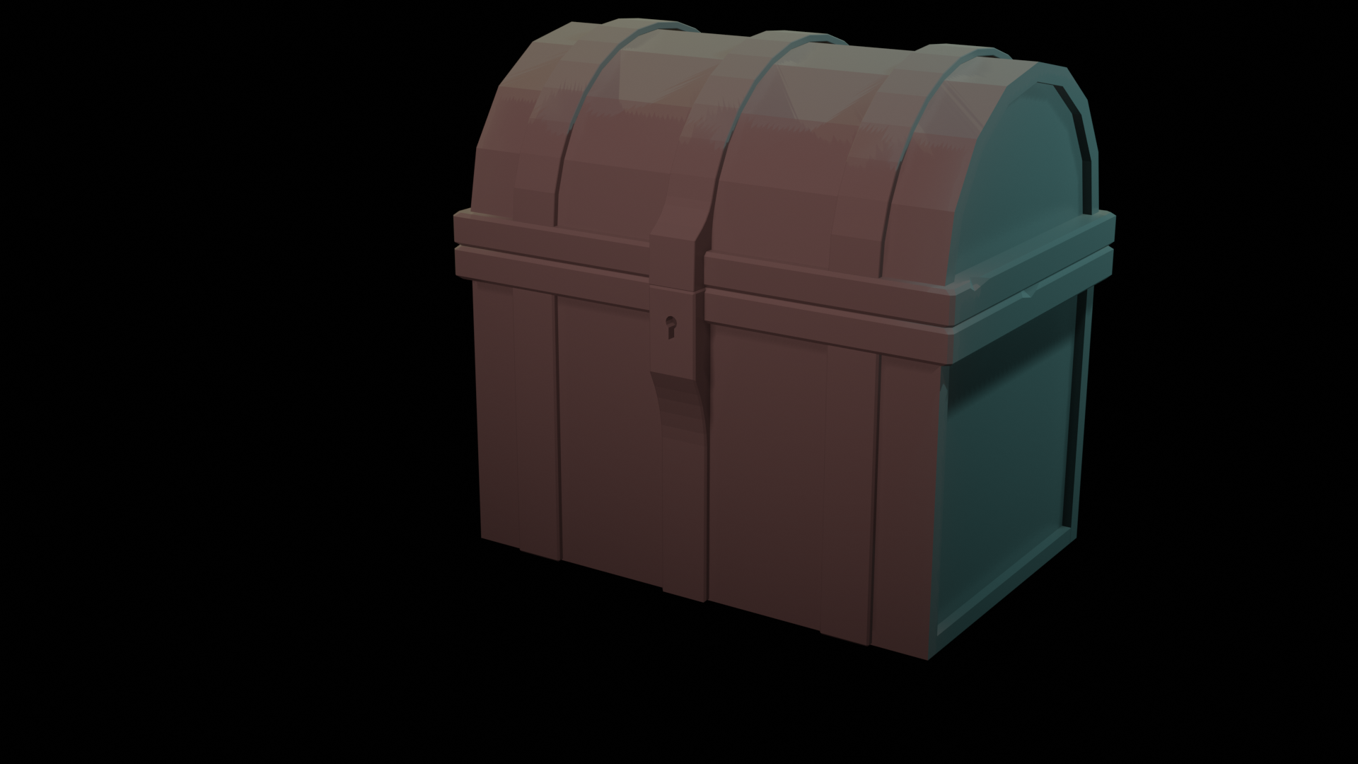
Good start man, just a reminder that the deadline for this week is Sunday at midnight so I'm looking forward what you do until then!
I seem to be having issues with the knife tool. When I try cutting the extra edges it seems to be creating two vertices next to each other. I tried merging them by distance but they don't seem to be merging. Anyone else run into this?
![]() notcastanza Sort of, I was looking for the old remove doubles command and noticed they replaced it with Mesh -> Cleanup -> Merge by distance. You can adjust the distance default is pretty low like 0.001. I was using 0.01
notcastanza Sort of, I was looking for the old remove doubles command and noticed they replaced it with Mesh -> Cleanup -> Merge by distance. You can adjust the distance default is pretty low like 0.001. I was using 0.01
![]() notcastanza If you click in the 'middle' of a face, when using the knife tool it creates a vertex. You can also use Alt M merge at center or at first or last or....
notcastanza If you click in the 'middle' of a face, when using the knife tool it creates a vertex. You can also use Alt M merge at center or at first or last or....
Thanks, expanding the merge distance helped. I also figured out that if I hold ctrl it will snap to the edge. Not necessarily where I wanted it but then I could slide the vertices to where I wanted them.
Wow, these little dents and details are a bit tedious. I do like how it looks
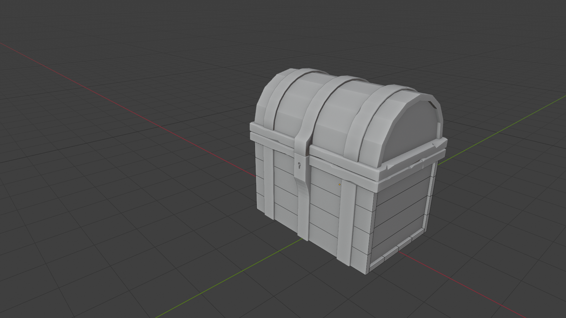
![]() notcastanza I know what you mean. I imagine you are probably doing the wood splits right about now.
notcastanza I know what you mean. I imagine you are probably doing the wood splits right about now.
WEEK 1 HOMEWORK SUBMISSION
I think I have the model finished. I wanted to add a padlock type lock to it but I didn't have enough time.
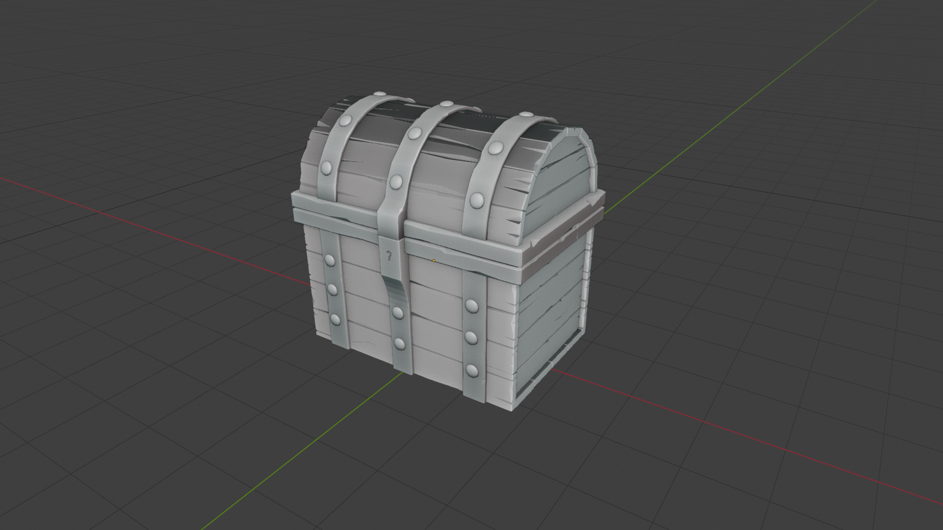
Nice cracks and crevices in the wood planks. This is going to look spectacular with the texturing.
![]() notcastanza Nice to see you in class again, Ben!
notcastanza Nice to see you in class again, Ben!
Wow, these little dents and details are a bit tedious. I do like how it looks
They certainly are tedious. Which is party what inspired me to share object data between planks, saving detailing time.
I'm glad you made it made it through the tedious task because your final chest turned out great. My only note (super tiny) is that some planks pieces appear to have their normals reversed. I ran into this problem myself in the course. A simple solution is select all objects in object mode, tab into edit mode, select all mesh components, and hit SHIFT + N to recalculate the normals.
That's such a tiny thing that I don't count it against your grade. You've earned an A from me 👏
![]() notcastanza Good effort! I was just about to comment on the normals of the planks, but Kent beat me to it!
notcastanza Good effort! I was just about to comment on the normals of the planks, but Kent beat me to it!
Week 2 Submission - Texture/Shading
I had a heck of a time getting the dirty vertex to bake only to figure out that I missed the Vertex Input node. Failure is learning, right? I won't forget so easily next time.
For the base I duplicated some planks, copied the material and added a hue-saturation node to make the wood look more worn.
Rendered in Cycles
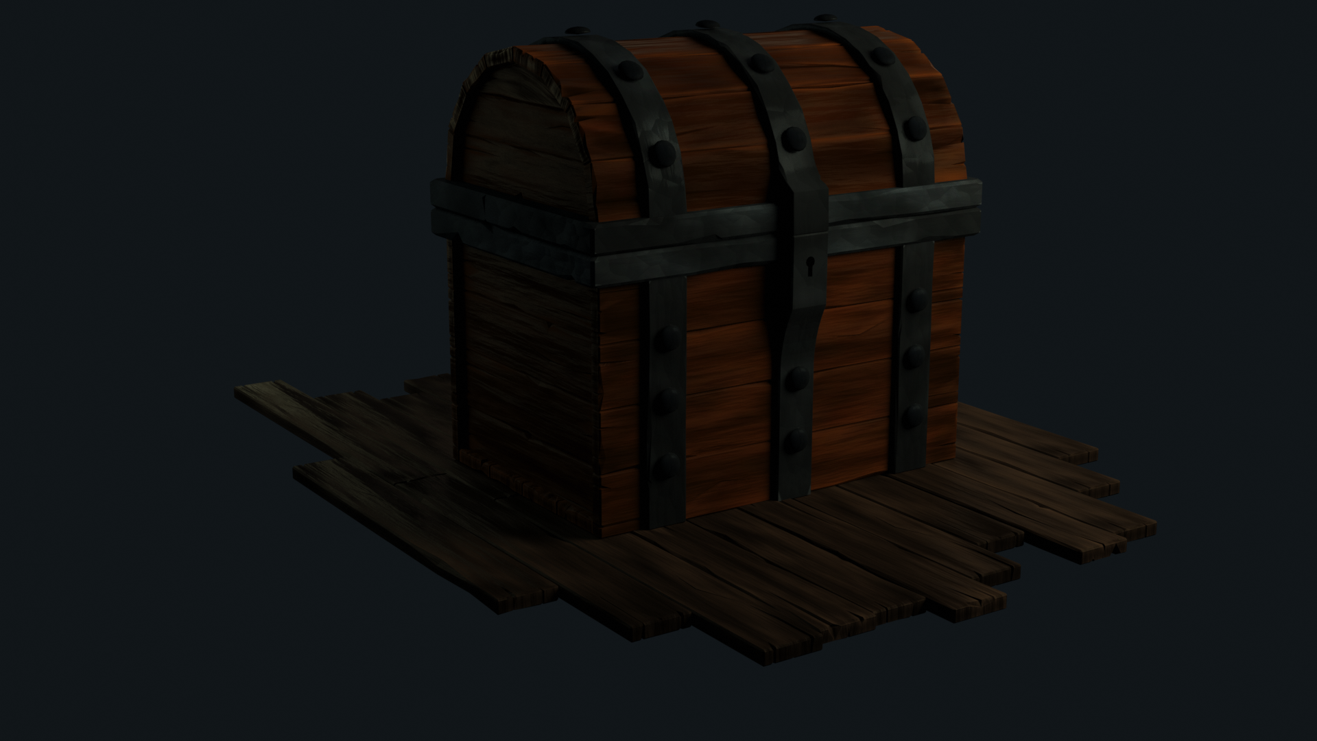
![]() notcastanza hi Ben the painting looks great! Your picture is a bit dark though so it’s hard to see all that awesomeness. Next week when you do your final render for the last homework assignment you should crank up those light so we can all enjoy this glorious chest of yours 😊👍🏻
notcastanza hi Ben the painting looks great! Your picture is a bit dark though so it’s hard to see all that awesomeness. Next week when you do your final render for the last homework assignment you should crank up those light so we can all enjoy this glorious chest of yours 😊👍🏻
ssmurfmier1985 I brightened it up with Photoshop. I'll work on properly lighting it for week 3.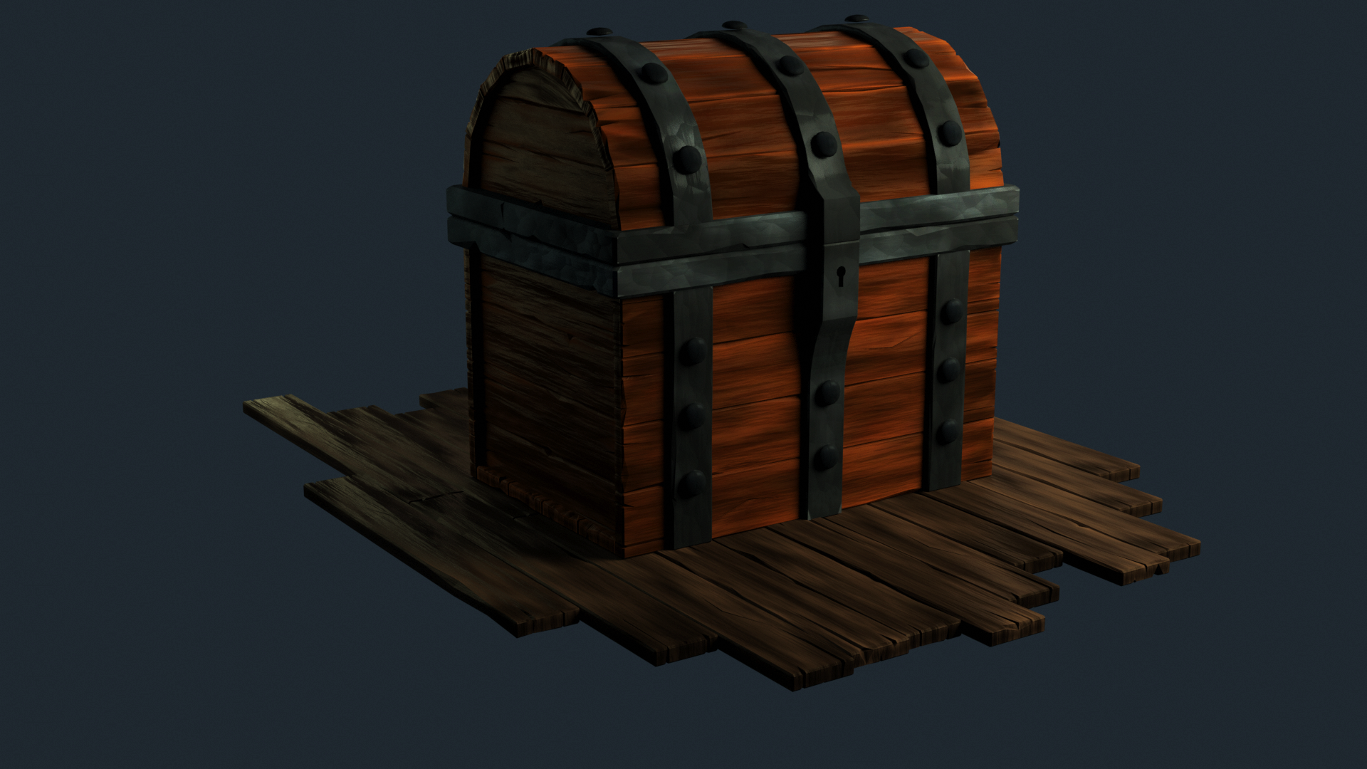
![]() notcastanza Thanks for brightening up the image, Ben. Looking at that version closely, you've done a great job with the wood grain detail and tonal variety. Same with the metal. The only thing missing is edge highlighting and crevice darkening. If you add that it will be an A 👍
notcastanza Thanks for brightening up the image, Ben. Looking at that version closely, you've done a great job with the wood grain detail and tonal variety. Same with the metal. The only thing missing is edge highlighting and crevice darkening. If you add that it will be an A 👍
@theluthier I did add the dirty vertex node but I might have the mix more towards the color node. I'll play with the slider to get the edges to show more. Thanks!
Played around with some contrast/brightness with the dirty vertex node.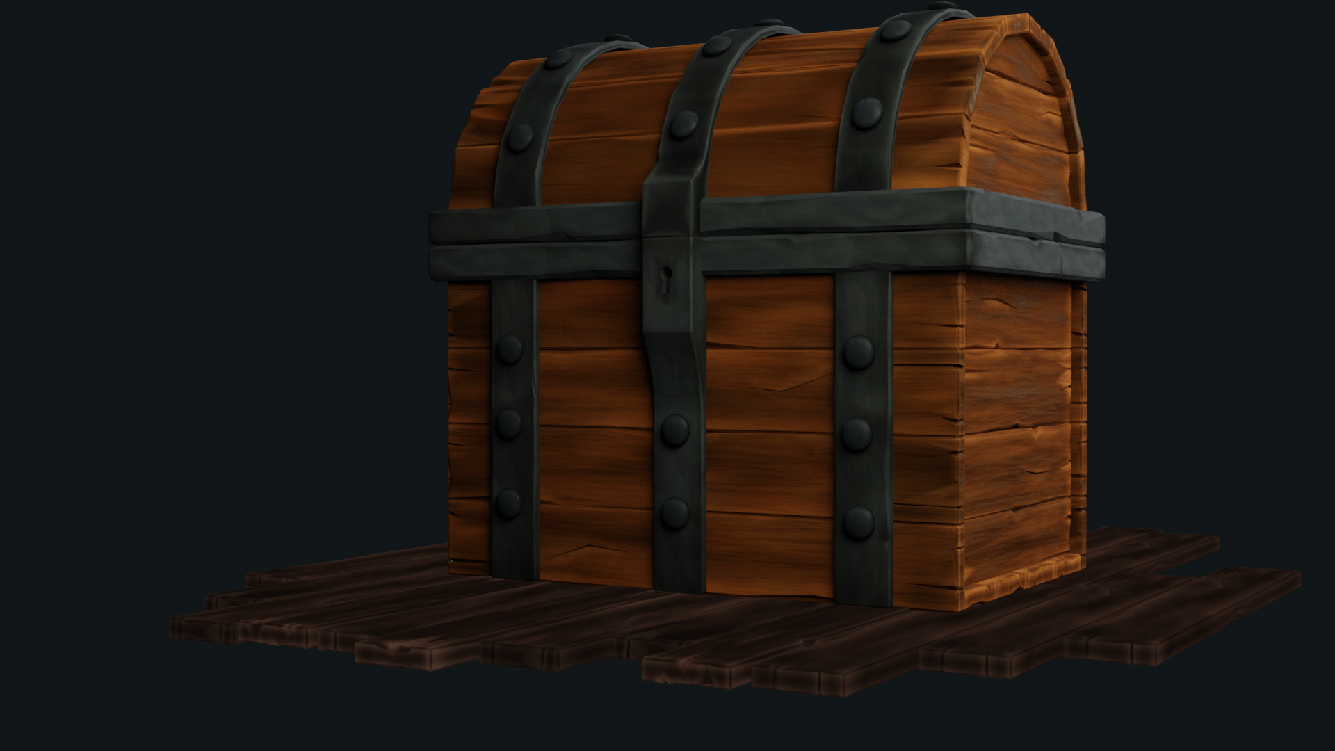
@drgnclw I setup a three light setup and each lamp is set above 1000.
My monitor is a high end gaming monitor and it looks fine brightness wise but when I look at my renders on a different computer (work computer) they look so much darker. I might need to get a second monitor or something.