Hello, I am software engineer from London and I enjoy working with digital arts in my free time.
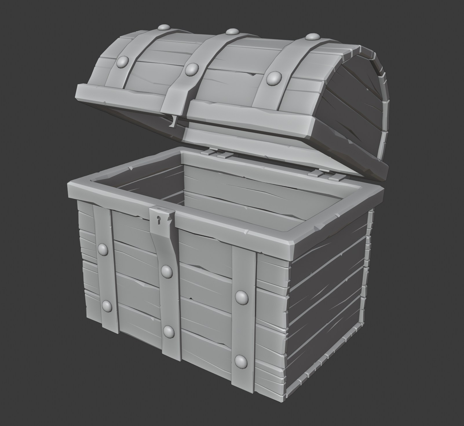
I've been doing the odd tutorial here and there and took this class to help make the transition to 2.80. I am hoping to start to be able to create more of what is in my head rather than just being able to follow along with tutorials. Although saying that, my first stab at the homework was to learn the technique in creating the treasure chest. I am hoping to have enough time to create a few more pieces to submit for the homework.
I welcome any criticism that you may have. Thanks.

Looks excellent to me!
I'm just not quite sure the super clean roundness of the pins match the rest of the model.
![]() otowa I see what you mean. Not used to modelling without sub div and when I do, I probably crank it up too high.
otowa I see what you mean. Not used to modelling without sub div and when I do, I probably crank it up too high.
![]() captainbedpan Like how you added the little details like the locking mechanism itself.. Looking good
captainbedpan Like how you added the little details like the locking mechanism itself.. Looking good
![]() dieterweireldt Thanks. Just realised that I am missing the iron for the rivets on the inside of the chest.
dieterweireldt Thanks. Just realised that I am missing the iron for the rivets on the inside of the chest.
Honestly just ran out of energy. I'll have to do the details later.

![]() captainbedpan Great! And you've got the 'plug' (there is probably a special name for it that I don't know of, I am by no means a barrel expert...) in the right place;)
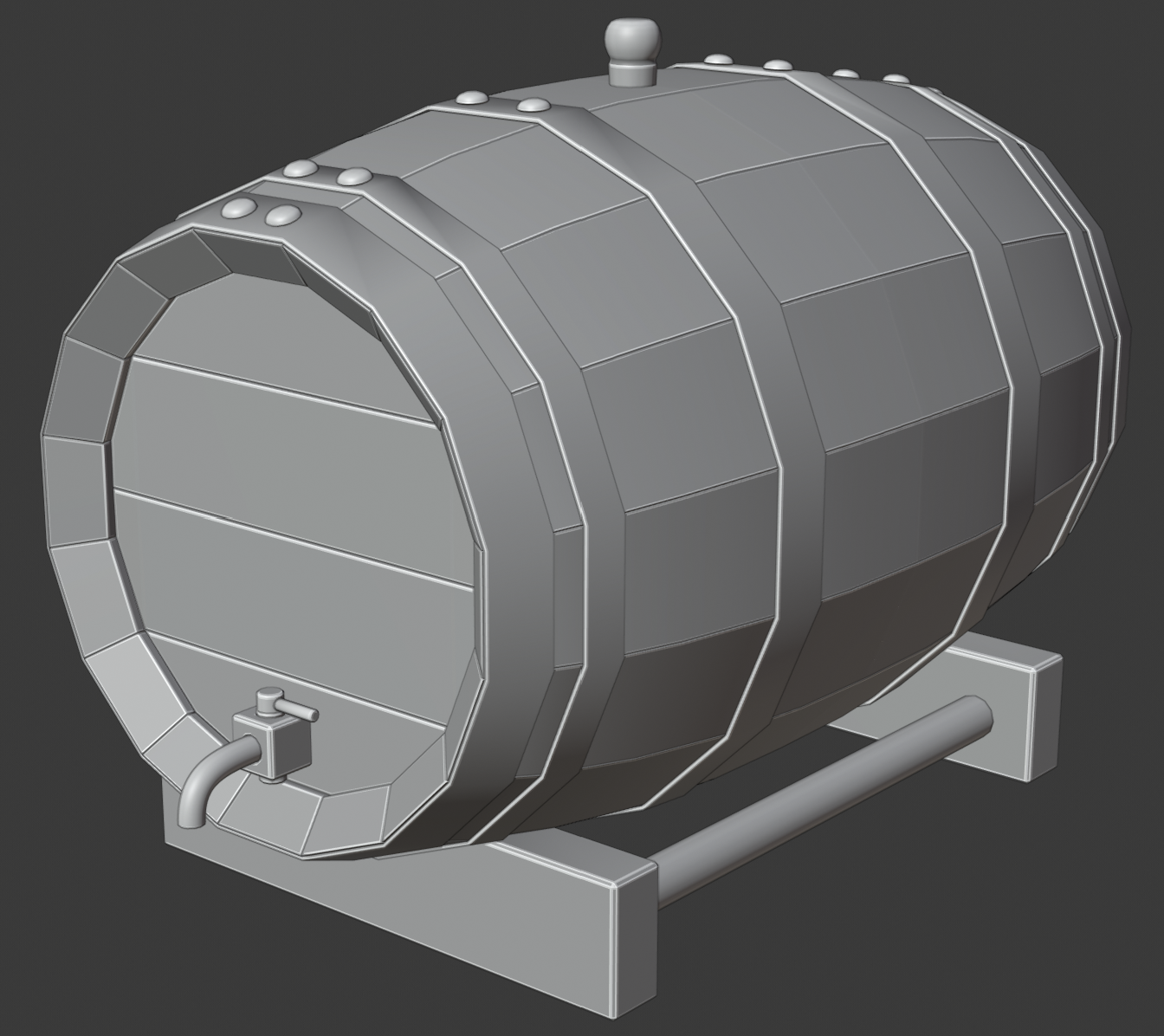
captainbedpan Great! And you've got the 'plug' (there is probably a special name for it that I don't know of, I am by no means a barrel expert...) in the right place;)
Don't forget the deadline though; better to post something that is not quite finished (after all you do have three objects!), than nothing at all.
Keep up the good work!
![]() captainbedpan Sorry, it's a bit too late, but you could have used the, already detailed, wood of your chest to make the barrel...
captainbedpan Sorry, it's a bit too late, but you could have used the, already detailed, wood of your chest to make the barrel...
I explained the method near the end of my post.
![]() captainbedpan That's a good chunk of work. The barrel could have been better like
captainbedpan That's a good chunk of work. The barrel could have been better like ![]() spikeyxxx said but overall, good job.
spikeyxxx said but overall, good job.
@drgnclw Yeah, I'll have to get those details in for the final render.
![]() captainbedpan Hello, and welcome! There's some good progress here already! Some notes for the future, if you have the time:
captainbedpan Hello, and welcome! There's some good progress here already! Some notes for the future, if you have the time:
The metal bars on the chest have some dings, but they're mostly on the side. Maybe you could add a couple scratches across the front face to help break up the overall smoothness, like with the wood planks.
The sword looks nice, as well, but could use some varying range of marks to also break up the overall smoothness, if you want the sword to look more worn than it is now.
Not much for the barrel, since it's incomplete, but good effort.
![]() captainbedpan Really nice work this week, Erik! Kudos for doing all 3 assets. I like the simple sword featuring those wonderful little dings. My only concern is that they won't be too small to be noticeable when seeing the whole sword in frame. Perhaps these could be accentuated in the texture.
captainbedpan Really nice work this week, Erik! Kudos for doing all 3 assets. I like the simple sword featuring those wonderful little dings. My only concern is that they won't be too small to be noticeable when seeing the whole sword in frame. Perhaps these could be accentuated in the texture.
Adding the same level of detail to the barrel would great, but I understand running out of gas. Especially if you did all this in a day and a half! Still you've gone above and beyond. A+ from me 👏
![]() silentheart00 Thank you for your comments. I really appreciate them. Now that I think about it, it makes sense that there would be scratches on the metal as this would be the first area to receive contact. I will definitely give them some attention. I will add some more to the sword as well.
silentheart00 Thank you for your comments. I really appreciate them. Now that I think about it, it makes sense that there would be scratches on the metal as this would be the first area to receive contact. I will definitely give them some attention. I will add some more to the sword as well.
@theluthier Thank you Kent. I can see now that the sword details are too small. They do not match with the details on the chest. I will make them a little larger and create more. Been taking lots of notes on chapter 2 and looking forward to seeing the results with the dirty vertex bake.