Hello there guys!
I am kind of new to CG Cookie (started like a month and a half ago), and with Blender too (less than a year). When I saw the opportunity to be in this class, I did not hesitate sign up for it.
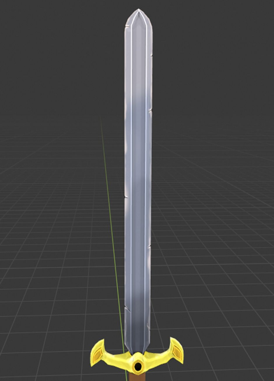
I decided to go with the sword model, mostly because I love them. At first, I started following the standard model showed in class, but I wanted to do little tweaks to it without changing the stylized look it had. I modified the handle and the tip of the grip, in order to leave space for some runes and markings that I am planning to add on the Texturing process.
I hope you guys like it!
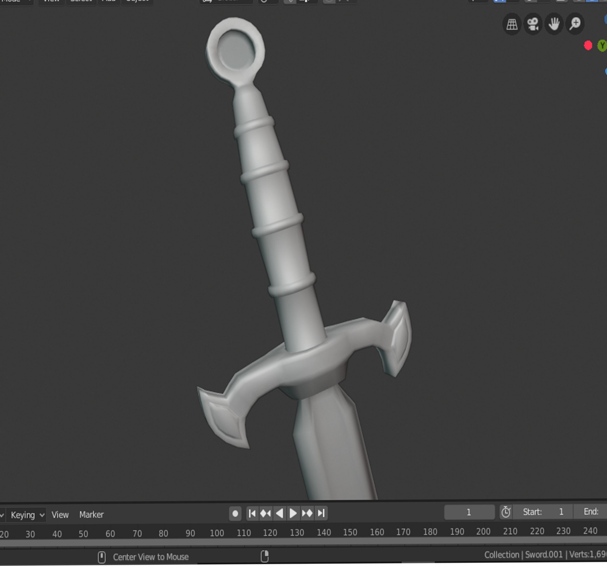
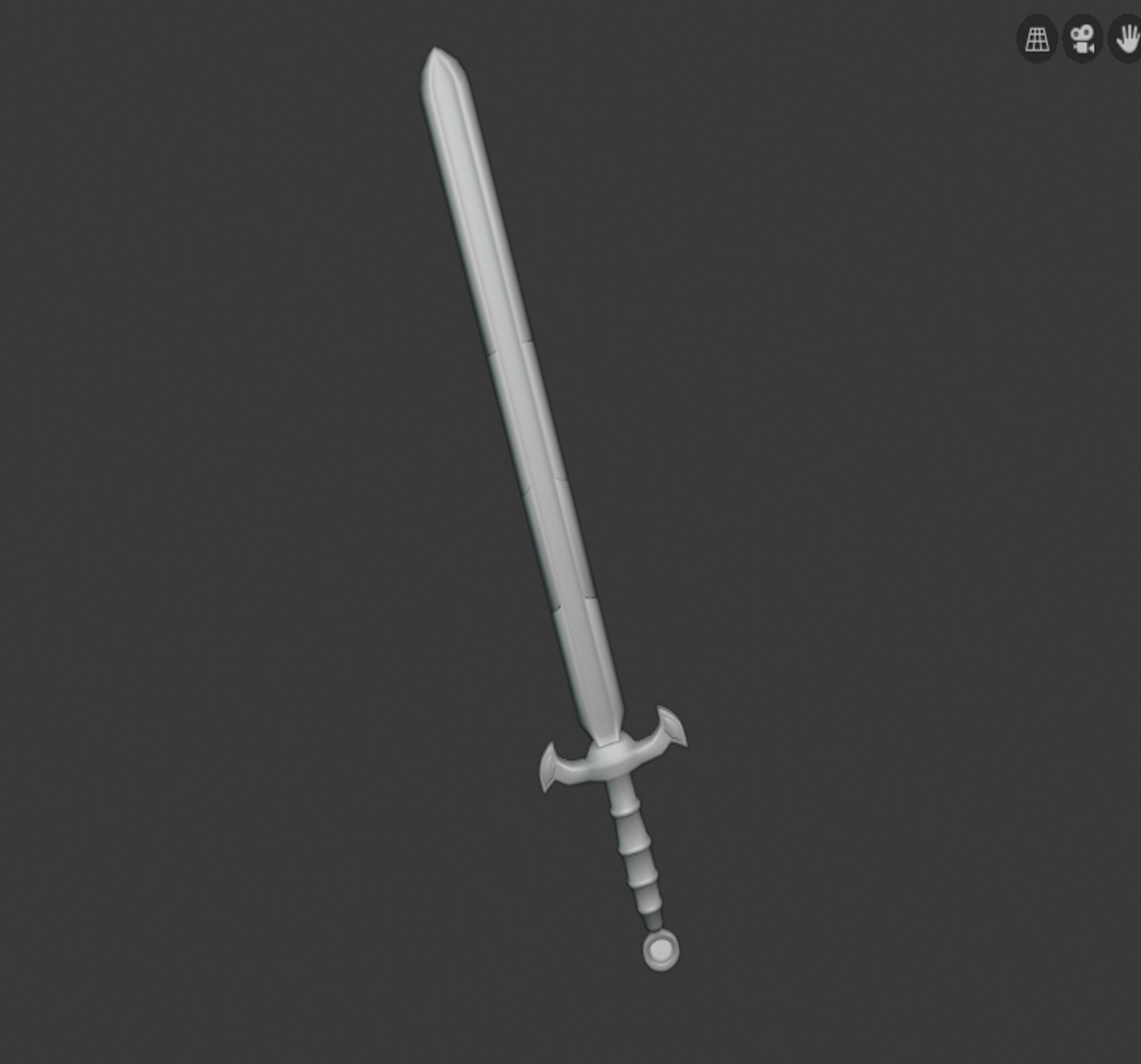
Welcome! Great work, but if you don't mind me saying so; the damage on the blade is too symmetrical!
And maybe the handle is a bit small compared to the blade?
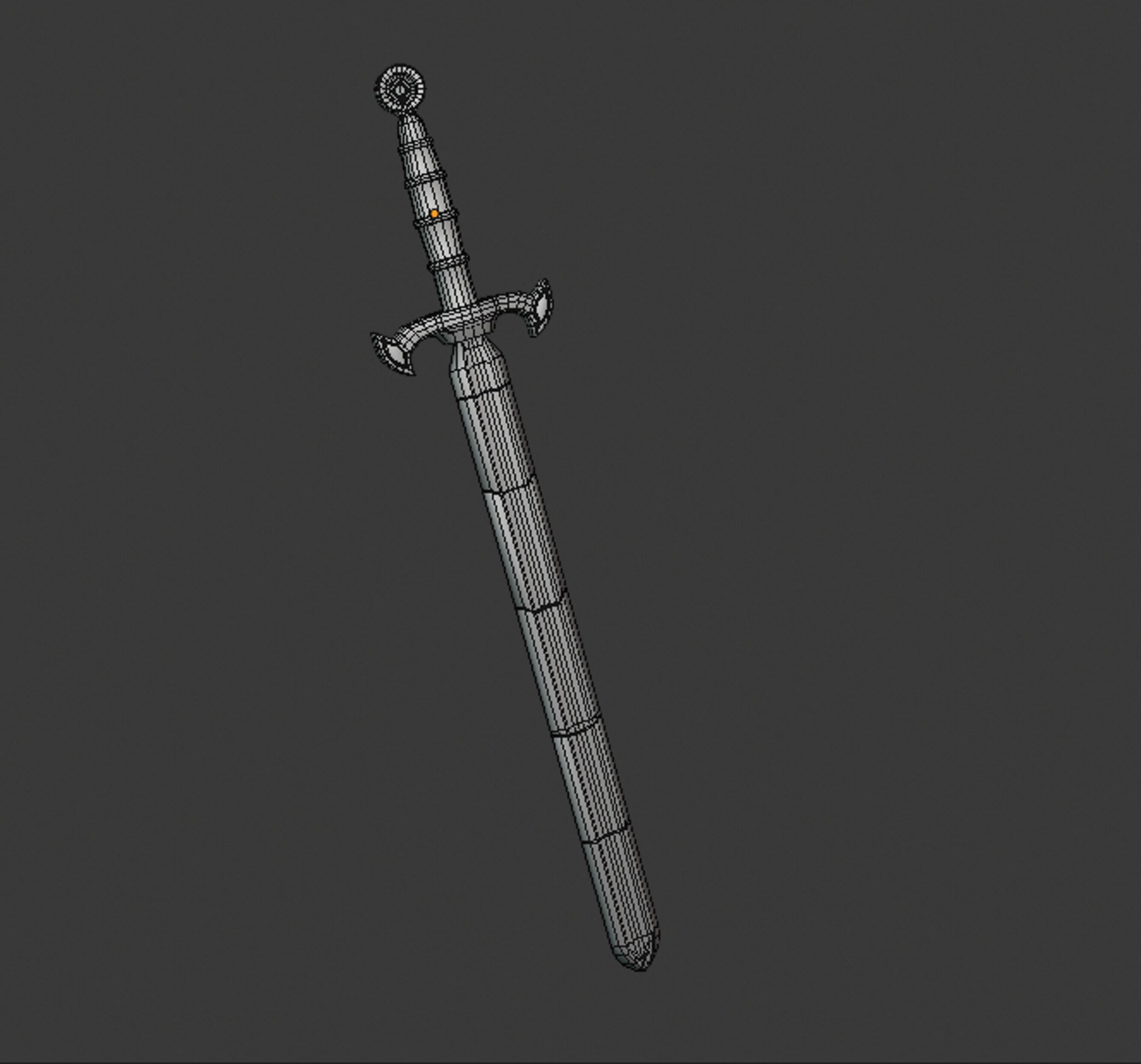
vvictormuv Great work! I think you should auto smooth it and mark the sharp edges to make it pop, it will look fantastic!
vvictormuv Great job on the homework this week. I like that your sword is similar to mine but clearly unique as well. It shows that you're able to truly apply what you're learning. I like the cross guard too. It's got way more edge and identity than my plain one. Nice touch.
No critiques from me. I was going to mention the symmetry but spikey beat me to it and you were already aware yourself :) You've earned a A in my book. I'm looking forward to seeing this textured and shaded.
PS: Welcome to your first class and thanks for sharing a bit about yourself! How have our courses been treating you so far?
vvictormuv Hello, and welcome! Good effort so far! I second what Jack said; there are no sharp edges so everything feels overly smooth. You can mark them sharp by selecting all the edges you want sharp->right click for the context sensitive menu->Mark Sharp towards the bottom. That should help.
@theluthier Hey there Kent!
Thank you for taking the time to grade my work. I am definitely looking forward to the next sections of this class!
Cg cookie's courses have been amazing. After going through some classes from the modeling flow, I have certainly seen some improvement in my topology and approach to modeling in general.
I am loving this platform and the community!
Thank you guys for the feedback.
I honestly never thought of doing tge sharp edgesss!! I will surely try to apply those tips and see what happens 😁 hehehe
Hey there guys!
So for this week's homework I started kind of struggling on getting the UV map working properly (good stretching); but even though the unwrap feels kind of sloppy to me, I managed to get the area stretch looking decent haha.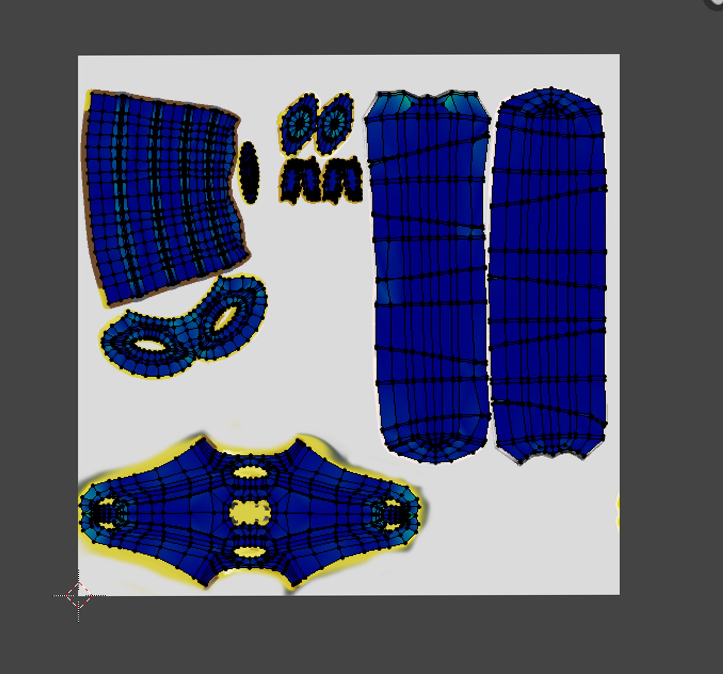
Moreover, I have followed Kent's advise regarding setting the base colors, tone variety, and coloring the edges in the texture of the sword. So far this is what I got:
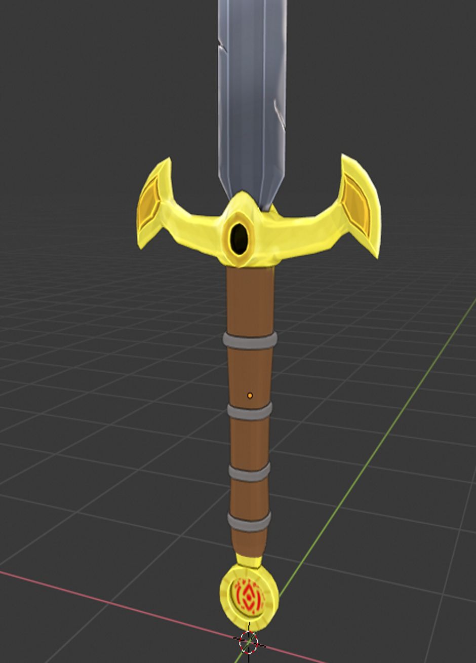
There is still a lot to paint (Like the grip), and I have not done the "dirty vertex paint trick" yet, but I am planning on finishing everything up tomorrow before the due time.
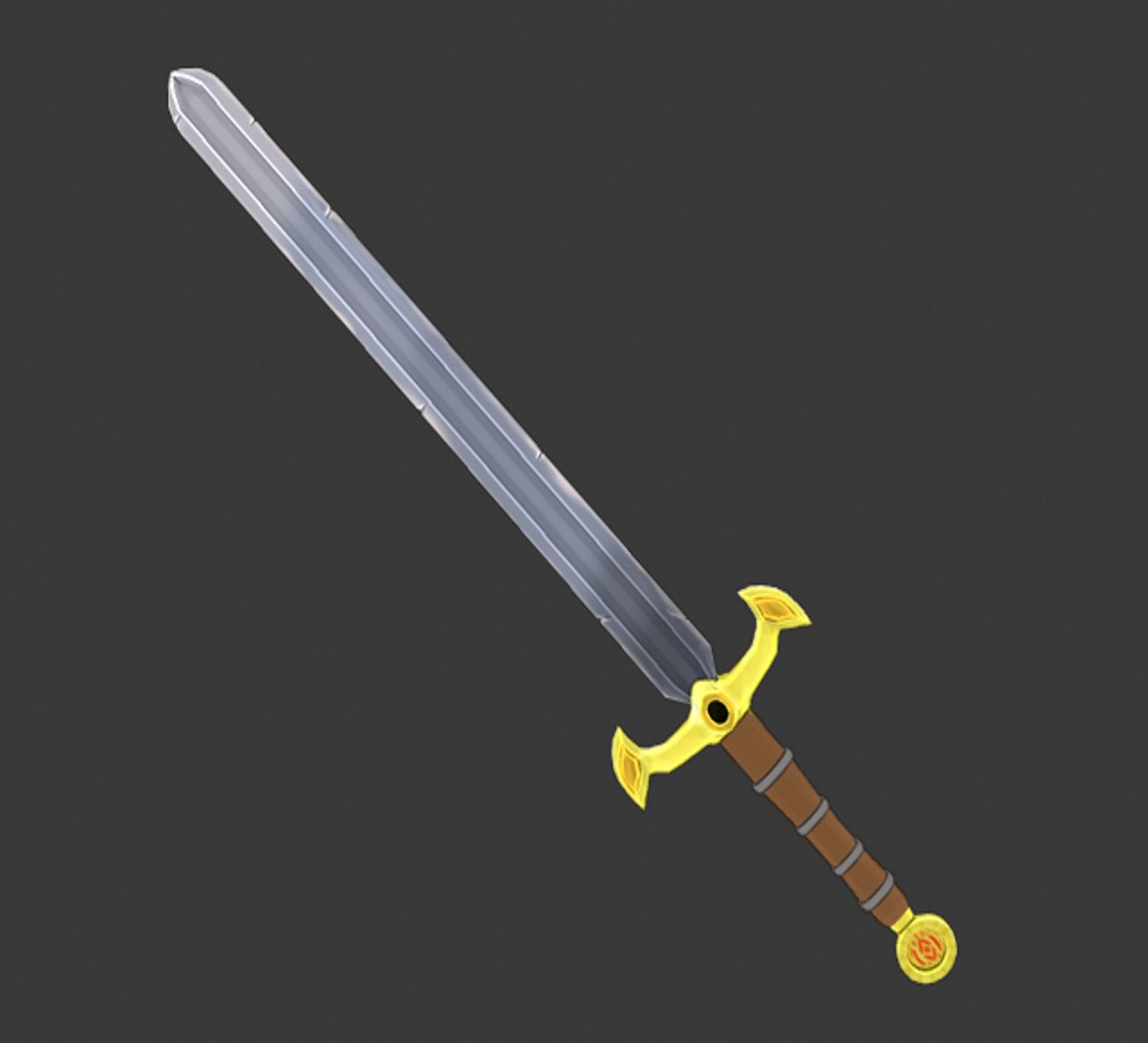
I would appreciate any feedback and anything you guys could tell me!
I am here to only improve hahaha.
vvictormuv The gradient on the blade feels too "stepped". It's not gradual enough. I like everything else, though.
vvictormuv Looks good! I might have expected a little more dirt on the cross-guard section. And wow, did you hand paint all those runes!? Those came out really neat!
vvictormuv Fantastic texturing! Your model to me was good and now is great as a result of the texture. It's a wonderful example of how much detail can be accomplished with skillfully crafted texture. I absolutely love the edge highlights and crevice darkening, scratch details, and rune designs. It's a n A+ from me 👏
Hello there guys!
Finally got the time to finish rendering my sword! the world of nodes and shading is pretty complex to be honest, yet it is also fun to open your mind to so many possibilities when shading something.
I will definitely say that this Class helped me a lot to open more my mind when it comes to modeling stuff that is in my mind. Kent, Thank you so much for the amazing guidance and tips. I certainly see an improvement in my skills after taking this class!
Homework - Week 3
For the last tweaks:
- I improved the topology of the Handle a little bit.
- Played around with the reflections and the bump maps.
- Added a emission map to the runes on the blade (is a slight glow).
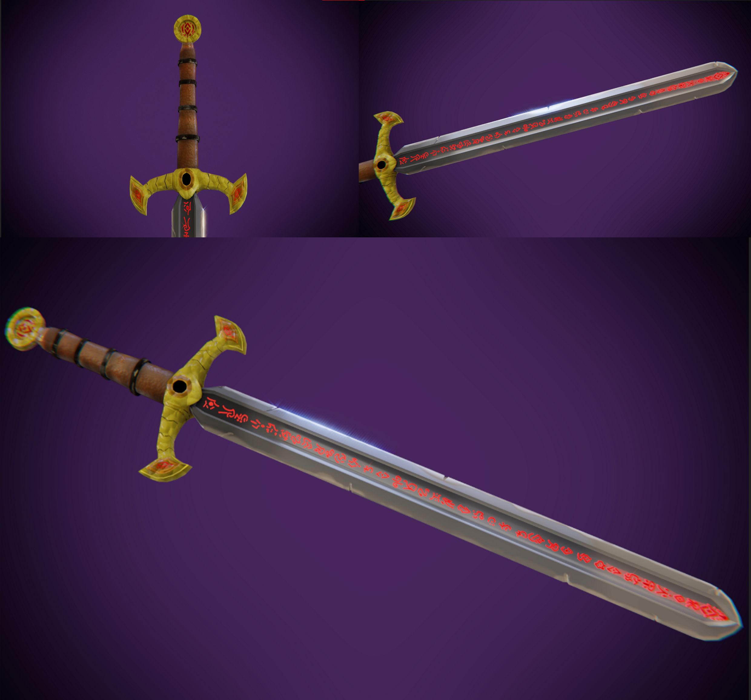
vvictormuv What a great final result! Each week your sword has taken leaps forward in quality and appeal. I'm so happy to hear that you see can see your improvement. It definitely shows.
The blade looks awesome: gloriously metallic. The glowing runes are great and the leather grip looks great too. My one criticism is that the yellow cross guard and pommel seem like perfect candidates for a golden material. However they're more ambiguously yellow at this point. Personally I recommend to crank that specular value down in the principled BSDF and crank the metallic all the way up.
Still I'm really impressed with this overall. It's a strong A from me! Nice job in the class 👏
@theluthier Thank you so much for the feedback!!!! I will personally take that critic and experiment again with the sword's shading hahah. I really enjoyed the class, and I will definitely work toward absorbing all those tips, advices, and concepts taught in class in order to keep improving in my art!!