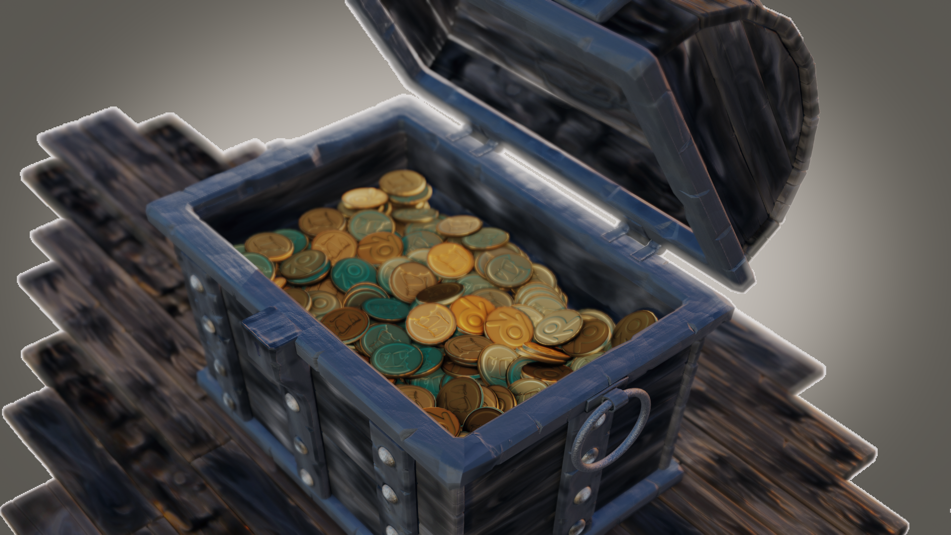
Hello guys, just starting my thread . Thought I'd post some progress shots although I'm having some difficulty with Blender 2.80 on my machine. I'm running Windows 7 64 bit, so if anyone knows what my problems are maybe they can help me.
First of all I have problems selecting objects. I have no problems selecting in edit mode, but only in object mode. I know how to switch between box select, circle select and regular select but for some reason I cannot easily select objects. I usually have to go to the outliner to select the objects I want.
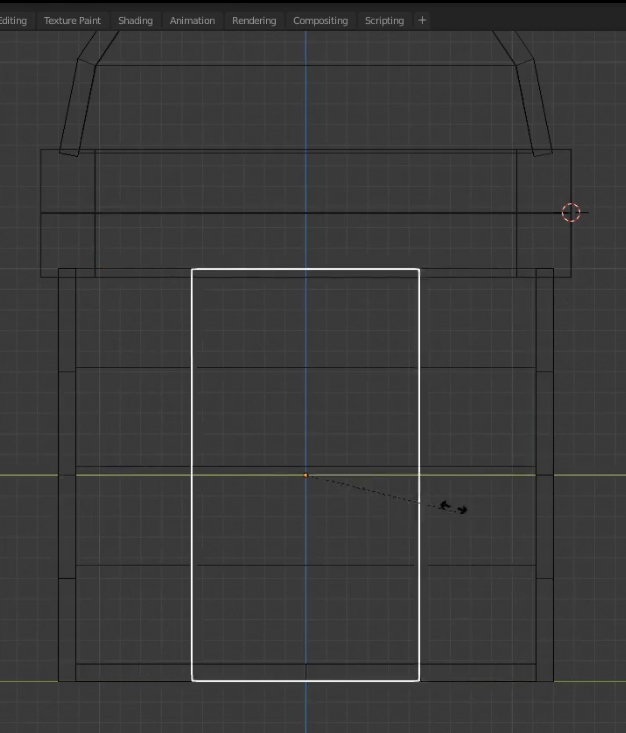
The second problem I have is when I switch to wireframe viewport mode all I get are the outlines of the objects, I don't get the inside faces (lines) so it makes it difficult to work with. I can sort of get around that by selecting multiple objects then go into edit mode and just edit the object I want but I think there's probably some setting I don't know about. This is from Kent's treasure chest video, I would like my wireframe to look like this:
Anyway, this is my blockout for the treasure chest:
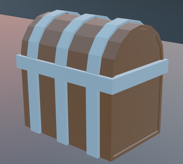
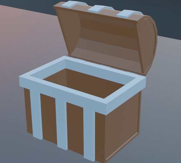
Thanks for reading, looking forward to another good class with Kent and CGCookie members.
![]() spikeyxxx It could be something in my graphics card, I can sort of see the noodle when I'm connecting nodes but I can't see them when I've connected them
spikeyxxx It could be something in my graphics card, I can sort of see the noodle when I'm connecting nodes but I can't see them when I've connected them
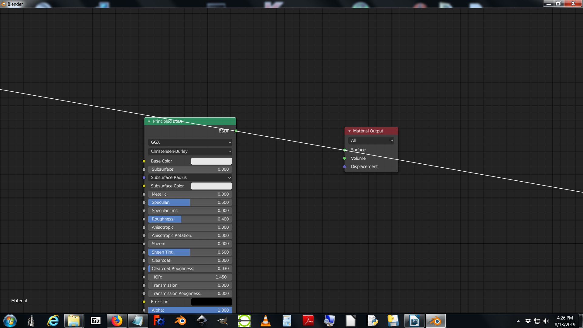
ddoulos4iesou Crazy!
But I saw that you already made a bug report, so I guess you're in good hands now.
Homework - Week 3
Sorry I haven't been able to keep up with the thread. Just a shout out to Spikey, thanks for all your help turns out I just just needed to update my graphics card driver to see the noodles and once I did I could do the compositing.
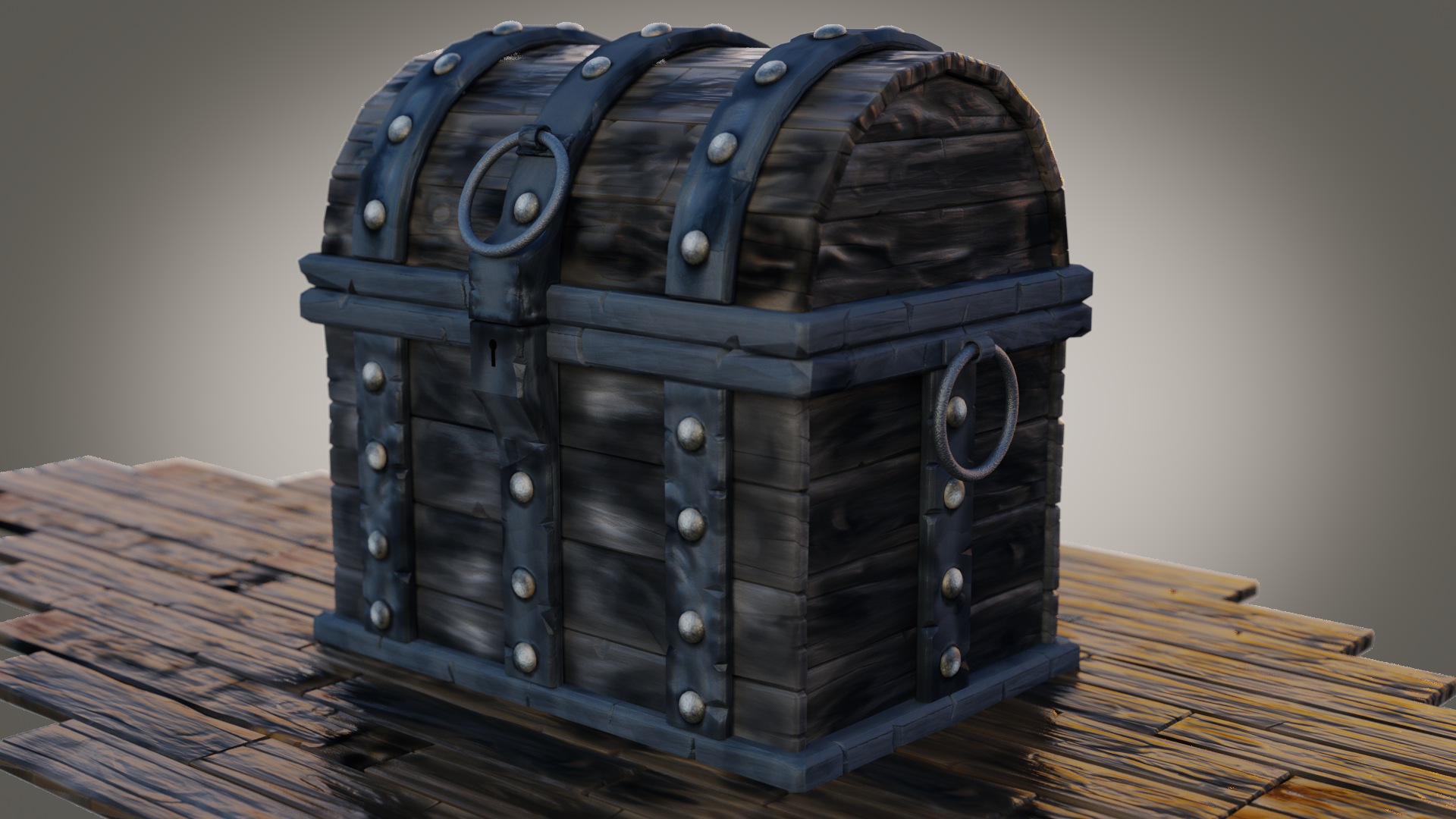
ddoulos4iesou Sorry to hear about the technical trouble you experienced. I'm glad you were able to continue past it and finish the project!
You have all the elements present and looking good. The bump on the wood looks really nice. However still the overwhelming impression I get is that a significant portion of the render is desaturated. Clearly you have orangish-yellow lighting, as seen on the screen-right side of the floor. But the textures still feel like they're nearly black and white. It makes for an odd viewing sensation of, "It's black and white...or is it...hmmm."
That could be artistic preference though. It does give a fairly ominous / gritty feel to the whole thing. I'll assume it's artistic preference and give you the A 👍
@theluthier Thanks Kent, I did consider adding the saturation node, but I ended up adding in to the floorboards and sort of like the contrast between the floor boards and the chest. Thanks for giving me some slack :)
Good course and good video series, probably one of the best I've done here at cgcookie.
This could use a lot more work but I thought I'd throw it in here for fun.
