Hi All, I've been using blender for about 5 years and normally do mid-high polly with procedural textures, so low polly texture painting seemed like it will be a fun change.
for the sword I decided I'd try to make a German Langmesser, it looked a little lonely by itself so gave it a barrel and floor for company.
Week 1 Homework Submission
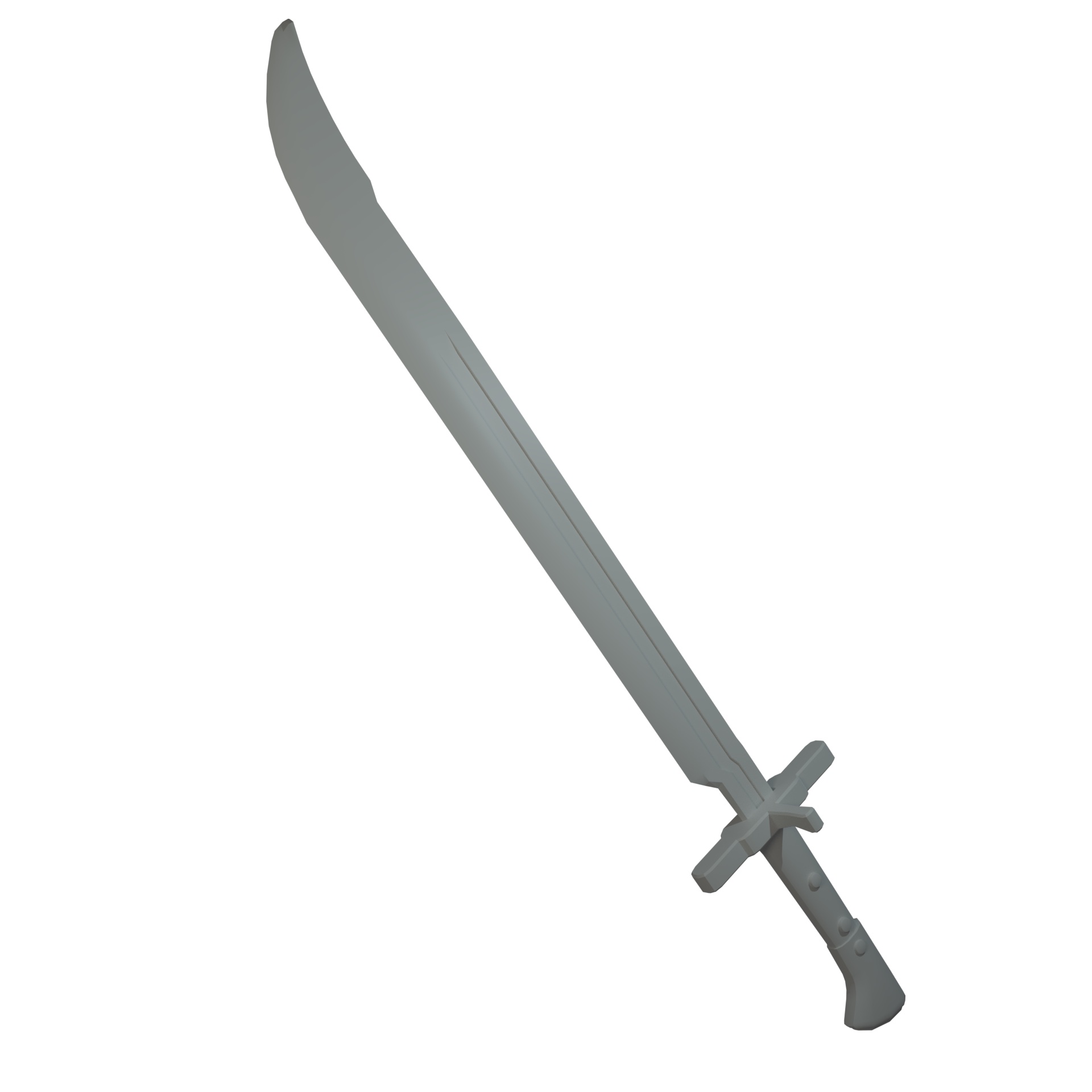
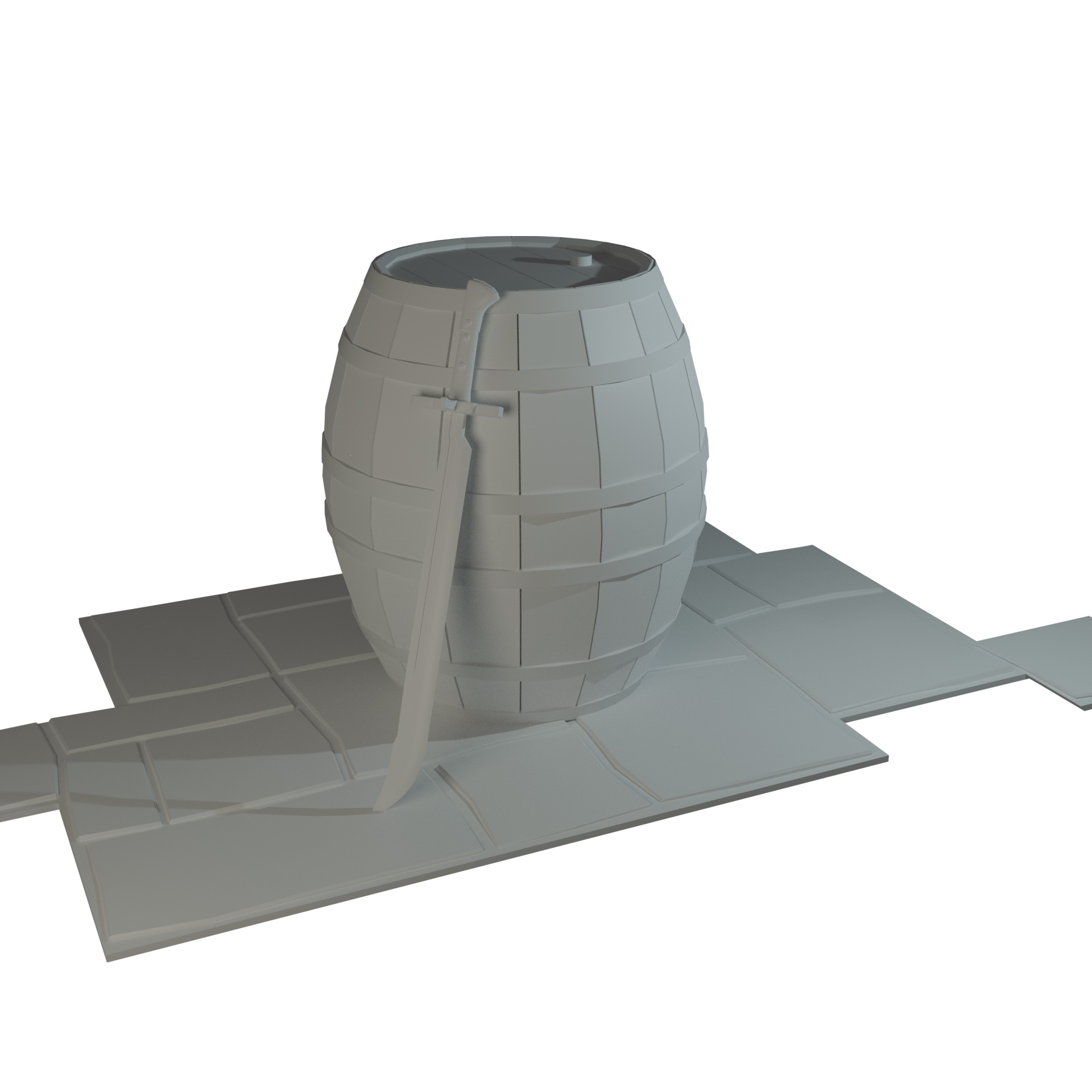
Hi, and welcome! Good for you for challenging yourself on something new! Looks good.
Welcome to the class ![]() iylandmuncee! Nice work so far on the sword and barrel. Is this ready to grade? Only thing missing is an "officially" declared homework submission post like this one. When I grade I look specifically for the bold title at the top of the reply "Homework Submission Week 1".
iylandmuncee! Nice work so far on the sword and barrel. Is this ready to grade? Only thing missing is an "officially" declared homework submission post like this one. When I grade I look specifically for the bold title at the top of the reply "Homework Submission Week 1".
Alternatively you can update your thread's description with this label above your final week 1 image, like this thread.
Either way I assume a student is still working until officially declaring the submission in one of these ways. So I'll check back later today to see if this is 100% final :)
![]() iylandmuncee I like that you challenged yourself by doing both the sword and the barrel. Both have spot-on form, structure and proportion. My one criticism is the lack of wear and tear. They look too pristine to me, and while everything was new at some point, aged items are usually much more appealing to the eye. Especially medieval-era objects like this.
iylandmuncee I like that you challenged yourself by doing both the sword and the barrel. Both have spot-on form, structure and proportion. My one criticism is the lack of wear and tear. They look too pristine to me, and while everything was new at some point, aged items are usually much more appealing to the eye. Especially medieval-era objects like this.
Though I understand that keeping them pristine could be your choice, and a valid one, it's at least a good exercise to try adding split details to the wood as well as beveling and denting edges.
So for that I'm inclined to give a B but the fact that you challenged yourself to do both assets (and the floor which I just noticed) I raise it to an A 👍
Homework Week 2 Submission
Quite enjoying this :)
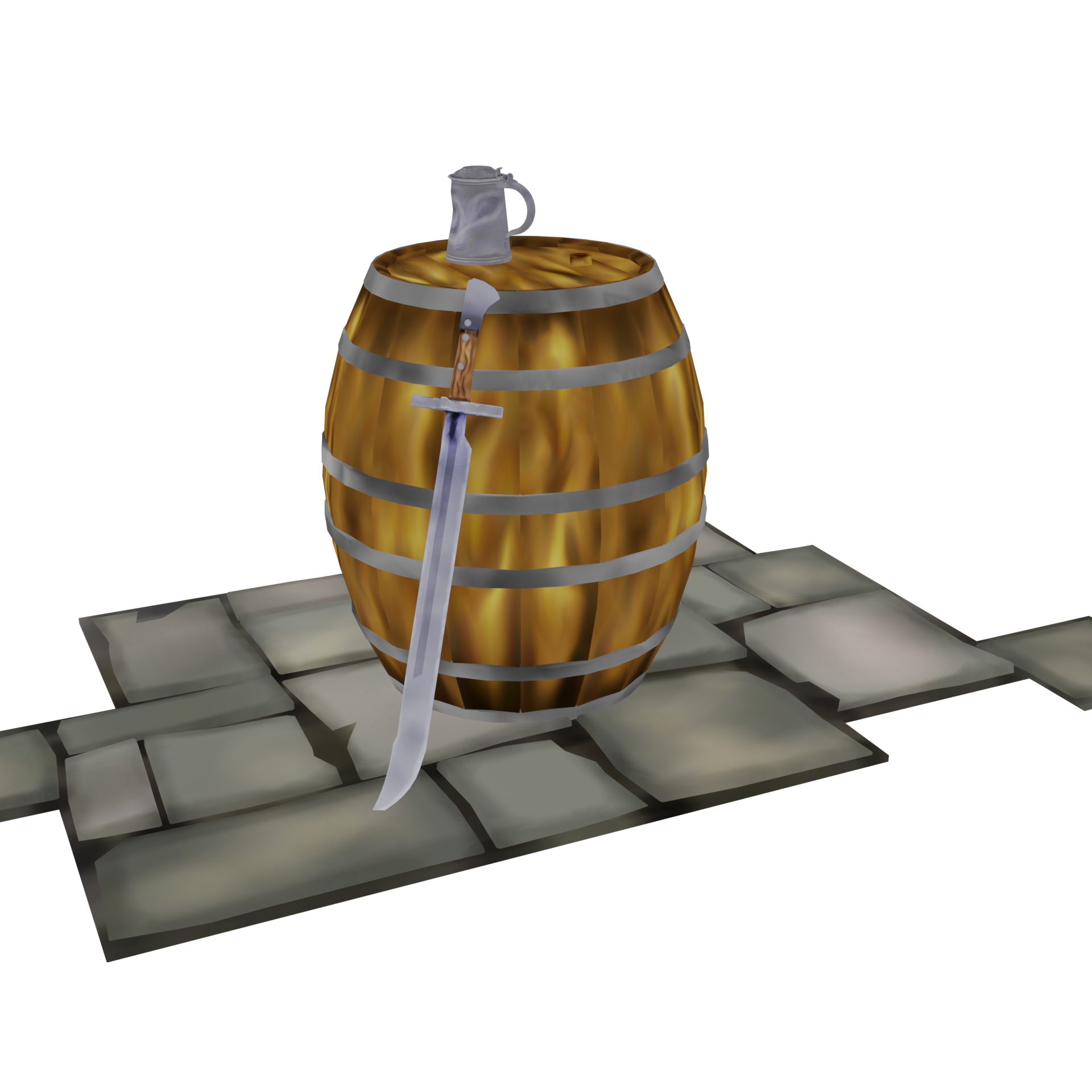
The references for the sword and barrel were of new objects so decided to keep them that way, that said taking on the point about wear and tear I've roughed up the floor a bit more and as I had enough time I added in a dented tankard.
My thinking (or story) behind the scene is that as the sword and barrel are new they probably belong to someone well off, but not too well off as the Langmesser was more a practical sword instead of a prestige one. So someone from the merchant class, this person lives in an older townhouse and over the years the floor of the cellar (where I imagine this is) has become deformed. Although a quality sword is important for when out and about or traveling, the tankard whilst dented is still functional and so does not need to be replaced.
![]() iylandmuncee Your barrel's on fire!
iylandmuncee Your barrel's on fire!
I like that. And it certainly reads as wood.
Let's see what some proper shading and lighting can do ...
![]() spikeyxxx Do you mean literally? I think it really does look a bit like it's on fire.
spikeyxxx Do you mean literally? I think it really does look a bit like it's on fire.
![]() williamatics Both literally and figuratively. There does exist wood that looks like that, though...
williamatics Both literally and figuratively. There does exist wood that looks like that, though...
![]() iylandmuncee Nice job! The wooden part of the sword handle came out really nice!
iylandmuncee Nice job! The wooden part of the sword handle came out really nice!
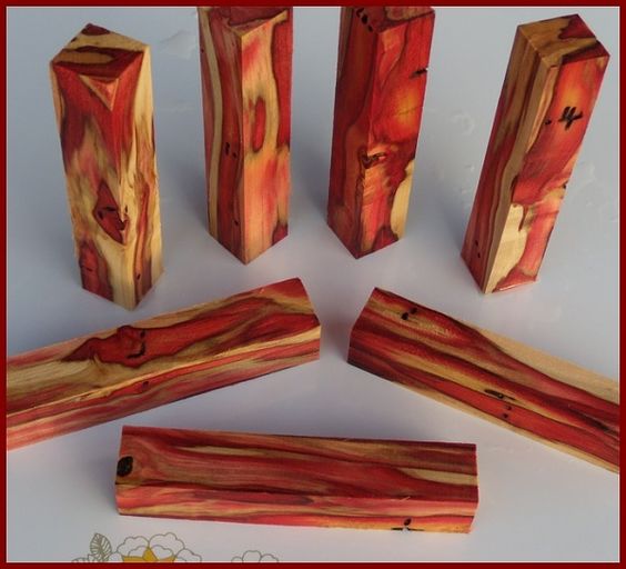
![]() iylandmuncee Looking good! The whole scene is turning out well. I love the stone floor. My only suggestion with the floor is to add some pot-mark details similar to this example:
iylandmuncee Looking good! The whole scene is turning out well. I love the stone floor. My only suggestion with the floor is to add some pot-mark details similar to this example:
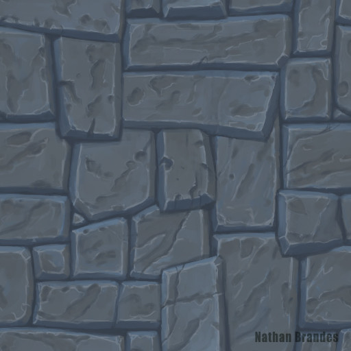
I think that would finish off the floor nicely. Everything else reads well enough. You've earned an A this week!
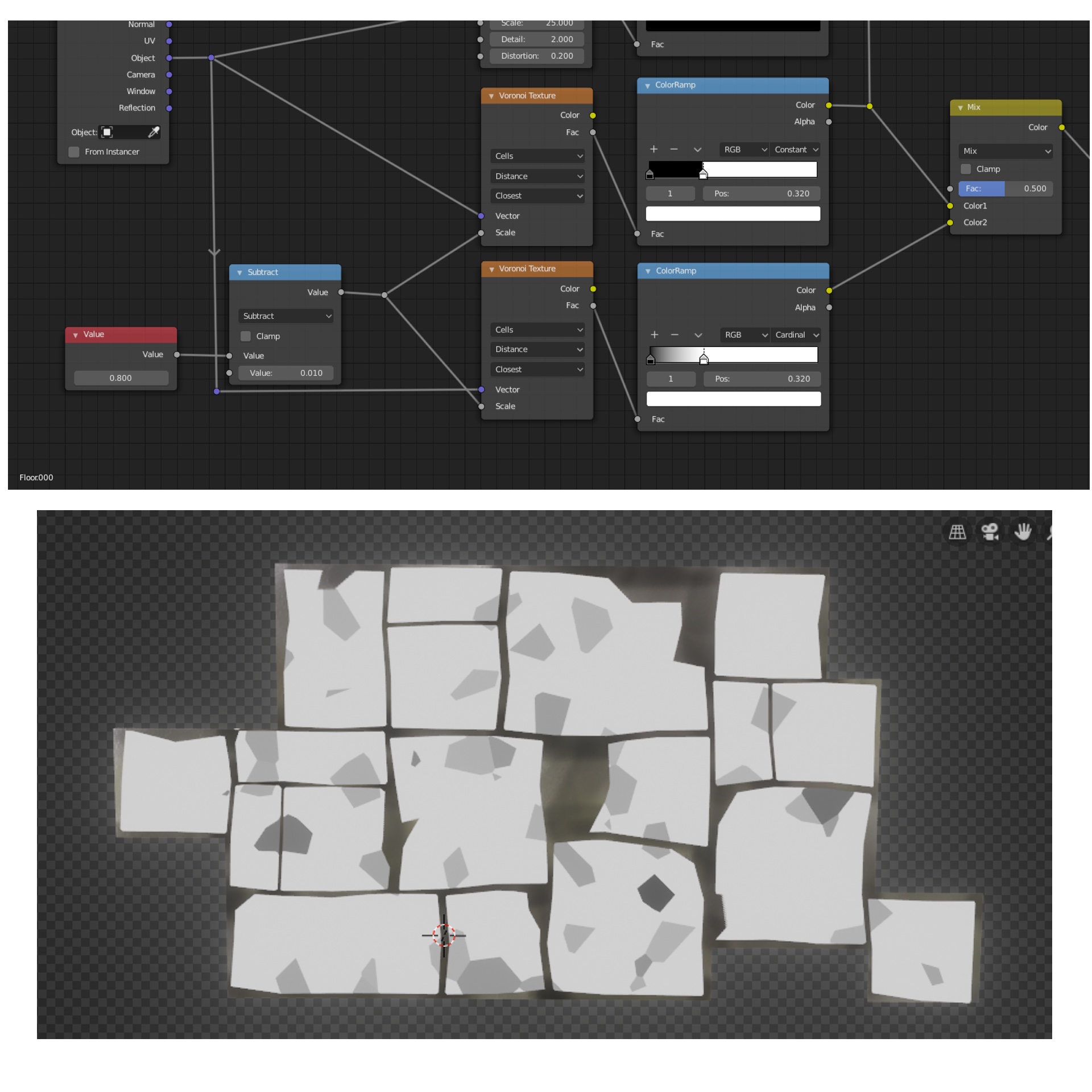
Decided to use nodes to add pot-mark indentations to the stones, and also used it to darken the indented areas slightly.
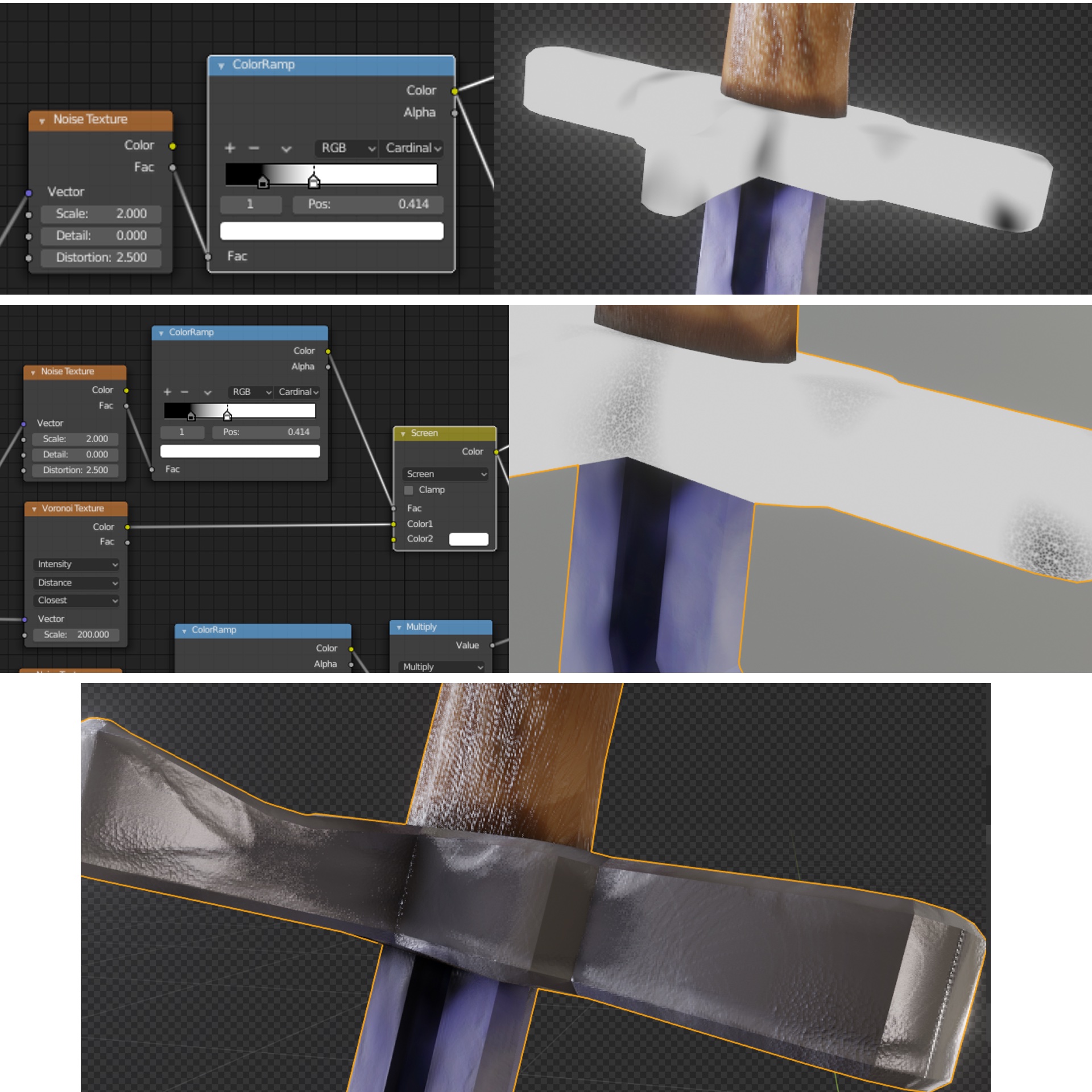 Decided to go with a cast metal instead of hammered metal appearance for the for the handle and pommel, to mimic the inclusions/impurities/air pockets that might occur I used a noise texture to mask off the areas for the defects, and then a voronoi texture to create bumps/indentations.
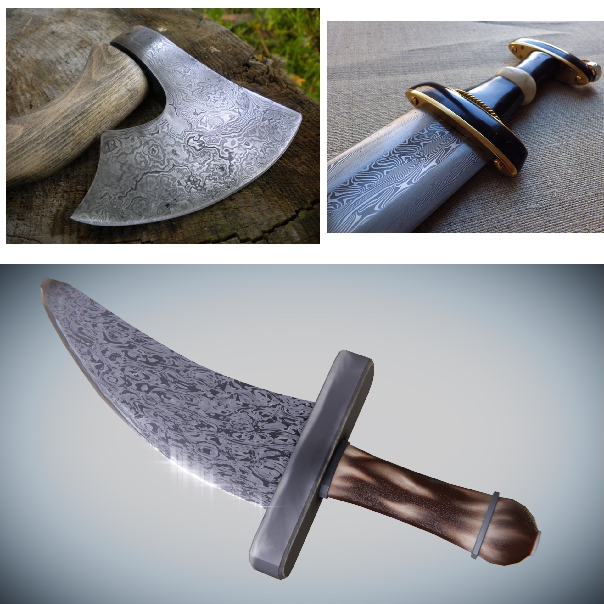
Just a quick experiment, the initial part of the blur setup reminded me of wootz steel so made this.
![]() iylandmuncee This turned out great, Iain! I love the choice to use a voronoi procedural to accomplish the stone color variation. Works beautifully to establish an appealing aesthetic. Same for the other assets and overall render.
iylandmuncee This turned out great, Iain! I love the choice to use a voronoi procedural to accomplish the stone color variation. Works beautifully to establish an appealing aesthetic. Same for the other assets and overall render.
It's a simpler aesthetic with less/more broad detail and you've made it work very well. The bright blooms are fitting for the style as well. It's an A+ from me. Excellent work this month! 👏
![]() iylandmuncee Oh and I forgot to ramark about the dagger experiment. First, that photos are messing with my head. The patterns so perfectly match a Blender procedural pattern I keep thinking "Wait, are those real photos?!"
iylandmuncee Oh and I forgot to ramark about the dagger experiment. First, that photos are messing with my head. The patterns so perfectly match a Blender procedural pattern I keep thinking "Wait, are those real photos?!"
Your recreation is pretty spot on. The only difference is that the pattern in the photo seems to end right at the edges of the axe head. Though not so much with the sword/dagger..maybe the axe is older and more used so the pattern gets rubbed off on the edges.
Anyway cool experiment!