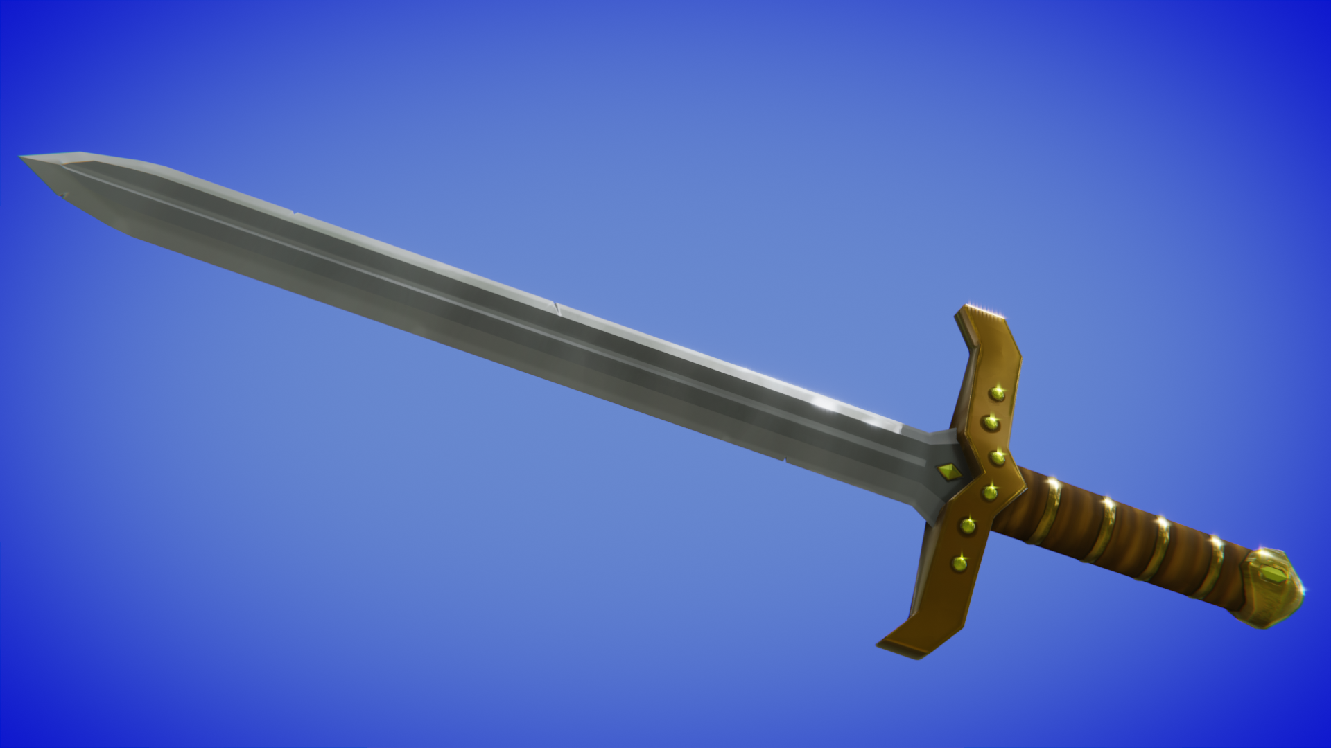
Here's my homework for week 1. My intention was to take pictures as I went along to show my progress but I ended up in a groove and forgot to grab the pictures...
I based the design off of a sword from an MMORPG that I used to play.
I need some advice.. I'm wondering what the best way to orient these gems to match the angle of the guard? I can eyeball it but I figure there's gotta be a better way.
It seemed to be a problem with Fill. I was able to paint over them with the brush.
I ended up re-doing the UVs like 7 times because I kept finding things wrong. BUT here we go.....
Week 2 homework
Gonna walk away from it for a bit. Maybe watch the Chest course like I said I was going to last week...
![]() leverett I'm sorry to hear you had a rough go with UVs. In the end, your sword turned out well though. It earns an A from me. Way to persevere through the struggle!
leverett I'm sorry to hear you had a rough go with UVs. In the end, your sword turned out well though. It earns an A from me. Way to persevere through the struggle!
My only note is that I think your sword could benefit from more pronounced edge wear and crevice darkening. I can see that you have both of those in the texture but it's a touch subtle in my opinion.
Gonna walk away from it for a bit.
Sometimes this is definitely the best choice: Take a break, disconnect, come back later (tomorrow a couple days) and approach the project with a fresh mind.
![]() leverett Late to the party. Sorry to hear about your UV struggles. But hey, you learned something each time, right? Then time not wasted. Good effort on your sword.
leverett Late to the party. Sorry to hear about your UV struggles. But hey, you learned something each time, right? Then time not wasted. Good effort on your sword.
Thank you @theluthier and ![]() silentheart00 . I agree about the edge wear. I think everything is too subtle, I also didn't have the lighting setting to flat when I painted it...
silentheart00 . I agree about the edge wear. I think everything is too subtle, I also didn't have the lighting setting to flat when I painted it...
Week 3 homework

What a ride, but here it is. I wish the leather looked better but I couldn't replicate Kent's results, not sure where I went wrong along the way.
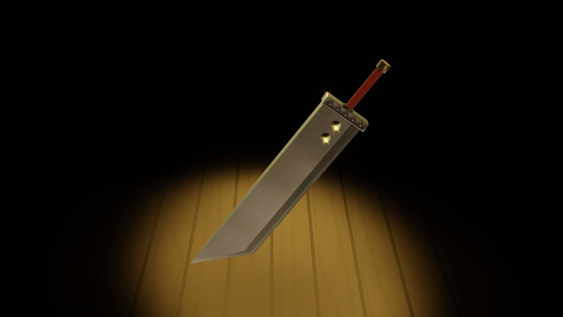
Extra Credit

Attempted to get this done before the deadline but I ran out of time. I could have sworn there was a way to add a shadow after the fact in compositing but I couldn't find it.
![]() leverett Way to finish strong, Lee! And you even added Cloud's sword as a bonus - that's awesome. Though my Captain Falcon is all too familiar with this sword's devastating effects in smash bros ultimate....so forgive me if my bitterness negatively effects your grade.
leverett Way to finish strong, Lee! And you even added Cloud's sword as a bonus - that's awesome. Though my Captain Falcon is all too familiar with this sword's devastating effects in smash bros ultimate....so forgive me if my bitterness negatively effects your grade.
Overall your lighting and shading is good and effective at presenting your swords well. I like the sparkly blooms of the metal, the wear and tear on the edges, and the fact that your metals feel like metal.
I couldn't replicate Kent's results, not sure where I went wrong along the way.
To me it looks like the darkening and lightening of the leather is a little too consistent, resulting in a stripy pattern more than a more varied worn-leather pattern. Honestly it's not that far off from mine 👌
I could have sworn there was a way to add a shadow after the fact in compositing but I couldn't find it.
I'm not aware of a way to generate a shadow from compositing nodes after rendering. You'd need to setup a shadow pass that would simply separate the shadows into their own layer during rendering. But I don't think Eevee supports that yet - Pretty sure it's Cycles only right now.
For the quality of your final result and the extra credit sword surprise, you've earned an A+ this week Lee 👏
@theluthier
Though my Captain Falcon is all too familiar with this sword's devastating effects in smash bros ultimate....so forgive me if my bitterness negatively effects your grade.
That's all right..... I've been falcon punched off of stages for a long time now so I can understand your resentment.
I'm not aware of a way to generate a shadow from compositing nodes after rendering. You'd need to setup a shadow pass that would simply separate the shadows into their own layer during rendering. But I don't think Eevee supports that yet - Pretty sure it's Cycles only right now.
That's probably what I'm thinking of. I'll have to revisit it someday with cycles or when it gets added to Eevee.
For the quality of your final result and the extra credit sword surprise, you've earned an A+ this week Lee 👏
Thank you! I learned a lot and I'm looking forward to keep going with it.