Hi everyone,
As I never really introduced myself before, I figured now was the time.
I always wanted to do something with 3D since I saw Lord of the Rings in theater...18 YEARS AGO? Time goes fast. When I was younger I did some art school, and left that pretty fast. Did some 3D, 1 semester or so. Family and money got in the way, so ended up in a Computer Science school, which I didn't like much. (I come from Canada so colleges are generally pretty cheap).
Time travel to now. Moved to a different country, speaking another language, married, and trying to get back into what I really wanted to do to begin with. 3D.
I started learning Blender this year and have been making my way through the modelling flow.
------
For the project, I decided to go with the sword. And because I have a lot of free time, I decided to find a more ornate sword online. I present to you the barbarian sword Warmonger! "ooOOOh!"
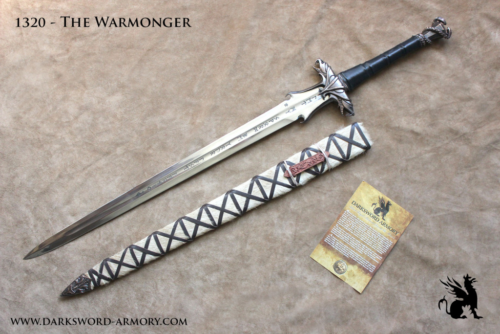
Week 1

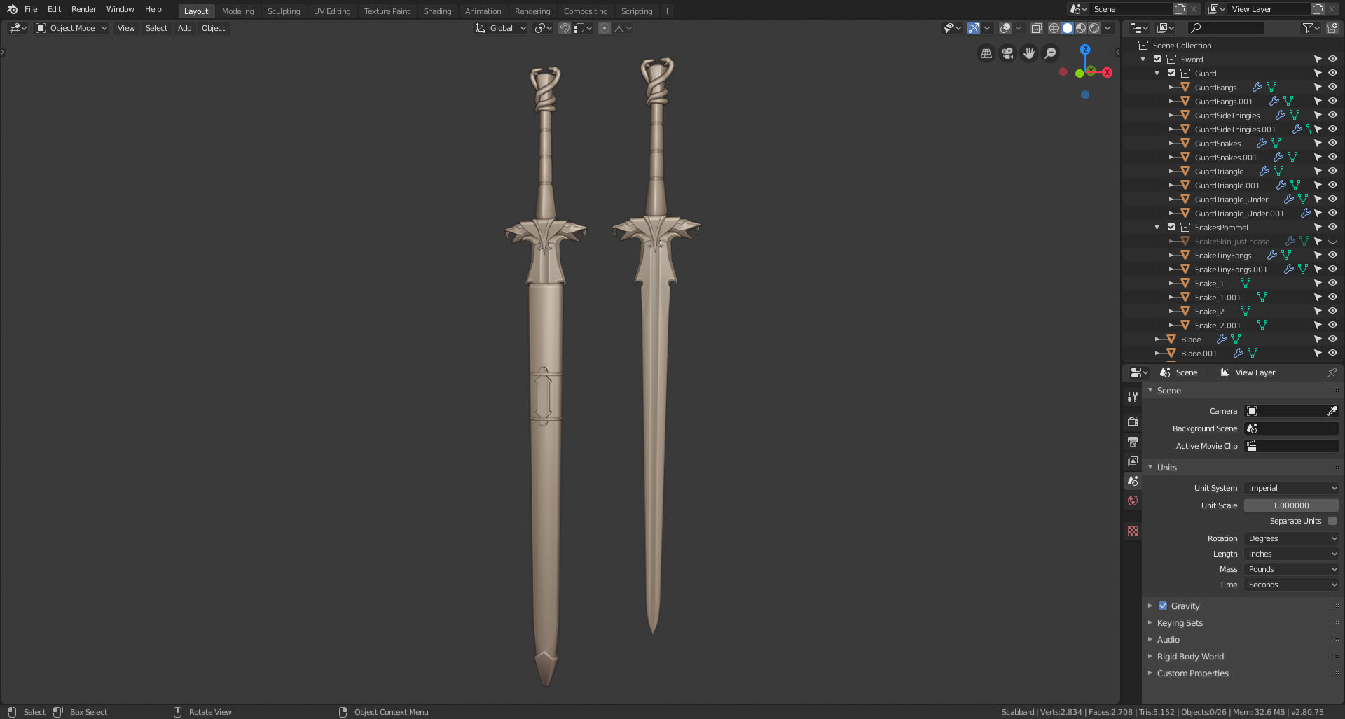
Week 2
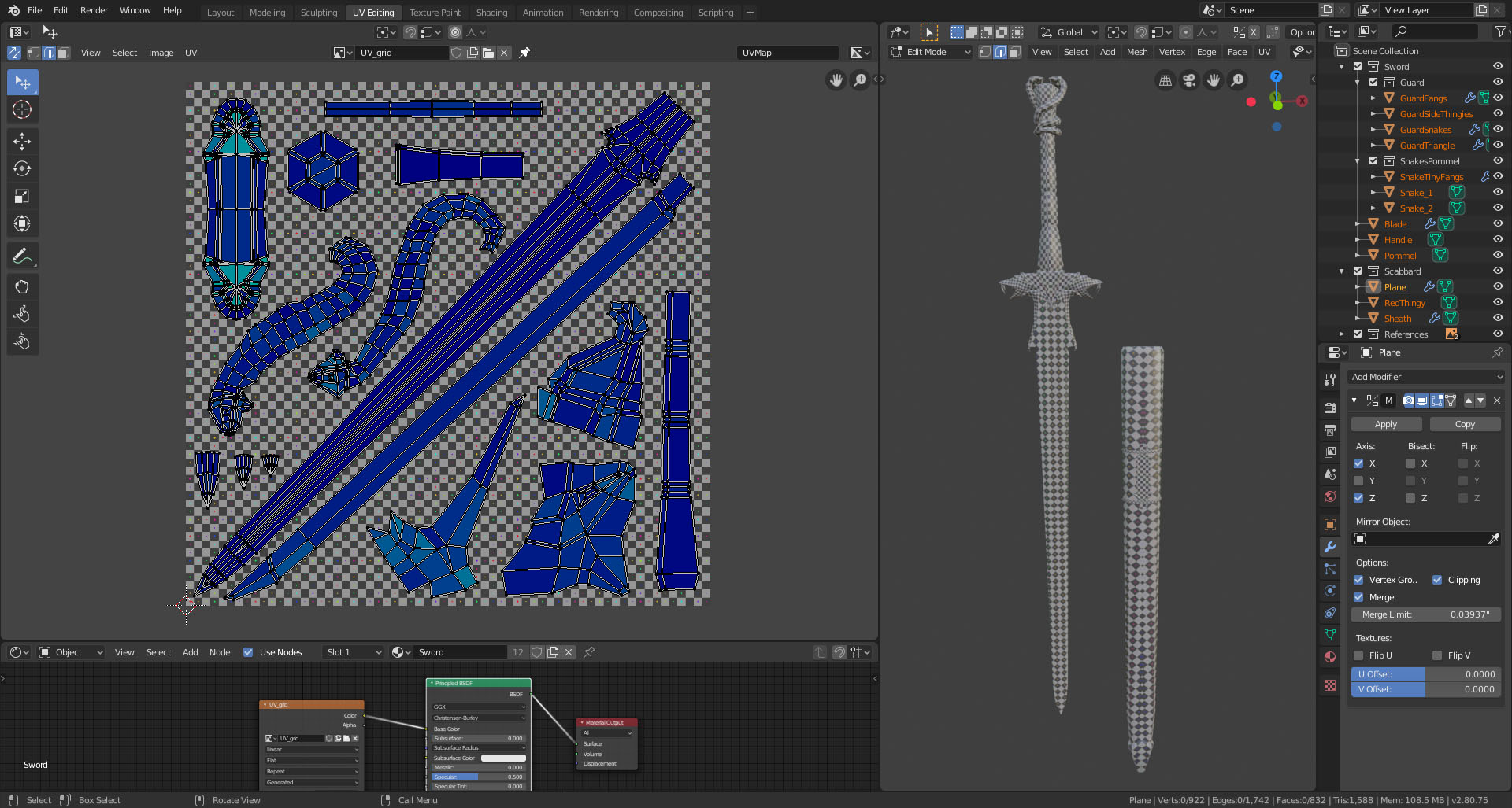
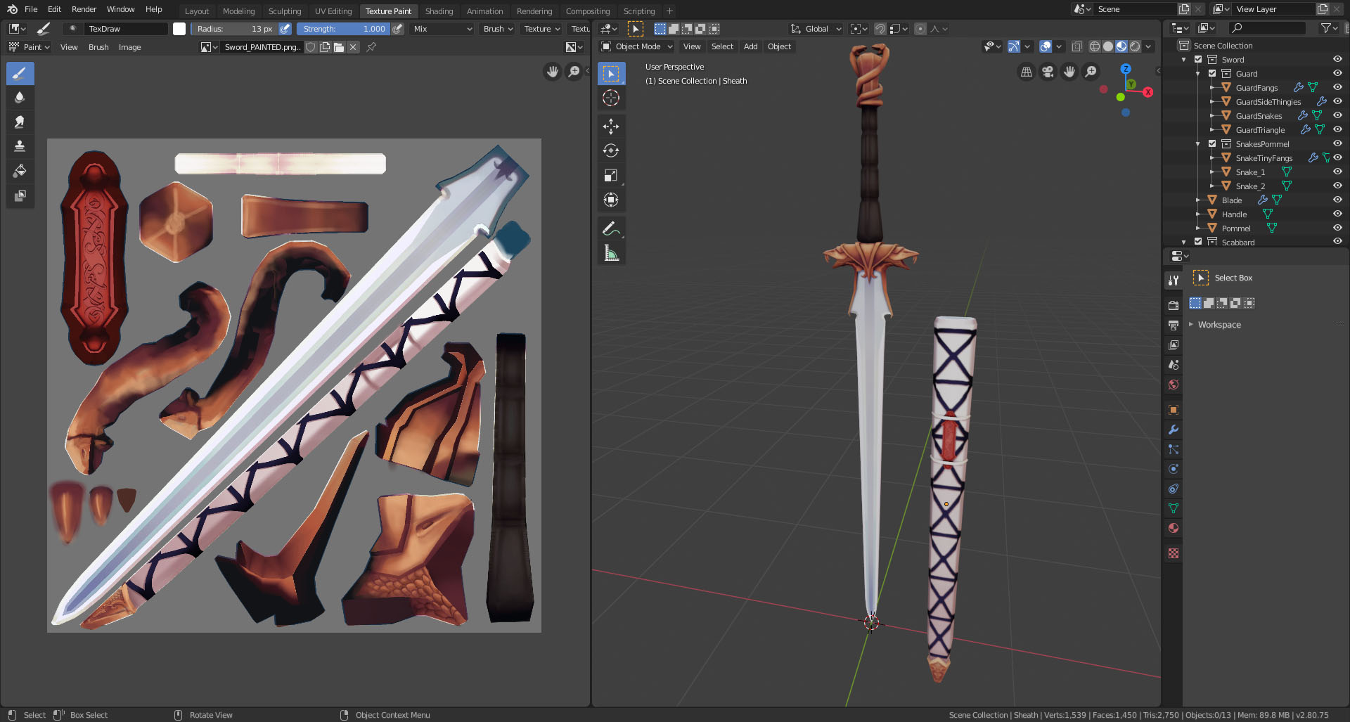
Week 3
I'm moving this week/weekend so I had to finish it today. It's really not where I wanted it to be, but for a first time at hand painting I'm happy with it.
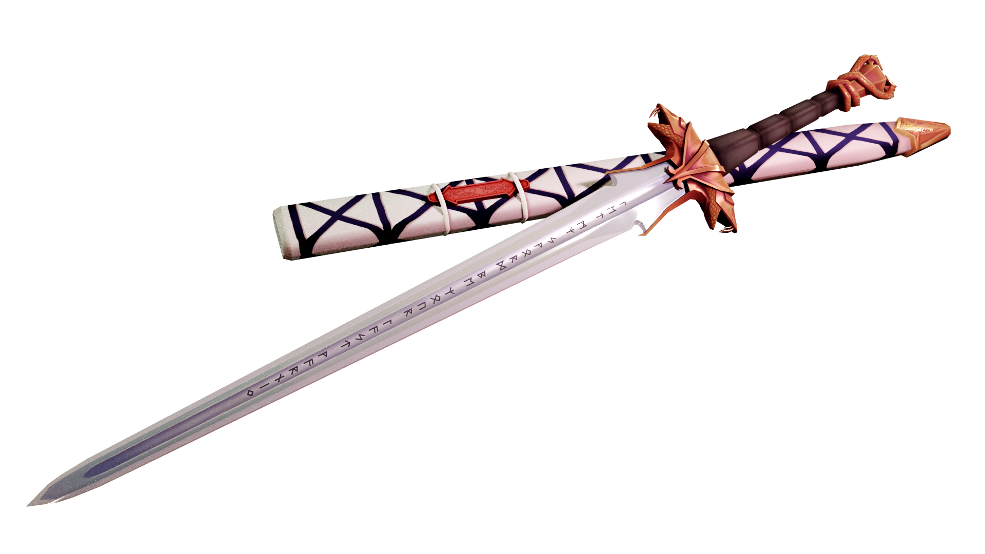
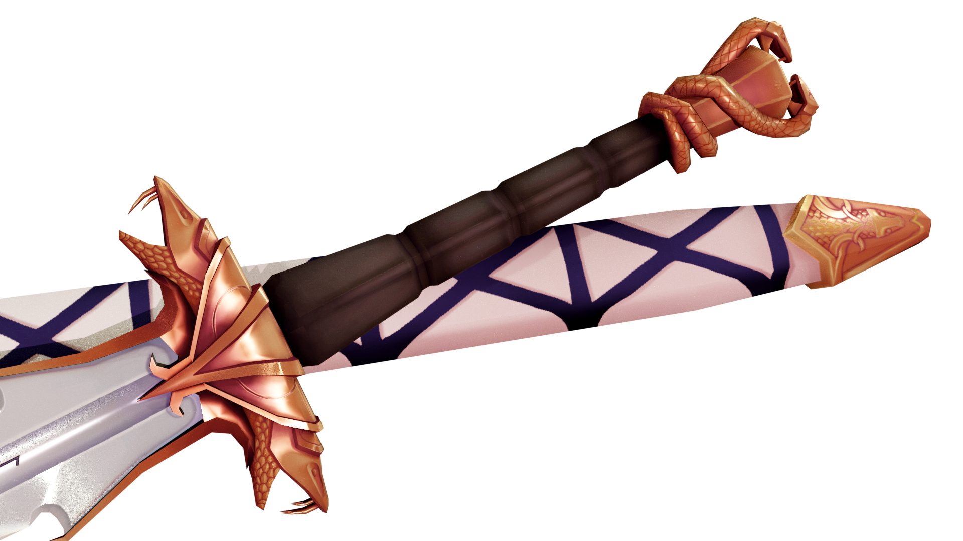
Great Pick. Do what you like is not possible every time, but the best choice!
Keep doing!
That is sooo beautiful!
I guess you'll be needing a lot of your free time for this one; very challenging. Good luck!
Thank you for sharing a bit of your story! Wow is LotR really 18 years old...Those movies got me way into bow and arrows. I made custom ones out of PVC pipe by melting strategic points along the pipe to curve it into [elven] shapes. Haha good times.
I really like your sword choice. To me it's an example of well-designed detail that isolated and balanced. Not overly detailed nor overly simple but a perfect balance of both. Looking forward to seeing your model!
The sword certainly looks ripe for a stylized, hand painted look if you're going for that.
I watched the extended versions of the original trilogy a couple of weeks ago and I'd be lying if I were to say making a LotR themed character didn't cross my mind :D
So this is what it looks like so far! Still need to model some designs on the guard, but I think I'll keep the more refined details for the textures, and try a more hand-painted process.
I like how they added the small hooks to catch the blade. Wouldn't want your beautiful bronze snake guard to lose a head.

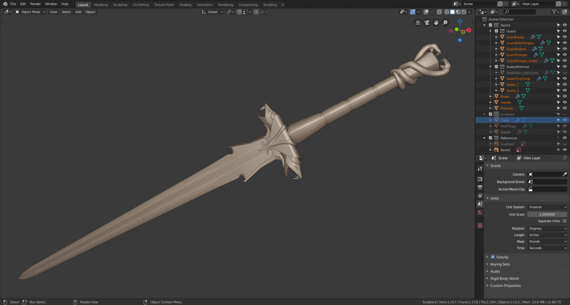
I also went a bit too far and translated the runes on the blade.
"Let my sword be your last warning"
aamyeha This looks really good already! I love the design of the sword you chose
Very cool! I love the snakes on the handle, I haven't seen them in the template :)
This is where I'm at with the UVs. I tried to stack the repeating forms as much as possible. We'll see if I keep it this way or not as it'll limit me big time while painting.
I might also try to add some plane with alpha for the runes. I don't know if I'll have enough density for them on the texture as it is. Anyone knows if that'd work?

aamyeha I'd start by making a small test with some text. Doesn't matter what font you use, or what it's saying, doesn't even need an alpha, just an image of some text (You can make some text in a new scene, make the camera orthographic and clear it's rotation and location, by pressing ALT-R and ALT-G, raise the camera a bit on the Z-axis, so that you can see the text through the camera. Remove all lights from the scene and set the strength of the Environment to 0. Give the text an Emission Shader, pure white and render).
Now put that on the sword to see how it looks. (Pixelated?)
If necessary, double the resolution of your Texture. When you first paint your Texture and then try to put on the runes, you might end up having to paint all over.....
aamyeha Really liked to read your story and it is a very beautiful model, good luck in both life and 3D
aamyeha This turned out wonderfully! Lovely details, perfectly executed. I have one note to offer: The handle seems a little long to me. Imagining 2 hands gripping it makes the sword a fairly short one. Though perhaps that is your intention in which case please ignore the note. But if you intended this sword to be long, I'd recommend shortening the length of the handle.
Regardless, you've definitely earned an A this week! I'm looking forward to seeing this textured and shaded 👍
aamyeha It looks like in your unwrap that maybe some of the items didn't have their scale applied before unwrapping, so the density is off in some places, which could partly explain some of the teal/green bits in your unwrap. Other than that, it looks good so far.
I'm trying at a more hand-painted style. It's a lot harder than I thought lol.
Didn't have enough time this weekend to work on it, so this is all I have to show for last week. Still a LOT of painting to do. I'll try to pick up the pace, but we're moving this week so we'll see how far I get.
