As Kent mentionned during the stream "low poly" is not about a number but more about the modeling technique and style.
I'm pretty sure the chest of the course can be considered low poly and has a much higher vertices count than that.
It could be considered low poly, but I can see ways for it to be improved. Kent definitely has it covered with the better edge flow. Remember: surround your important edges with edge loops and think about how you want the edgeflow to go. Perhaps a good thing to keep in mind is only adding an edge loop if you absolutely have to for better form. Maybe that'll help you to think in a very minimal way. Give it a shot, see what happens. Good effort so far.
If you want to go for low-poly, consider not using a Subsurf Modifier, but Smooth Shading, with Sharp Edges where needed and Auto smooth turned on. Together with Kent's suggestion of edge flow, you could get a good result with very sparse topology.
To reiterate what's been said here, if you're going for low poly a Subsurf modifier is probably best avoided. You can "remove" any subsurf you've applied by adding a decimate modifier and switching it to un-subdivide. It's not perfect by any means and won't bring your model 100% back to its original base but it will definitely get it lower poly if that's what you're looking for.
Hey,
thanks to all of you, I appreciate your answers. I'll clean than up how @theluthier mentioned it.
Just to get the rumors out, I haven't used subsurf, I produced that pile of vertices by starting out with a plane and extruding it. I should've known better, but somehow my brain just can't use what I've learned about good topology :D
Update:
Dang it, I've lost the roundness of that blade. Has somebody an advice about rounding it up, without creating more loopcuts? (Shade smooth and autosmmoth are both turned on)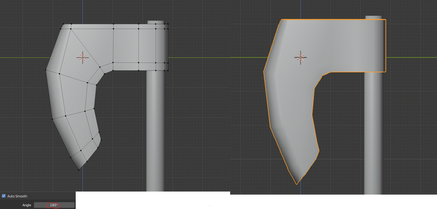
Cheers
tobles
ttobles You will need at least two more edgeloops like so for instance:
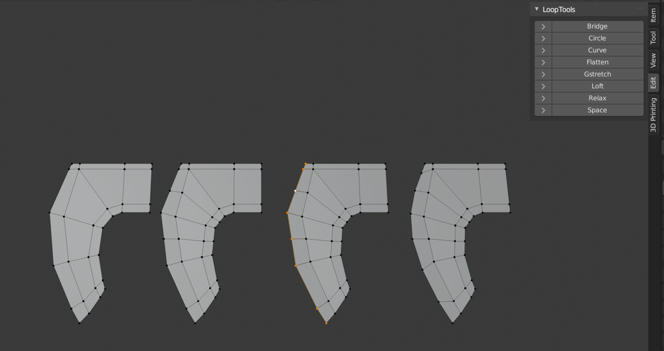
Then select the blade edge and (make sure you have Looptools addon enabled!) Looptools > relax.
(Right click for the specials menu, or if you use right click select, W)
Looptools can also be found in the N-Panel under Edit.
Spikey already pointed you in the right direction 👍
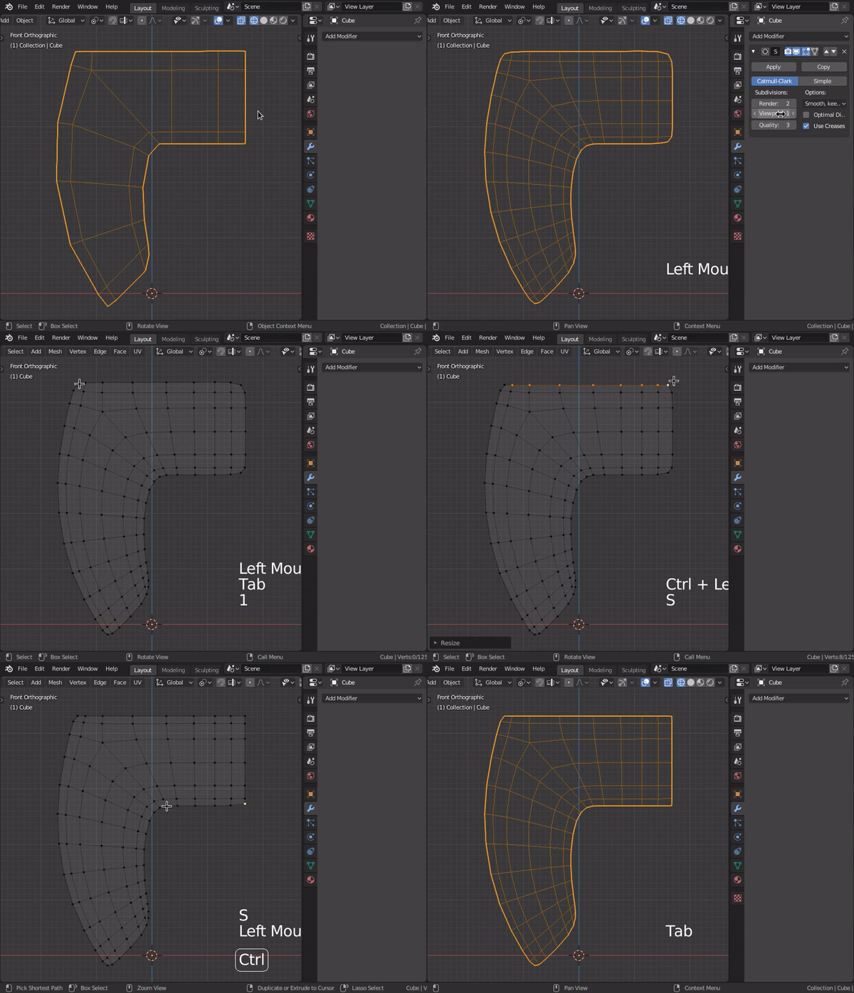
Here's a couple other tips: First you can use the "percentage" mode of the bevel tool to smooth out your low poly curve shapes easily:
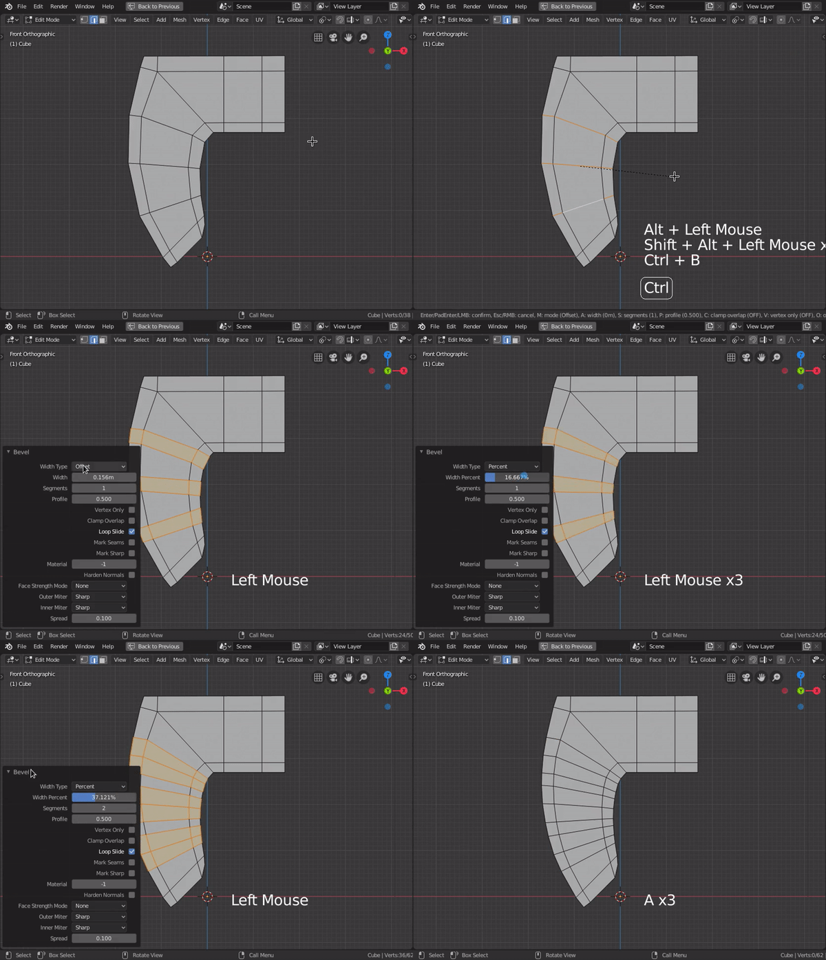
Second, you can use a subdivison surface modifier to smooth the whole mesh and then apply it. It still counts as low-poly since the smoothed version becomes the new base mesh:
Anyhoo, you're progressing very well. Keep up the good work!
Moin moin,
here is my actual progress: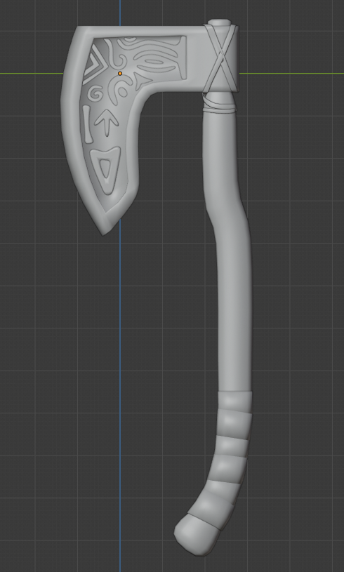
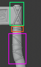
I redid the ornaments, added some straps and reshaped the shaft... for ergonimical head-splitting I guess :D
If someone would be so nice and have a look the lower wrappings for the grip. They look strange to me but I can't figure out why and how to change it.
When submitting for week 1, do we post a screenshot or some rendered stuff?
Greetings,
tobles
ttobles Looks good! Some strange shading artefact at the bottom of the axe head...
The lower wrappings do look a bit strange, but imagine them textured; I think that will solve the problem (at least I hope so!).
As for submitting week 1, a screenshot is perfectly fine, seeing that we haven't done any texturing and shading yet....
ttobles I think the size is fine visually, however if I think about the sort of functionality of using that axe there's the wrapped portion of the handle where you would hold it when you wanted to really chop something and get a large amount of force behind the swing, but when you wanted to use it for finer more precise chopping work your hand would be up around the section you added the fasteners to which could feel uncomfortable in the hand.
Looking at various reference images online, a lot of other hand axes that incorporate pins to help fix the head to the handle do so by drilling through the head directly. If you wanted some elements visually where the fastners are, maybe consider extending the cord or wrapping you already have there, or repeating the wrap you have near the bottom of the handle near the top.
Maybe something like this.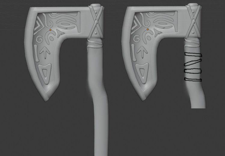
Homework Submission Week 1
For this week, my goal was to model an axe with barbaric/viking/germanic style. I therefore put some runes in an inset on the blade and added some leather straps around the axe head and the shaft. I decided not to add any dings, dongs or scratches to the axe since I want it in a pristine state.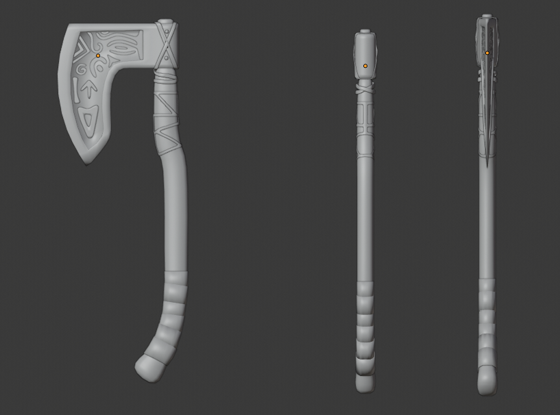 In case of grading, I can provide the blend-file if needed.
Cheers,
tobles
ttobles This turned out nice! I'm getting some God of War 4 vibes. Makes sense, since they're both about Celtci/Norse gods. Good effort!
ttobles Your axe turned out great! It makes me want to watch The Patriot. I like the form, structure, and details. The only notes I have to offer involves the leather strap/cord wrapped around the handle + axehead:
