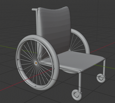
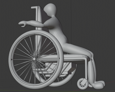
It's a bit late, but I decided to join in on the challenge. My idea is to have a rocket powered or hot rod wheel chair. Right now, I just have the base wheel chair in it's simplified state. I'm going to have there be a test dummy on the wheel chair and have different renders be tests they did with it.
I'm not sure if I'll be done by the due date, but I'll do what I can.


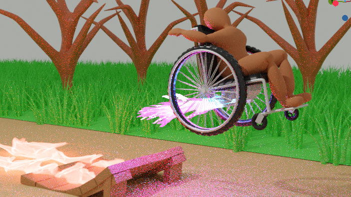
Man, I'm going to have to be wise with my time. I'm not having a lot of it right now. I'm going to do a few different engines on the wheel chair. I'll have a rocket thingy too. I'm going to get this first render done first though, because I don't know how much time I'll have.
@cgcookiedough The wheelchair model looks great , but I think your "test dummy" is very out of proportion and should be a lot bigger. I would google images of people sitting in wheelchairs. On yours , the back - which would usually sit level with the bottom of his neck at most, is almost higher than his head.
As for the fire, it looks good but would look better when its rendered properly. How have you made the fire? I would suggest that you look up some Blender smoke simulator tutorials as you can get some pretty neat fire and smoke simulations with it.
Keep up the good (and crazy) work :)

Does this look like it works? I was just messing around for a bit and decided to try low poly out.
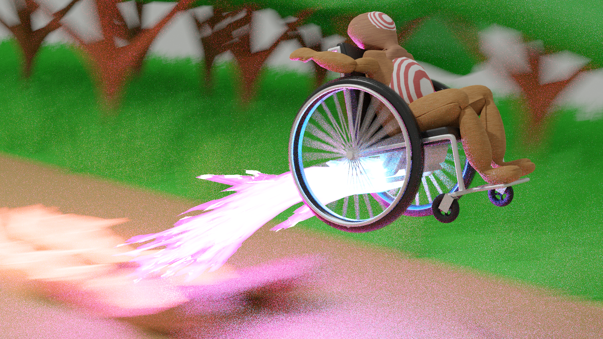
Also, I was wondering how to get motion blur to work.
@cgcookiedough yes that scale works better.
I'm pretty sure with motion blur, you have to animate the object to actually move , and then choose a frame to render out and check the motion blur checkbox in the render settings (sorry for being vague but I am still getting used to Blender 2.8 after using 2.79 for so many years and now so much has changed/moved)
Im pretty sure Kent covers motion blur in one of his older videos but I can't remember which one. Perhaps somebody else can remember, I think it is in one of the fundamentals courses but I cant be sure...

I think I got the dummy look down, though it looks kind of like wood instead of cloth. I'm not sure if the motion blur in the background is too much. In the final render, I will swap the red and white. I don't know why I didn't do that prior to doing this render.
@cgcookiedough I think the motion blur works really well. It draws focus to the action and it emphasizes the speed and ferocity that that poor dummy is experiencing.
If anything I would say I don't think you have quite nailed the test dummy feel yet , not with the colours I think go for some bright vibrant warning colours on all of his body