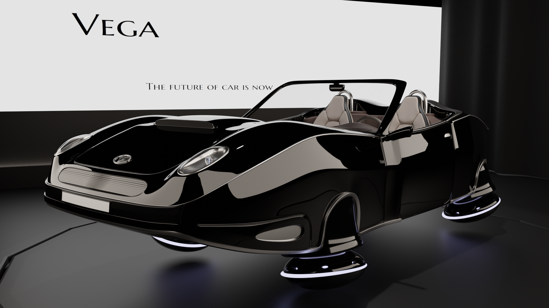
Hello there!
I decided to jump in this contest, even though I'm really a beginner. It will test what I actually learned from the first hard surface modeling tutorial.
After some hesitation, I decided to go for a futuristic Hover-Car.
Here's the starting blockout (that is still ongoing, of course).
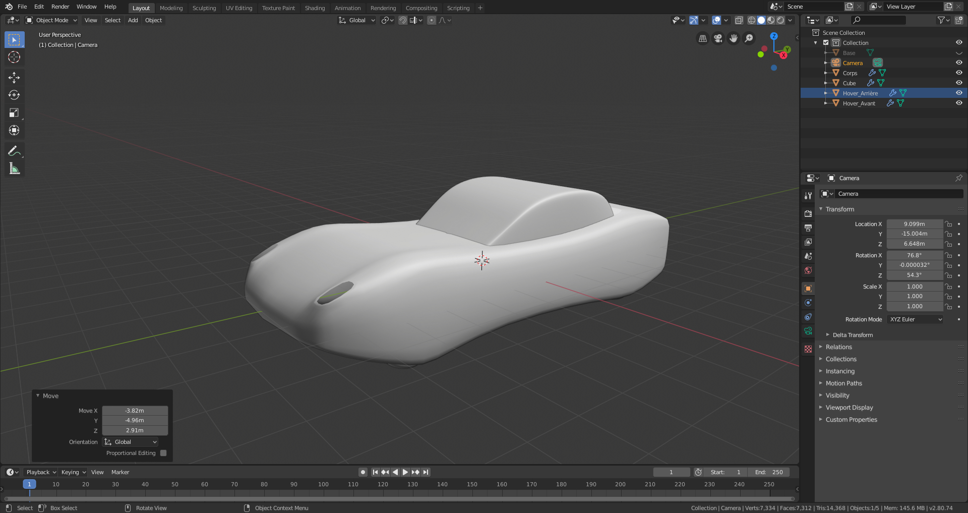
End of my "day 1".
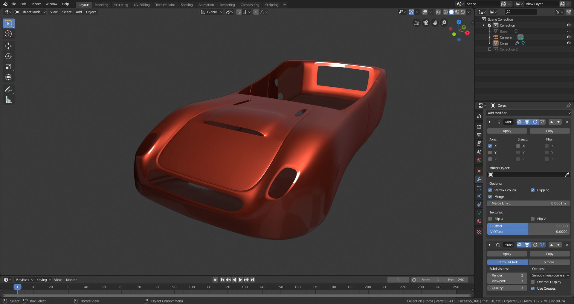
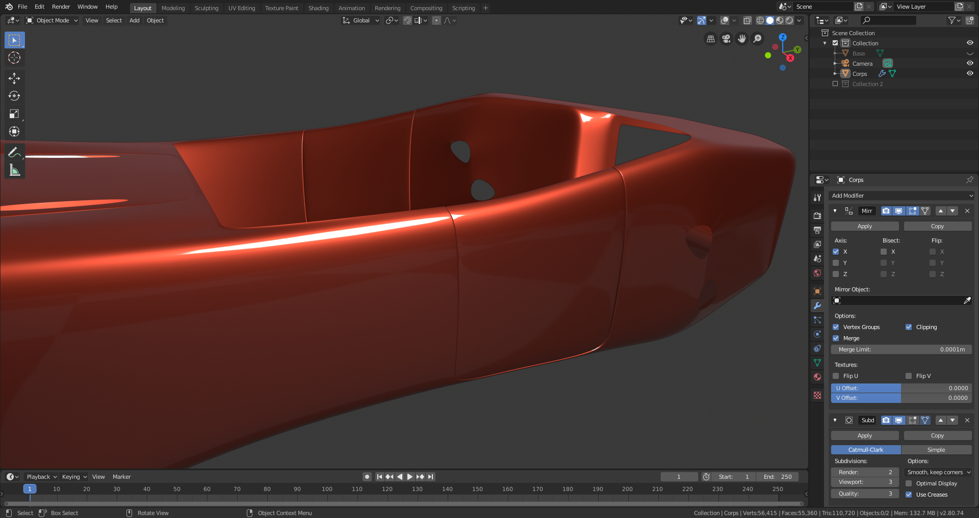
Been modeling most of the base body of the car. Still needs cleaning of the mesh. The topology is far from ideal but the messed up parts will be covered with other items.
![]() otowa looking good. and dont stress about topology too much, if its not going to be seen. no one will know, or care. if shading looks good, then its good. :)
otowa looking good. and dont stress about topology too much, if its not going to be seen. no one will know, or care. if shading looks good, then its good. :)
Some more progress today.
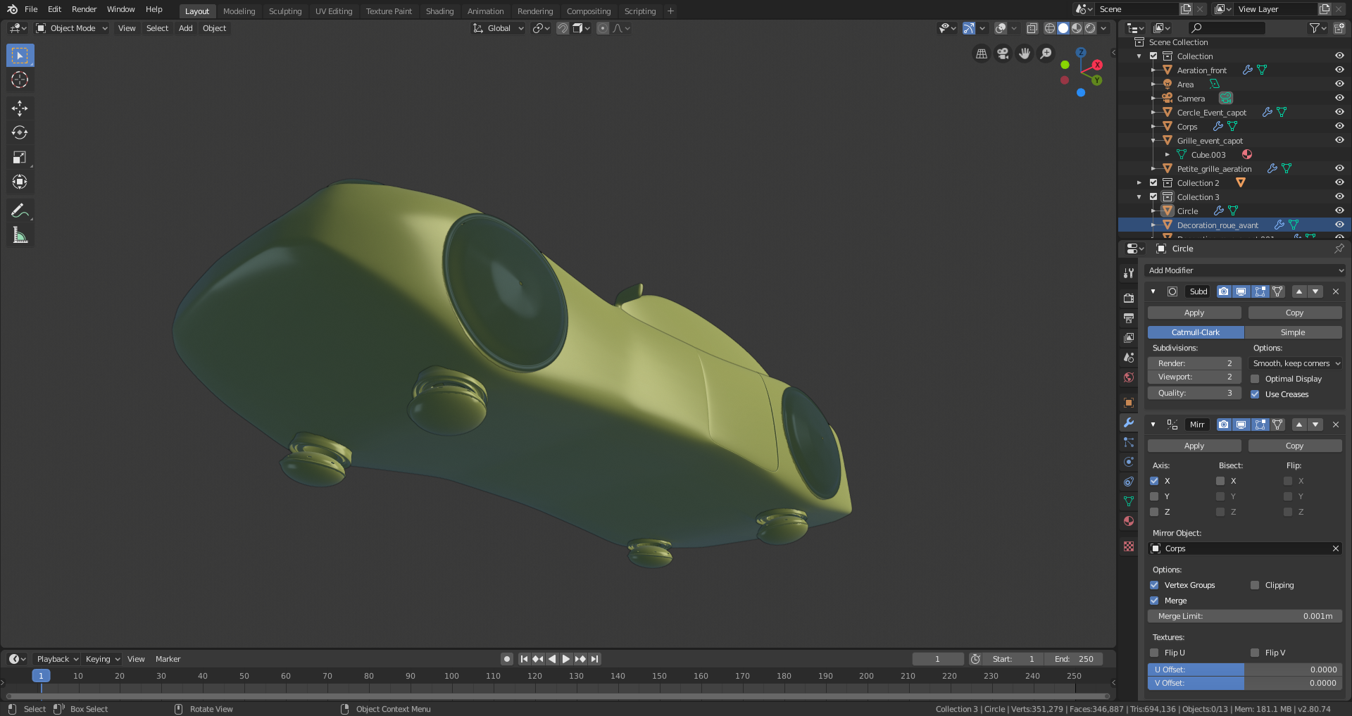
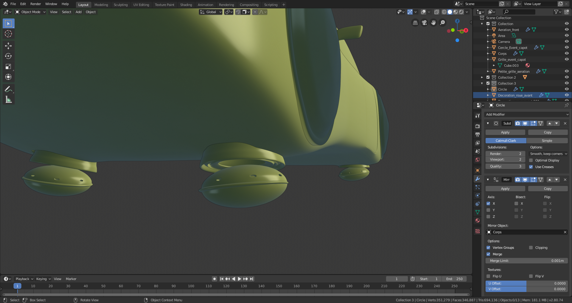
Started modeling the "Hovering wheels" and the side decorations, even though I'm still not sure where I'm going with these.
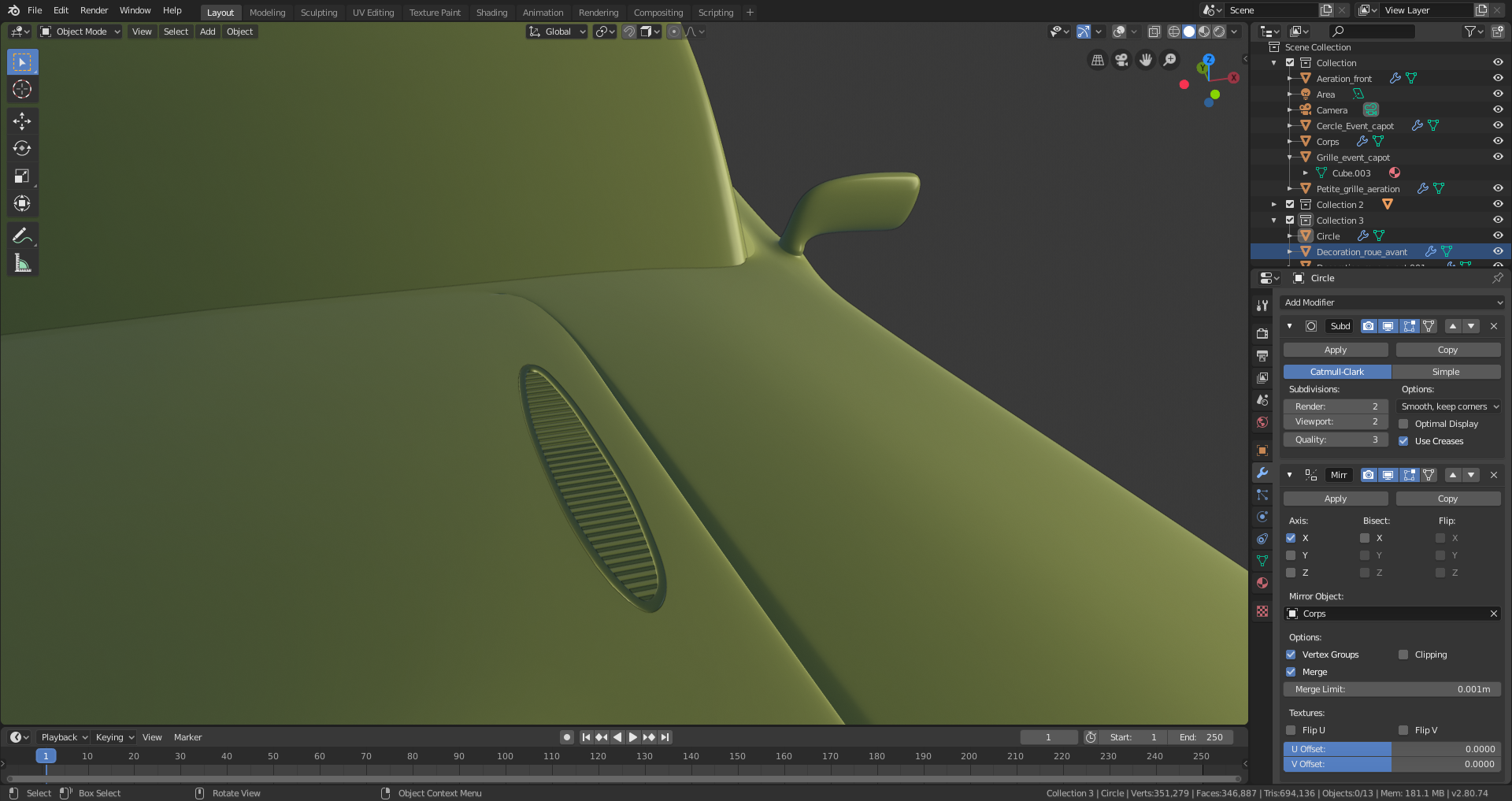
Added last aeration grids,rear mirrors and blocks for headlights.
![]() spikeyxxx Good suggestion, I'll see if it solves also my problem of : what do I do on the sides?
spikeyxxx Good suggestion, I'll see if it solves also my problem of : what do I do on the sides?
The last suggestion from spikey helped a lot, and helps defining more shapes for the car.
I also added some "chrome line", desperately trying to give more character to the car. 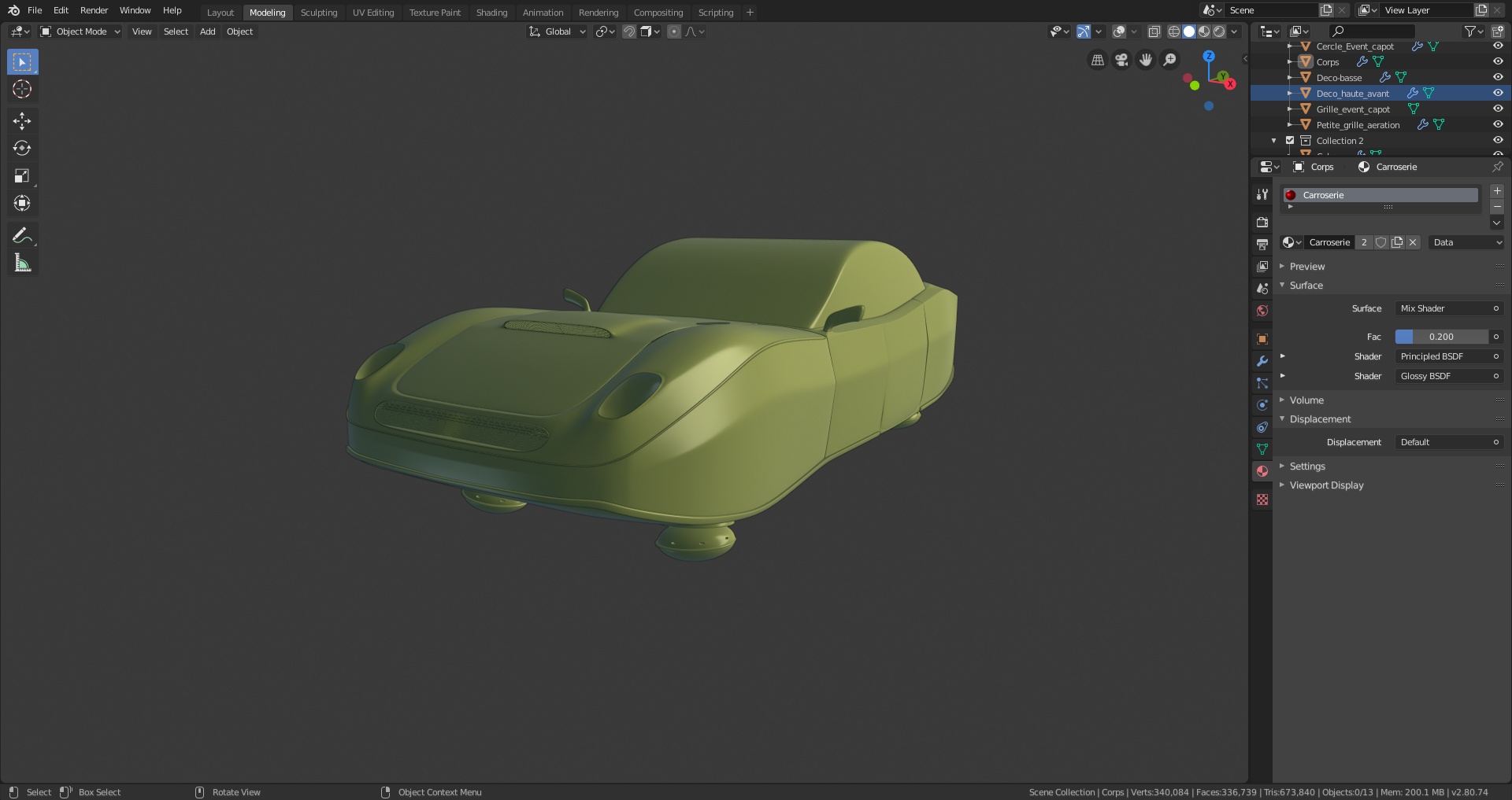
I think it's going somewhere... I don't know where but I'm curious to find out.
And I know it's way too early for that, but since I didn't feel like doing much more modeling this evening, I spent a few minutes messing around with shader...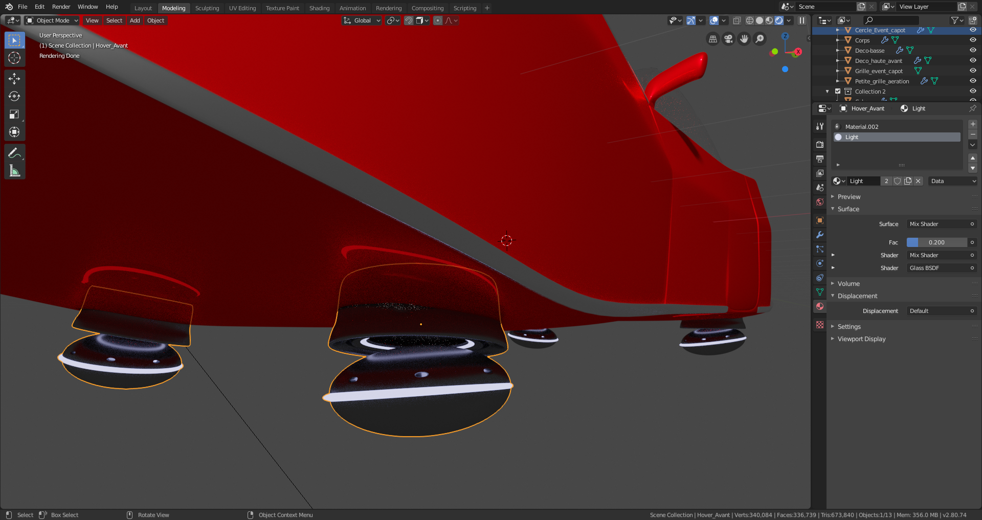
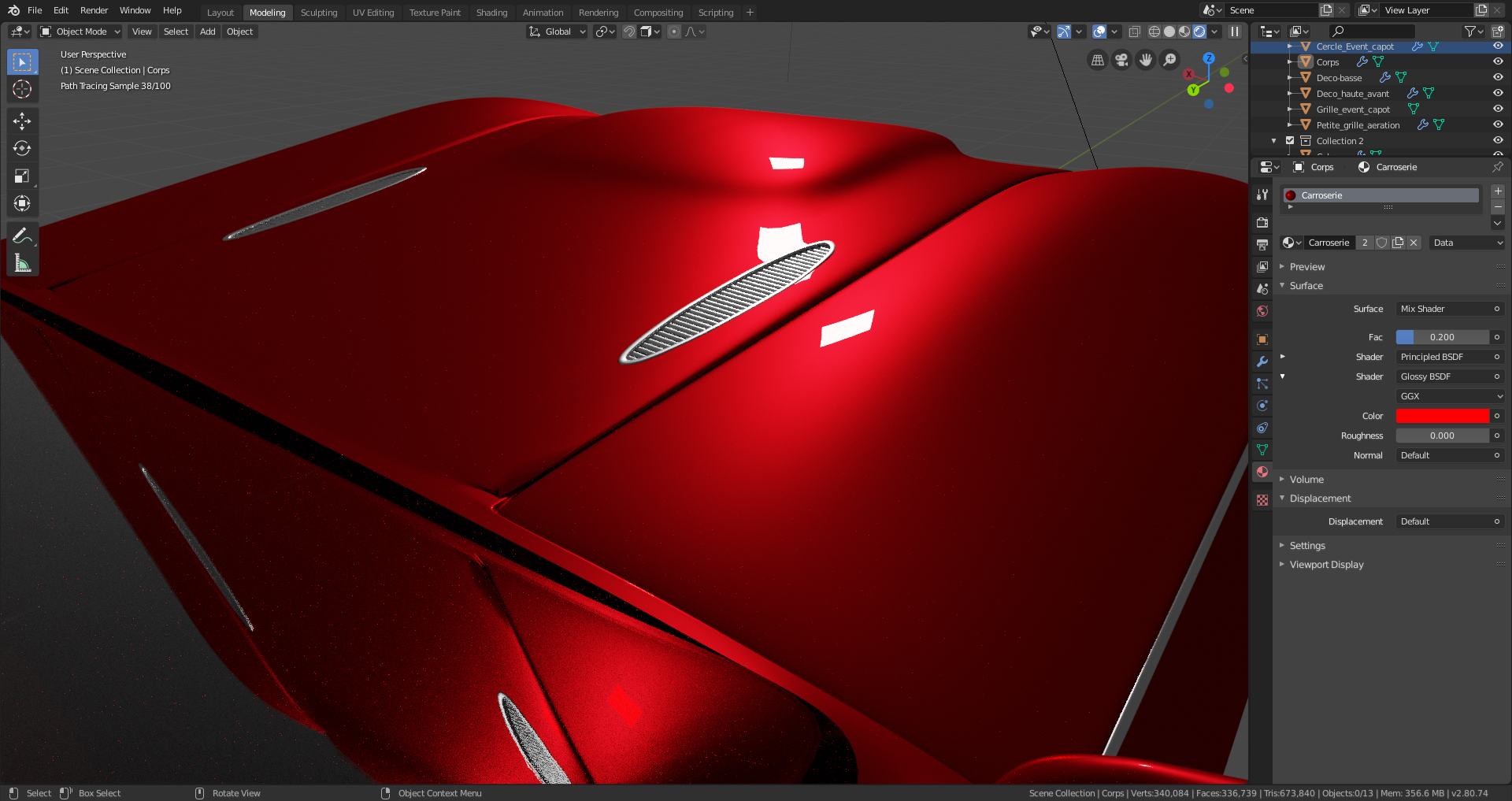
SO... It was not working. The thing is, if you remove wheels on a car, it looks like something is missing... Here is my current workaround to avoid having big pans of empty metal :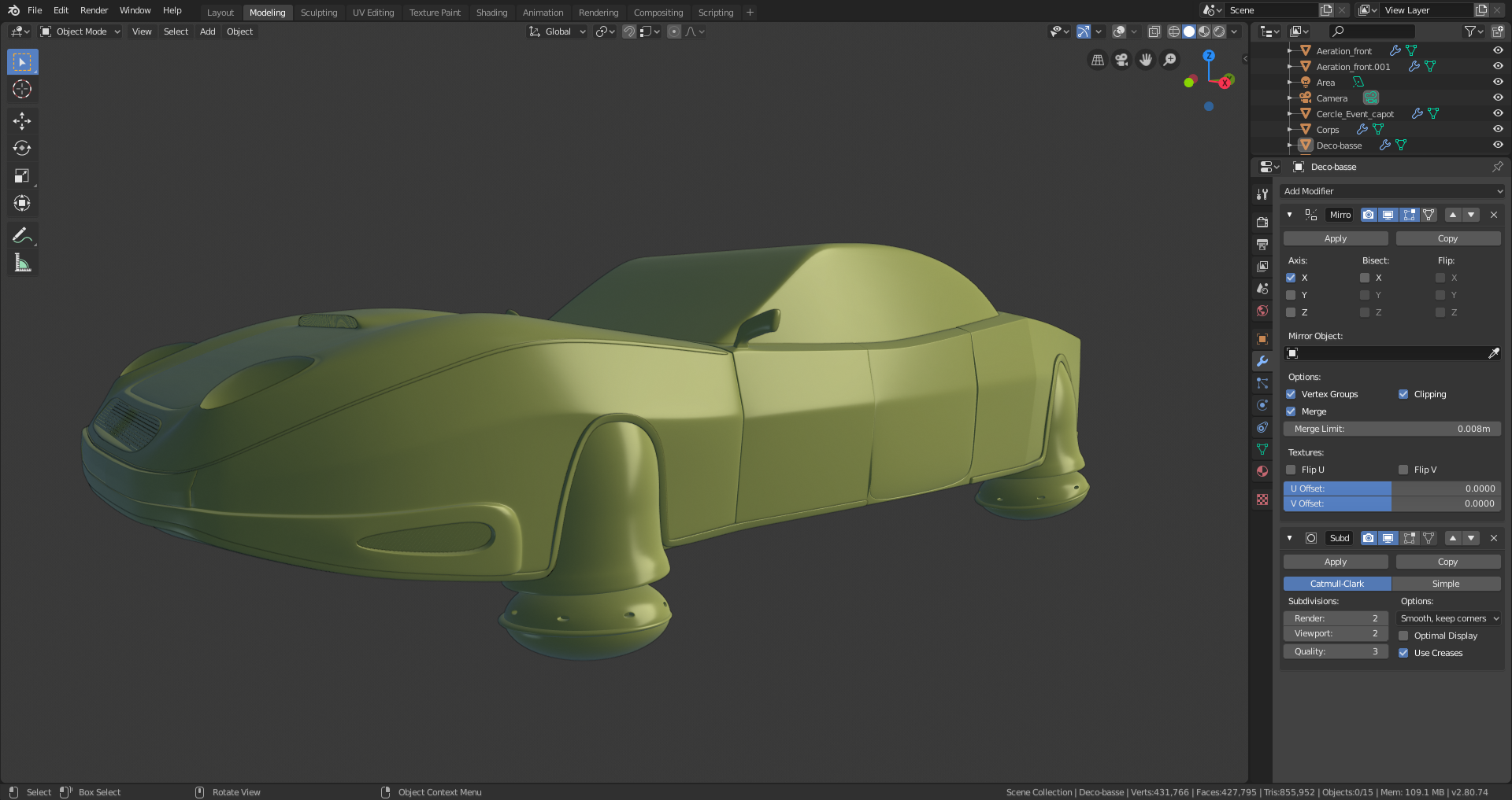
![]() otowa looking good, just a thought, maybe the wheel arc doesnt have to go so up? like half the size and make it more circular on top, instead now its more cone shapes. maybe just tad higher than the front bumper.
otowa looking good, just a thought, maybe the wheel arc doesnt have to go so up? like half the size and make it more circular on top, instead now its more cone shapes. maybe just tad higher than the front bumper.
After following Kaj good suggestion about the wheel arcs, and starting to work on how the windshield and interior should be, I came across a conclusion : my doors are completely misplaced compared to the car, and in a way, the interior compartiment is just way too big for a 2 seat car. So... I completely shrunk the rear size forward.
Oh and I also decided that it was going to be a convertible/cabriolet (I don't know which term is correct in english).
Now biggest part remaining are :
-Windshield
-The whole car interior
-The rear of the car, which was supposedly going to harbor a futuristic thrust motor, but I'm still unsure about this one...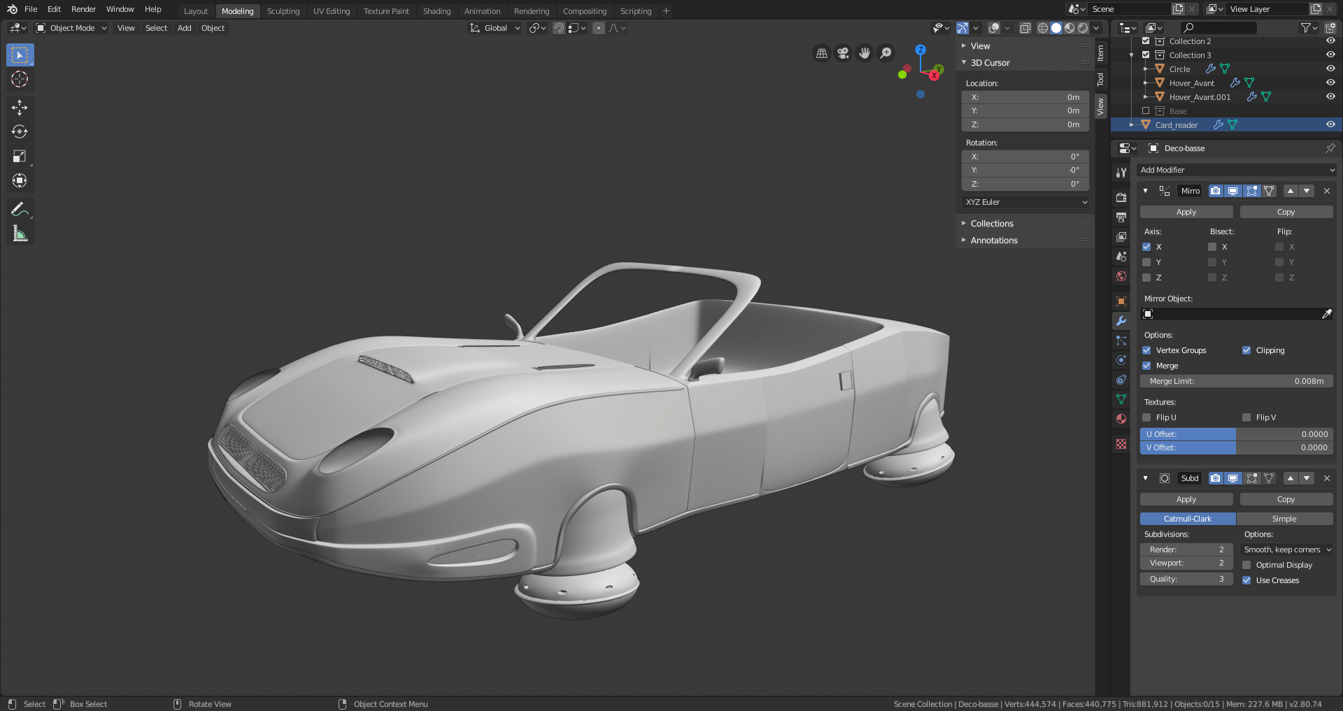
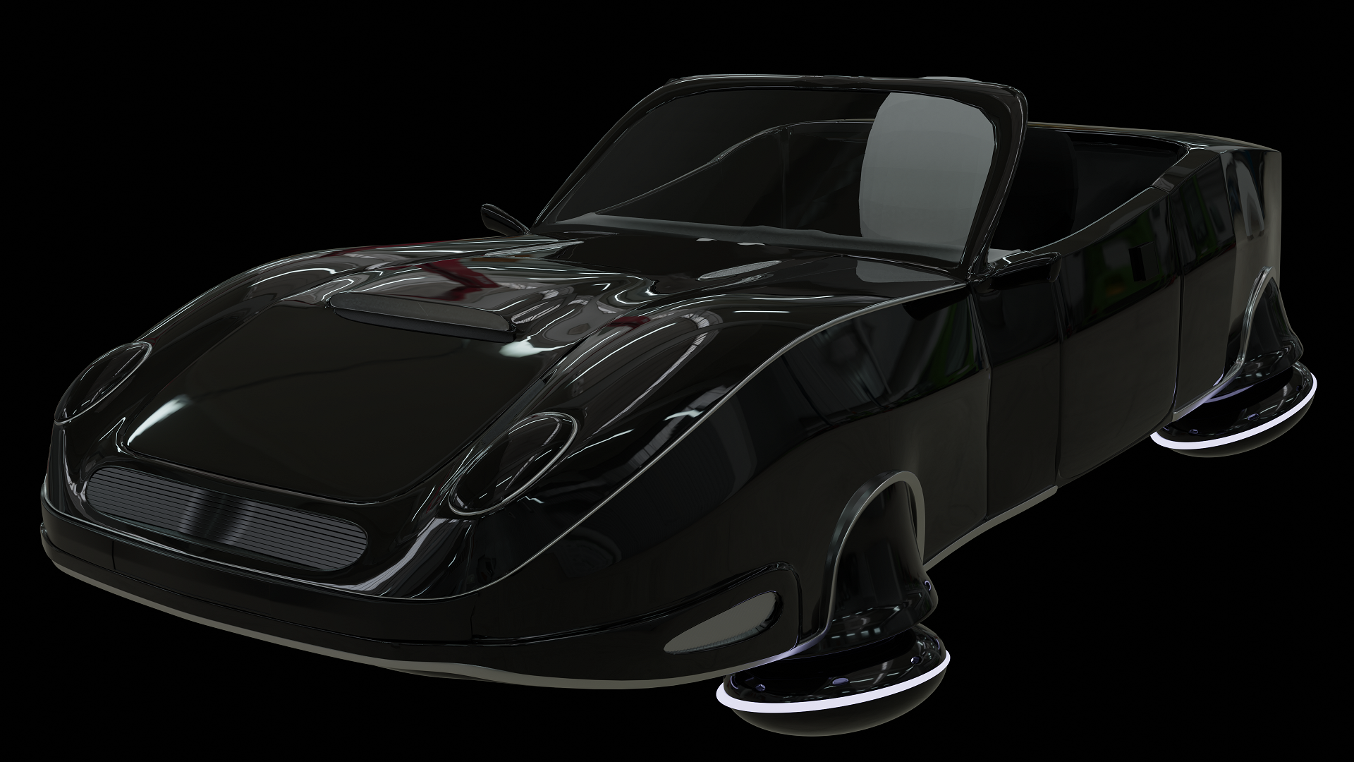
For whatever reason, I couldn't get myself to sit at my desk and work on the car interior... So I spent some time on shaders and HDRI...
And seeing how it turns out gives me some fresh motivation to go on...
![]() otowa You're definitely getting there!
otowa You're definitely getting there!
But don't you think that the door looks a bit too small? You're not modelling an existing car, so it's all up to you, but look at some car references.
Even if you'll just connect the vertices at the front of the door, that would already improve it, I think...
![]() spikeyxxx Yeah, one of my biggest mistake here has been to not rely on reference images for a lot of very basic shapes and size of things.
spikeyxxx Yeah, one of my biggest mistake here has been to not rely on reference images for a lot of very basic shapes and size of things.
I just looked into it, there are several problems:
-On a "regular" car (not cabriolet), the door include the rear mirror, and contains the window "holder" that comes and connect to the side of the wind shield and the roof.
-On a cabriolet, the rear mirror is also on the door, sometimes slightly backwards.
The thing is : everything is very messed up in terms of topology on my side as far as the rear mirror and the base of the wind shield are concerned.
Lesson learned : ALWAYS use reference image.
The only thing that is simple to do that I can do is to just get the front of the door a little closer to the front of the car :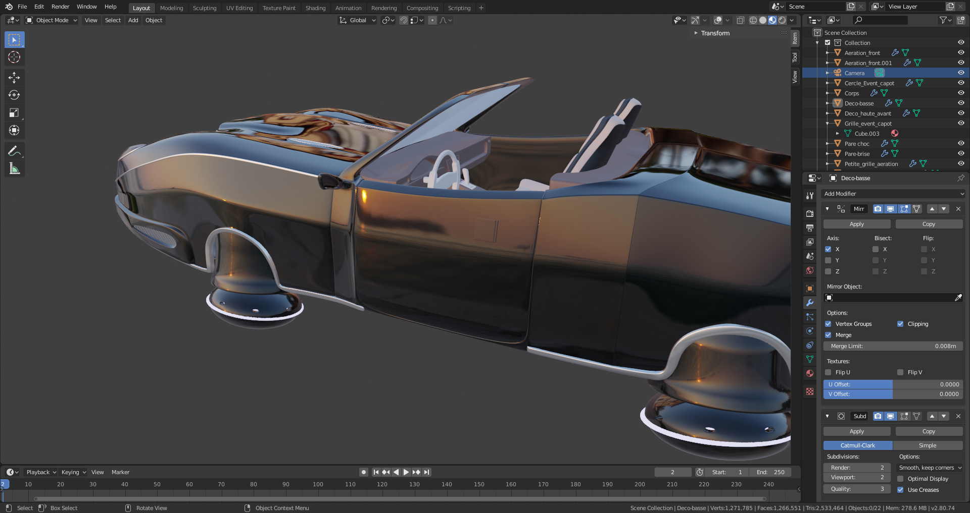
But trying to move the rear mirror now, or having to solve the whole windshield issue if I try to pull the door more in front is not really feasible for me now.
![]() otowa Already better as proportions go!
otowa Already better as proportions go!
As for the rear view mirror, I would make it a separate object ( as it would be in real life), then you can place it wherever you like without messing up other topology.
But time is an issue here, so: if it can't be fixed, leave it. At least you'll have learned a lot and do things differently next time!
Keep it up! Cars are very difficult and you're doing really well.
Didn't feel like modeling the rest of the car today, so I started thinking about the scene...
So the HDRI is gone, and I need to find the best way to light everything in the current configuration.
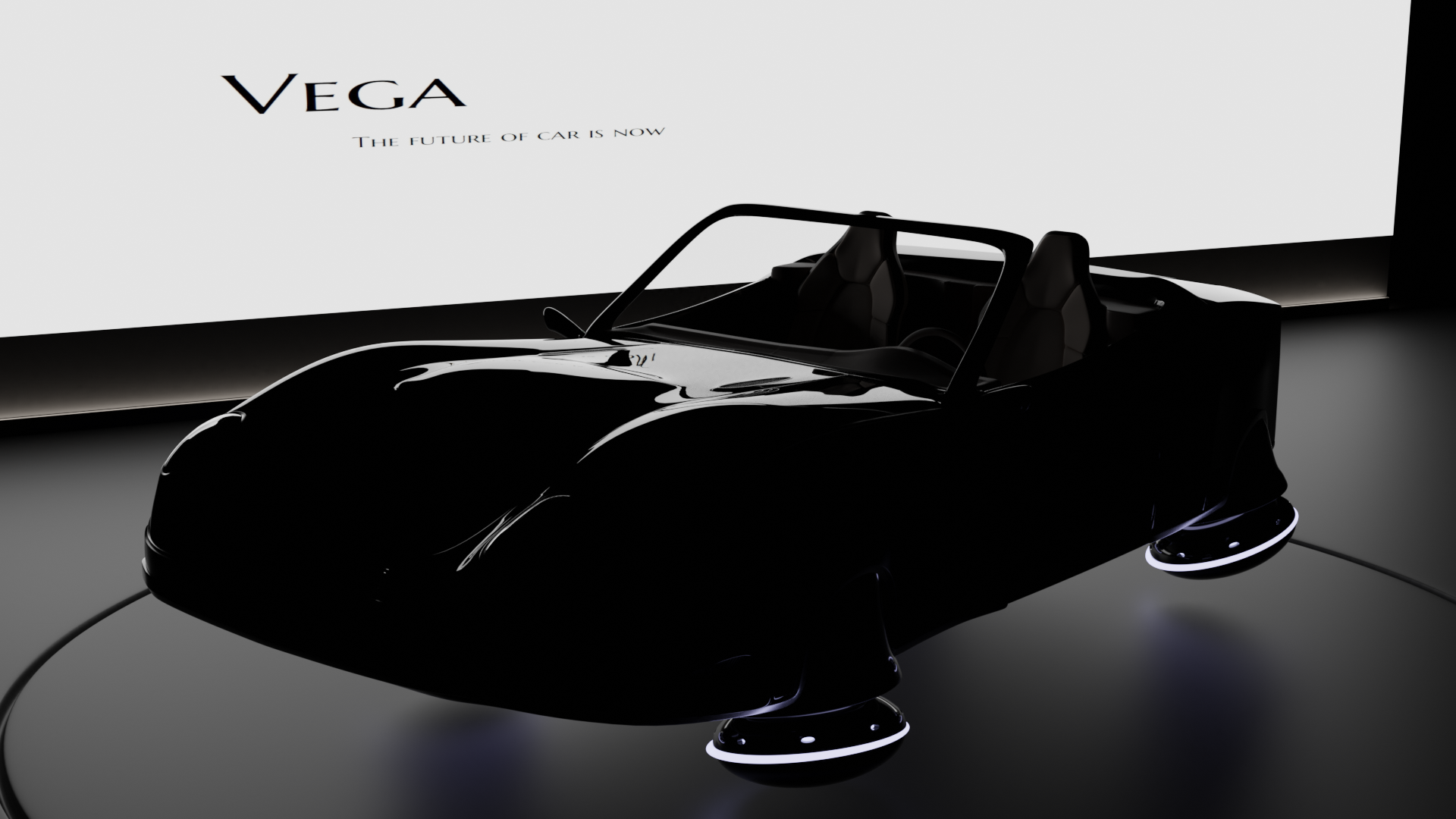
Even though I already posted for Live Critique submission earlier, I already changed a few things :
-Added windshield rearview mirror
-Changed the shape of the car behind the seats
-Started working on the headlights
-Added chrome bars on the back part of the car
-Changed the shader of the car hood grid to reflect less light.
-Changed the camera position (lighting will have to be adjusted later accordingly)
