For my project, I'm going to have:
I had this idea a while back. haha, even before I knew about Eevee. Originally, I was thinking to just have it say, "It's time to go"
I'm going to try to give Suzanne a body. I might have it be kind of like a stick figure with just a bit more volume.
After about 2 hours of modeling and finding out what the keyboard shortcuts got changed to, I got this: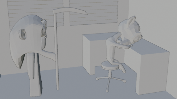 Let me know now if there's anything you think I should change about this. If anything looks disproportionate, let me know, because I'm not good at spotting that stuff right now.
Basic color information
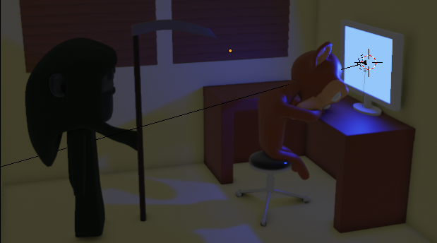
I'm going to have it be rendering something on the screen.
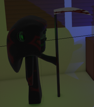
I think it looks Grimm enough... maybe the blood on the scythe is a bit might though.
@cgcookiedough I really like where this is going!
I would definitely keep the blood on the scythe, but maybe make it more vertical, like it's dripping down.
Also, and this is just me, thinking, if you could, somehow get the 'reaper Suzanne' a bit closer to the 'sleeping Suzanne'. it would gain in drama, but maybe that is not what you want...
Anyway, good work!
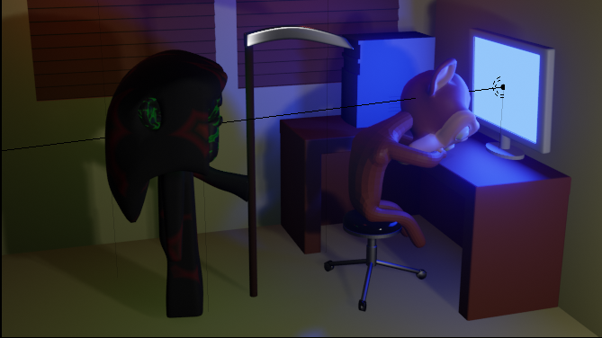
Do anyone think I should change the pose of the "sleeping" monkey? If not, I'm going to apply the modifiers.
@cgcookiedough I think that the position of her right arm is a bit weird. Why is it wrapped around her chin? Also, the scythe looks kind of soft, as if it were mde of steel-colored butter. Maybe making it thinner would help?
@cgcookiedough Looks okay to me, but why would you apply modifiers? Never apply modifiers unless you really have to. A good idea anyway is to save this file and then save a next one where you can 'mess things up', ( I mean save this as Challenge1.blend and also as Challenge2.blend and then work on the second one), so you can always come back to the older version.
I hope this makes sense...
![]() williamatics I think it was because I didn't have good topology. How's this look?
williamatics I think it was because I didn't have good topology. How's this look?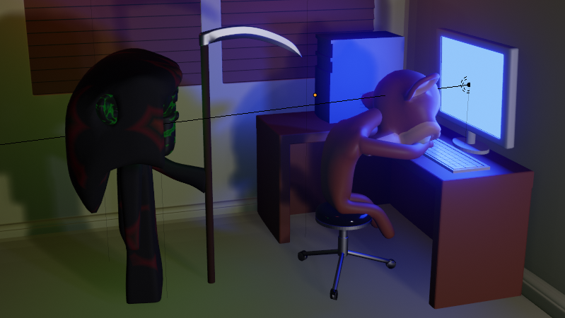
Oh and spikey, I can't shade smooth if I have the skin modifier on. I made a new collection for backup, then put it in there.
@cgcookiedough While the bad topology probably had something to do with it, I think the main reason it looks soft is because you didn't curve it well. The bend is too sharp and looks as if it sort of melted and is drooping down because of it's own weight.
![]() williamatics OH! Okay, I see what you're saying. So hows this look now?
williamatics OH! Okay, I see what you're saying. So hows this look now?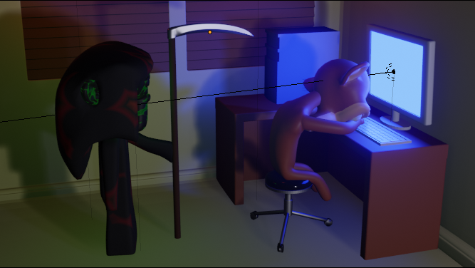
@cgcookiedough That's great! Now it looks like something that could actually cut me.
@cgcookiedough Maybe the image that is being rendered on the computer screen should be this whole image, thereby creating an infinite loop!
![]() williamatics I was thinking about that... but then it would be two infinite loop images, because of the hour glass I made.
williamatics I was thinking about that... but then it would be two infinite loop images, because of the hour glass I made.
@cgcookiedough Oh, I like it this way; Suzanne having fallen asleep, because the Cycles render takes 'forever', gives this image a real 'Eevee-promotion' character!
And in 2.80 the render happens in a new Image Editor window, which I have set to go Fullscreen, so this looks natural to me.