I'm kind of a shy person so I haven't shared any of my work online yet (except for cgc exercises and an unrelated model) but I've started to think it might be productive to share my humble models, textures and some 2d art.
Here's the sketchfab link to the unrelated model. I didn't spend much time on the design or modeling because my purpose was to get used to Substance Painter.
https://sketchfab.com/models/4994a423bb1440d0af2cb2f520fa9dee
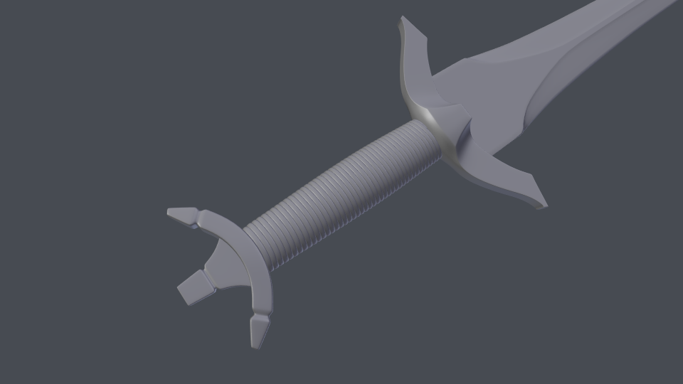
Here's two OpenGL renders of another sword that I made some time ago. The design and the modeling could have been better but I'm happy with the wrapped cord (it was my first time trying something like that).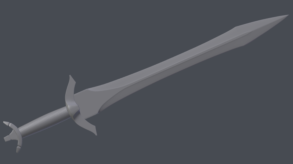
Since I decided to share my work, I started my first serious project (basically, I set a deadline :D). I will model, texture and render one of these swords (probably the second one from left) and give my best while doing all of it. If you can't tell already, I love swords and I have modeled a lot of them so far. I'm going to branch out a bit after this one.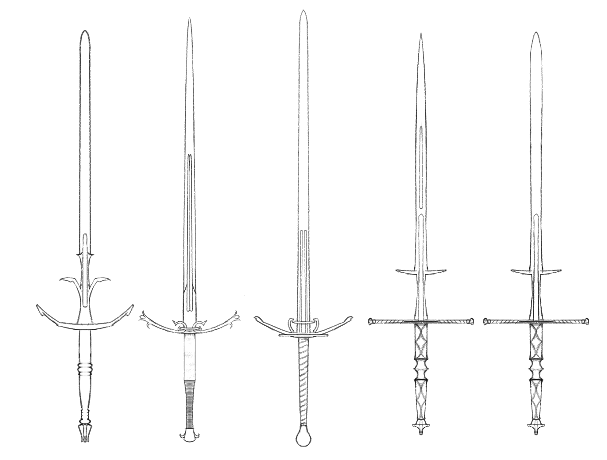
@drgnclw Taking the leap to share your personal work is a big step, so good for you for taking that step!
I haven't used Substance Painter, so this is going to be a light critique over the materials and some notes to improve it or future materials. I like that you added some surface scratches to the blade; it helps to break the too perfect CG effect. However, the scratches are too consistent. Try breaking it up into large and small scratches and vary their positions to help break up the larger scratches. Check this course out that talks about creating layers of detail, (this one's specific to metal). The leather on the grip looks nice, actually. Similar idea for the brass bits, too; levels of detail. The topology looks good to me. Maybe for the insets on the guard there could be some chamfering as demonstrated in this tutorial at about 28:30.
The OpenGL shots are nice. I'd be curious to see the wireframe overlayed, too, so I can critique your topology. Or upload it to Sketchfab since it has wireframe view built-in when you're done.
The second one from the left looks like fun. I kind of like the design of the first one, but it's your project, so do what you want. Looking forward to updates!
![]() silentheart00 Thank your criticism! I'll certainly look into those before modeling my next sword.
silentheart00 Thank your criticism! I'll certainly look into those before modeling my next sword.
Here's the sword in the OpenGL renders: https://skfb.ly/6CNwz I added some loops to the pommel as it had only a few of them and looked very blocky, I also removed the supporting edges but topology is pretty much the same.
I like the first sword too (I actually like all of them :D) but it was the last one I drew so I rushed it a bit.
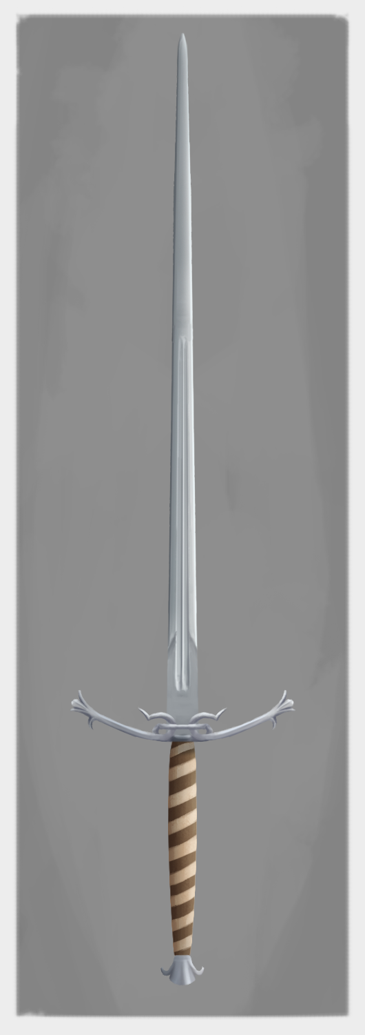
I changed the hilt with the third one. There are two strips of leather wrapped around the hilt, I might change the color of the tan one. Those two hook looking shapes extrude from the guard and go through the ring so shading them was a bit difficult and the result isn't that great.
@drgnclw Yeah, you know your way around topology. Good work. One criticism I have is the hilt and pommel are a bit blocky, which can have its place in design, but for something as nice and elegant as that blade, the other parts could use the same level of elegance. So either maybe some chamfering on the edges of the hilt and pommel to really catch the light in an interesting way or rounding the forms a bit could step it up.
Do you watch Man At Arms? Maybe watching the process could help to inform you and your designs when modeling.
![]() silentheart00 Thank you for yet another useful comment :)
silentheart00 Thank you for yet another useful comment :)
I used to, but I got bored of watching them make lots of fantasy/video game weapons (I think they also make functional stuff every now and then) and after a while I stumbled on HEMA (Historical European Martial Arts) channels. Those people talk more about how do melee weapons and armors work, why were they made certain ways, in what contexts were they used, etc. which is infinitely more interesting to me and although, I'm not an expert, what I'm trying to incorporate in my designs.
@drgnclw Ah, gotcha. Well now you can blend to two: design and functionality. I understand that balance when creating characters that will be in combat but you still want to have some personality in what they wear very well. Sometimes it's hard to break that thought of, "But how will this function?" and to just go with the design. It takes practice and experimentation. You got this.
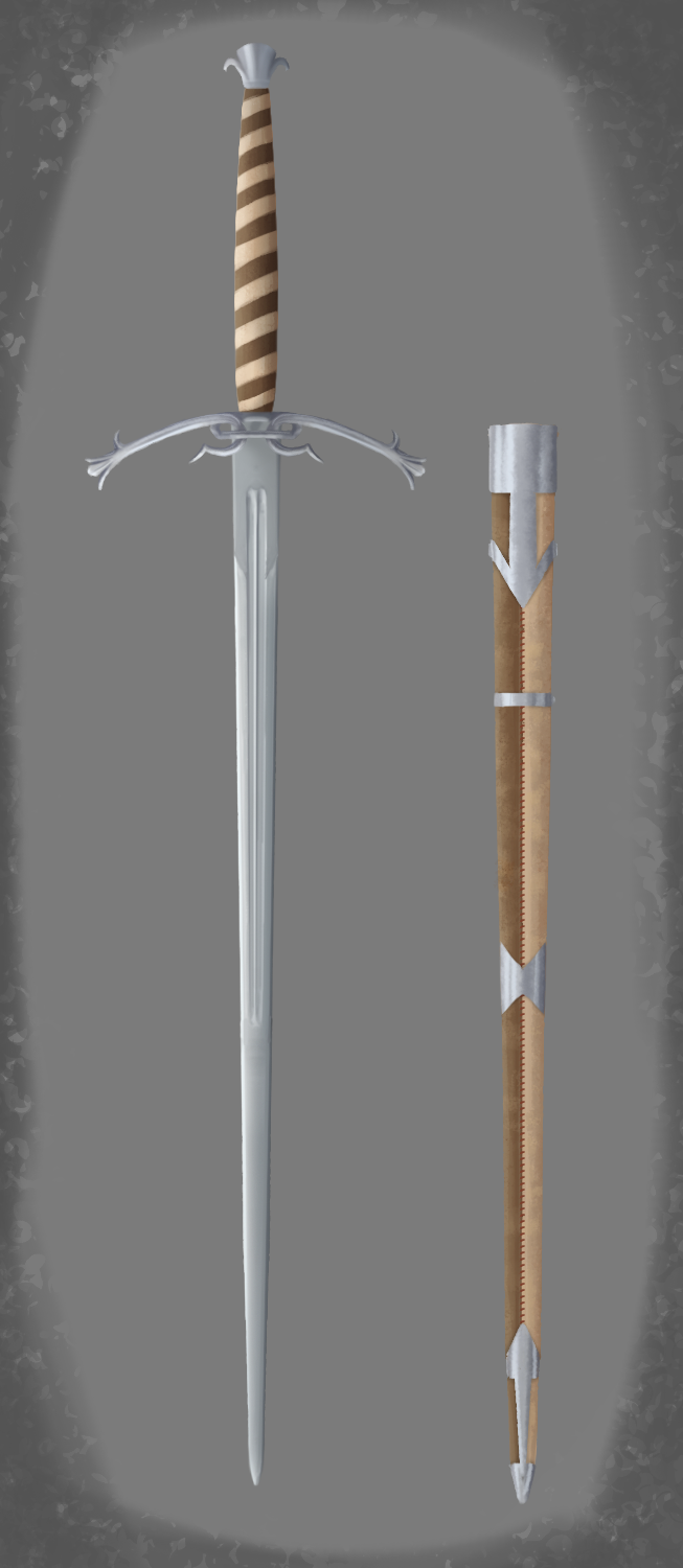
I always forget to make a scabbard for my swords. This time I didn't. Shading it was so fun that I got caught up in it a little bit. Same with the hilt, it is wrapped in two different leathers.
Since my concept is finished, I started modeling the blade. Intersecting two fullers and the ricasso (which is the unsharpened part of a blade at the base) took two tries to pull off. There is no tip of the blade or any kind of taper as of yet. I'll add those and hopefully, the rest of the sword tomorrow.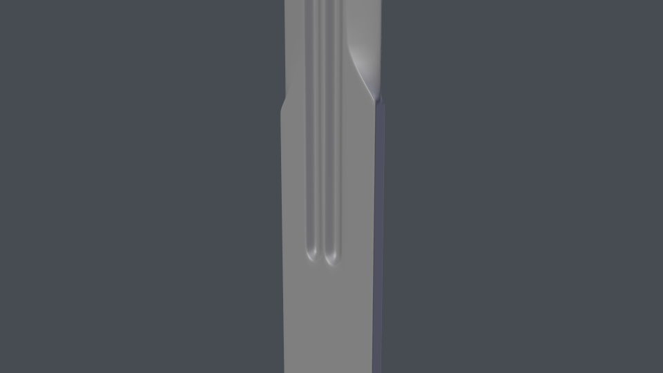
Today was tiring. There are still some rough parts such as the ends of the leather strips. I'll also work some more on the guard.


I'm starting to feel like I'm not going to make the deadline and I'm out of my depth :D Modeling of the project is pretty much finished. I still need to fix some issues with the metalwork of the scabbard. I might also delete and/or move around some vertices.
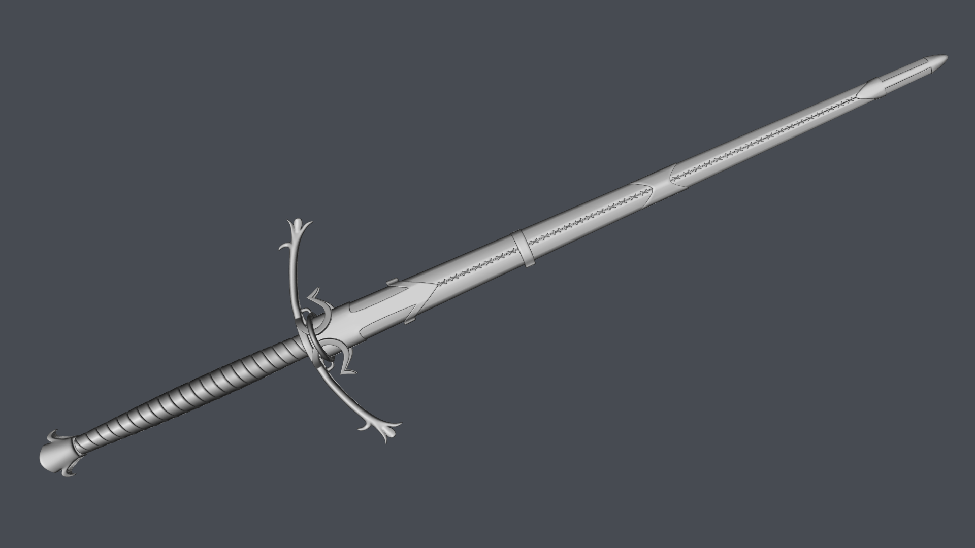
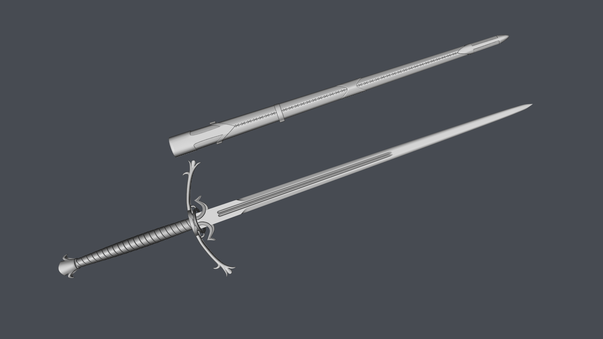
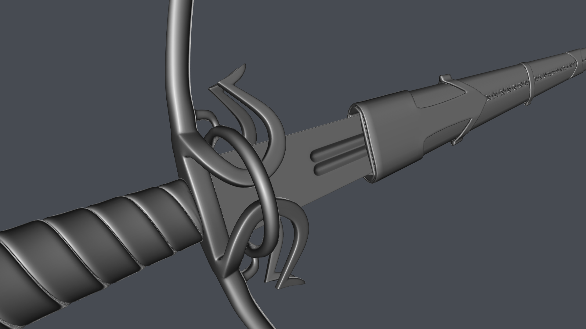
Yesterday, I modified my brushed metal material from my other sword. I think it looks better but haven't tried it on the new sword. I also discovered a way to make cool looking wood grain.
Today, I moved around some more vertices and started uv unwrapping. The whole sheathe came out alright but the blade was for some reason unwrapped very wonky, so I had to work on that a little bit. Hopefully, I'll unwrap and texture the whole thing tomorrow.
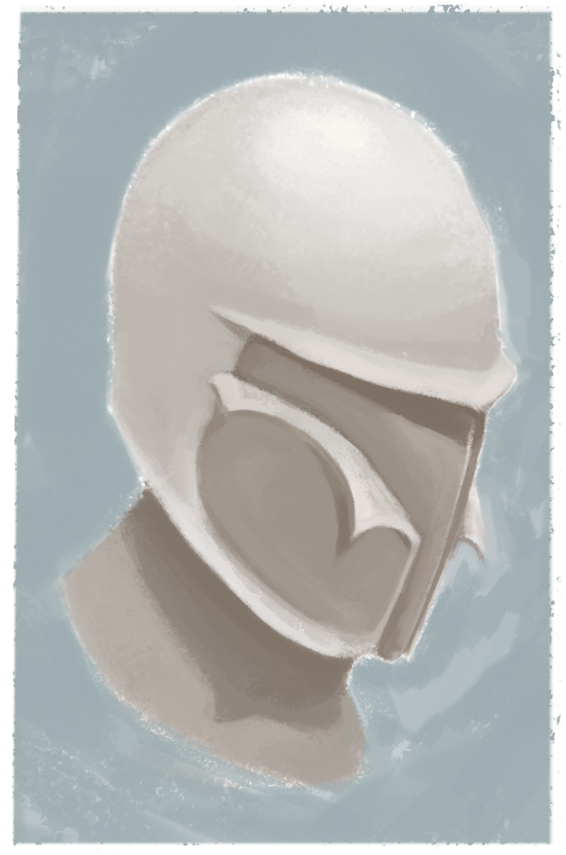
Here's something I painted a while back when I got bored :D
I wanted to finish the project by the 15th of this month but due to unforeseen difficulties (also a lot of slacking) with uv unwrapping and some shift in my sleep schedule, I couldn't make it. It looks like one more day will be enough.
Here's the WIP

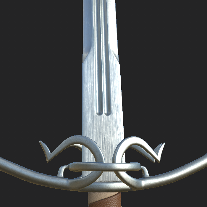
The screenshots were taken from Substance Painter's viewport. I went for a brand new, unused look and did my best to break up the consistency of the scratches in my material (thanks to ![]() silentheart00 's advice and @theluthier 's great brushed metal video. I just applied what I can in Substance Designer.) I will add some more detail and variation to the leathers and the metalwork. Any criticism is welcome and kind of needed :)
silentheart00 's advice and @theluthier 's great brushed metal video. I just applied what I can in Substance Designer.) I will add some more detail and variation to the leathers and the metalwork. Any criticism is welcome and kind of needed :)
@drgnclw Yeah, that's looking really nice. And hey, you're a day late, but you're finishing it, so that's an accomplishment in my book lol. Sometimes the hardest part is finishing.
One critique would be the surface of the blade is perhaps a bit too pronounced in the bump. Since you're going for a brand spanking new look, those sorts of things would be polished out. Still there, perhaps, but much less pronounced. Course, I don't look at swords all day, so take it with a grain of salt.
![]() silentheart00 Thanks! You're right about the bump. I'm aware of it but I increased it for the screenshot. Since it's resolution is low, I wanted the bump to be more noticeable.
silentheart00 Thanks! You're right about the bump. I'm aware of it but I increased it for the screenshot. Since it's resolution is low, I wanted the bump to be more noticeable.
My first render excluding simple exercises and courses is finally done! I wanted to make the background fur. The sword would look like it sunk in a little bit with some fur going around the edges and such. But between my inexperience with particles and the viewport lag, I went for a wooden background. I got the texture for it from Texture Haven. I'm also disappointed with the leather. It looked better over in SP.
I could have made a fabric background with fancy patterns or my own leather material for the leather bits (I'm going to do both this month) but I couldn't because of my time limit. I should have managed my time better. Overall, I'm content with the result. I learned a lot.
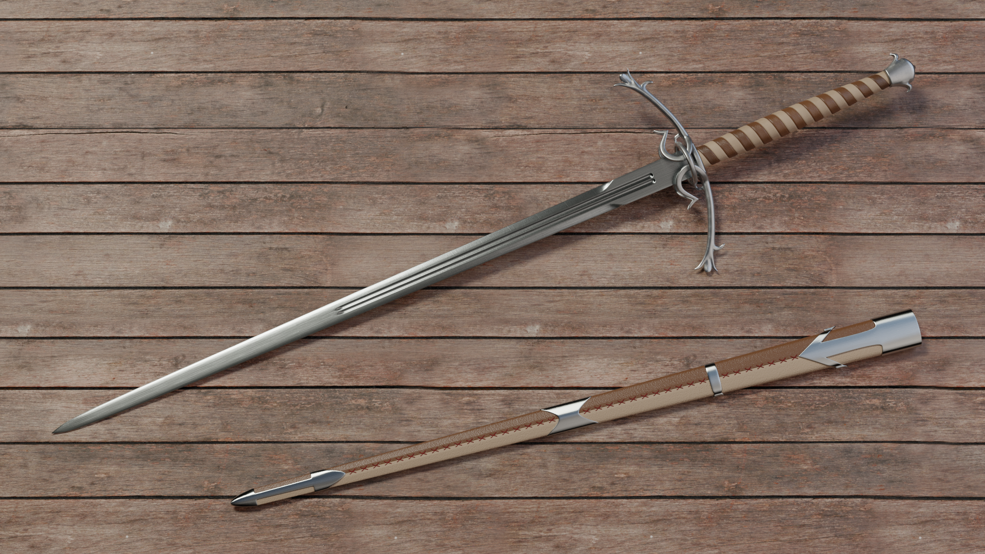
Don't forget your criticisms :)