I'm catching up late with this class but i wanted to participate !
Homework Week 3 submission
some health issue kept me away for a while but i m happy to be here again
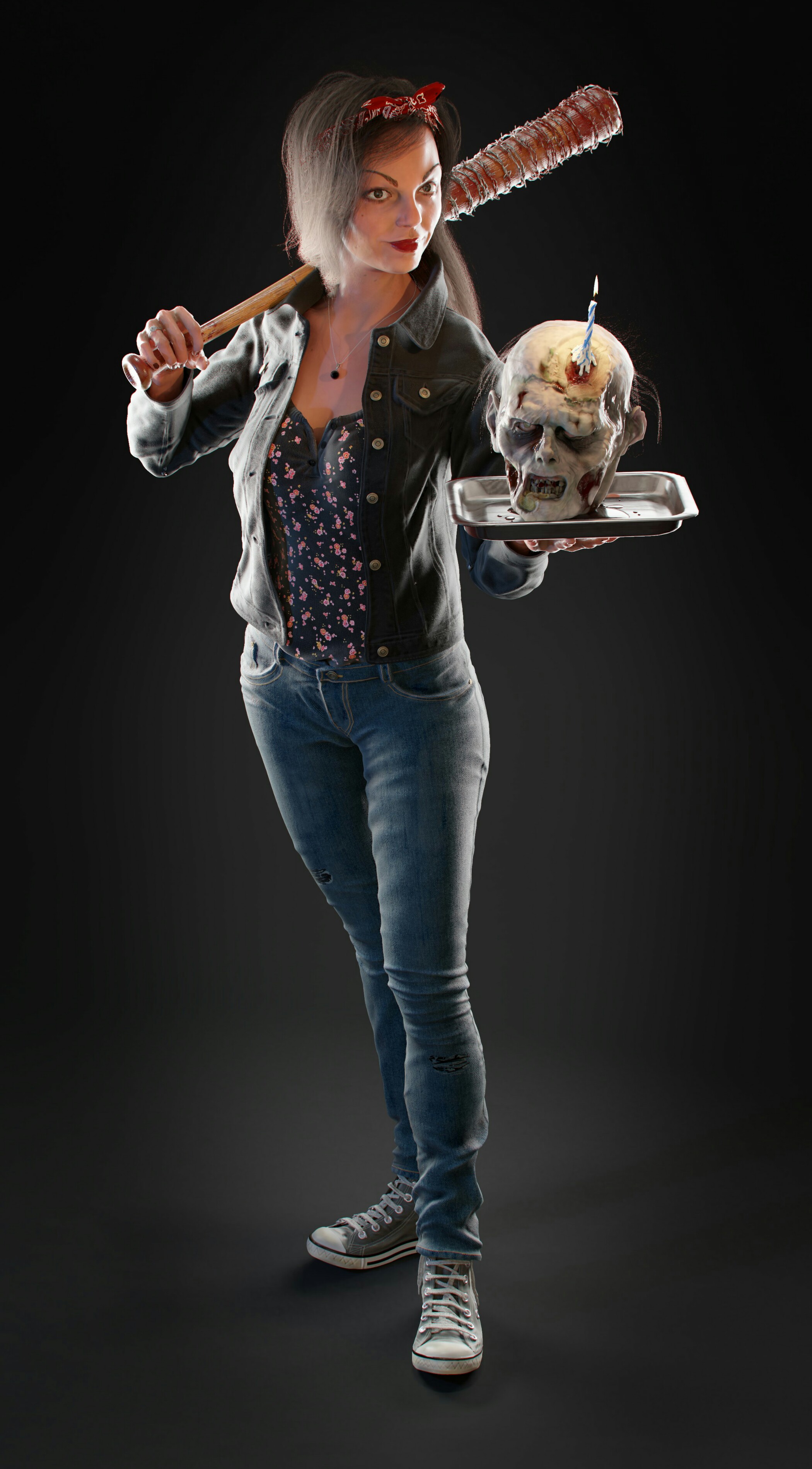
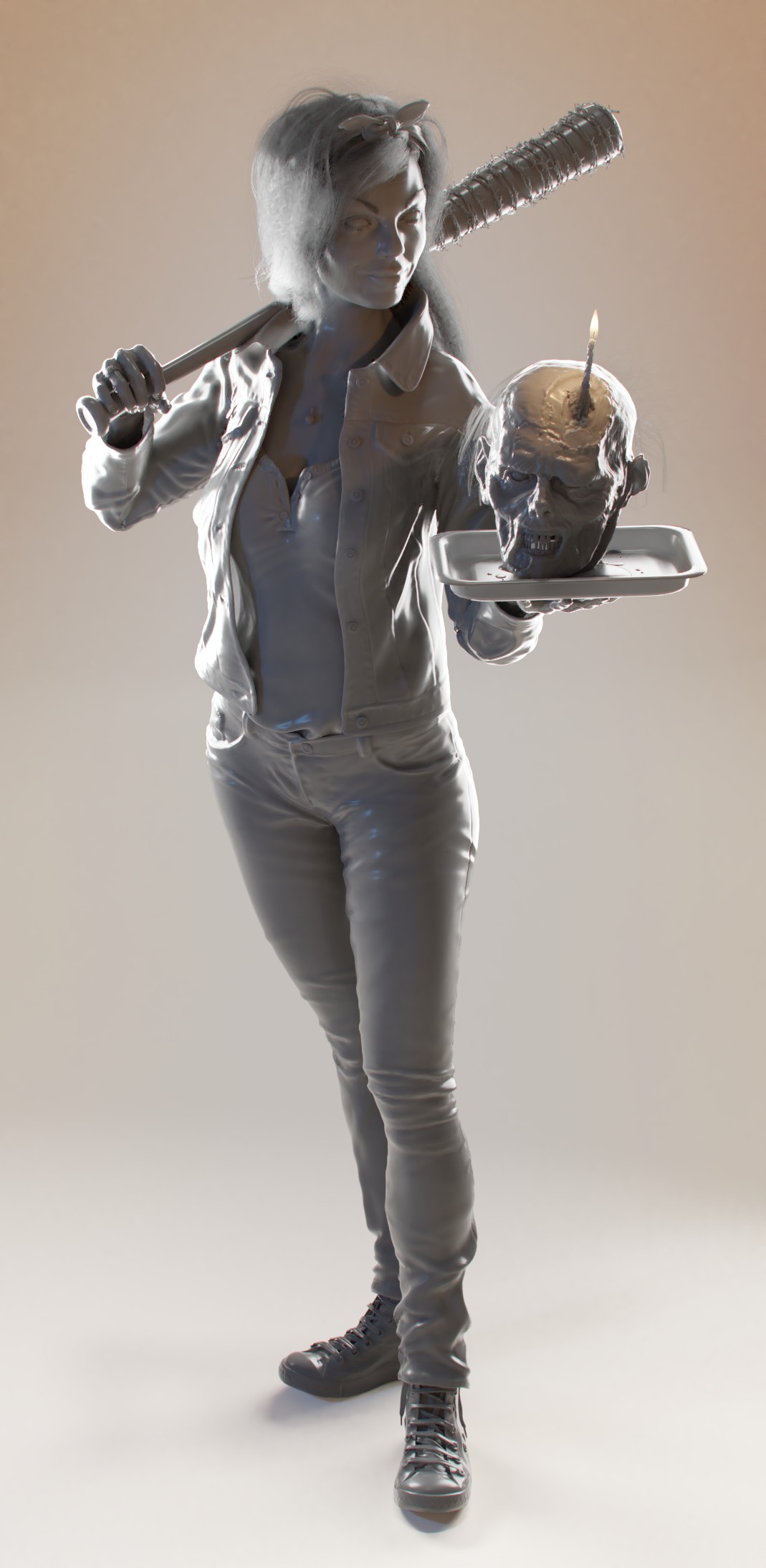
i just finished a character project, and i wanted to share my light set up with the classe
wish u like it
i uses 2 strong spot light as rims , 2 bleu fill light with a very low strength HDR , and a key ligut at the candel !


mmalhomsi Amazing as always my friend! It's like I can touch that zombie head!
Wow, you went 110% on this render, mmalhomsi! Welcome to class :)
So much texturing and modeling work in this image - Wow. You've done an amazing job. The strong rim lights on each side help the character pop off the background. Without that it's likely the dark coat would be lost. Good stuff. In general all the materials are well crafted; very believable and very tangible. A+ work!
If someone would not know mmalhomsi , he was one of the best students of the BC2-1803 March class here on CG Cookie, finished on the second place with the gathered XP's.
For me the most memorable was that "One-legged Pete" sculpt, it is just great again that you joined.
@theluthier that might be an idea for the official class system once, creating a Hall of Fame and giving some extra motivation/gamification in the month
mmalhomsi Not disappointed. Great job once again and we're happy to have you back!
Homework Week 4 submission
I know Nothing about the arch viz stuff nor about photography , so i wasnt sur what to do ,
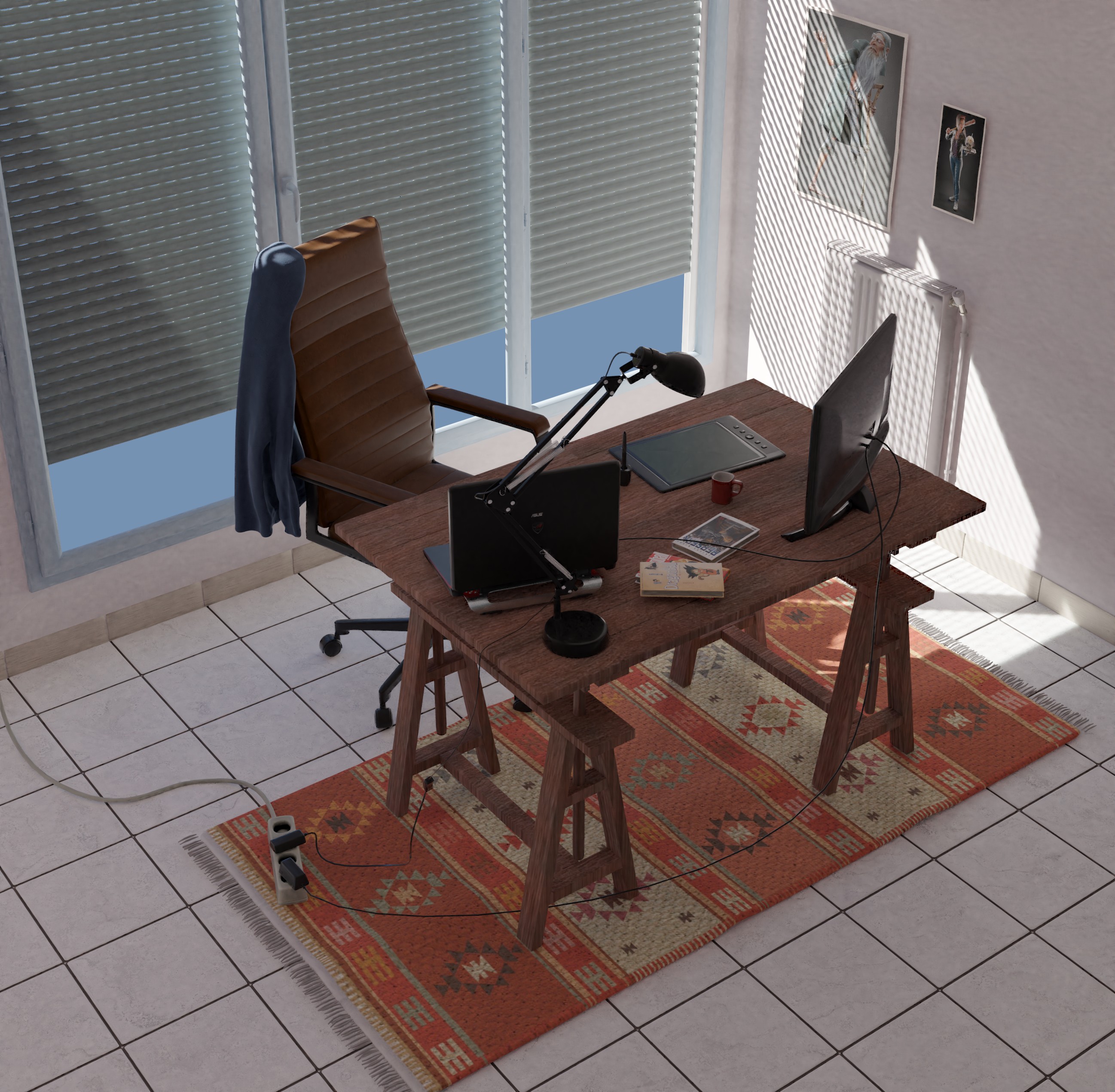
i choose to model what i call my Blender corner , so i'm happy to share with u .
it was tedious.. mesure every thing modeling..shading ..a lot of work for a mediocre result.
i wish i have more time ton fine tune the shaders ( at least Breaking the reflection with some surface imperfections)
render time was a pain ..thank u Kent @theluthier for getting us out of our comfort zone !
i'll be doing the light match later ..
mmalhomsi I like your Blender corner! You got this modeled fast considering we only got a couple of days for each homework. Well done 😄
mmalhomsi Amazing Blender corner and the sweater on the chair is like a cherry on a cake. I envy your tablet, been considering buying new one some time soon. But yeah, good job!
You work fast! High quality models as always! I think that maybe a HDRI background and a different angle for the sun will give those models justice :P
Also, we may have the same chair lol.
![]() jack07 thank u my man , i appreciate ur words ,but the quality of the models r discutable ;)
jack07 thank u my man , i appreciate ur words ,but the quality of the models r discutable ;)
![]() swikni thank u Jere , i got the tablet after the stylized character class , but i having hard time giving up my mouse : ) ,
swikni thank u Jere , i got the tablet after the stylized character class , but i having hard time giving up my mouse : ) ,
ssmurfmier1985 thank u , it was fast and dirty ( topology Wise ) .
thank u my friends i m Always Learning a lot with u
it was tedious.. mesure every thing modeling..shading ..a lot of work for a mediocre result
mmalhomsi Wow, yeah, that's a ton of work to build everything from scratch! I wasn't expecting people to do that this week but rather use one of my provided scenes or use an existing one of their own. Heh I do love your art on the wall!
It's impressive you were able to do so much in a week's time and considering it's outside your comfort zone. You've earned an A on effort alone. I like the theme a lot and the models themselves looks great. Lighting is believable too. Interestingly there's still a lot of light getting through those closed blinds 🤔
Here's a couple notes:
mmalhomsi You have much more comfortable blender corner than me xD. Good work.
mmalhomsi And there is 'One-legged Pete' on the wall from the sculpting class :-)
Very good idea also that shining through effect through the windows
once again a very good class .
thank u @theluthier
i was secretly asking myself how my last project posted on CGC gallery wasn t staff picked , i found t not bad at all , modeling is ok ,textures and shading feel pretty good . i was disappointed .
today streaming brought me the bitter answer.. it's the magazine effect .! my art is good ,but boring not interesting ..
i see it now ; and i'm going to take a step back and rethink it..
good luck for all of you , hopefully i ll see u around in the next class !
mmalhomsi Admittedly I didn't push the "magazine factor" in week 4's livestream. I didn't realize how often I would be giving the note. It taught me something too!
You do really good work sir. You're commonly among my faves :)