Week Two:
Color Match
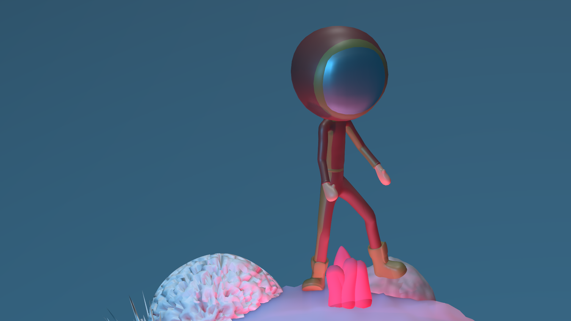
This was an attempt that I can not seem to get so I will do a different one. Just put this up for some helpful feed back. I wanted to use a gradient world texture but couldn't seem to get it to work in 2.8 with eevee. Next one I will try 2.7.
Match: Ugh
ArtStation

Vehicle ..
Well a flying variety made by me :D
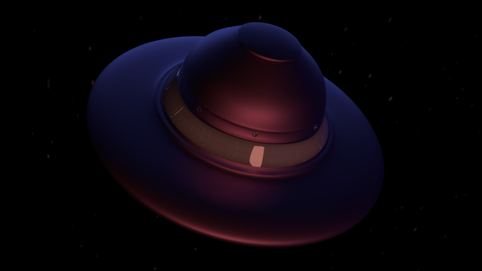
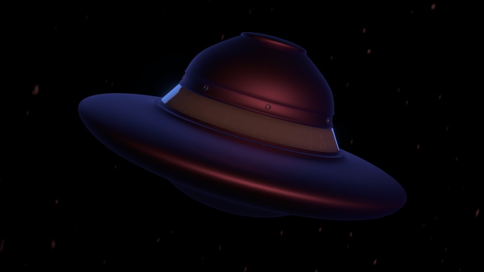
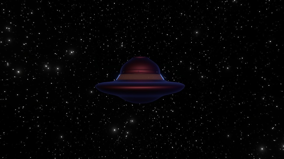
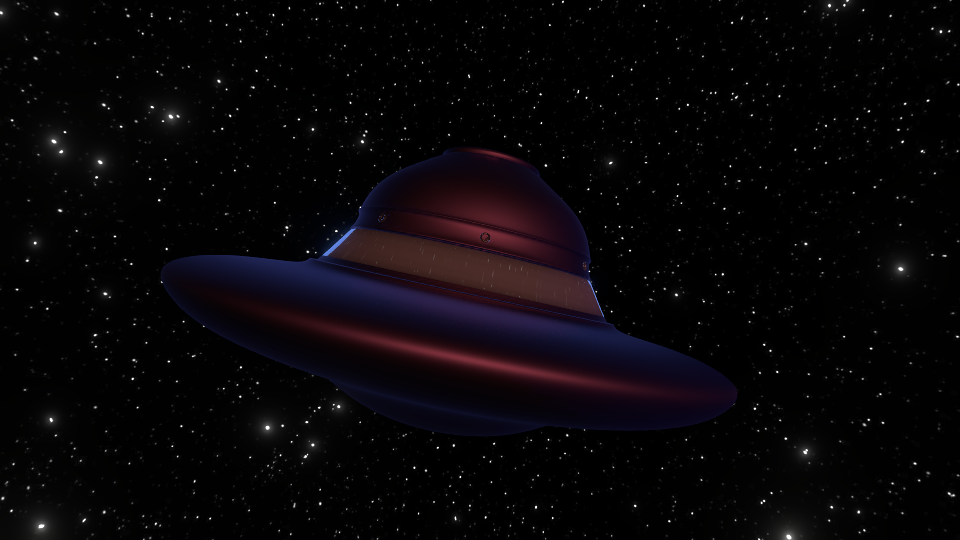
I am a bit behind but will continue making progress:) The below where done in Eevee except the night scene (cycles). Had a problem in all renders with the light shade near the window tried several times and the renders just worsened with each consecutive render. Thought it was to much ao but idk couldn't figure it out.
Week One:
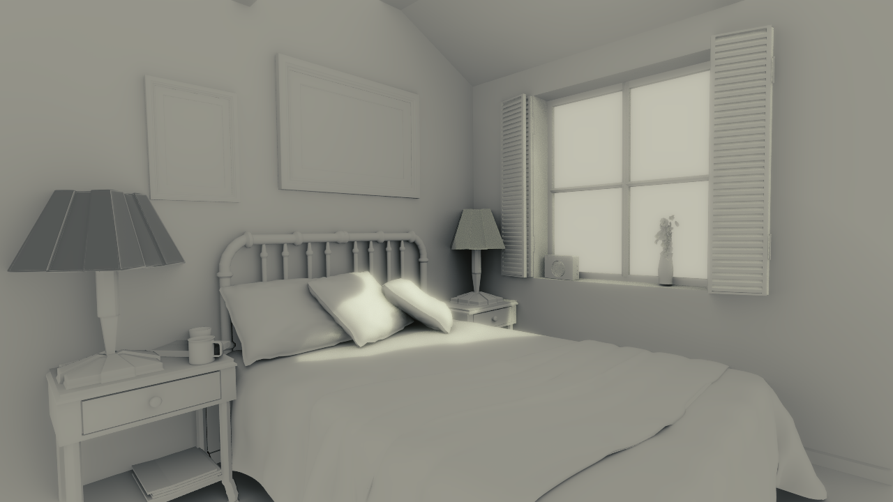
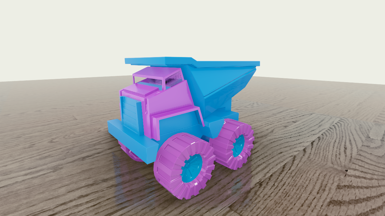
ggolden-kitty Hi nice to see you again! Good job on the homework 😊 The day version could be a bit lighter though, it's more of a twilight feeling.
Quick tip: you should add B4-1810 to your topic name so @theluthier can find your homework. There are so many participants this class that it's challenging for him to keep up.
ssmurfmier1985 Hiya! Going to add the bit in the title, tx :) Yes I agree on the the day picture..looks abit dark.
ggolden-kitty Hey, better late than never! Got to take that first step.
The day scene has a strange over-softness to the shadows, making it blurry. Bust some objects are in focus. Kind of weird. The night scene is nice. There is some weird shading happening in the corner; maybe 2.8 read the file differently and there's some issue there. You could potentially remedy it by giving the walls some slight depth in future projects.
The truck is a good start. There's something odd about this, like maybe ambient occlusion is missing? It's not sitting on the surface quite right in that CG-feeling kind of way. Overall, good work.
Better late than never indeed ggolden-kitty! Welcome to the class. I agree with silent about the extreme softness in your daytime bedroom render. Looks like a little to generous with a glare node perhaps? It's got a dreamlike quality to it which may be desired. Is the night scene really Cycles? I would guess it's Eevee and the day time is Cycles..
Your toy truck looks pretty good. One of the most common notes I've been giving this class is how seeing the sharp edges of a plane against a background (blank or environment) breaks the immersion potential of a render. It screams "this is a 3D render". I highly recommend doing whatever is needed avoid this situation:
Overall though it's an A for week 1.
I really like the UFO lighting on the black background. The subtle blue rim light and red key light works well together; pleasantly stylized and matching the aesthetic of the vehicle model.
However I think the starry background is a negative addition. It reveals that there's nothing providing the blue rim light and it feels cut and pasted. Perhaps a bright blue planet or nebula in the background would better establish the blue rim.
So it's a B+ for the vehicle. Do you plan to do the light match exercise as well?
@theluthier Good to be back in class!! Thanks for the crtiques these will really come in handy. I will work on the ufo and try out your recommendations and do a comparison :D..... I get it about the edges blending together would make a big difference if those angles where softened for a more gentler transition. Yes the night time is cycles and the rest is with eevee. Working on the light match exercise now. Will try and finish all the exercises this week I really am loving 2.8 now but it is not without its bugs lol.
ggolden-kitty You did some amazing work last class, so you'll get there 😊 Good luck this week!
ggolden-kitty Lighting in that UFO looks neat. Keep going and you'll catch up!