![]() silentheart00 Thanks. Yes, I'm going for the carbon but cant get the same look it was on 2,79 Cycles.
silentheart00 Thanks. Yes, I'm going for the carbon but cant get the same look it was on 2,79 Cycles.
![]() svetimas I think the size is a bit large just looking quickly at some references.
svetimas I think the size is a bit large just looking quickly at some references.
Welcome to the cass ![]() svetimas - and with a bang no less. Love the start to the vehicle. It doesn't quite read like carbon fiber to me but a pretty cool pattern nonetheless. Can't wait to see more!
svetimas - and with a bang no less. Love the start to the vehicle. It doesn't quite read like carbon fiber to me but a pretty cool pattern nonetheless. Can't wait to see more!
![]() silentheart00 Thanks for advice. I went smaller but suppose it is still too large compared to real world but I wanted to keep some pattern visible.
silentheart00 Thanks for advice. I went smaller but suppose it is still too large compared to real world but I wanted to keep some pattern visible.
@theluthier Thanks. Now I tried to fix that look but as I understand in EEVEE there is no anisotropic shader and the option with Principled BSDF shader doesn't work as it should (or at least I haven't made it to work).
I spent all the evening trying to figure out why do then I change the material the object doesn't change at all. And only after a long time I accidentally noticed that I had duplicated the same object and it was on top on each other... Oh well, at least the paint of the car remains unscratched and clean :D Only the wheels suffered some damage.
![]() svetimas These macro close pics are crystal clear, I like very very much how you did, the color selection itself gives a unique design but the materials just more, really easy to remember
svetimas These macro close pics are crystal clear, I like very very much how you did, the color selection itself gives a unique design but the materials just more, really easy to remember
![]() svetimas A bit late to the party. Yeah, that scale of carbon fiber looks a lot better. Looks pretty good to me. Good work.
svetimas A bit late to the party. Yeah, that scale of carbon fiber looks a lot better. Looks pretty good to me. Good work.
![]() svetimas First of all, nice job on week 1 homework! It definitely counts. My only note is that the night time lamps are a little too strong imo. I'd love to see some bluish shadows/darkness in the room. Currently the whole room is lit up in a bright orangy-yellow. I like that color but it shouldn't be powerful enough to make the scene monochromatic. Still it's an A for week 1 👍
svetimas First of all, nice job on week 1 homework! It definitely counts. My only note is that the night time lamps are a little too strong imo. I'd love to see some bluish shadows/darkness in the room. Currently the whole room is lit up in a bright orangy-yellow. I like that color but it shouldn't be powerful enough to make the scene monochromatic. Still it's an A for week 1 👍
Now how about that carbon fiber! It looks so good; so crispy and sharp. It's an excellent effect. Car paint looks good too. Love the leather material on the interior though I think the pattern could be shrunk a little bit; scale seems a touch too large. I like the effort to add scratch wear on the rims. But I think it's too strong. Rather than big gashes, I would try to tone it down in color and bump so it's a little more subtle.
Really nice work though. An A from me!
Are you planning to do the light match exercise?
@theluthier Thanks for advices! Yeah, I'm on the level then you think "the more - the better". But doing more stuff will led to skill not to overdo things. And there is still a lot of mystery for me how you (and other mentors) manipulate procedural textures to get desired results. I have recently watched wood shading lesson and it left me scratching my head and thinking how can one think about manipulating with nodes in such way...
I will go for light match but I might finish it only on weekend. As I understand the same lighting exercise would be legit to use in character shading homework for week 3?
![]() svetimas Honestly the issue of overdoing things is better than under-doing them imo. I find its easier for people to go too far and learn to dial it back than it is for people to be timid in not going far enough and learn how to push it further.
svetimas Honestly the issue of overdoing things is better than under-doing them imo. I find its easier for people to go too far and learn to dial it back than it is for people to be timid in not going far enough and learn how to push it further.
Procedural texture nodes is a pandora's box for sure. There's so much potential for what can be done that I still feel I've only scratched the surface. Bartek's wood shader blew my mind about what he was able to do with nodes. I know the feeling lol.
As I understand the same lighting exercise would be legit to use in character shading homework for week 3?
I'm not exactly sure what you mean. I've assigned another light match exercise but it won't count if people submit week 2's light match for week 3. I want to see a unique light match each week.
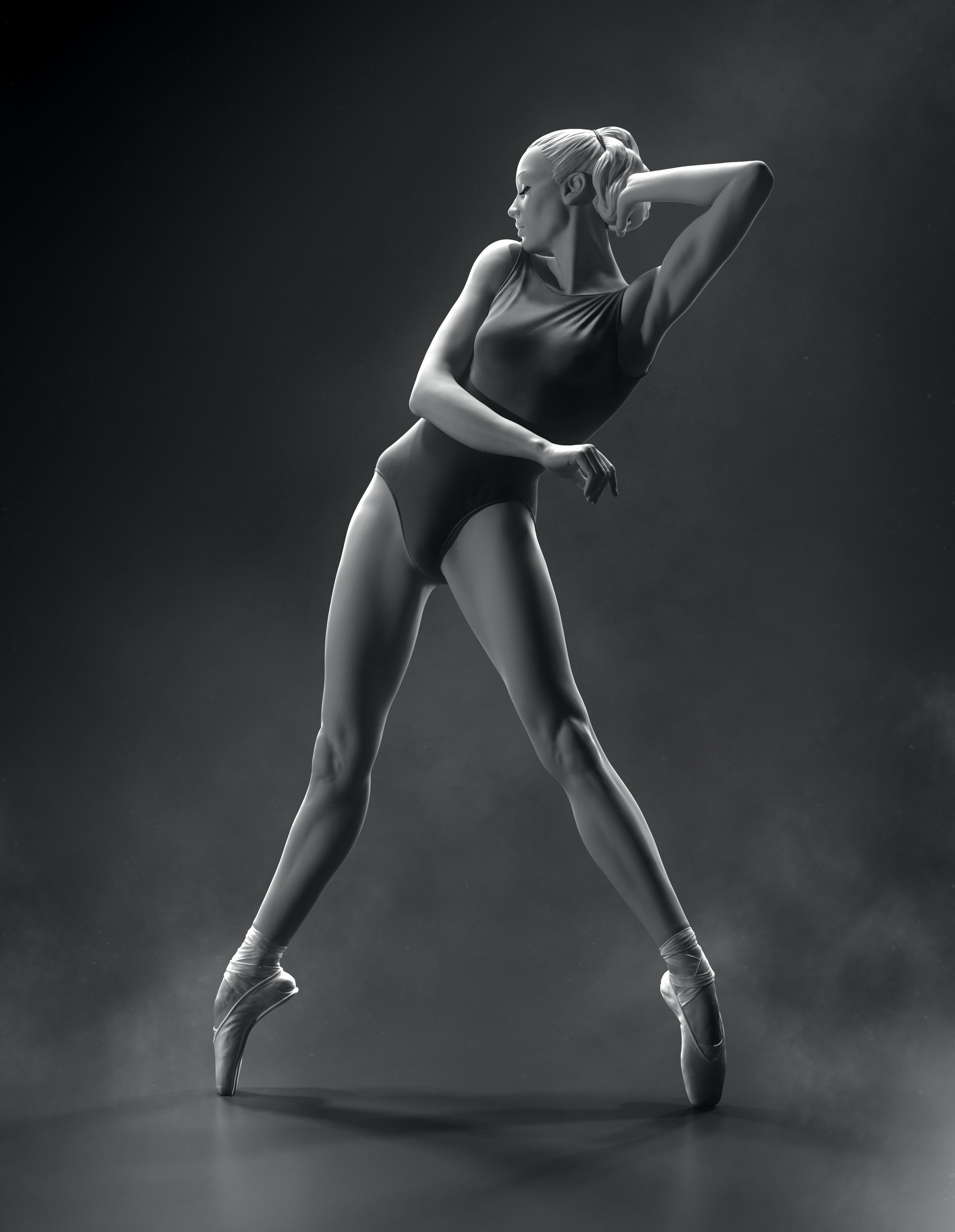
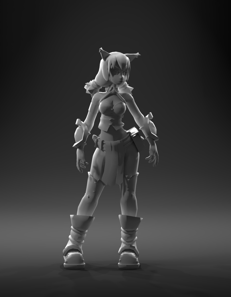
Here is my try to come closer as I can with a lighting match exercise. I have used this character for lighting purpose but had no luck to put it into the same pose as reference image. As I took an image as reference i couldn't be sure for accurate shadow positions. Nonetheless, I have tried to get as close as I can (for my level) and here is my submission:


![]() svetimas It's a good match. The shadows are a little harsh in your match, but increasing the size of the lamps should help with that. The shadows are also more grey than black in your match compared to the goal, so maybe that has something to do with the world color. Otherwise, good work.
svetimas It's a good match. The shadows are a little harsh in your match, but increasing the size of the lamps should help with that. The shadows are also more grey than black in your match compared to the goal, so maybe that has something to do with the world color. Otherwise, good work.
![]() svetimas good work . like how you managed to get the rim lights on the body as it should looking at the goal .
svetimas good work . like how you managed to get the rim lights on the body as it should looking at the goal .
can i ask how you did the carbon fiber ? that was really amazing done . so i am kinda curious :p
yyukinoh1989 There's a course in the Shaderforge section that talks about carbon fiber.