Okay I lied, guess I will be making my own thread. Decided I'm gonna be posting a lot more than I previously estimated so it was worth making a thread for. For context my scene is going to be a slightly stylized and my pumpkins specifically rotten or old, if that helps any critiques.
So here's what I came up with last night, those of you who follow this class threads might've seen this:
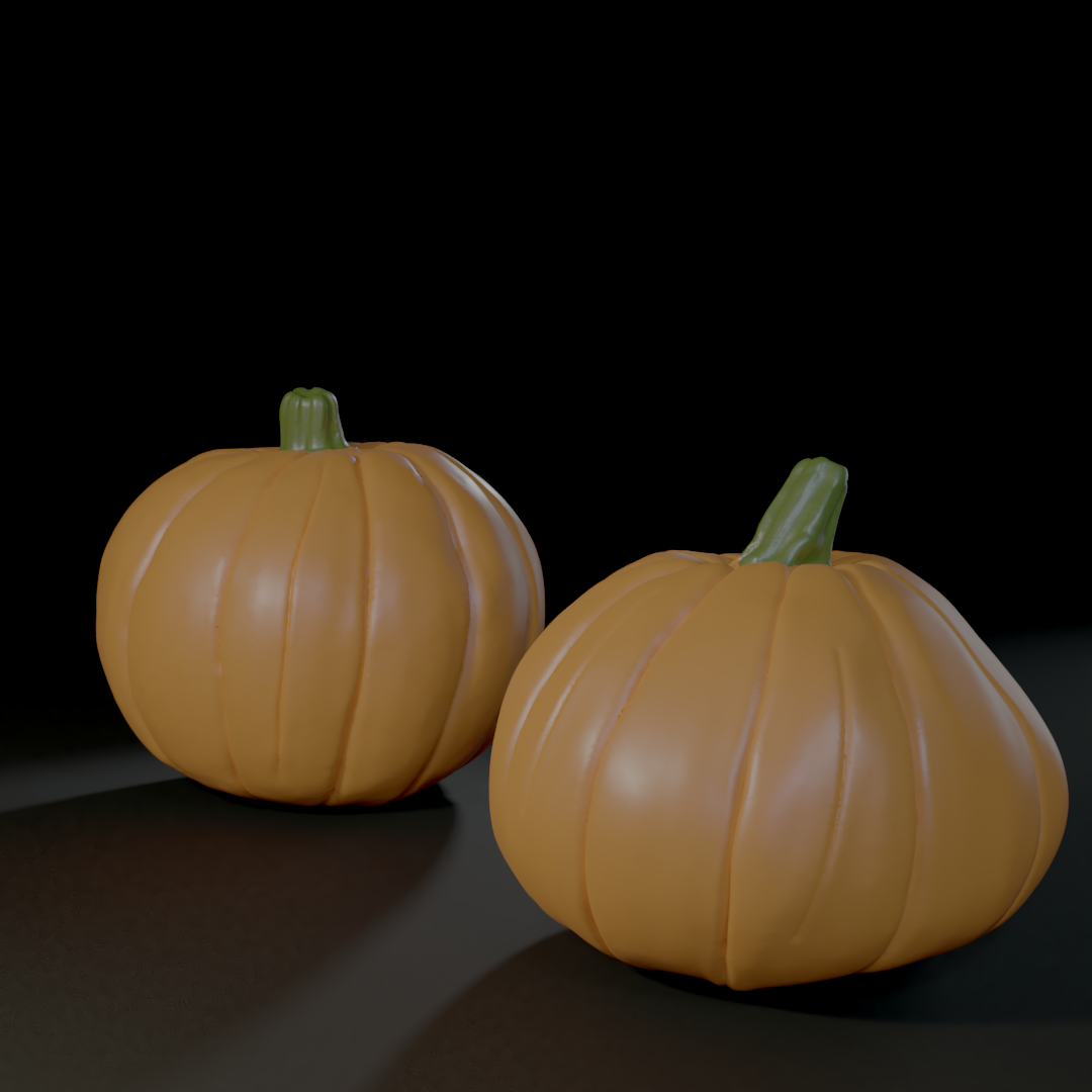
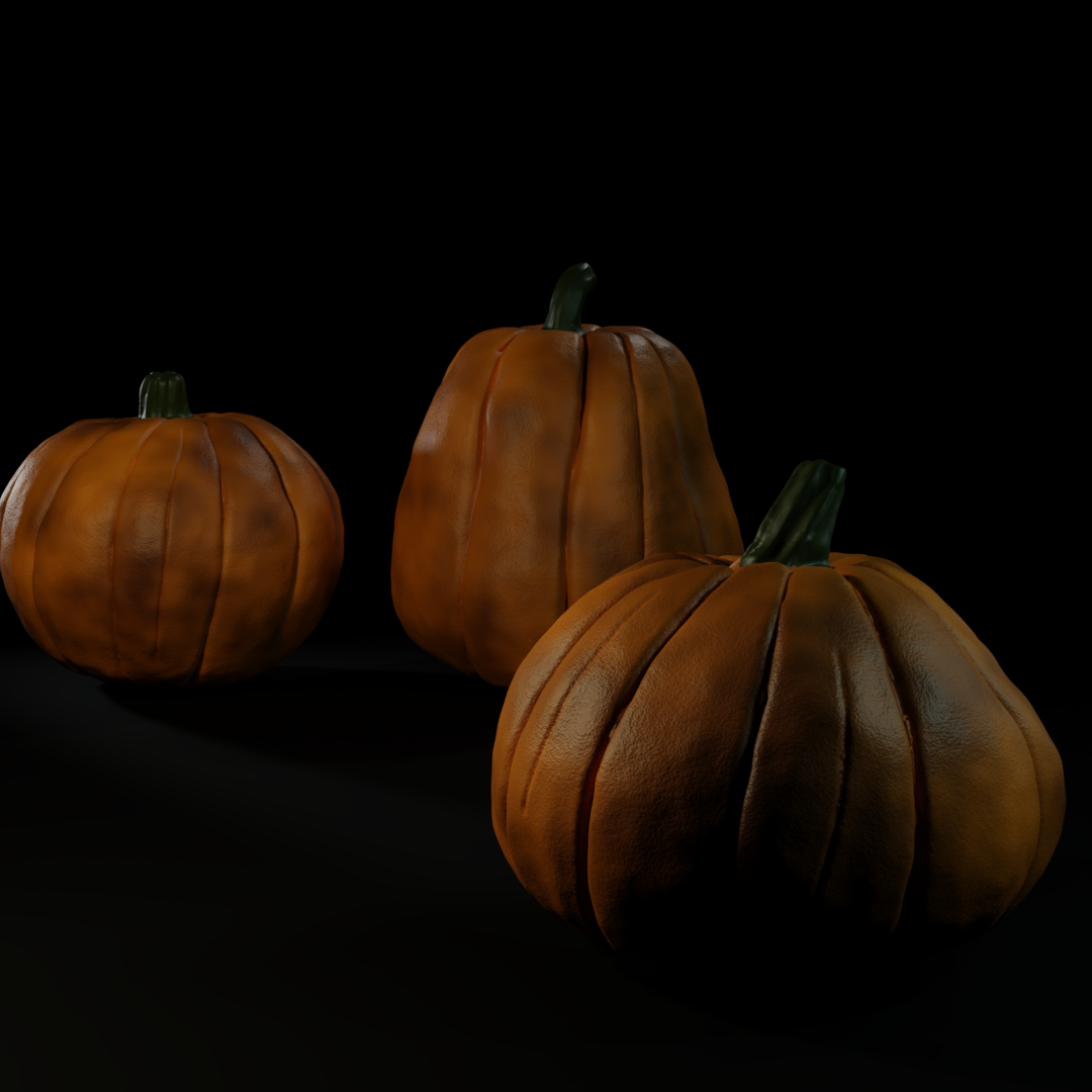
Pretty basic but a start. Made a bit of progress since then. Added another pumpkin and messed both with the textures and lighting. Here's the result:
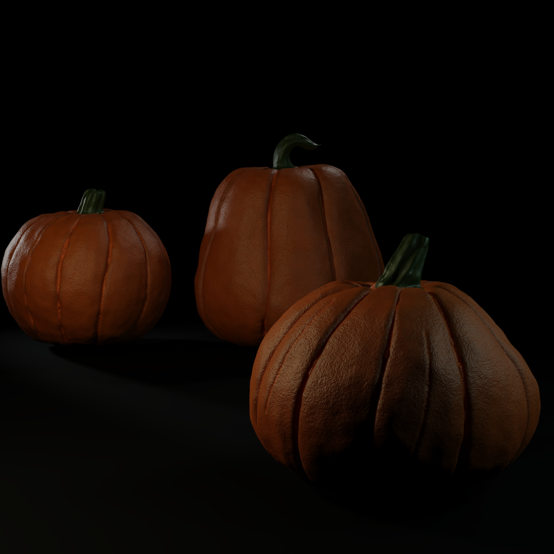
So I was mostly looking for critique on the texture so far (haven't touched the stalk yet, just the body), though by all means feel free to critique other stuff. For example I feel the elongated pumpkin (or oversized bell pepper) could use more crease due to its size. Here's the node setup so far (and by all means feel free to use this yourself:
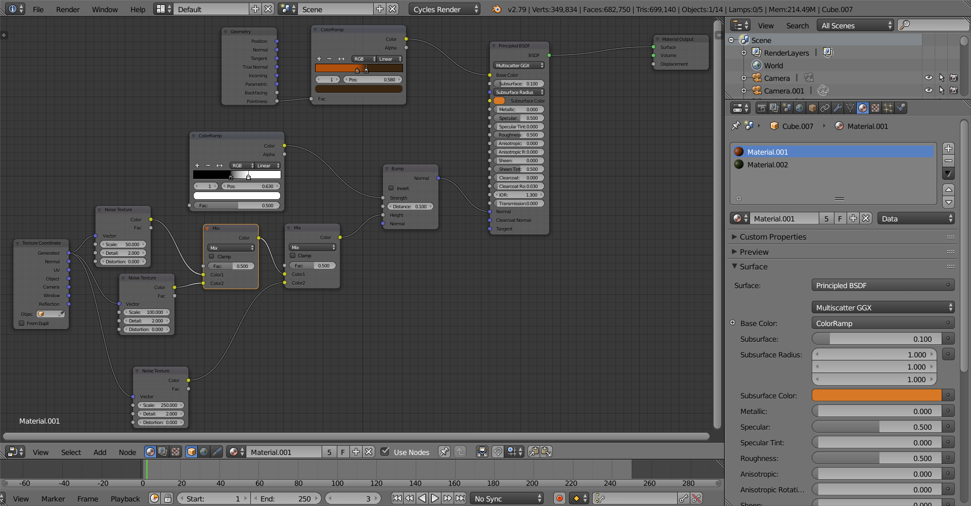
For context I'm going to be going for a somewhat rotten and stylized vibe (I'll put this in the header too) so with that said I appreciate any feedback I may receive and good luck to you all!
edit: should also point out I intend to add other details like wrinkles and whatnot just haven't done them yet.
Add some big patches of yellowish-tannish-brown. That would help. Also I think the orange should be brighter.
![]() williamatics You mean something along the lines of this? The patches anyway, I tried to increase the brightness but it doesn't look like I increased it enough:
williamatics You mean something along the lines of this? The patches anyway, I tried to increase the brightness but it doesn't look like I increased it enough:
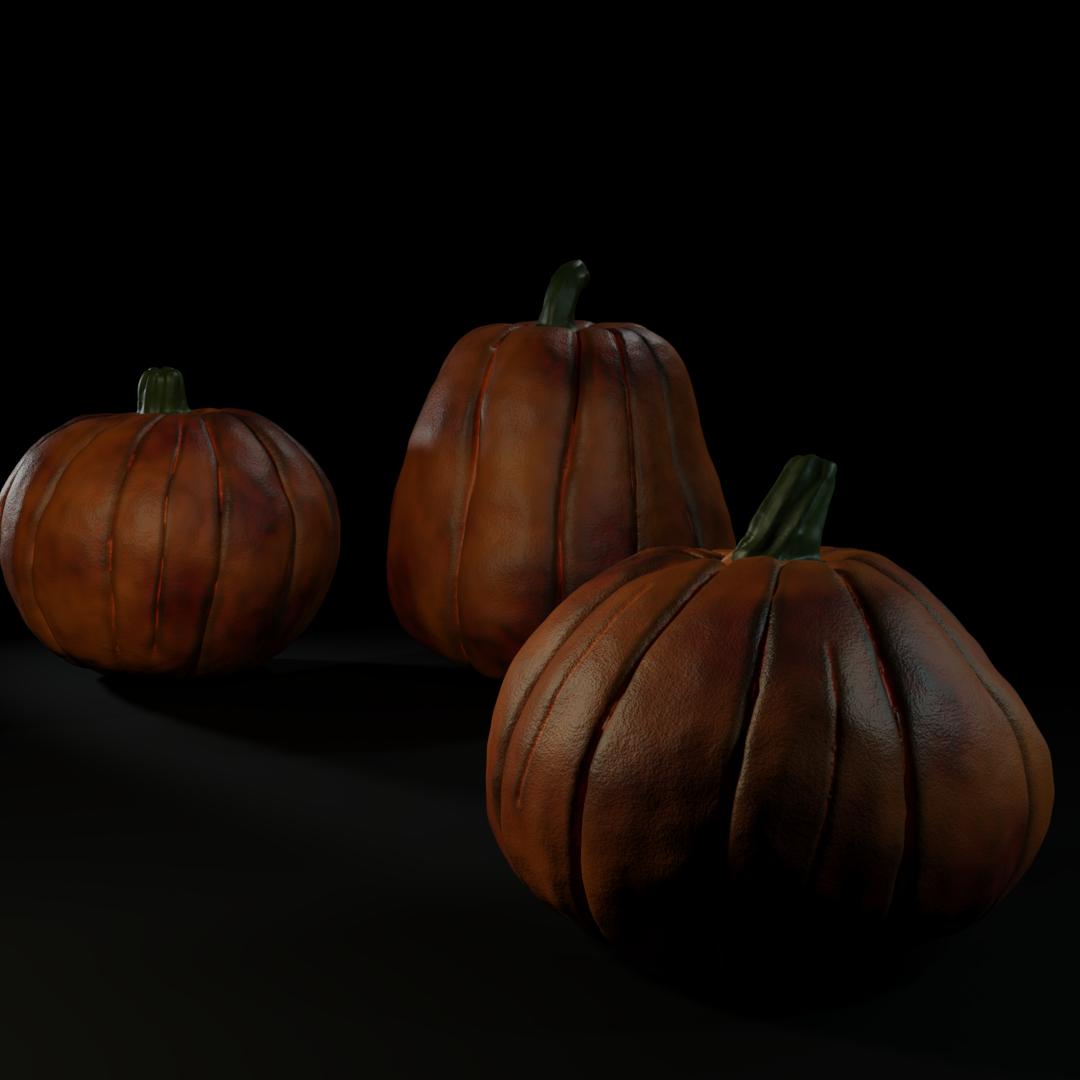
I definitely think I overdid it a little bit so it now looks like it has bruises (which considering they're rotten may actually be a good thing) but I hope this is roughly what you had in mind. Cheers for your insight!
![]() thecabbagedetective wow that is some nice shading great result you have. It indeed gives me some kind of sense like it started to rot so good job.
thecabbagedetective wow that is some nice shading great result you have. It indeed gives me some kind of sense like it started to rot so good job.
yyukinoh1989 Why thank you! Trying to get an authentic stone texture now which is proving a lot more difficult than I was expecting.
![]() williamatics Awesome! I did decide to experiment a little bit and tone the bruises done whilst simultaneously increasing the base brightness. Your preference?
williamatics Awesome! I did decide to experiment a little bit and tone the bruises done whilst simultaneously increasing the base brightness. Your preference?
![]() thecabbagedetective This is coming together really nicely! I like the last one the most 😊
thecabbagedetective This is coming together really nicely! I like the last one the most 😊
![]() thecabbagedetective I'm not THE ONE you need to get the approval of, you know.
thecabbagedetective I'm not THE ONE you need to get the approval of, you know.
I think the patches need to be lighter. The lighting could also be lighter. I like the first one better, but the second one could progress into something more interesting.
ssmurfmier1985 Phew, glad to know the work was worth it, thanks!
![]() williamatics Yeah I know, but hey I thought I should milk your opinion as much as I could haha. Glad to hear your feedback as well, I'll certainly be taking it into consideration, so thank you!
williamatics Yeah I know, but hey I thought I should milk your opinion as much as I could haha. Glad to hear your feedback as well, I'll certainly be taking it into consideration, so thank you!
![]() thecabbagedetective You're welcome. (I think I should start a pumpkin thread too...)
thecabbagedetective You're welcome. (I think I should start a pumpkin thread too...)
![]() nabro Wow, commenting on each other's stuff at the same time, that's spooky, but thanks! Definitely the hardest part for me.
nabro Wow, commenting on each other's stuff at the same time, that's spooky, but thanks! Definitely the hardest part for me.
Tried messing around with a stone shader. Found this tutorial which certainly pointed me in the right direction, though I ain't done tweaking yet.
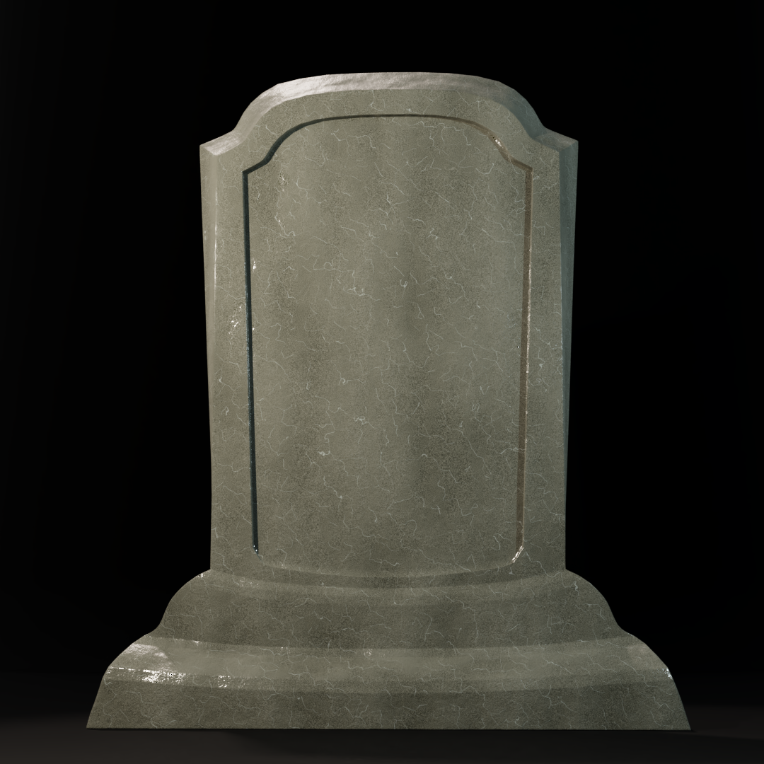
Possibly a bit too shiny but overall I like it. Time to add more details!
![]() thecabbagedetective This is cool! Great shape looking good 😎 A bit too shiny yes, and needs some grime, chipped off pieces/deeper cracks etc. but you're not done tweaking so I'm sure that will come 😬
thecabbagedetective This is cool! Great shape looking good 😎 A bit too shiny yes, and needs some grime, chipped off pieces/deeper cracks etc. but you're not done tweaking so I'm sure that will come 😬
ssmurfmier1985 Oh absolutely! That and some writing! This was my first time experimenting with layer weight which is responsible for the shininess so I'll have to get that rectified. Thanks for the feedback! Also are you joining the contest?