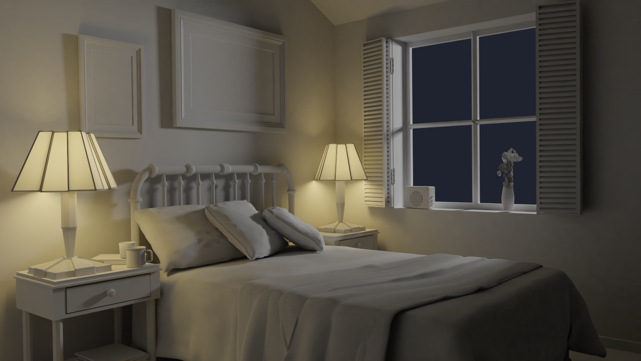
I have redone only the night lightning exercise because I was unsatisfied with the way the lights were behaving in the lamps. They felt very sharp to me, so I gave them some minor tweaking. Here is my first submission of this exercise.
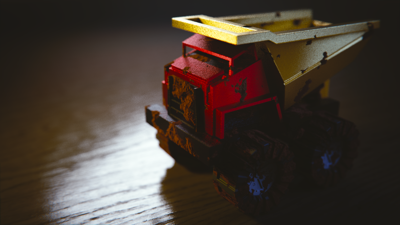
I have also redone the Shading a Toy Truck exercise in Blender 2.8. Before this week's class I used to completely ignore the "Input" section of the node editor, so it gave me a boost to play with it. I also tweaked the lighting of the scene because I got inspired by seeing Kent using more saturated lights. I wanted to get a little gloomy-but-not-outright horror-Alan-Wake'y vibe. It doesn't feel perfect but I'm satisfied with it.
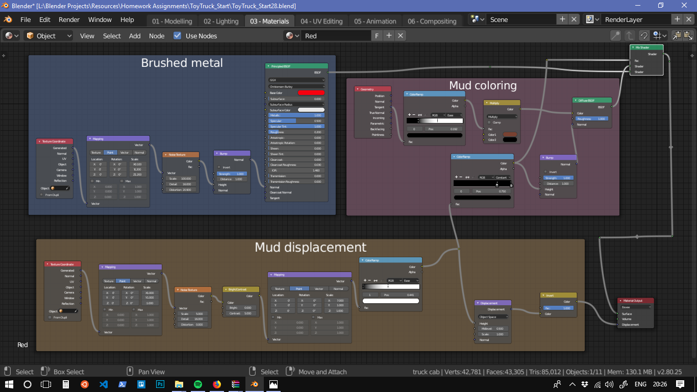
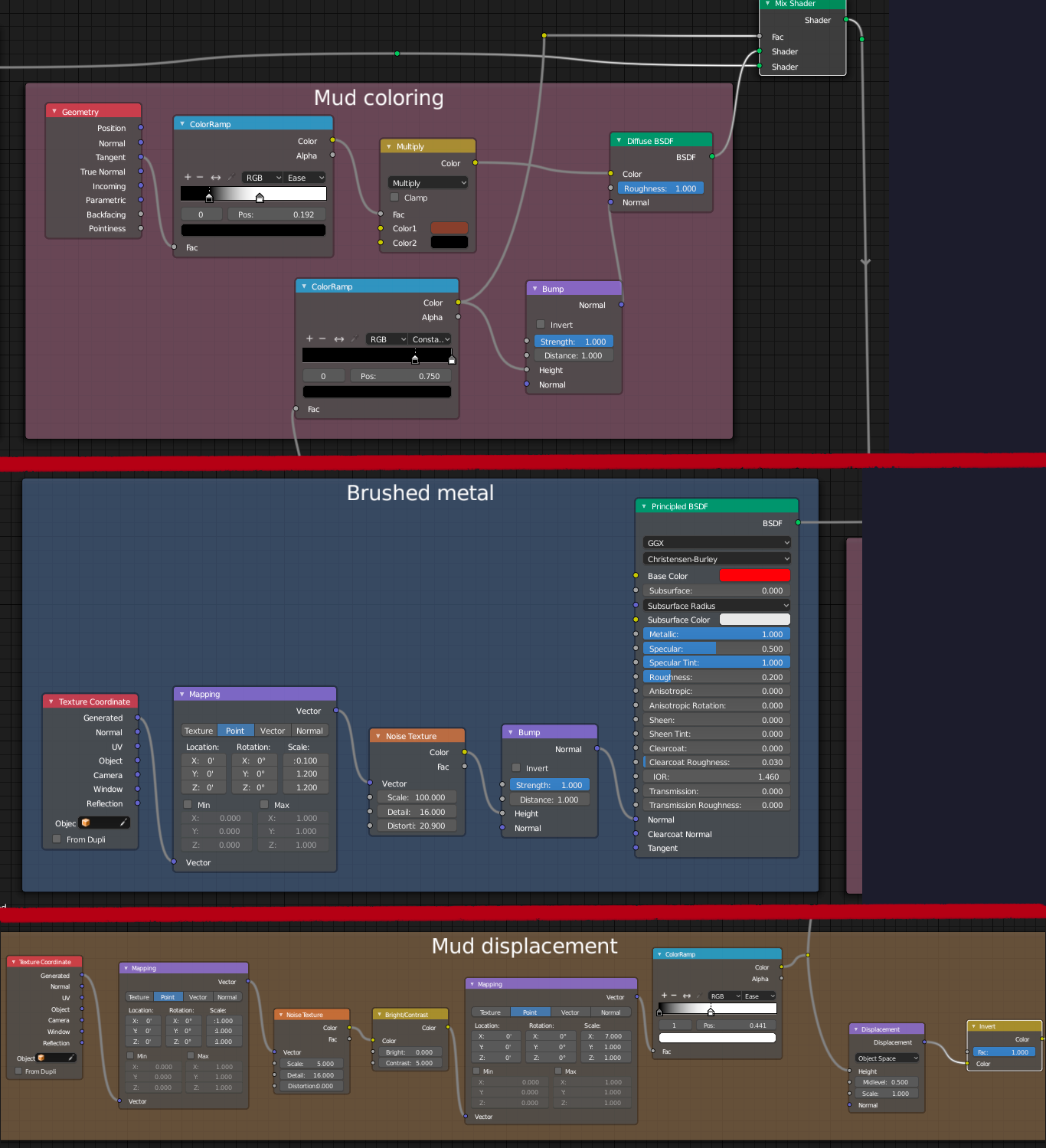
I also got inspired by JJ McGuckin's submission of this execise in the shading basics course, and wanted to give the displacement node a go. The idea was to make it look muddy, so I did with a noise texture and heightened contrast -- and thanks to the now-available-in-my-head Input nodes, I managed to heighten the contrast of the mud... which may be a little overdone, but it's an experiment (lol).
I also used the Principled shader to give it a more metallic look, so that it didn't look so much like a toy. Then I gave I tried to give it a "brushed" look by using noise and stretching it with a mapping node.

Here is my original submission of this exercise
I think the mud looks a little silly, though. The tires are not worn at all, and there is no "thin" mud or dirt, just these thick muddy spots. Sadly, I only noticed these details after a very long render time (does 2.8 take more time to render?), and I don't have more time to dedicate to it today, and the deadline is pressing in. Despite that, I am satisfied with it. It was challenging and I feel like I "leveled up" doing it.
![]() jack07 Hey, mate! Here they are. Just tweak the mapping nodes at the bottom (mainly the second one) to add more or remove some of the mud
jack07 Hey, mate! Here they are. Just tweak the mapping nodes at the bottom (mainly the second one) to add more or remove some of the mud

Close-in:

Looks good for a metal type of feel. I agree the mud isn't quite there. It doesn't look that bad when it's not in direct lighting, but it looks weird on the front of the truck.
I really like what you're doing with toy truck! One of the more unique attempts I've seen. Love the idea for the mud. I think what's slightly off is that the mud feels heavily displaced but it doesn't appear to be altering the model's silhouette (judging from the mud on the bumper). So it's as if the displacement is set to bump instead of true displacement, essential overworking a normal map. Still though, you're on the right track and the procedural approach makes me proud
The updated night time scene looks great. Nice work. Overall it's an A+ from me this week, Paulo 👍