Here's my week one Homework.
My lighting submission is fresh: https://cgcookie.com/exercise_submissions/16609
I've done the Shading Fundamentals Course about a year ago but I still suck at shading so the picture below is my new and fresh attempt. I know that it doesn't look fantastic, but I'm hoping on improving over the next weeks :)
Here's my attempt from a year ago: https://cgcookie.com/exercise_submissions/7558
Your day scene is nice; subtle blues and oranges. The night is nice, too, but maybe a bit dark overall. The truck shader looks solid. There are some really dark areas that look too dark to me. What's happening there? Overall, good work.
I quite like your day-n-night renders, Carolyn. Very realistic in my opinion. I can see where silent is coming from too with the night scene being a touch dark. But overall a small critique.
Your effort to add grime to the toy truck is a solid effort! Especially on the yellow and blue parts. The [overly] dark crevices on the wheels and bucket could be significantly reduced - like 20% of its current value. But the idea is right on track! Good work.
Overall an A this week from me 👍
Super late Week 2 Submission. Maybe late is better than never :(
Both are rendered with Eevee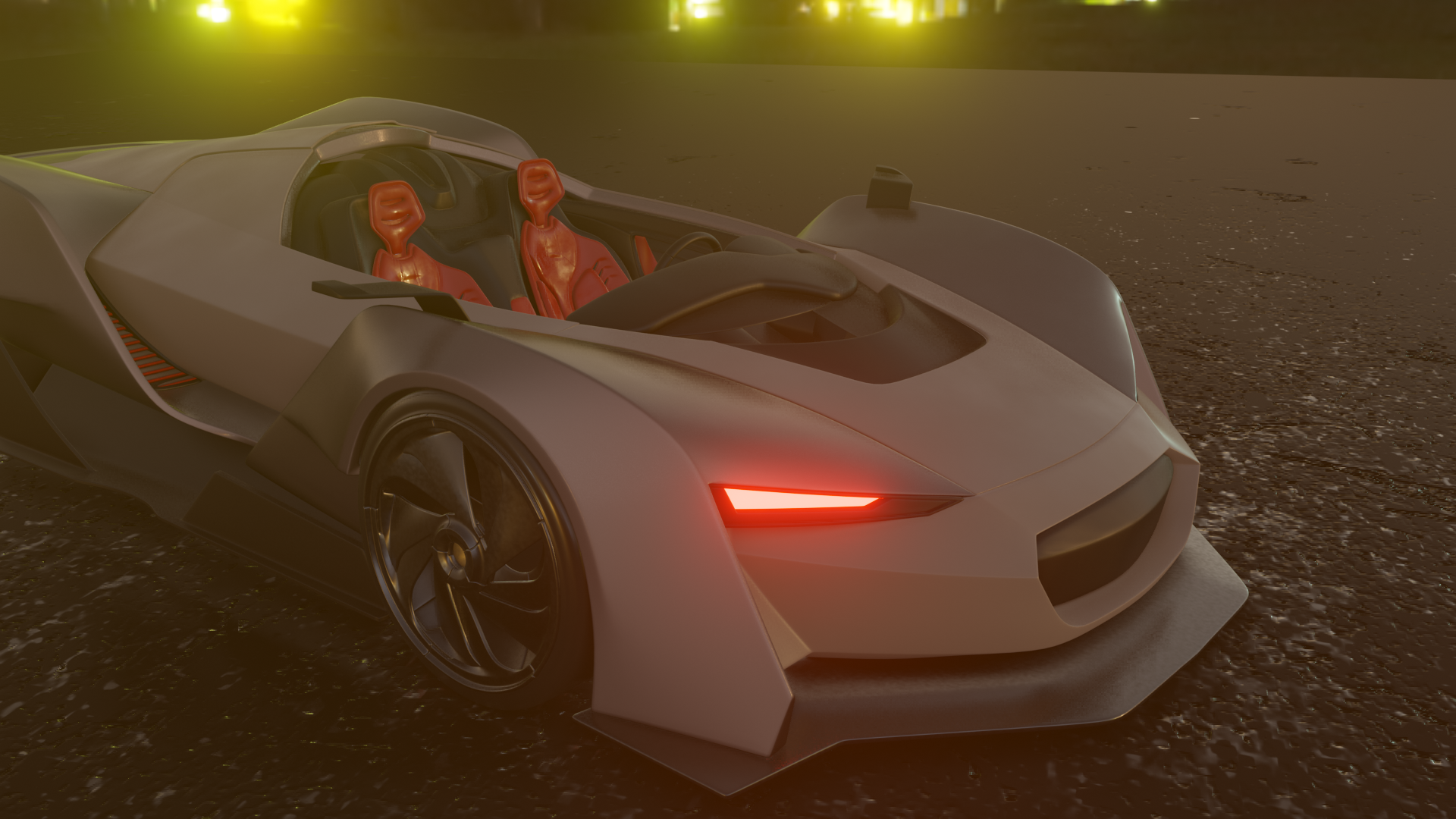
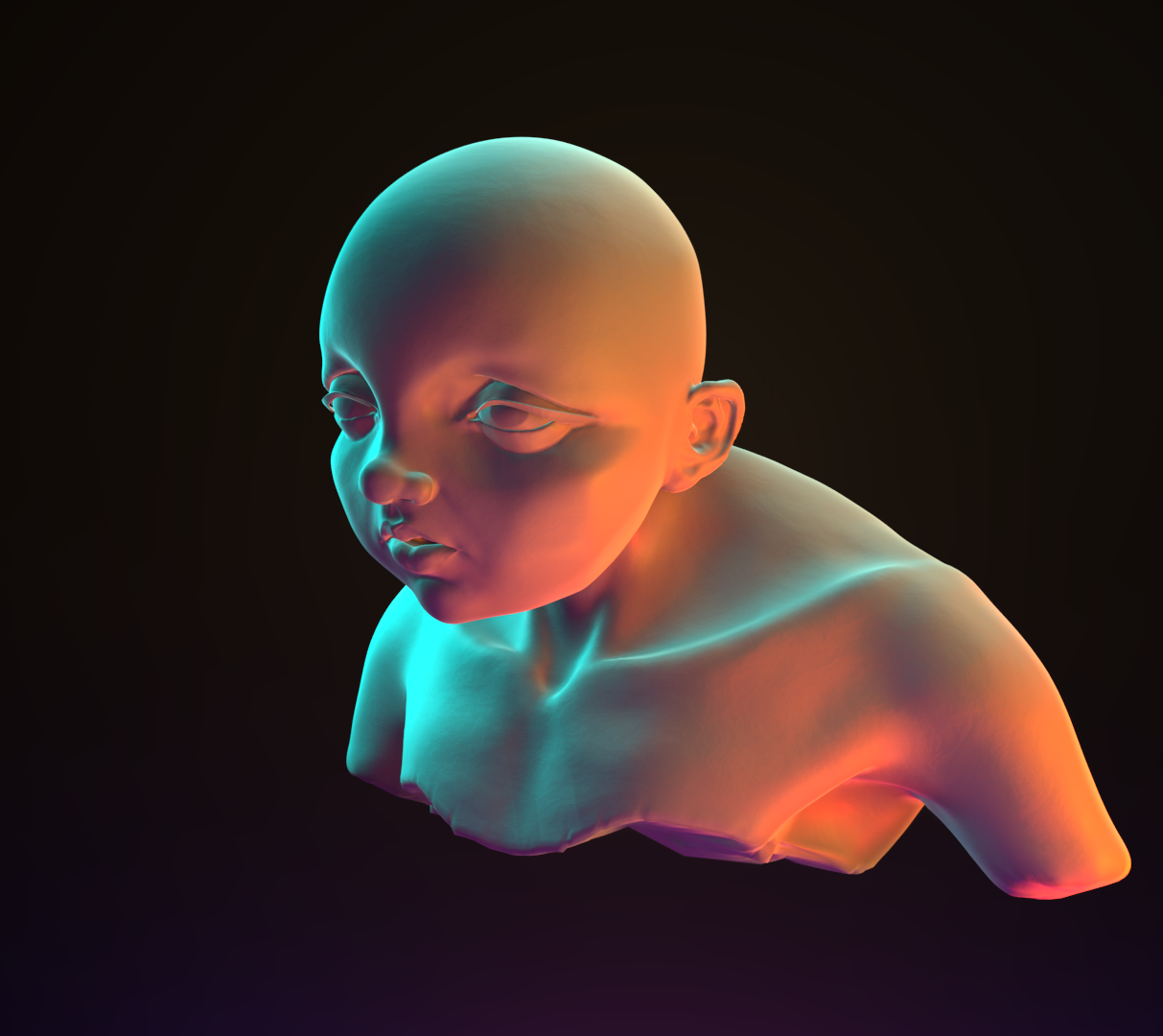
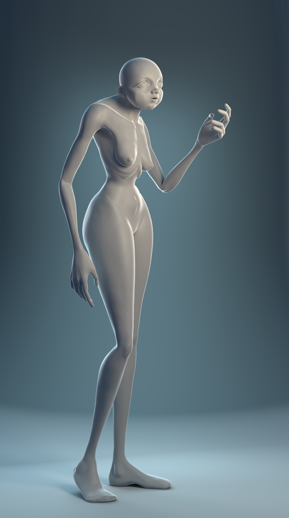
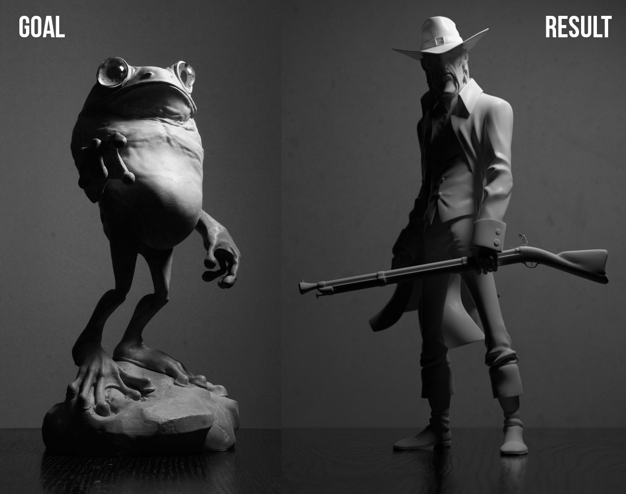
I've been working on this character for months, and I'm glad my lighting skills are slowly getting better :) Kent's Lighting Goal inspired me. (Cycles render)
I sculpted this hand about a year ago, then I lost the file and found it again a few weeks ago^^Those were some dramatic emotions back then, so I thought a dramatic light would be appropriate!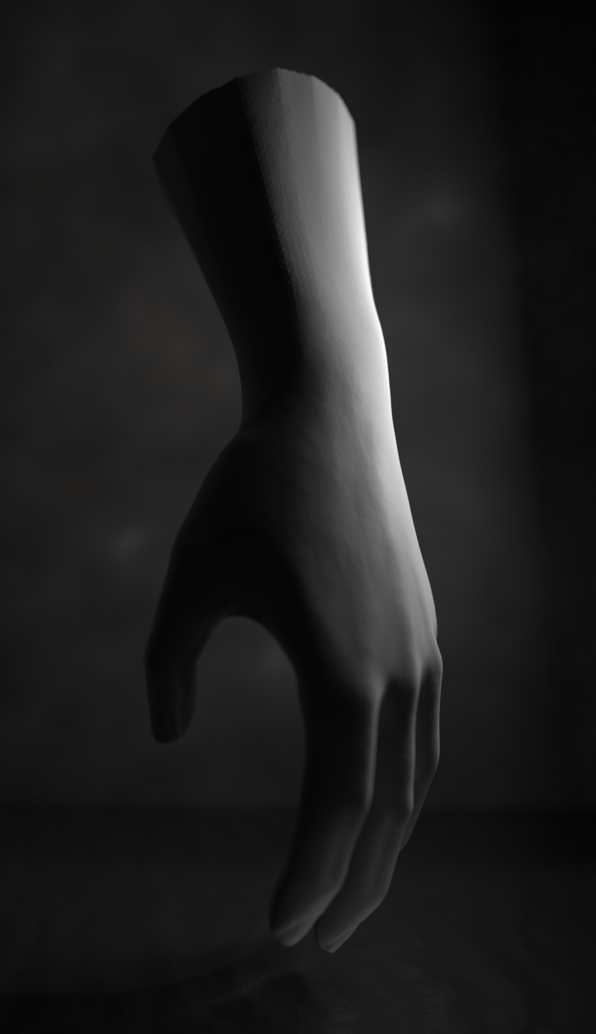
![]() rostzwiebel Nice job on the color match lighting. I think that one was really nice.
rostzwiebel Nice job on the color match lighting. I think that one was really nice.
As far as the character... setting aside the subject, nice job on lighting it in a way that is appealing. Nice rim lights :D
I said setting aside the subject matter because to me, the different parts of the body don't really feel like they belong to the same character.. the head seems like a small, chubby kid, the body seems emaciated, the arms seem like from a tall, lanky person, and the legs like from a curvy, sexy body. the combination just seems strange and out of place to me. But as this was about the lighting and shading, I tried to look at those, and that was very well done.
![]() gradyp Hey Grady, thanks for your critique! Actually I'm quite happy with my character design, but I will keep your arguments in mind while I make my next one. It's interesting to see how different people interpret forms and combinations of those in different ways.
gradyp Hey Grady, thanks for your critique! Actually I'm quite happy with my character design, but I will keep your arguments in mind while I make my next one. It's interesting to see how different people interpret forms and combinations of those in different ways.
Late is better than never! Good stuff from week 2's assignments, ![]() rostzwiebel. Love the color scheme on the vehicle as well as the materiality of everything. Feels tangible and believable. There's also a pleasant hazy vibe - I assume from the bloom effect. Only note is that the ground plane ends too abruptly, which has been a common critique this month. It makes the ground plane obviously CG and threatens the viewer's ability to be immersed into the render. I recommend using depth of field to blur the plane out into the background. Still it's a B+ from me 👍
rostzwiebel. Love the color scheme on the vehicle as well as the materiality of everything. Feels tangible and believable. There's also a pleasant hazy vibe - I assume from the bloom effect. Only note is that the ground plane ends too abruptly, which has been a common critique this month. It makes the ground plane obviously CG and threatens the viewer's ability to be immersed into the render. I recommend using depth of field to blur the plane out into the background. Still it's a B+ from me 👍
I really like the light match! Super appealing colors and I think I know the image you were matching. A on that one.
As for week 3, you crushed the character render. I like the values of light and shadow, the colors are subtle and work great for a model-centric render, and the rim light is *poppin*. An easy A on that one.
You also did an excellent job matching this week. Kudos for matching the background and floor material. The extra effort there is very worth it imo. A+
![]() rostzwiebel If you're going for a stylized character, I think you've got it. Good lighting match, too.
rostzwiebel If you're going for a stylized character, I think you've got it. Good lighting match, too.