My homework thread for the October 2018 Class.
I made my way back from the north and now it's time for some Blender again!
Fortunately I have made the first homework exercises earlier this year and be able to submit my homework in time.
Here's the Toy truck and the Bedroom scene
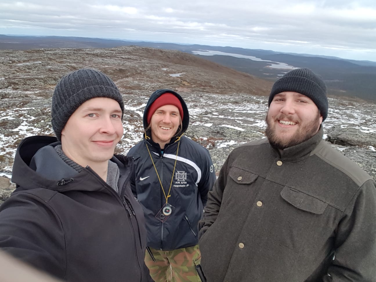
And as a bonus I want to show a picture of us at the peak of Hammastunturi (straight translate: Tooth Mountain). Happy fellows.
![]() swikni Hej Jere nice to see you and also the renders of course, with that congratulations for joining all the CG Cookie classes in 2018 :D
swikni Hej Jere nice to see you and also the renders of course, with that congratulations for joining all the CG Cookie classes in 2018 :D
![]() swikni Cool photo! Hope you had fun 😎
swikni Cool photo! Hope you had fun 😎
Very colorful truck, I like it! and nice lighting in the bedroom 😊
![]() csehz ssmurfmier1985 Thanks and nice to see you too!
csehz ssmurfmier1985 Thanks and nice to see you too!
Ps. The hike indeed was such a great time even if the nights started to be pretty chilly lol
![]() swikni You certainly seemed to have enjoyed yourself, but welcome back! Looking forward to what new things you have in store for us.
swikni You certainly seemed to have enjoyed yourself, but welcome back! Looking forward to what new things you have in store for us.
![]() silentheart00
silentheart00 ![]() thecabbagedetective Thanks! I do feel very refreshed being back on computer. I think there might be some submissions in the forum worth checking out.
thecabbagedetective Thanks! I do feel very refreshed being back on computer. I think there might be some submissions in the forum worth checking out.
@theluthier Nice guess. It does look like a tooth since it has three peaks. At least some animals or humanoids tooth lol.
Week 2 Homework Submission
There is a relocation progress going on in my life so I wasn't able to do EEVEE render since my laptop doesn't have OpenGL 3.3 support. Doing the lighting homework was a bit slow but possible, and it's not too serious that few times it felt like this machine was going to set itself on fire when rendering lol.
Too bad it was this week when we had to use 2.8 because we're travelling south to get the rest of my stuff tomorrow and I should (finally) get on my main computer again on Wednesday. Well at least I'm able to do the rest of the class with full power and after this arrangement I shouldn't have to work on a laptop for a while 😊
I used my Piece of Junk (Mazda323 from the vehicle class) on both exercises. I checked out some models online but it was too difficult to choose so I decided to go with the simple option.
Shading and lighting:
This is like the coolest render I've done on this computer. It turned out surprisingly good but if the working wasn't so slow I would've tweak it just a little more. For example maybe do something for the ground and the background.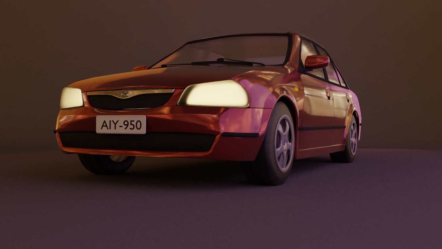
The lighting match was both fun and difficult. I had a blast figuring out how to use lamps and luckily I went with pretty simple reference. Well I'm not too sure if it's simple but it looked like that to me and it felt like it would match.
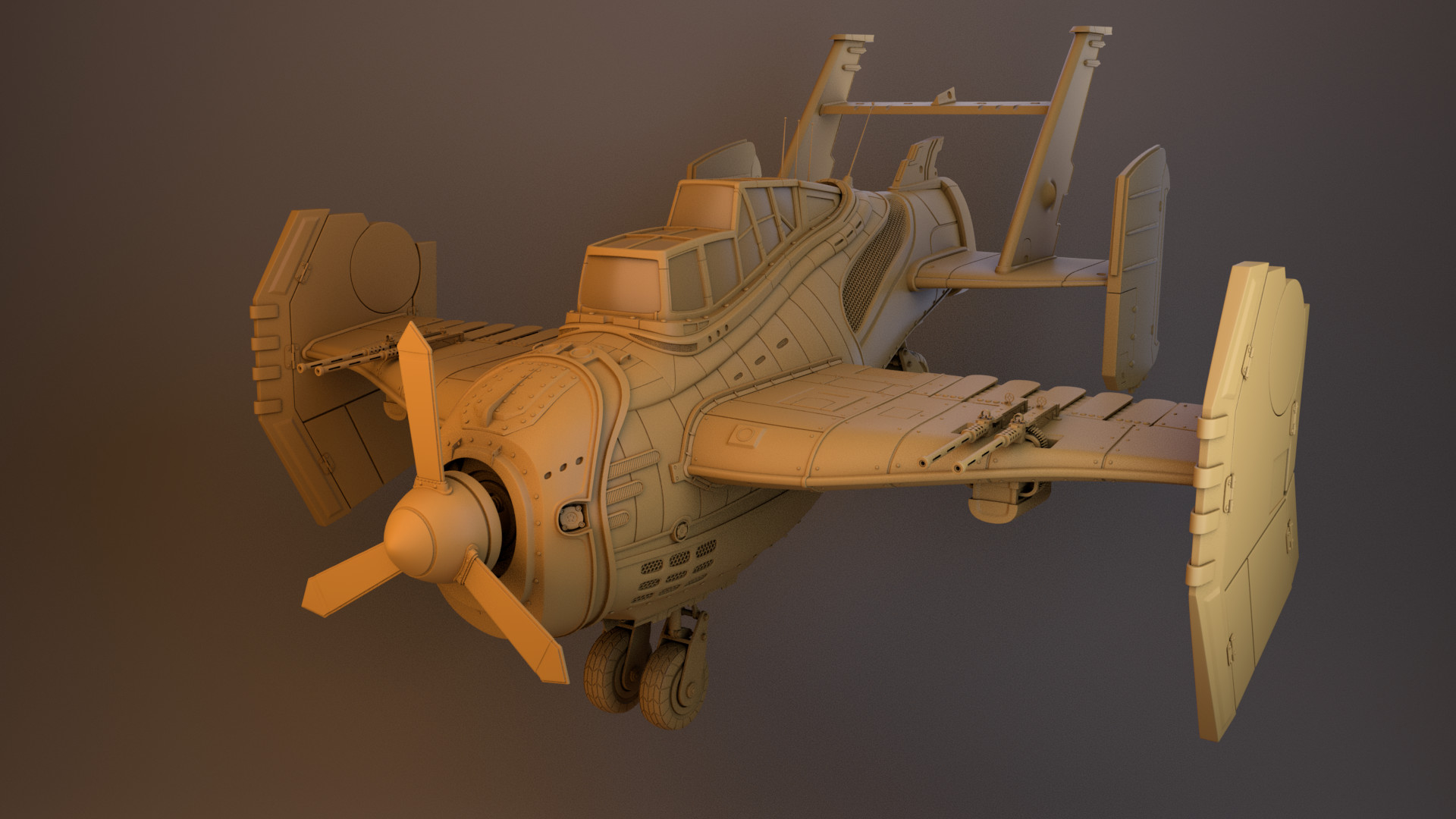
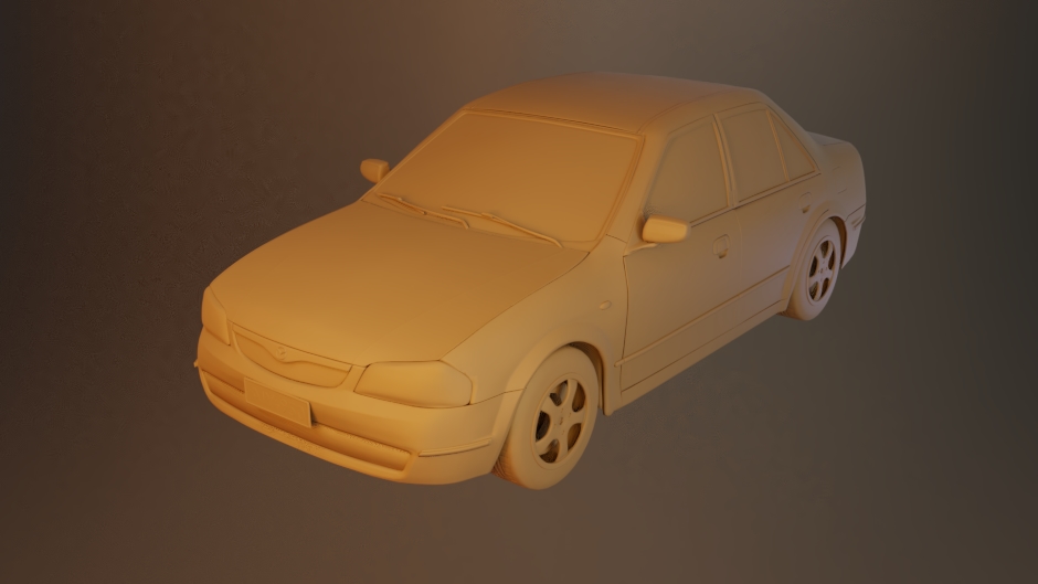 As reference I used image by Yoel Pereira López
![]() swikni Glad you could do at least do some work with your laptop, 'cause it's looking awesome!
swikni Glad you could do at least do some work with your laptop, 'cause it's looking awesome!
The car is really nicely shaded and lighted, love it 😊 It would indeed have been nice to have something more going on with the floor, but hey you did what you could. The car still looks good 😬
Light match well done, looks very much like the reference 👍🏻
Great job this week Jere! Good luck with the rest of your relocation, and looking forward to your next weeks homework with your full workstation 😄
![]() swikni Of course this is the Eevee week! Lol no worries, I appreciate that you did it anyway with Cycles. If you want to do Eevee you could do week 3 with Eevee instead of Cycles.
swikni Of course this is the Eevee week! Lol no worries, I appreciate that you did it anyway with Cycles. If you want to do Eevee you could do week 3 with Eevee instead of Cycles.
Your car turned out very good indeed. The HDRI you chose is working really well with the car paint reflection.And I like the cloudy plastic on your headlight. It contributes to the old junky car feel. The only negative about the render is the background and floor. As you said, you might want to do something extra with those. Not that your current setup is that negative, after all the focus of the image is the vehicle first and foremost. But they don't contribute to the image at all when they could. Still it's a B+ for that half of the homework.
I don't have much to say for your light match other than, "you nailed it!" It looks super similar. Fantastic light-detective work 👍 A from me.
![]() swikni Jere reading your comment I started to feel lucky that Eevee runs so fast on my oldie computer from 2011.
swikni Jere reading your comment I started to feel lucky that Eevee runs so fast on my oldie computer from 2011.
Being not sure what is that OpenGL 3.3 support and so just being satisfied that not having issue like that
![]() swikni Little late to the party. You did what you could with what you had and you persevered. Looks good to me. Maybe the orange light in the lighting exercise is a bit too much, but it looks good otherwise.
swikni Little late to the party. You did what you could with what you had and you persevered. Looks good to me. Maybe the orange light in the lighting exercise is a bit too much, but it looks good otherwise.
@theluthier ![]() silentheart00
silentheart00 ![]() csehz Thanks for the notes!
csehz Thanks for the notes!
Yes that sounds like a good to try out some EEVEE renders in the character lighting homework. I might give it a go and definitely play around with it more in the future
Week 3 Homework submission
I tried few different lighting set ups. It felt pretty free and fun to add lamps and just try out what worked. I don't have any newer character models at the moment and wanted to use something own so I used Cuthbert from character creation class.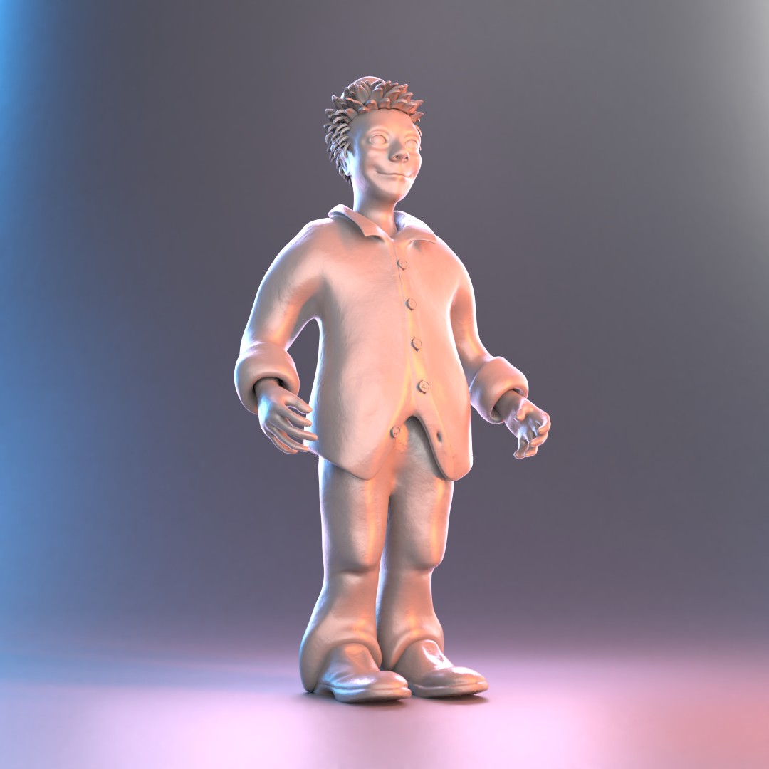 First I just wanted to lit it brightly and just make it sure that it's not too dark and added noise shaders. After that I wanted it to look like a lit statue.
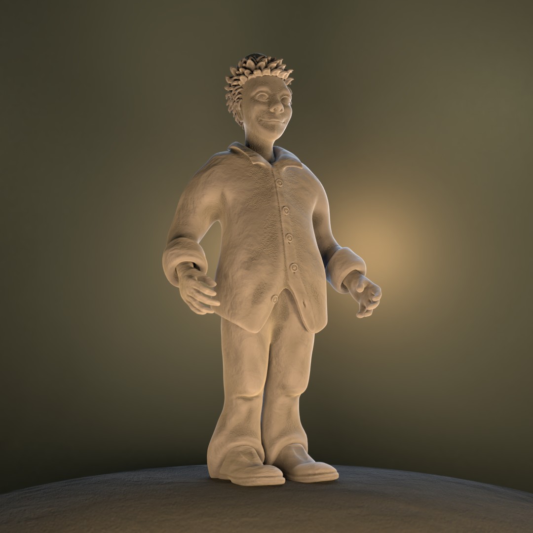
Then I made some test runs with EEVEE since I couldn't use it last week. The lights do work very differently with it so I found it pretty difficult.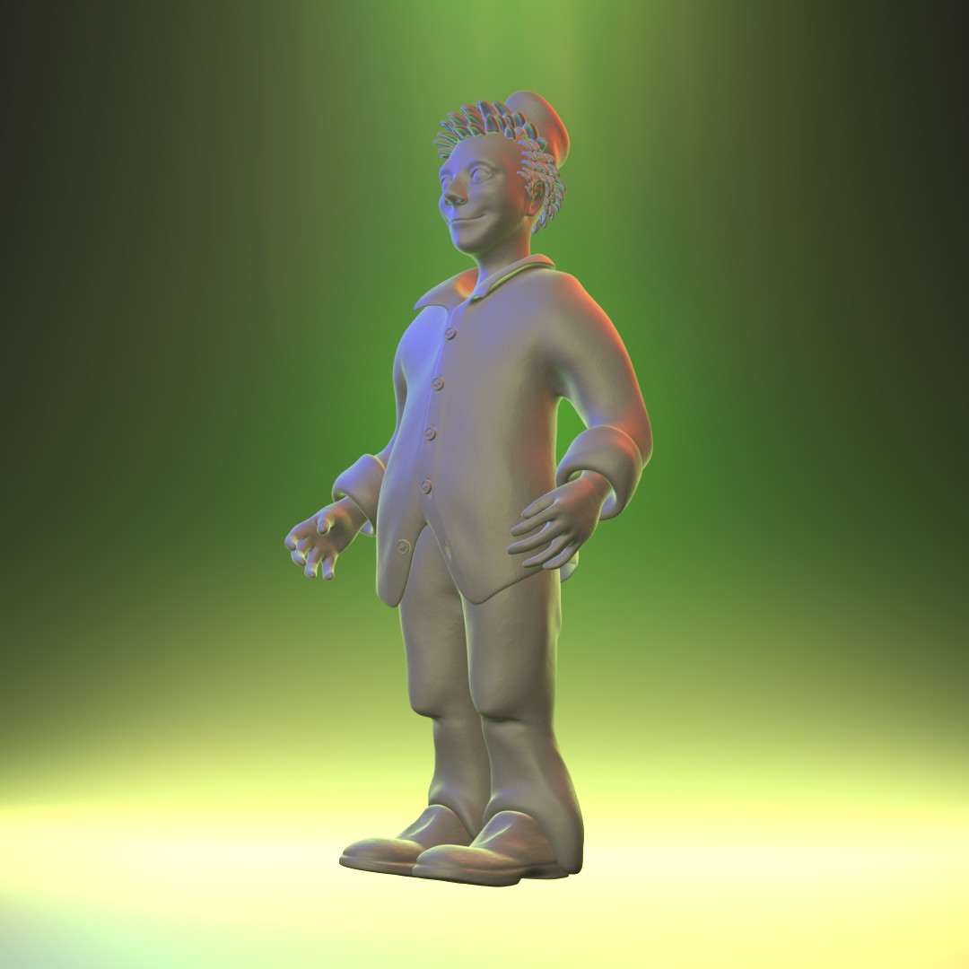
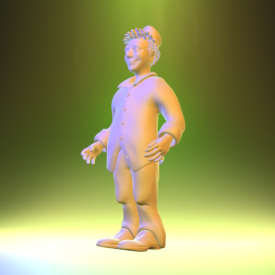
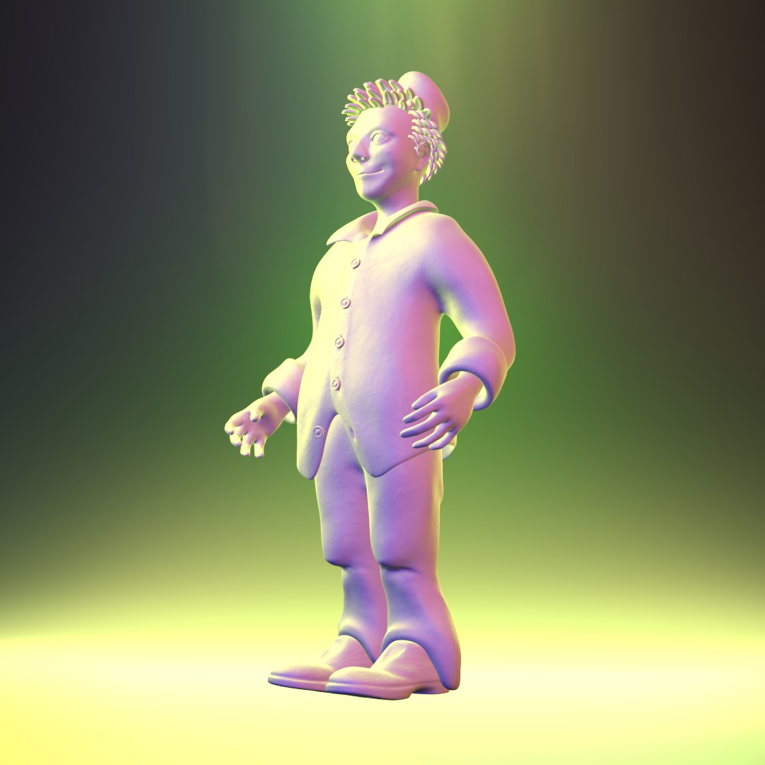
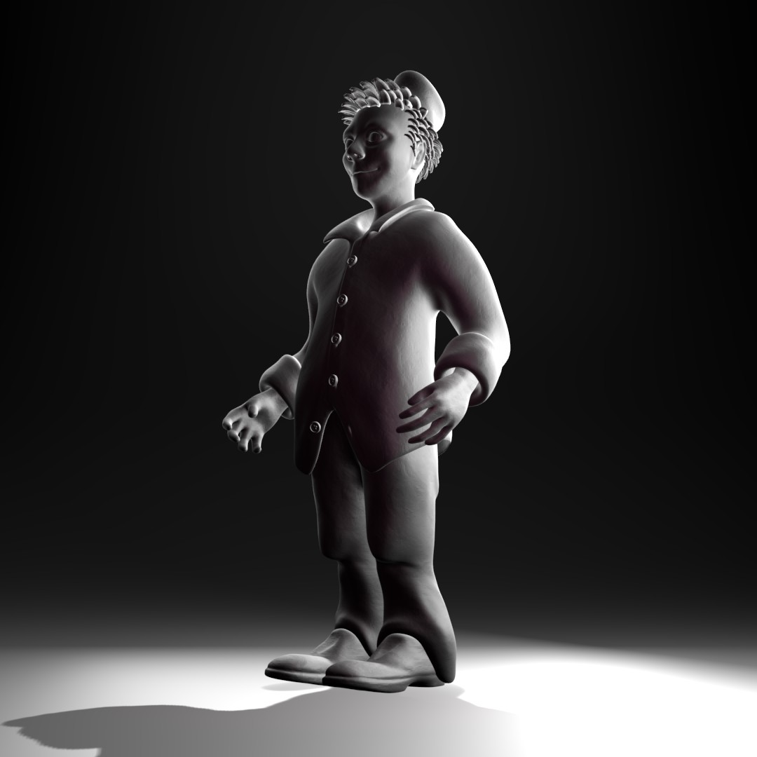
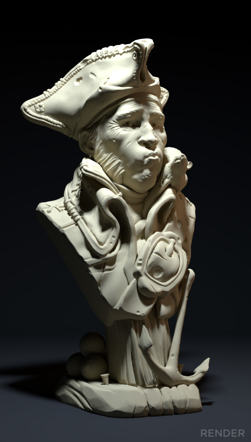
For lighting match I chose again quite simple reference. A pirate and his rat by David Ostman. Maybe too much of Cuthbert at this point so maybe the old clown head can work as a model for this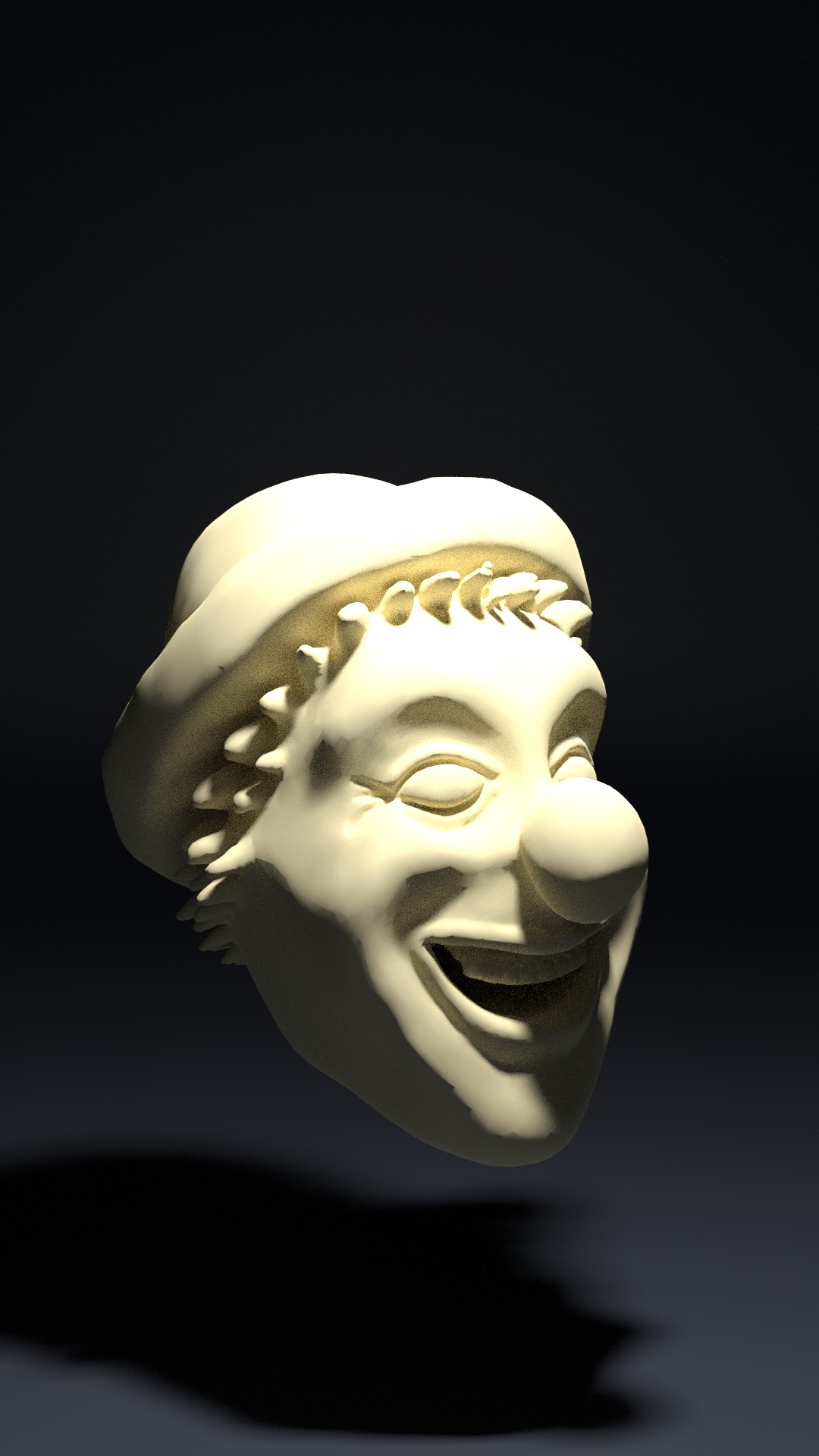
Reference:
And as a bonus, here is my lighting testing for the Epic Pumpkin Contest scene. Trying to figure it out now for couple days before next homework. Vector curves and mixing noise textures worked out beautifully on the ground. That pattern looks very cool and non uniform to me.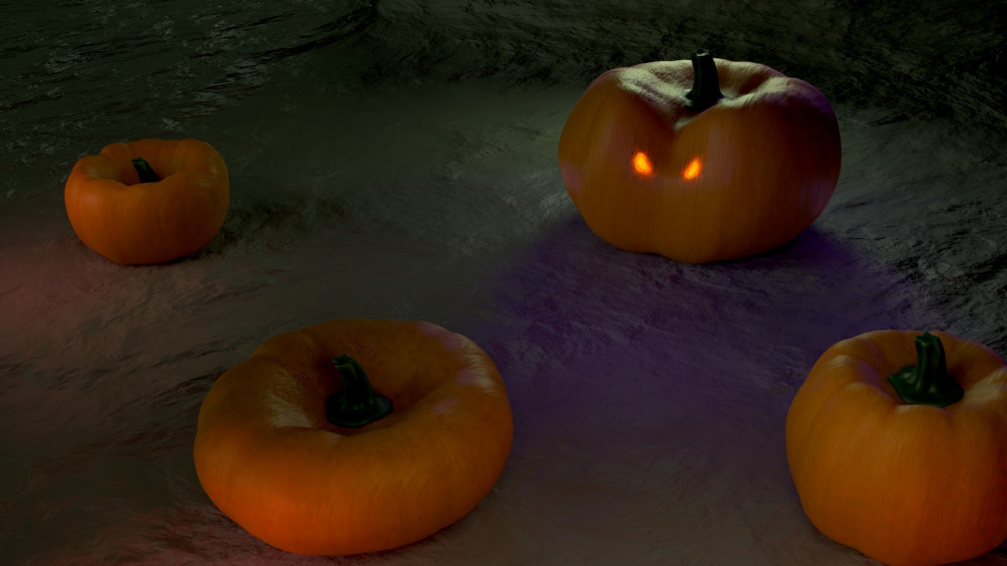
![]() swikni Really cool to see you try so many different setups! Your experiments were all over the place, in a good way; from moderate to wacky color schemes. I really like to see that level of exploration.
swikni Really cool to see you try so many different setups! Your experiments were all over the place, in a good way; from moderate to wacky color schemes. I really like to see that level of exploration.
These are my faves:

The Eevee ones are pretty noticeable. It definitely takes more effort to get them on a comparable level to Cycles. One thing to look out for is too much blow out in the highlights. It can be too bright for taste. The 3rd from the left in that row (green/purple/pink) gets a little too blown out imo.
Overall an A+ for me in quality and effort.
With your light match I think you're quite close but difference in the model's detail level is a quick disconnect. Yours is also perhaps a little too blown out by comparison, though that could be due to details too. While the source is definitely blown out in the highlights, the blowout isn't quite so broad. It's B+ from me 👍