Welcome everyone in my BC4-1810 class room, feel free to comment/critique the submissions as I would like to learn
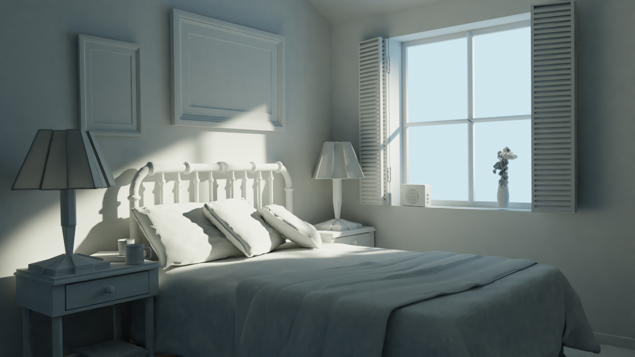
Week 1 - Lighting a Simple Bedroom

Week 1 - Shading a Toy Truck

Week2 - Vehicle Lighting
Week2 - Lighting Match #1 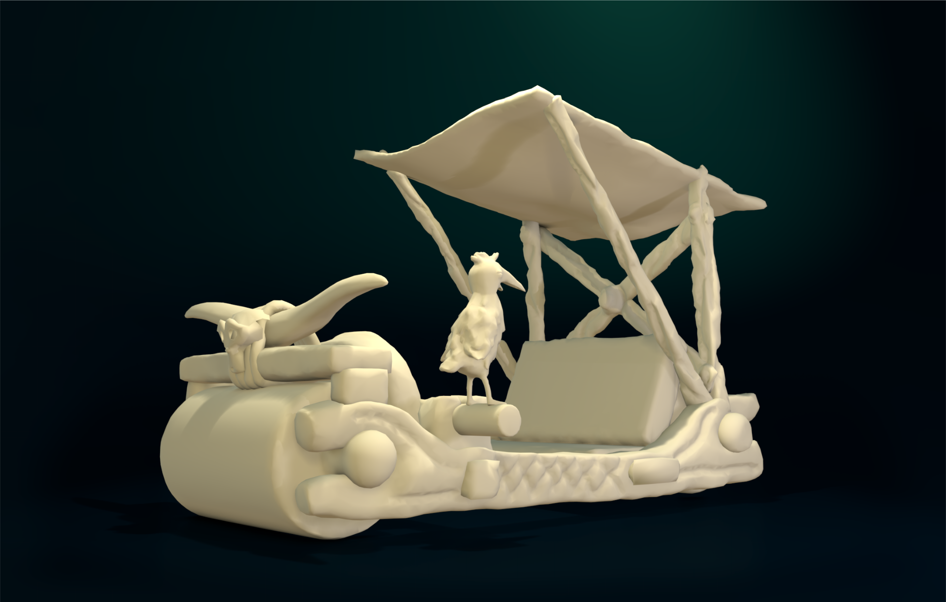
Week3 - Lighting Match #2
Week4- Architecture Visualization
Week4- Lighting Match #3
Basically would like to express that found both exercises very useful as a start, they are not so easy as would maybe look at first.
Regarding my computer which is a laptop from 2011, well it turned out that can not have too many shots during the weeks, as 500 samples rendered in 2 hours :-) But as mentioned somewhere already here, I focused so far mostly on modeling, being not so much familiar with these next phases as S&L.
Anyway the nature of this class seems slightly different than the before ones, sometimes just 3-4 clicks here and there by human and the rest is waiting for the result from the computer :-)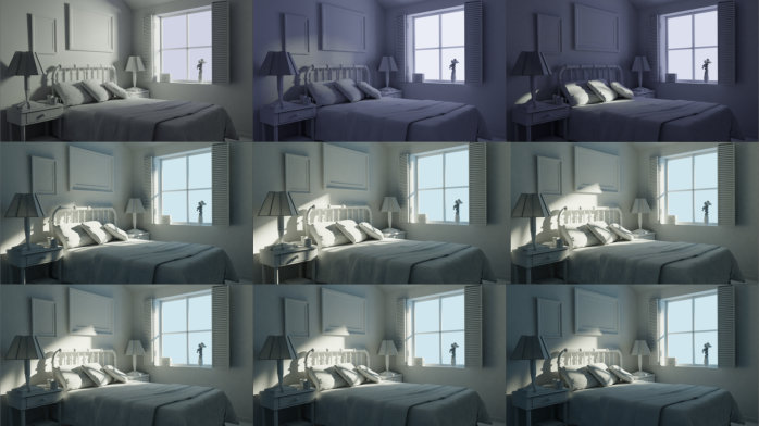
Week 1 - Lighting a Simple Bedroom
As you can see above here tried some versions till calibrating the required angle, in general being satisfied with re-producing it, hopefully the strength also fits around to have gradients, this is the one which is selected as final
https://www.cgcookie.com/exercise_submissions/16583

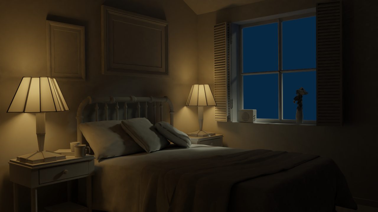
For the night one just had two renders and this seccond one liked it inspite of being aware, that not perfectly match
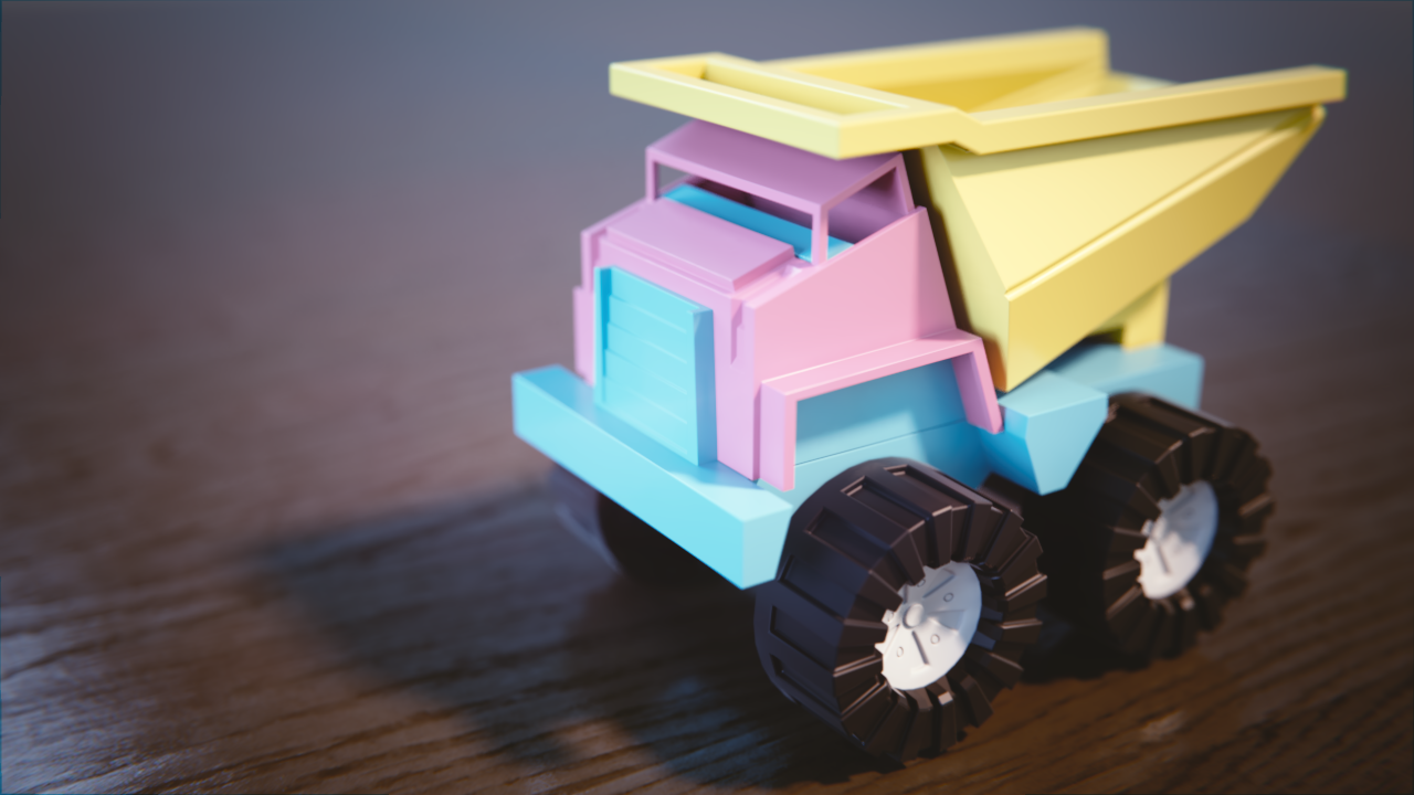
Week 1 - Shading a Toy Truck
Here with the colors just had one target to have a visually pleasing result for my 1,5 year old baby girl, so this is a mostly girl truck :-)
https://www.cgcookie.com/exercise_submissions/16582
![]() csehz Nice to see your process with the bedroom! That;s a nice day render there. Subtle shades of color. The night one is nice, but maybe the light from the window could've used some blue to help balance out the orange lights. It's also a bit dark on the right side of the image.
csehz Nice to see your process with the bedroom! That;s a nice day render there. Subtle shades of color. The night one is nice, but maybe the light from the window could've used some blue to help balance out the orange lights. It's also a bit dark on the right side of the image.
Girls can like trucks, too! It has some nice pastel colors, and the shader looks good to me. Good work.
I agree with silent: Very cool to see your process on the bedroom!
...the nature of this class seems slightly different than the before ones, sometimes just 3-4 clicks here and there by human and the rest is waiting for the result from the computer
You're right, S&L is very different than modeling. Now that you mention it, this is the first class that isn't modeling-centric. Lighting is one of those things that can be achieved quickly if the desired result is understood completely at the onset or if stumbled upon by luck. It can also take longer than expected when the desired result proves illusive. Once we start diving into materials the general work load will increase.
But anyway, awesome work Zsolt! You crushed all your renders this week. I don't have anything to critique really... it's an A this week 👍
![]() csehz toy trucks colors are just LOVELY. Good job with the lighting too! The window could maybe be a bit darker in the night scene imo but the warmness of those lamps works perfectly
csehz toy trucks colors are just LOVELY. Good job with the lighting too! The window could maybe be a bit darker in the night scene imo but the warmness of those lamps works perfectly
Love the choice of colors on the toy truck :D Looks like one a little girl would have fun playing with :D
Being not sure how to evaluate this week, on one side learnt a lot and really focused on Blender and 2.8, but on other side rather struggled with the homeworks.
But what is important just had a break through - this week realized that I love Eevee! On my week old computer it works surprisingly fast, okay not the wireframe mode but the rendering time (so even with F12) is great.
In general so I like the 2.8 version, in August did not practice on it and that hit back a little bit now, but for my targets it seems stable so going to stick to this instead of 2.79.
Okay so the homeworks,
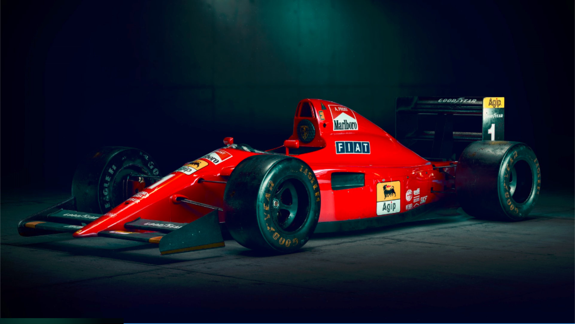
Week2 - Vehicle Lighting
This model from June class made from a toy reference, so its finally not a real car there were no blueprint to help. The shading showed some issues on especially at the doors, although seeing on the matchbox model it has around the same crashes so maybe real :D
Week2 - Lighting Match #1
Maybe it looks like a model for 3D print and basically I am satisfied with the gradients, but it would need some time yet to match. In this state the reference is rather inspiration than the same, but it is Sunday night turning to Monday
![]() csehz Ayy I remember that taxi! If you were going for a toy look I'd say you did pretty damn well! You did good on the lighting match, too, but there are a couple points of improvement:
csehz Ayy I remember that taxi! If you were going for a toy look I'd say you did pretty damn well! You did good on the lighting match, too, but there are a couple points of improvement:
- The ground closely surrounding the vehicle needs to be brighter and not fade so easily into the darker colours, like a spotlight.
- I personally feel the ground along the edges could be darker, to also help sell the spotlight look.
That's about it really, but as you said you haven't *quite* finished it yet so hopefully you'll return to it and make it even better!
![]() csehz Looking good. That's what I always say, don't have the mindset to point out stuff like Aaron here lol. I personally struggled with taking image of shaded model as a reference because it felt more difficult to figure out the color of the lights. However you got it working fine.
csehz Looking good. That's what I always say, don't have the mindset to point out stuff like Aaron here lol. I personally struggled with taking image of shaded model as a reference because it felt more difficult to figure out the color of the lights. However you got it working fine.
![]() swikni Sorry if I came off as rude, only meant to help. But yeah, the lighting match exercises are deceptively difficult, as it's mostly your intuition at play.
swikni Sorry if I came off as rude, only meant to help. But yeah, the lighting match exercises are deceptively difficult, as it's mostly your intuition at play.
![]() thecabbagedetective No no no it was meant as a compliment. I always enjoy reading those tips you guys give here. Keep it up!
thecabbagedetective No no no it was meant as a compliment. I always enjoy reading those tips you guys give here. Keep it up!
![]() thecabbagedetective Aaron yes I was also considering this, if the model were made based on a toy and the shapes are like that, then it can not be a real car and has to stay as toy.
thecabbagedetective Aaron yes I was also considering this, if the model were made based on a toy and the shapes are like that, then it can not be a real car and has to stay as toy.
Especially thanks for the constructive thoughts regarding the light match, yes the tome is always a tricky factor but that is quite a challenge in this task that whether enough to focus only to the lighting, or eventually helping the atmosphere also adding some materials :-) As at one point thought the Flintstone car could be red-black, although that concept would totally blow away my weekly time management :D
![]() swikni Jere thanks for the kind words, admittingly my spirit a little bit need them after this rollercoaster feelings, that 2.8 is great and works so nicely on the old machine, just I should know it more :-) (as the lighting match is also Eevee)
swikni Jere thanks for the kind words, admittingly my spirit a little bit need them after this rollercoaster feelings, that 2.8 is great and works so nicely on the old machine, just I should know it more :-) (as the lighting match is also Eevee)
...just had a break through - this week realized that I love Eevee!
It's a pretty sweet engine, right?! So exciting to consider what Eevee could do for our S&L workflow going forward.
The shading showed some issues on especially at the doors..
Funny / annoying how S&L can reveal model issues. Heh but like you said, you can easily pivot to a "this thing has been abused over the years" 😅
Generally you've done a great job! Reflections are reading well and fresneled. Without a ground and visible environment there's not too much to critique in terms of realism. So not much else to say aside from "it looks good!" It's an A from me for the vehicle.
Others have been pointing out good valid crits of the light match. I think the biggest disconnect immediately is that the source render is textured with distinctly different colors than your model. Also there's a backwall + floor present in the source that isn't in yours. So right away it's difficult to tell if they actually match.
What I can tell is that you've got a keylight pointed down from above like in the source. I suppose the lesson here is that to be a distinguishable light match texturing needs to be a factor: Either no textures in either (my suggestions) or both have textures.
Total for the week is still good at a B 👍
![]() swikni Ah no worries then my man, just wasn't sure, thought it best to play safe lol.
swikni Ah no worries then my man, just wasn't sure, thought it best to play safe lol.
![]() csehz Another person who loves Eevee! 😄 I really like what you've done with your taxi, I think it looks great 😊 Good attempt on the light match too.
csehz Another person who loves Eevee! 😄 I really like what you've done with your taxi, I think it looks great 😊 Good attempt on the light match too.
Oops I did (tweaked long, so struggled, in this way learnt a lot, but been swept away) again..
Hopefully once can post also the character lighting, at the moment it is sitting in the recycle bin :D
Week3 - Lighting Match
Goal
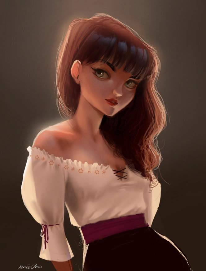
Match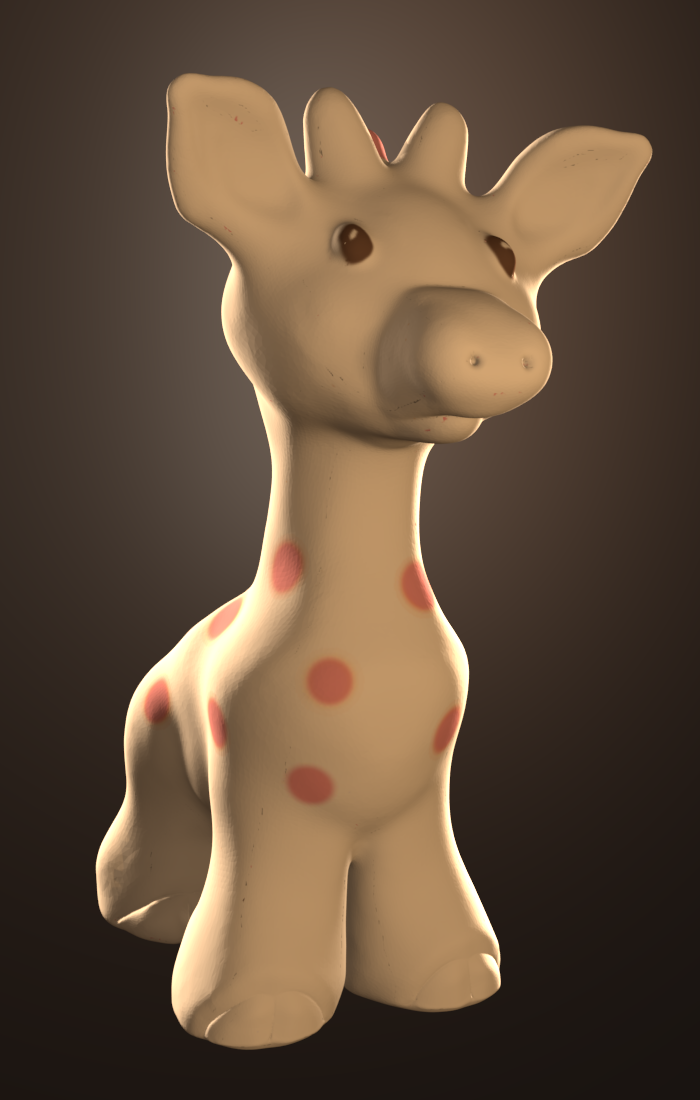
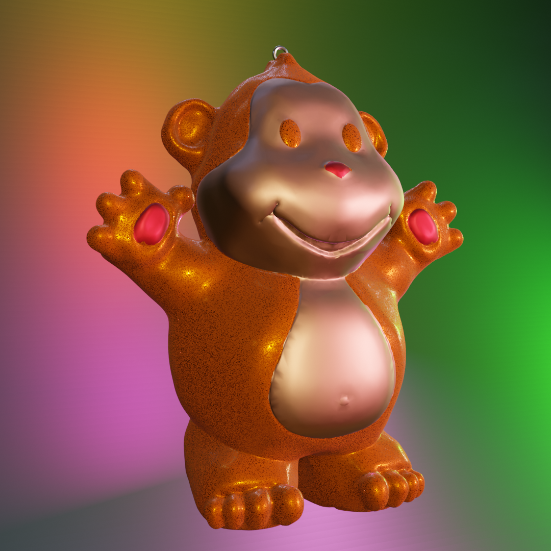
Okay it is Monday morning so at least can describe the things regarding the WIP monkey from the recycle bin..
Week3 - Character Lighting
So basically the concept of turning the "Buddha Monkey" to a "Christmas Ornament" I liked quite fast, but then run into two serious issues which just ate my time:
1) assigning separate materials to the sculpted object, it is quite hard to do precisely plus in Edit mode also very slow (plus the shading of course showed some issues with the model again :D)
2) creating an appealing background, the idea was that the ornament would be hanging maybe on the christmas tree or at least a kind of atmosphere about christmas, well, it was way too ambitious in my timeframe

