Hey everyone! First time participating in a live class!
This will be my homework thread for the October 2018 class
Week 1 Homework
Shading a Toy Truck
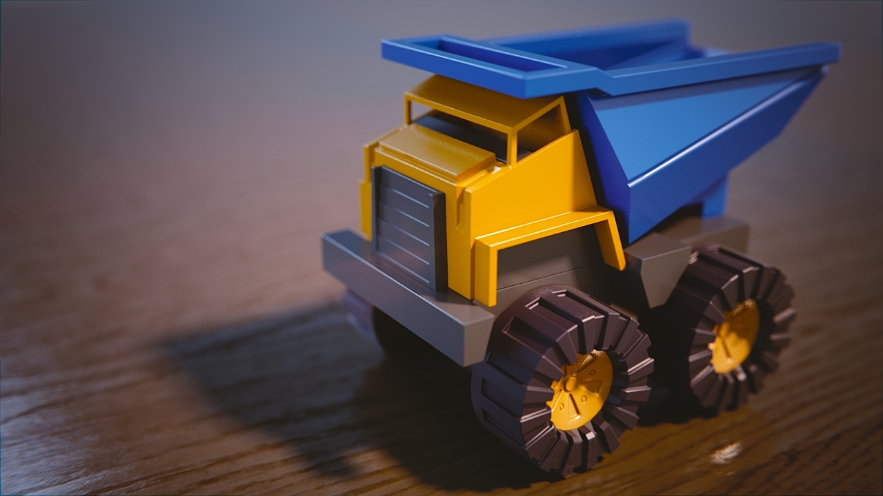
https://cgcookie.com/exercise/shading-a-toy-truck/exercise_submissions/16540
Lighting a Simple Bedroom
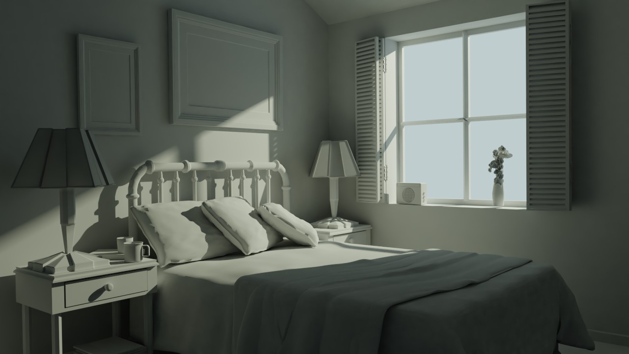
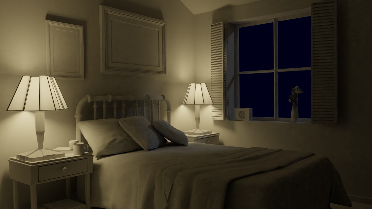
https://cgcookie.com/exercise/lighting-a-simple-bedroom/exercise_submissions/16572
ttcmpinheiro Welcome to the class! Your truck looks good. Not much to critique there. Your day scene looks nice, too. Maybe a touch of orange in the sun would help warm things up. Night scene is nice. Warm lamps and a cooler moon glow. Not much to critique. Good work.
hi looking good there, specially the night one, on the day one do the shadows look a bit too sharp?
Solid work on all your renders this week ttcmpinheiro! No notes from me on the toy truck. It reads like plastic and overall looks quite appealing.
I feel like you daylight could use a little extra strength from your sunlight. Seems a touch dull to me. Could be filmic too though..And I do agree with n647 about the moonlight shadows being too sharp. Softening them would help.
Overall great work. An A in my book 👍
ttcmpinheiro Good job this week, Tania. You vehicle looks good. However I'm not getting a sense of contact shadows anywhere aside from the car on the road. I'm wondering if Ambient Occlusion is enabled. Besides that it's solid effort with Eevee.
You got really close with your light match! Light colors, intensities, and positions feel spot on. My only note is the same as the vehicle: Ambient occlusion isn't as noticeable as the source render. I'd recommend turning AO on if it's not and/or increasing the strength of the effect.
It's a B+ from me this week. Keep up the good work 👍
Week 3!!
Shade & Light a Character
This week I picked the "Made you look" genre to make a golden figurine

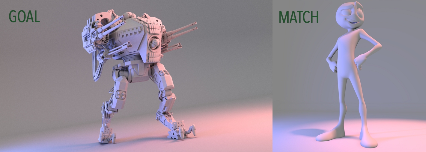
Lighting Match #2
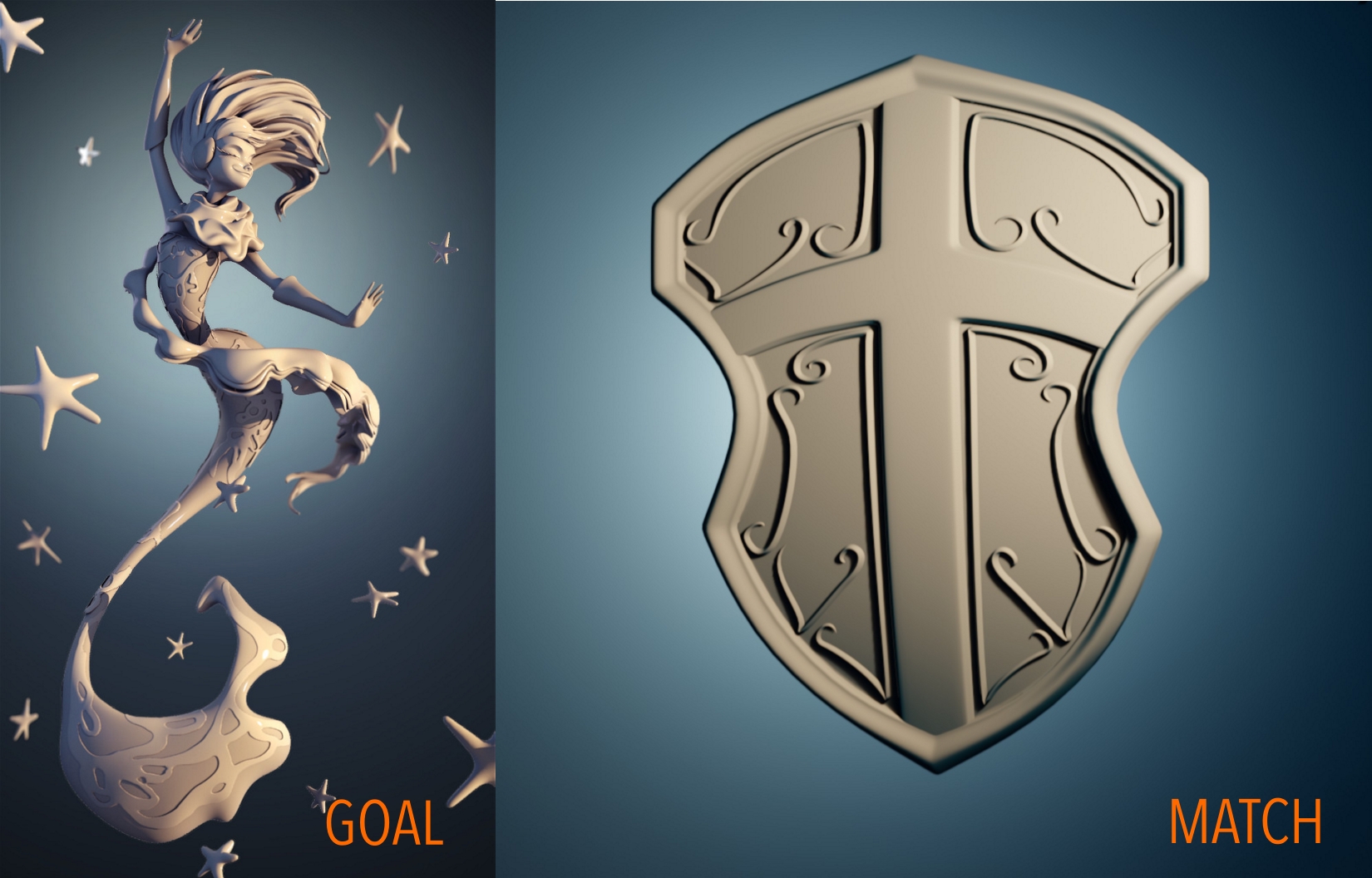
Image credits: "Mermaid" by Brittney Lee
ttcmpinheiro Interesting take on the lighting and materials for the goblin. Nice job on it!
One of the things we noticed last week is that it's really hard to judge light matches when the source and result subjects are this vastly different. That said, I think the gradient in the background on yours is definitely a brighter color as well as wider spread. Kind of hard to judge the lighting on the shield in comparison to the source, though.
ttcmpinheiro Nice job on your "made you look" character render! The gold reads very well; very believable. Do you have a HDRI environment in the scene? It looks like the gold is only reflecting the lamps and a blue-ish color. That's my only note, that I'd like to see more sings of an environment in the reflections. But it's a small note honestly. You've earned an A in my book.
I really like the source image you chose to match. It's a very appealing presentation. Unfortunately your shield - though I'm glad to see you did that tutorial! - is a pretty big disconnect from the source context (character). That makes it difficult to A) setup matching light and B) discern how much it matches in the end. I can see that your background is slightly more greenish in color and i don't see much evidence of a blue fill light coming from the left like I do in the source. Overall it's a B from me.
Solid work overall. One more week - keep it up!
Week 4
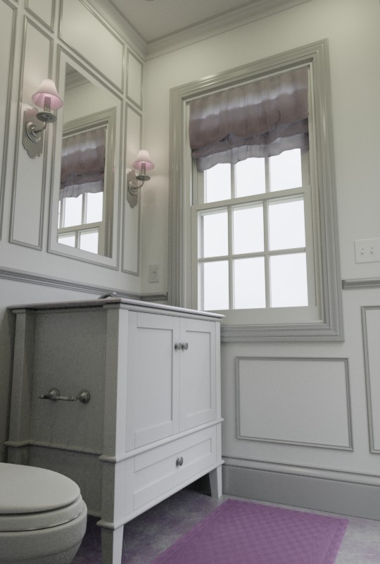
Arch Viz scene
Lighting Match #3
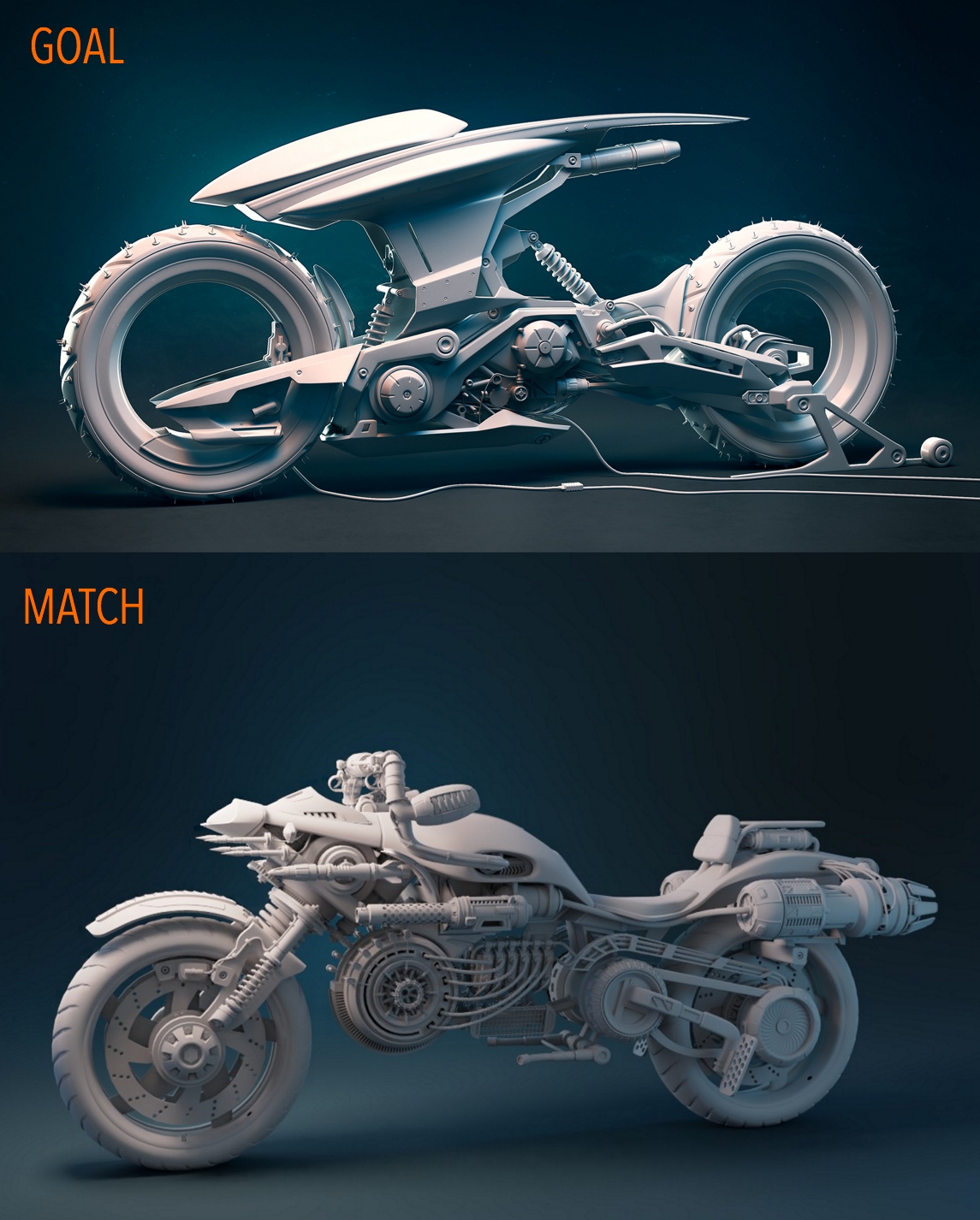
Image credits : "Sci-fi Motorcycle" by Mike Hill
Motorcycle model: "Rocket bike" from ChrisKuhn
ttcmpinheiro Congrats on submitting homework all 4 weeks, Tania! You've done a lot of good work this month.
Your arch viz is looking good. Certainly in the believable realm. A couple notes from me:
Overall it's a B+ from me.
Your light match is fantastic! Definitely one of my favorites from the month. You're super close to the source. Good work: A+.
Looking back through your thread, you've been fairly quiet this month, speaking louder with your renders than words. Which is fine - I hope you enjoyed the class :)
@theluthier Thank you so much for teaching this course and commenting my works. I've learned tons of new things these past weeks and now I feel more comfortable playing around with the textures and light setups.
Looking forward for next year's workshops.