My homework thread for October 2018 Lighting class.
My toy truck. Tried adding some dust to it. Combination of gradient, noise, voronoi and dot product. Probably not the most efficient way to do it but was trying to resist googling for help. Original submission: https://cgcookie.com/exercise/shading-a-toy-truck/exercise_submissions/16539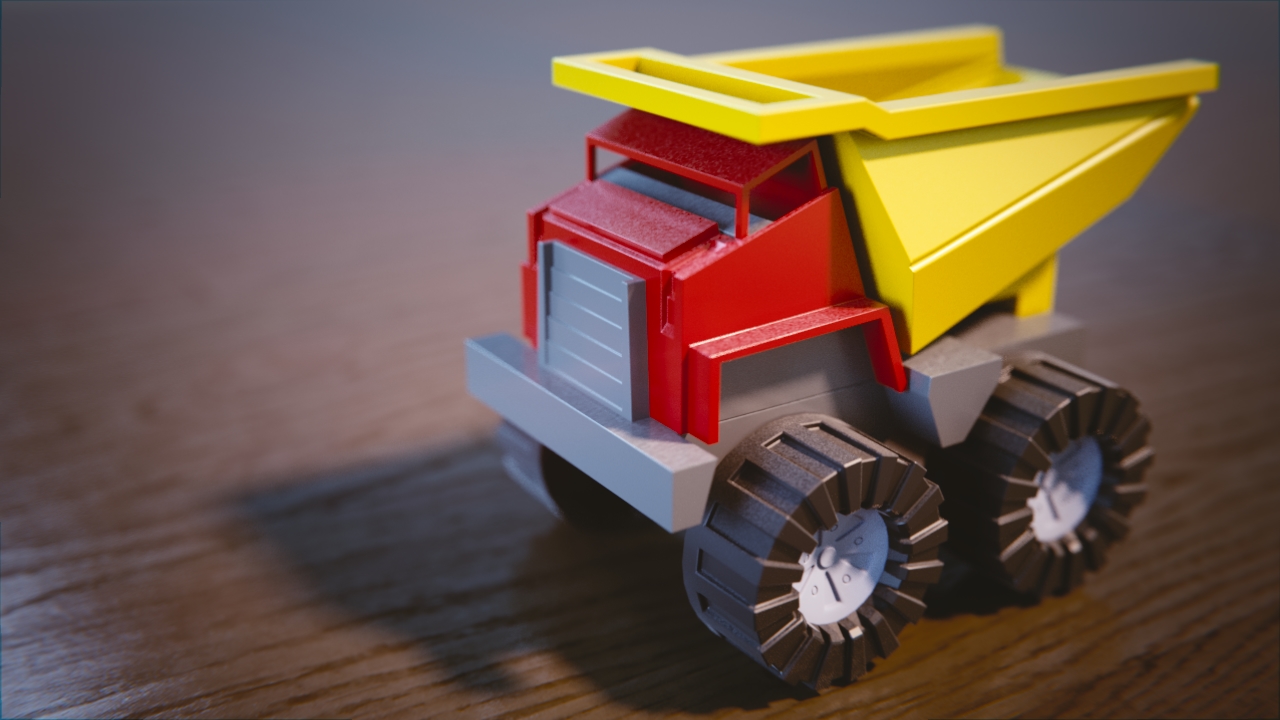
My bedroom scene. My wife, looking over my shoulder asked, "When did you take that?" "Um, it's a 3D render, not a photo." "Oh" I guess it was convincing enough. Original submission https://cgcookie.com/exercise/lighting-a-simple-bedroom/exercise_submissions/16571

ccthulusan Truck shaders are good. I like the dust effect. It works well on the wheels, maybe a little less successful on the rest, but good attempt. Day and night look good. Not much to critique there. Good work.
![]() silentheart00 Thanks for the feedback. I took another shot at aging the truck. Tweaked the dust, added scratches. Can't seem to get the pointiness to work reliably to get the edges. Not sure if I'm missing something. I'm not always sure why the nodes are doing what they do but it's fun to experiment.
silentheart00 Thanks for the feedback. I took another shot at aging the truck. Tweaked the dust, added scratches. Can't seem to get the pointiness to work reliably to get the edges. Not sure if I'm missing something. I'm not always sure why the nodes are doing what they do but it's fun to experiment. 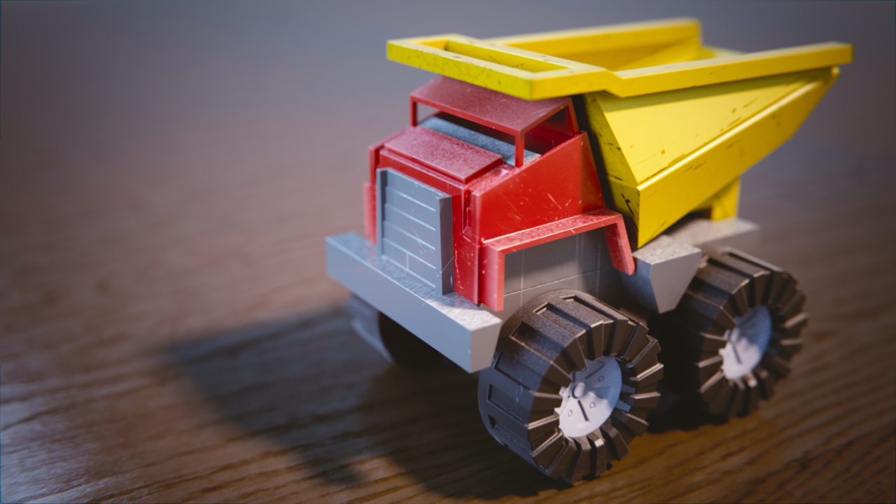
My wife, looking over my shoulder asked, "When did you take that?" "Um, it's a 3D render, not a photo." "Oh" I guess it was convincing enough.
I'm not sure better feedback is even possible! All of your renders are really nice this week. Both day night read realistic and appealing. No criticism there.
Your toy truck is top-notch. The dust and scratches are fantastic effects. Awesome job. A+ from me this week.
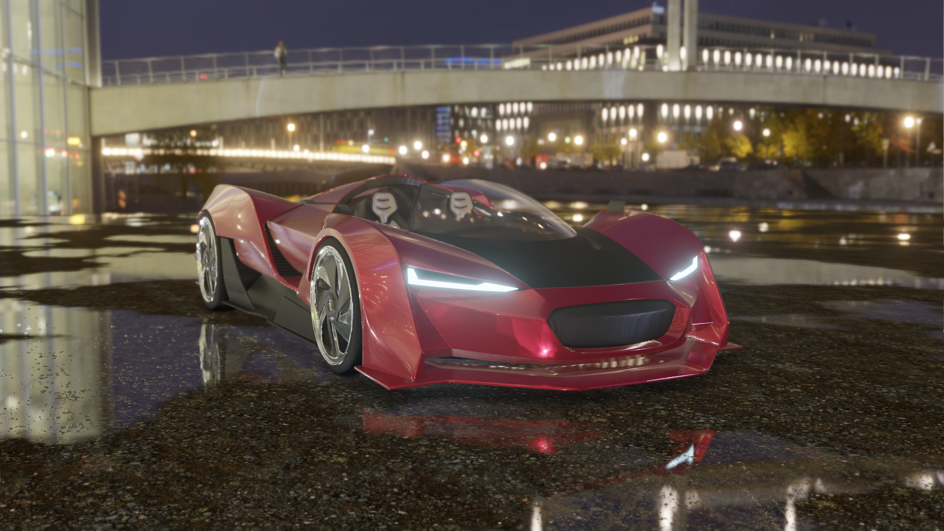
Car shots for week 2. Working in 2.8 is a challenge. Aside from the different UI I ended up running into a lot of oddities. Mirror modifiers that refused to render. Scales that wouldn't apply. Waiting for minutes for an undo command to...undo. Crashes galore. But it is pretty awesome. View port is very responsive and looks fantastic. Can't wait till this is ready for prime time.
Here's shots of my car. Wasn't sure how many to include so I added a day-time, night-time and interior render.
And my lighting match exercise. I've admired this shot from Blade Runner for ever so thought I would try and match it. Super challenging. I could never 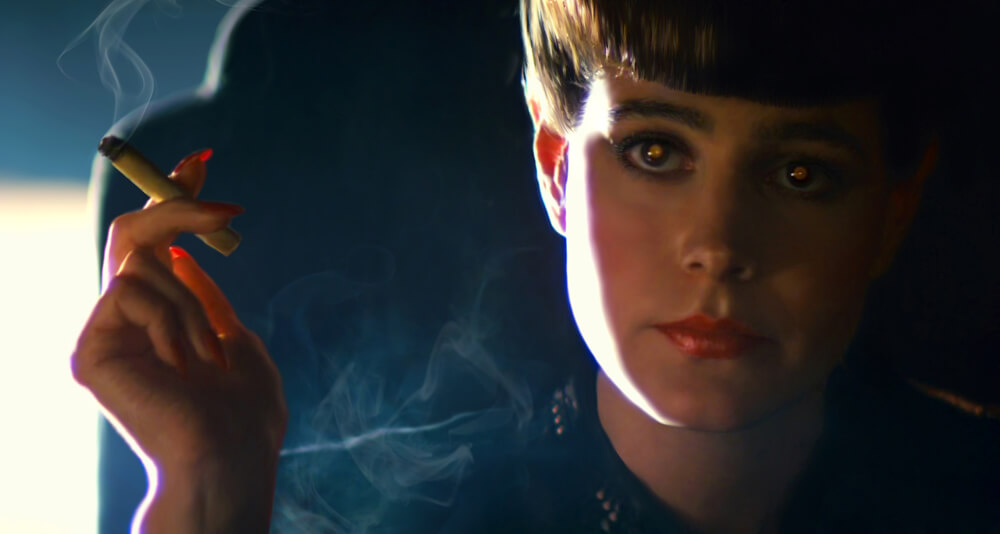 get the eyes to render properly. I assume I would need to rework the geometry for those but kind of clueless there.
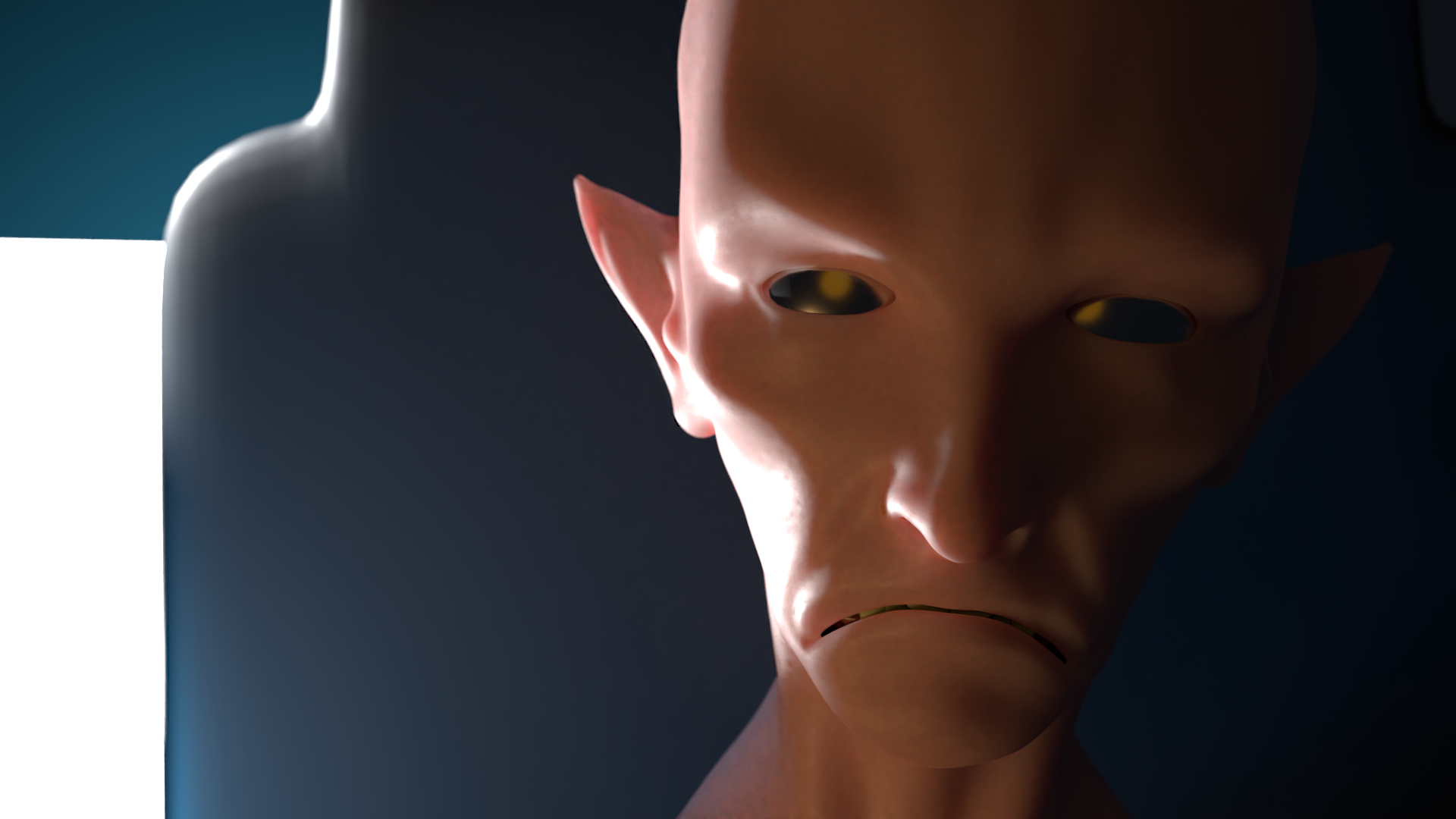
ccthulusan Nice car, good job. But that light match, that's spot on! Very well done 😄👍🏻
Updated lighting image. Wanted to try it with a slightly more realistic skin texture. BTW, this model and texture is the Retro Alien by DGordillo on blendswap.
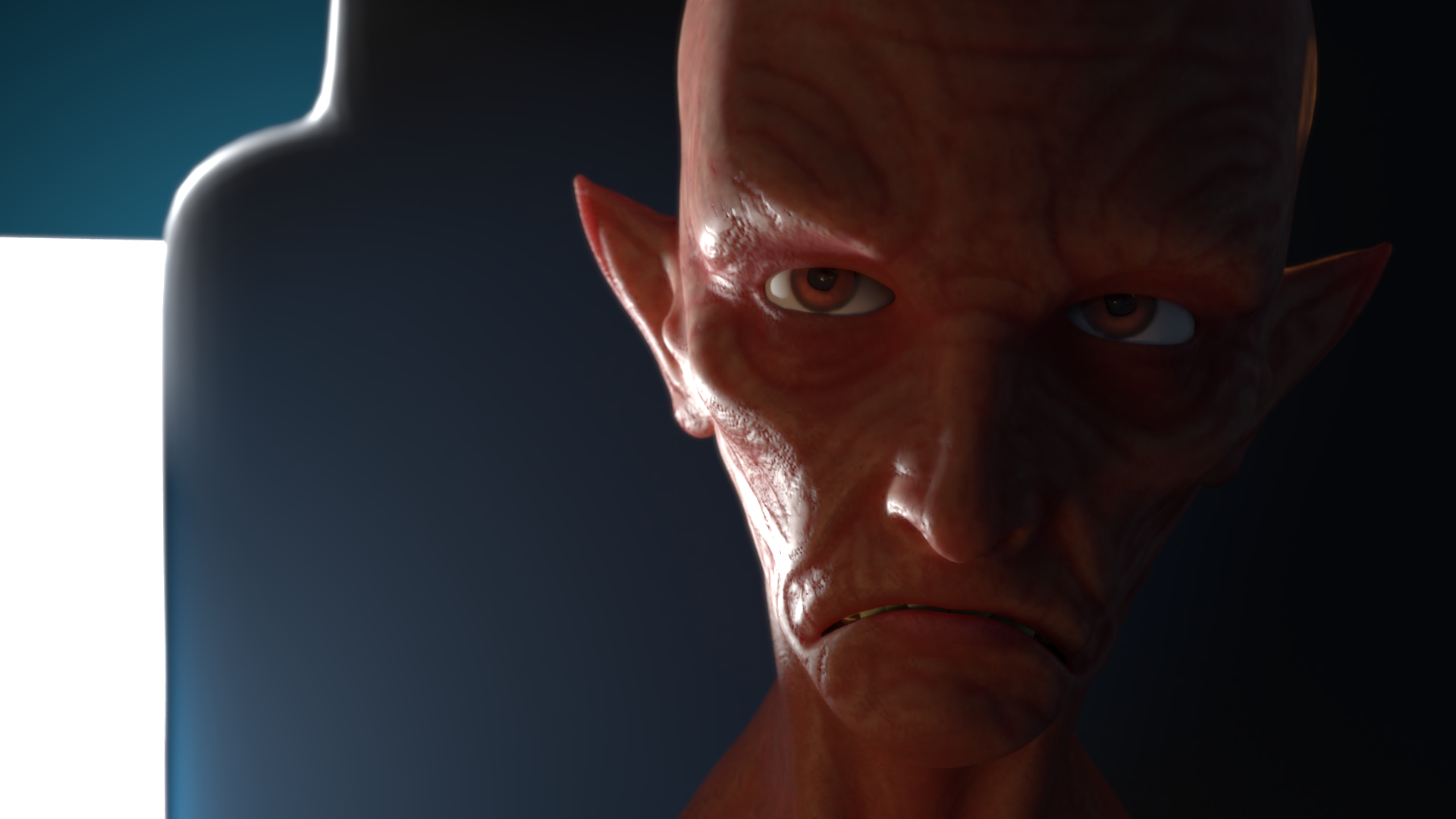
ccthulusan Nice car. Lighting match is a good start, but it looks like in the original there's a general light lighting the whole of the scene and then a very harsh rim light lighting the face and then a very small amount of fill on the right so the shadows aren't so harsh. I could be wrong though, but I think that's what's happening in the scene. You've got the spirit of it, if not an exact match. Good work.
![]() silentheart00 thanks for the critique. That fill light on the right has me flummoxed. I seems like bounce light but the ear and her shoulder make it seem like a rim light from behind. Maybe it’s both.
silentheart00 thanks for the critique. That fill light on the right has me flummoxed. I seems like bounce light but the ear and her shoulder make it seem like a rim light from behind. Maybe it’s both.
ccthulusan I love how you textured the dashboard, that's a lovely touch!
One last shot at matching. Brightened the world light and added not one but two lights to add fill light on the right with just a touch of added rim light.
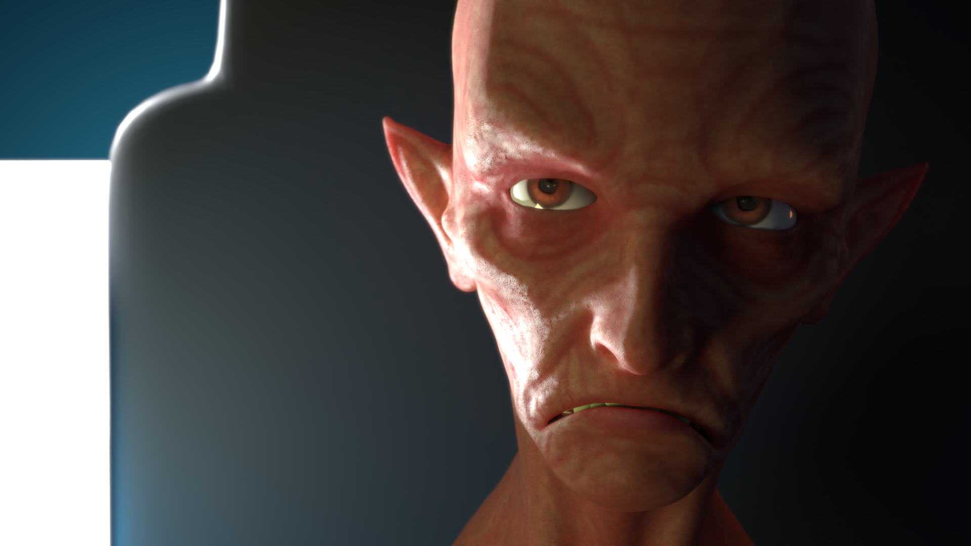
A for the week overall 👍
@theluthier Thanks Kent. I had a lot fun with the car and I learned a ton. Eevee was both fun and frustrating to work with. Can't wait to see it stabilize. I had to stop myself from continuing to tweak details.
The lighting exercise was challenging but very educational. That background light is actually pure white which is off from the warmer color in the original. Unfortunately, warming it up would also warm up the background wall (the blue behind it) and it would turn green. I should have modeled the background more like a window which is what I think it is in reality. Enjoying the class. Wish I could make the livestreams but work gets in the way. Recordings are good though.