I plan to fully participate in this class. I don't have any suitable models, unfortunately, so I'll have to use the ones provided.
![]() williamatics yeah, if this is cycles and you're new to using Filmic, that's what I'd check -- make sure that on the scene tab under color management that the Look is set to anything other than none (like base contrast). otherwise, Filmic does give a washed out look.
williamatics yeah, if this is cycles and you're new to using Filmic, that's what I'd check -- make sure that on the scene tab under color management that the Look is set to anything other than none (like base contrast). otherwise, Filmic does give a washed out look.
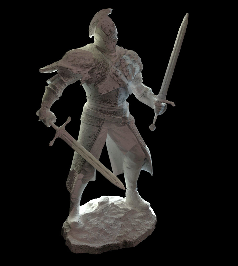
This is what I got after I played with the lights a little bit.
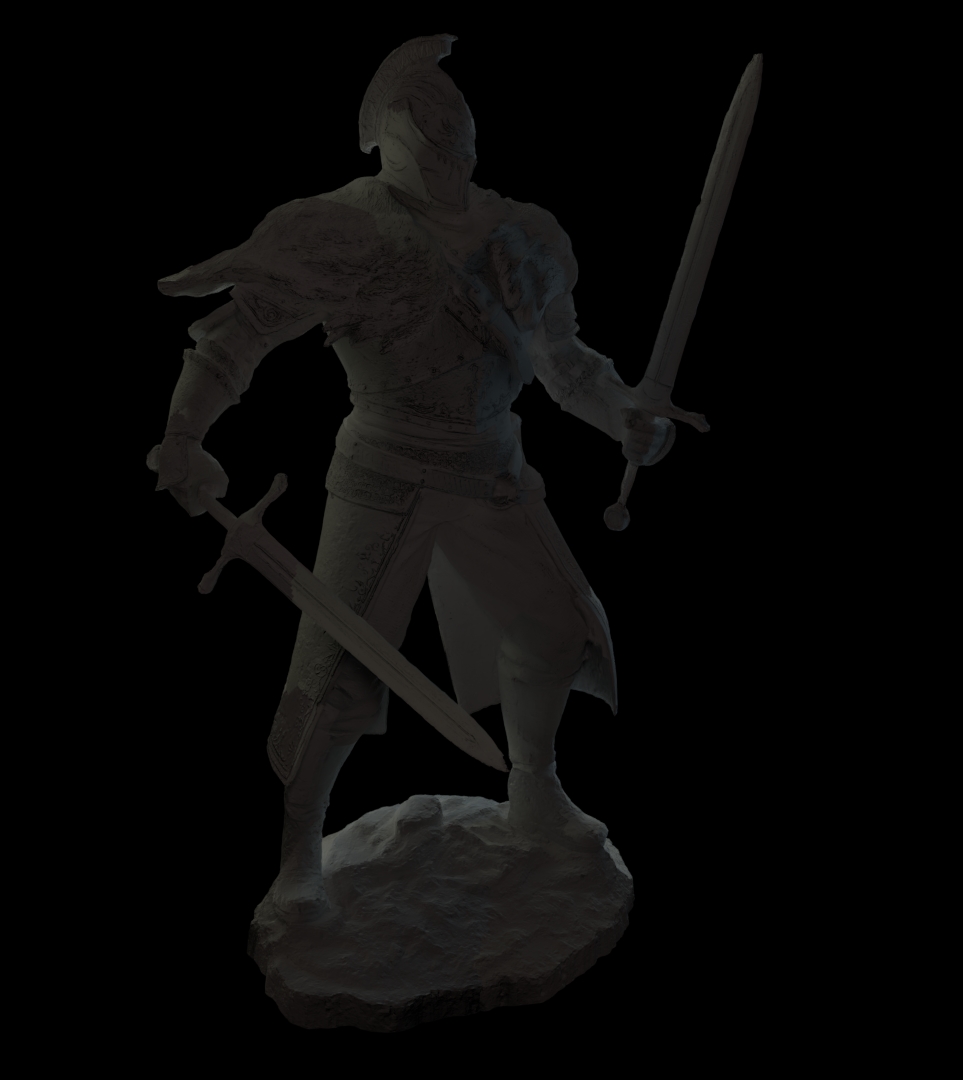 Which render do you think is better, and why?
![]() williamatics Ayooooo it's the Faraam Knight, love me some Dark Souls.
williamatics Ayooooo it's the Faraam Knight, love me some Dark Souls.
To answer your question on which is better is a bit difficult to answer, but I'd have to go with the first one, due to clear shadows which in turn helps everything stand out.
I will say though that you need to give your render a background. Preferably an HDRI if you're not already using one. The blank, pitch black background takes away a lot from the scene and just makes it look like he's floating in the Abyss about to fight the Four Kings (hehehehe Dark Souls reference).
So with the lamps how many are there? What are their colours? Their size? Strength? Mind showing your viewport?
So I definitely think you're off to a good start, but I think by adding an HDRI, adding a proper background (either the top hat thing seen in the streams or the HDRI itself), and maybe adjust the strength and size of the lamps and you could be onto something even better.
![]() williamatics The biggest issue I see is one of overly dark/dim. I talked about this broadly in yesterday's stream because I've seen a handful of submissions with this problem. This is the value spectrum of your renders:
williamatics The biggest issue I see is one of overly dark/dim. I talked about this broadly in yesterday's stream because I've seen a handful of submissions with this problem. This is the value spectrum of your renders:

You can see that 3/4's of the graph is not utilized at all. Since all the data is on the left 1/4, that means they're all close to black. So I boosted the levels so the whole spectrum is utilized:
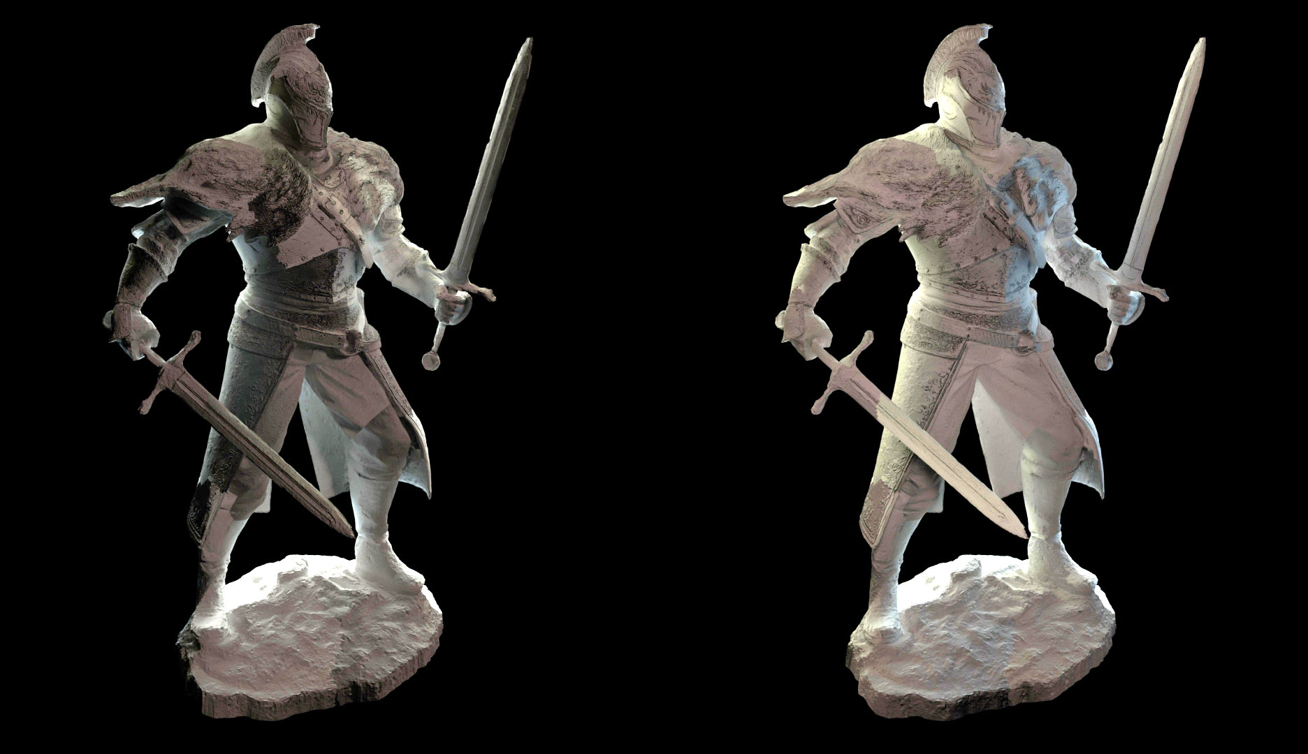

Now with the values adjusted properly, I kinda prefer the first one (left) because the rim light is stronger. However I also think the shadows are a touch too dark still. So here's a 50/50 mix of the 2 value-adjusted versions, which is my recommendation:
Still it's a B from me on the character lighting. Did you do a light match?
@theluthier No; I was running out of time. Fortunately, my sound works again!