Here's my entries for week 1.
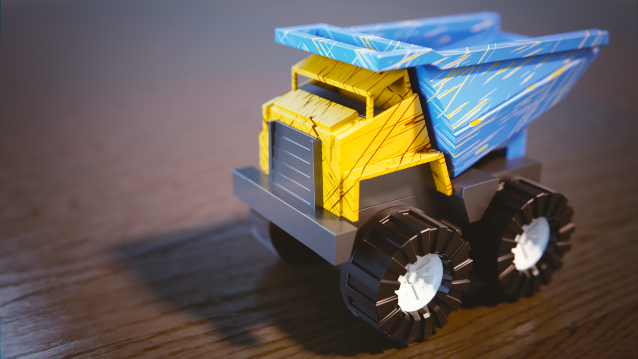
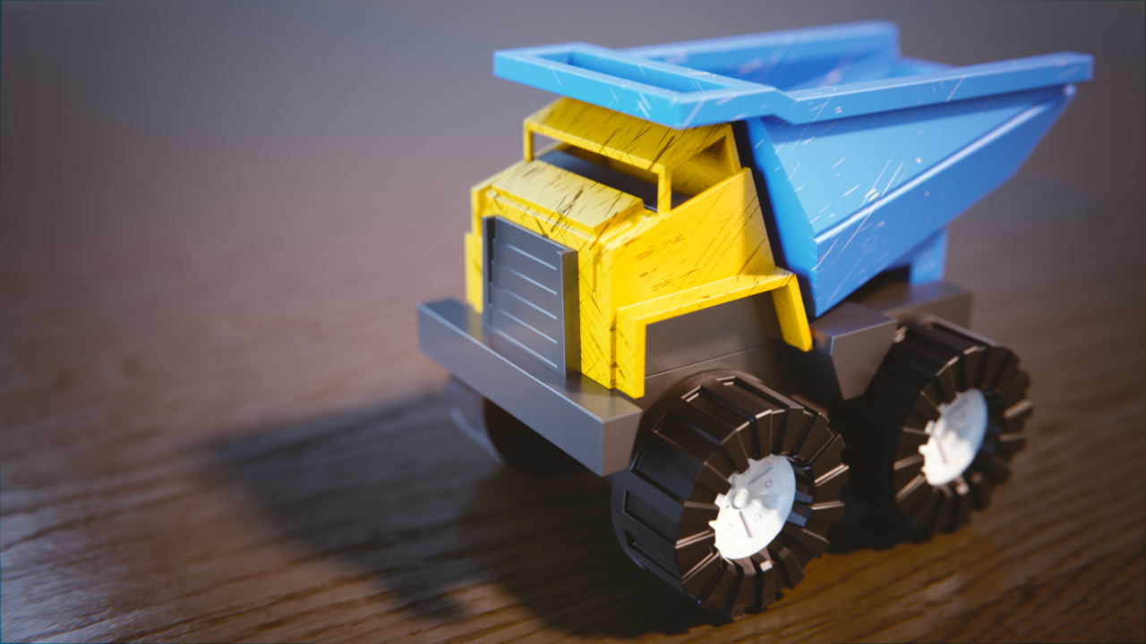
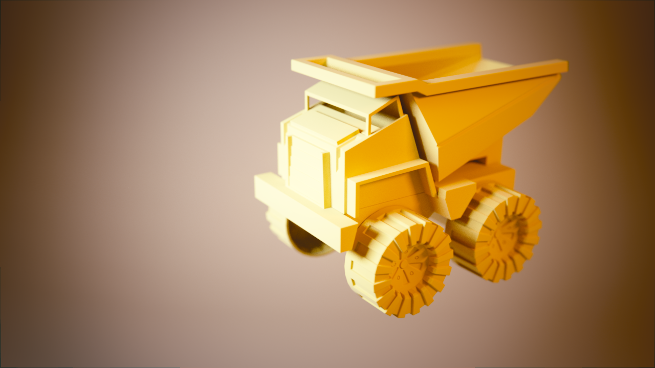
The truck with added scratches:
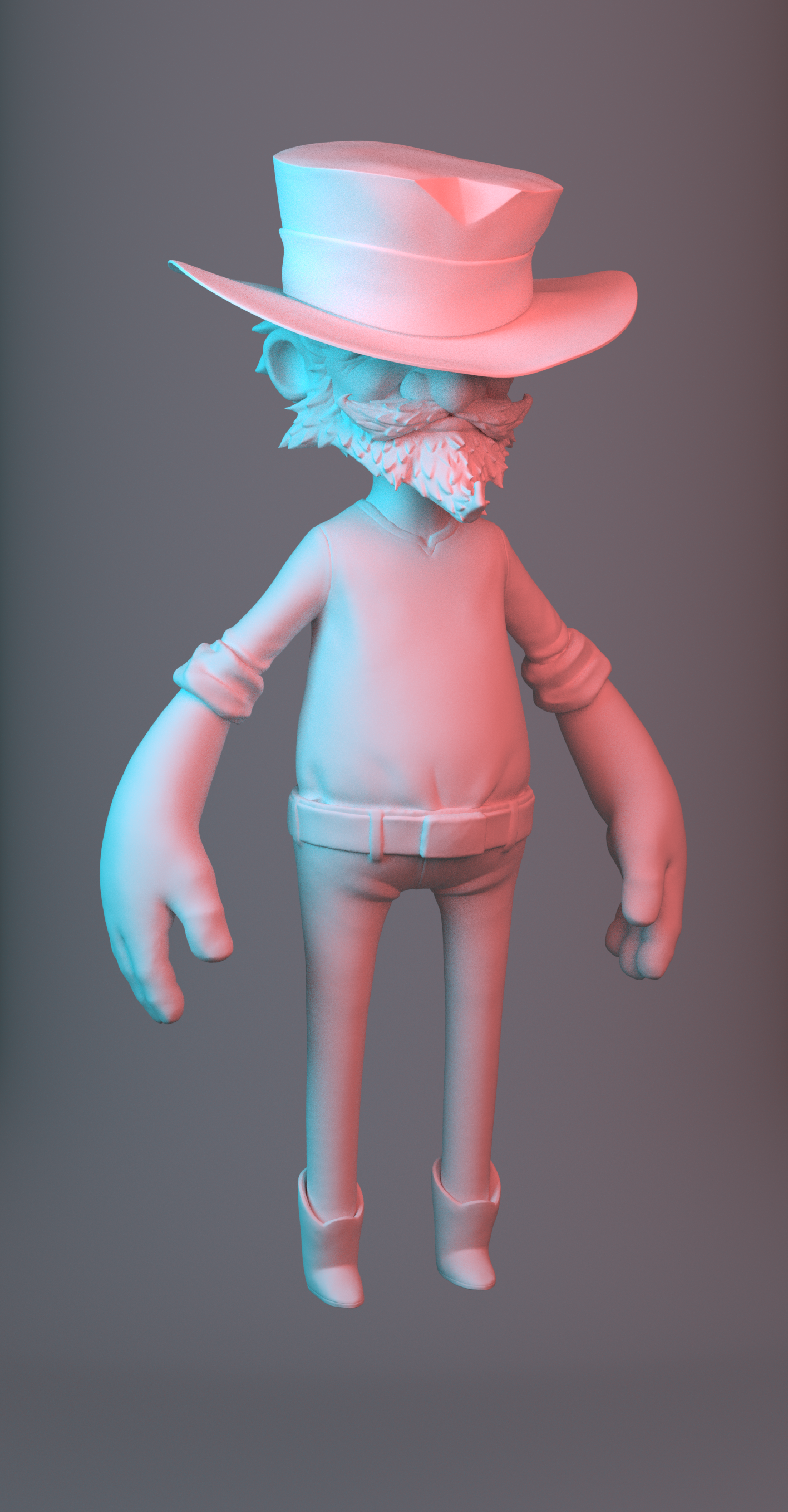
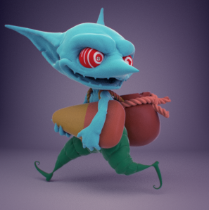
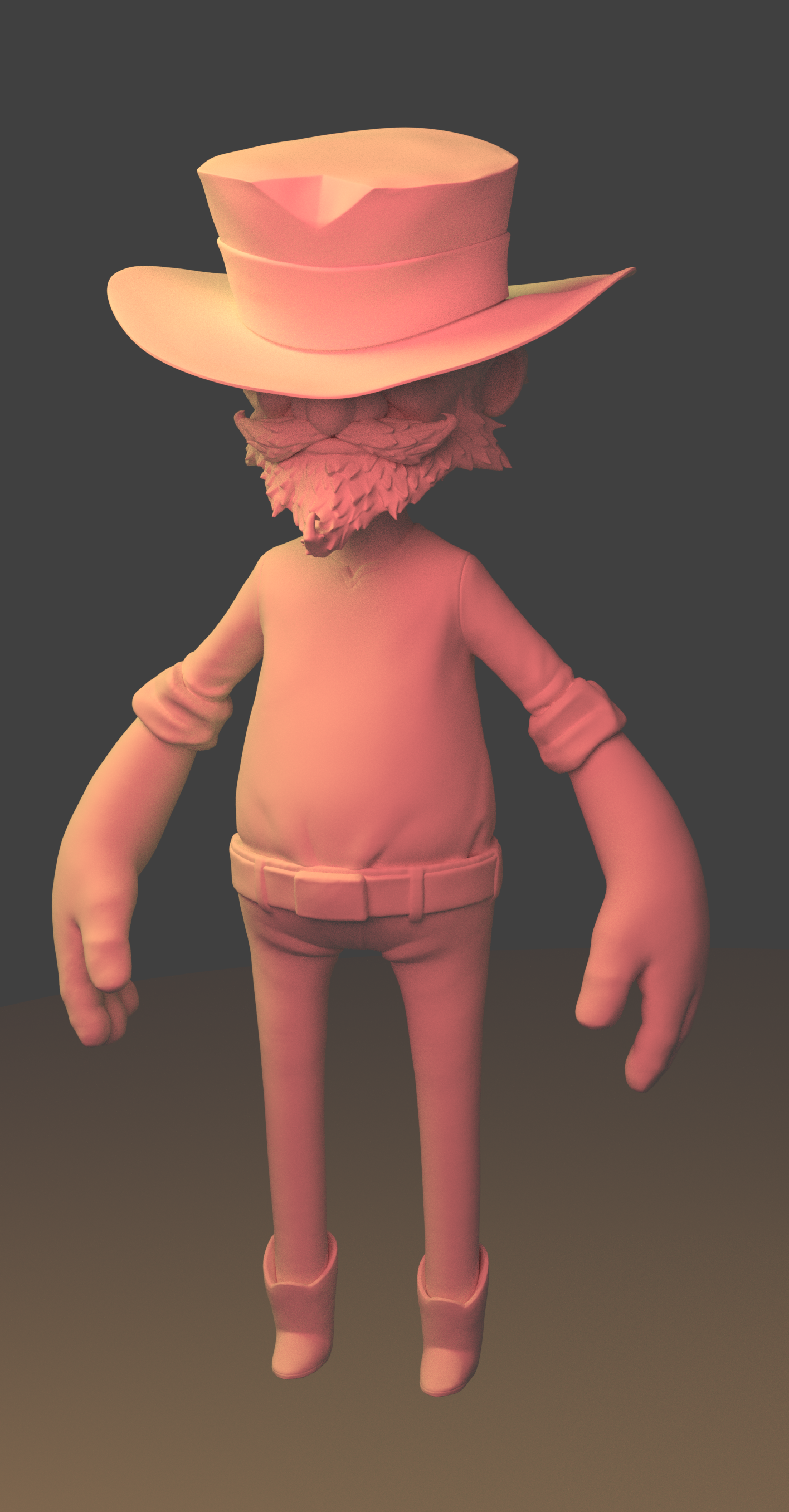
Instead of doing the bedroom scene again, I decided to a matching exercise with the Wrangler character.
Any critiques are welcome.
![]() blenderrender1993 hey can i ask you how you did those brown stripes ? i kinda was thinking about doing some stripes like kids went with collors on the truck but i cant get the effect. somehow i dont know if texture paint is allowed. but even then its not as sharp as with you result .
blenderrender1993 hey can i ask you how you did those brown stripes ? i kinda was thinking about doing some stripes like kids went with collors on the truck but i cant get the effect. somehow i dont know if texture paint is allowed. but even then its not as sharp as with you result .
![]() blenderrender1993 Those are some intense scratches. It'd make sense if the truck was painted, but it doesn't make sense to me if you're going for something plastic-like. Do you have any subtle displacement with those scratches? If not, I think that would really help bring in that sense of realism.
blenderrender1993 Those are some intense scratches. It'd make sense if the truck was painted, but it doesn't make sense to me if you're going for something plastic-like. Do you have any subtle displacement with those scratches? If not, I think that would really help bring in that sense of realism.
What was the lighting scene you were trying to match with the Wrangler? It's difficult to see how well you matched it without the reference.
yyukinoh1989 I used a texture from a PBR texture addon actually. Here's the link if you're interested: https://www.3d-wolf.com/products/materials.html
![]() silentheart00 I can tone down the scratches. By the way, would it be helpful if I repost the pictures?
silentheart00 I can tone down the scratches. By the way, would it be helpful if I repost the pictures?
![]() blenderrender1993 I like to see how you progress, so if you keep posting instead of replacing the original that would help me.
blenderrender1993 I like to see how you progress, so if you keep posting instead of replacing the original that would help me.
Good stuff ![]() blenderrender1993! I didn't really read the scratches as scratches, but rather like an interesting graphic pattern, which I kinda like. I say go with that ha. It makes it one of the more unique takes on the toy truck exercise.
blenderrender1993! I didn't really read the scratches as scratches, but rather like an interesting graphic pattern, which I kinda like. I say go with that ha. It makes it one of the more unique takes on the toy truck exercise.
Can you link me to your previous night and day exercises submission. I need PROOF that you did it 😊
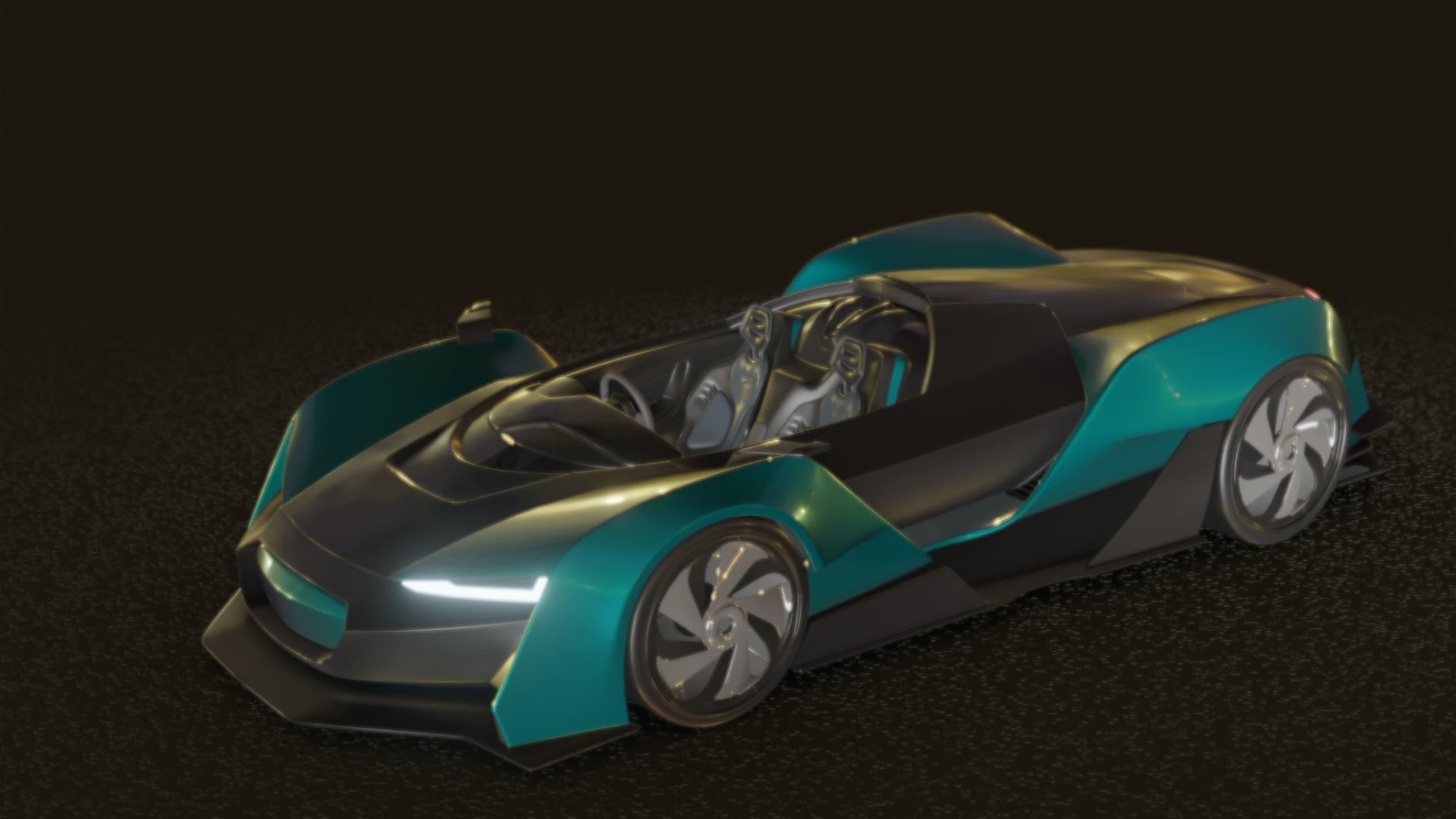
The wrangler light setup is looking great! Can you post the image you were matching?
@theluthier : Here's the link to the exercise. https://cgcookie.com/exercise_submissions/15659
Also, this is the picture I was trying to match.
https://s3.amazonaws.com/cgcookie-rails/uploads%2F1528307870927-06-monster-bust.jpg
![]() silentheart00 mentioned that the cracks are too big. Here is a revised picture:
silentheart00 mentioned that the cracks are too big. Here is a revised picture:
I don’t know if I mentioned this or not, but I’ll be away traveling and planned to combine the assignments for weeks 2 & 3 together.
Week 2
I really like your teal paint job. Reflections on the vehicle are nice, lighting is believable. The back wheel doesn't seem to be casting contact shadows on the ground, but it's not that big of a deal in this case. The speckled ground looks like a half-way attempt at asphalt - I like the idea but would like to see more effort toward completing a believable asphalt material, including subtle reflectivity. B+ from me.
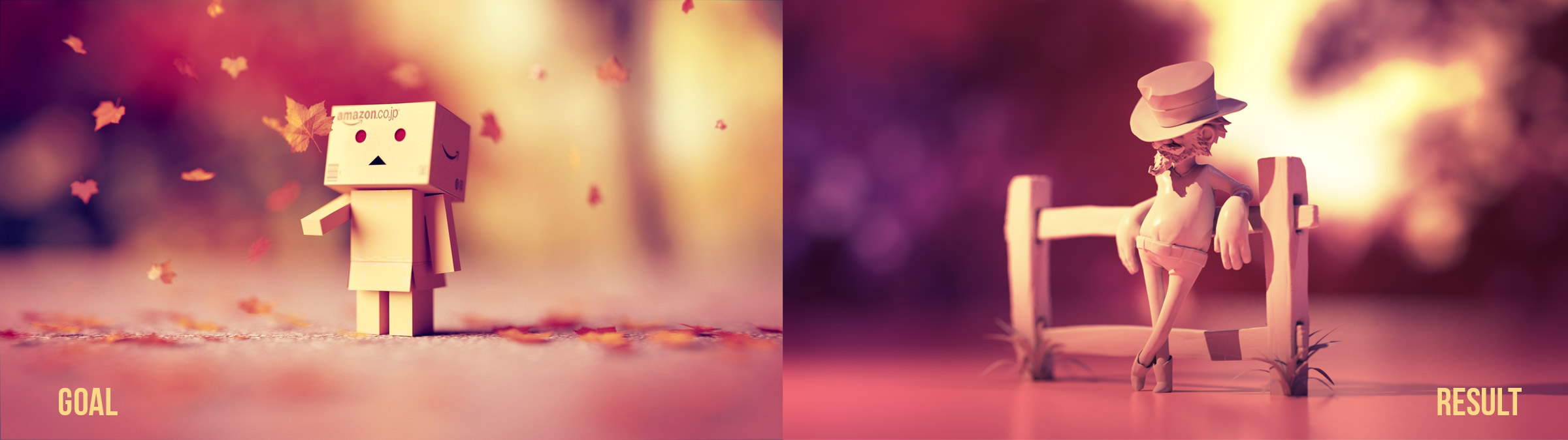
Your light match looks good by itself, but isn't the closest *match* imo. The yellow is significantly more saturated and the key light is coming from screen-left instead of screen right. Also the vignette is much stronger than the source. So I'd give it a B on appeal and a C on matching. C+ as the middle ground.
Week 3
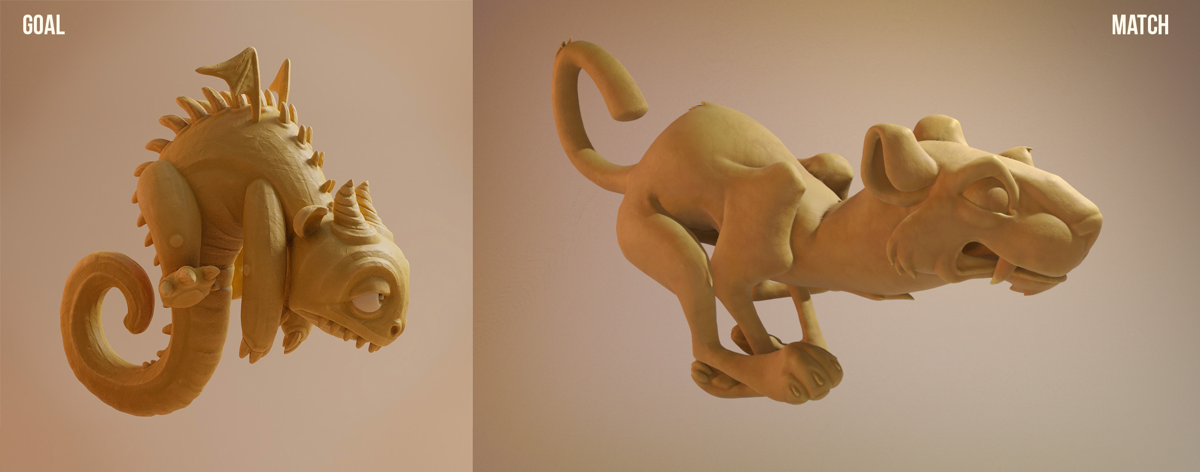
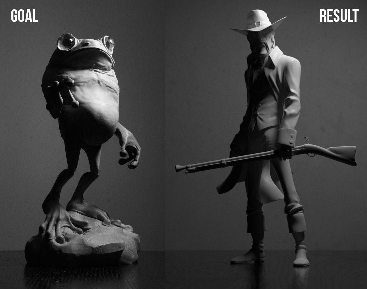
Your goblin is lit quite well but I find the rainbow-y color scheme a bit distracting. This was a common note I gave on several homework submissions. I took your render into photoshop to convert it to black and white and then add purple to the darks and yellow to the lights:
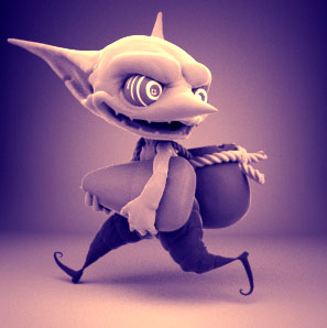
To me that's much less distracting than the colors all over the spectrum. Color is definitely a good thing but it's possible to have too much of it; too much and too random. I strongly recommend familiarizing yourself with color theory concepts like complimentary colors. There's many websites (like this one) that make it easy to find appealing colors to use. It's a B+ from me.
Your light match is ok, but the values are not nearly as contrasted as the source images. Also your key light is perhaps further backward than the source, leaving most of your model's body in shadow, unlike the source. Finally I would have liked to see a ground similar to the source. C from me.
Week 4
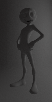
The biggest issue with your arch viz imo is the interior design aesthetics. That may seem like an odd note for a render, but when it comes to high quality arch viz, we have to respect the skills of interior decorating and or set design. Too often I see artists throw random materials and colors onto an interior and it turns out unconvincing. With yours the wood grain is not flowing in the right direction or stretched too far, seemingly random bits are wood on the vanity, other bits painted. The kelly green and muted green don't match that well. Also there are pieces from the shower wall showing floating in space when they should be hidden. There's something odd happening in the corner of the room where the outlet is above the vanity. I can't makes sense of what's happening with overlapping objects there...
All that to say there's a lot to disconnect the viewer from believing the render. Lighting-wise it seems pretty good but that gets lost among the disconnections. Sorry, I feel that critique came across as harsh but I intend it to be helpful. C from me.
The light match is in the ballpark but again, I really want to see a *match*. Missing ground planes and backgrounds defeats a significant part of the purpose to these exercises. It also makes it hard to judge how close they are. I like the result though so A for result, C for match, B compromise.