Hi y'all,
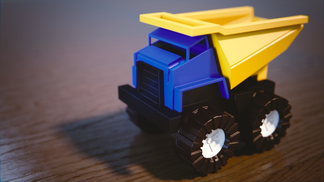
so this is last night's work :) Tried to add some bumpiness for wear & tear.
Also inlining the image here:

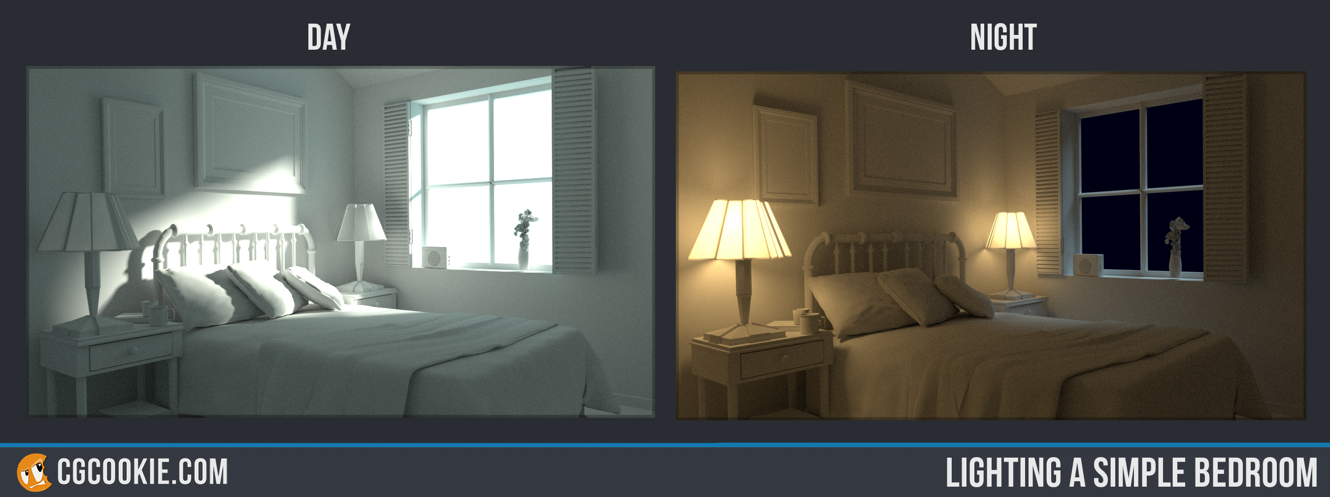
And throwing in my "Day & Night Bedroom lighting excercise" result.
Originally rendered before CGCookie's site migration.. re-submitted now, but will definitely try to re-approach and re-render it with latest 2.7x or 2.8.
Day & Night Excercise Submission

Hi, and welcome to the class! Your truck looks good. The bumpiness looks a little odd, though. It kind of looks more like cast iron or something than plastic, to me at least. Other than that, nice truck.
The day portion looks like it's really blowing out some areas, like on the pillow and head rail. Maybe you could add a touch of orange to the light, too? The night scene's pretty good. Not a lot I can see wrong with it.
That was quick Stephan, good work! I agree with ![]() silentheart00 notes, but overall you did a great job 😄
silentheart00 notes, but overall you did a great job 😄
![]() silentheart00 ssmurfmier1985 Thank you for your helpful comments. Yeah the idea of the bumpiness that I only put on the wheels (imagined to be of soft plastic) was that it should like some child had been running it over a lot of coarse ground. Yet looking at it again for that its probably too evenly bumpy.
silentheart00 ssmurfmier1985 Thank you for your helpful comments. Yeah the idea of the bumpiness that I only put on the wheels (imagined to be of soft plastic) was that it should like some child had been running it over a lot of coarse ground. Yet looking at it again for that its probably too evenly bumpy.
For the Day& Night as mentioned I'll give it another shot with a newer blender version and ass some slight tint to the daytime rendering. Just as Kent said, simply white is often too boring.. and in this case also too much energy.
Thanks again :)