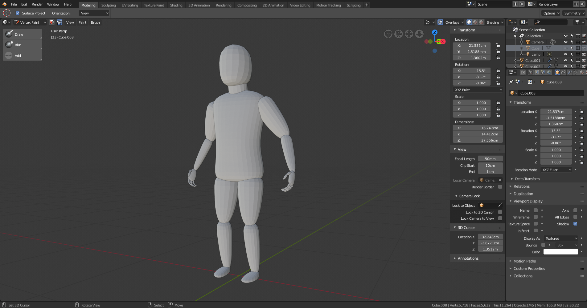
After watching Zacharias Reinhardt's assymetrical sculpting video on YouTube, I decided to work on a "mannequin" that I could pose and use for sculpting. Trying to get the basic proportions right but somehow it feels off a little.
I've already done a little tweaking narrowing the upper arms a bit, but welcome feedback on getting the proportions a little better.
The legs are still out of proportion -- they're a little small -- and the head is a little too elongated. Try adding in a background image that shows decent proportions and adjust your mannequin to that. Proko has a decent lesson on anatomic proportions you might check out.
Too, if you have a scribd.com subscription (or just want to try the month-long free trial to take a peek), you might check out the classic Andrew Loomis book Figure Drawing for All It's Worth (which can also be picked up for under $10 in Kindle format on Amazon -- a desktop or tablet reading app make it worth the purchase). It's got lots of great material in it for anatomy, proportions, and the artistic representation of the human form. It will very likely positively inform your sculpting efforts, too.
I agree with the previous comment. Take a look at yourself in the mirror and see the rough proportions of yourself. Legs are roughly twice as long as the torso, elbows roughly fall at the waist, tips of the fingers fall roughly halfway down the thigh, etc. I second Figure Drawing for All Its Worth. It's a great resource for human proportions.
Thanks... :D Felt it was way off but wasn't sure what :D guess I'll try again :D
Not sure why I did this, but I forgot the one basic thing... Always use reference :D
This version is much better, I think...

![]() gradyp this indeed looks better the basic shapes looks good to me. Now you just have to refine them :)
gradyp this indeed looks better the basic shapes looks good to me. Now you just have to refine them :)
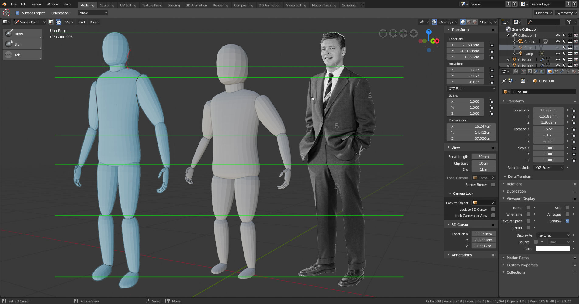
I wanted to give you a visual that might make it easier for you to see where you need to shore up your proportions, so I grabbed your most recent screenshot and did a little doctoring in Photoshop. I added in a real world reference (Mr. 50's Dude) and then took your model and readjusted the basic sizes for you to look at.

Note how the head is smaller and most everything else is longer. I thickened the forearms and lower legs and increased the size of the feet (which could likely be made longer still, but the angle of the image made it awkward for me to show that). I also adjusted the fall of the hands somewhat, though there's room for play there -- you could make the arms slightly shorter than what I've shown without losing much in the way of proportion. Take a look at how Mr. 50's elbows are actually above the green line at his waist. While he may have his hands in his pockets, which adds flex to his arms and shortens the fall of his hands, the elbows are still at a point similar to your pose.
Don't be discouraged by all the adjustments; these are common errors. We, as human beings, tend to focus on the head and chest area of other people -- those areas tend to be where the first "tells" in our body language are born. And, of course, we gravitate first to faces, which is why most cartoons aimed at young children (and children's drawings, for that matter) tend to have oversized heads and eyes. (Although, that's also because the oversized look echoes the proportions of a baby and young child. A year-old child's head equate to about 25% of its body, proportionally speaking.)
Reference is very much your friend. Even pros use it constantly. :)
And, in case it helps, here's a PDF of the Loomis book I was telling you about.
Cheers!