UPDATE: Originally the critique was scheduled for the 25th but due to a conflict has been moved back one day.
One magical Wednesday in September - the 26th - Kent and Jonathan Lampel will be live to critique your Blender art work. If you would like our focused eyes and critique to help push your stuff to the next level, please submit one of your projects to this thread.
NOTE: All active Citizen members have access to watch this live critique stream and submit art to be critiqued in this thread.
Hi, Just letting you all know that I am working on this bike (Yamaha Niken). So if you could give me some feedback that would be awesome. I am gonna submit this for critique.
Oh wow! Well here's a link to my latest (not quite finished) project. I would love any feedback at all from you amazing guys! Kent and Jonathan you are my favourite tutors!!!
https://cgcookie.com/u/starry/projects/egbert-eggy-pinfeather-original-character
Unfortunately I don't know if I'll be there for the live critique :( but I'll try.
Hi, Here is my submission. I spent almost 65+ hours on this. I never knew if I could do this. I wanted to just try so I started and I enjoyed it so much that I continued working on it now I strongly believe that anyone can do anything. I spent 6 hours everyday on it for 12 days(you can see my progress here). I have figured out a lot of things and learned a lot of new stuff which is great. I'd love to know what you guys think.
Hi there! Not dead, just thought I'd hop in.
Unfortunately whilst I had every desire to submit something new to this stream it appears this won't be possible unless a minor miracle blesses me soon and I get 3~ days worth of work into 12 hours. After a week or so of having a break I fell ill due to smoke inhalation ('cause I'm one smart boi) and have finally been feeling better the best couple days. Part of me feels bad because I took a much longer break than I'd have liked but it's good to be back! I suppose uploading one of my old renders would be acceptable?
Been looking at some of your renders and I'm really looking forward to this stream! Gonna be interesting to see what advice gets thrown around. See y'all then!
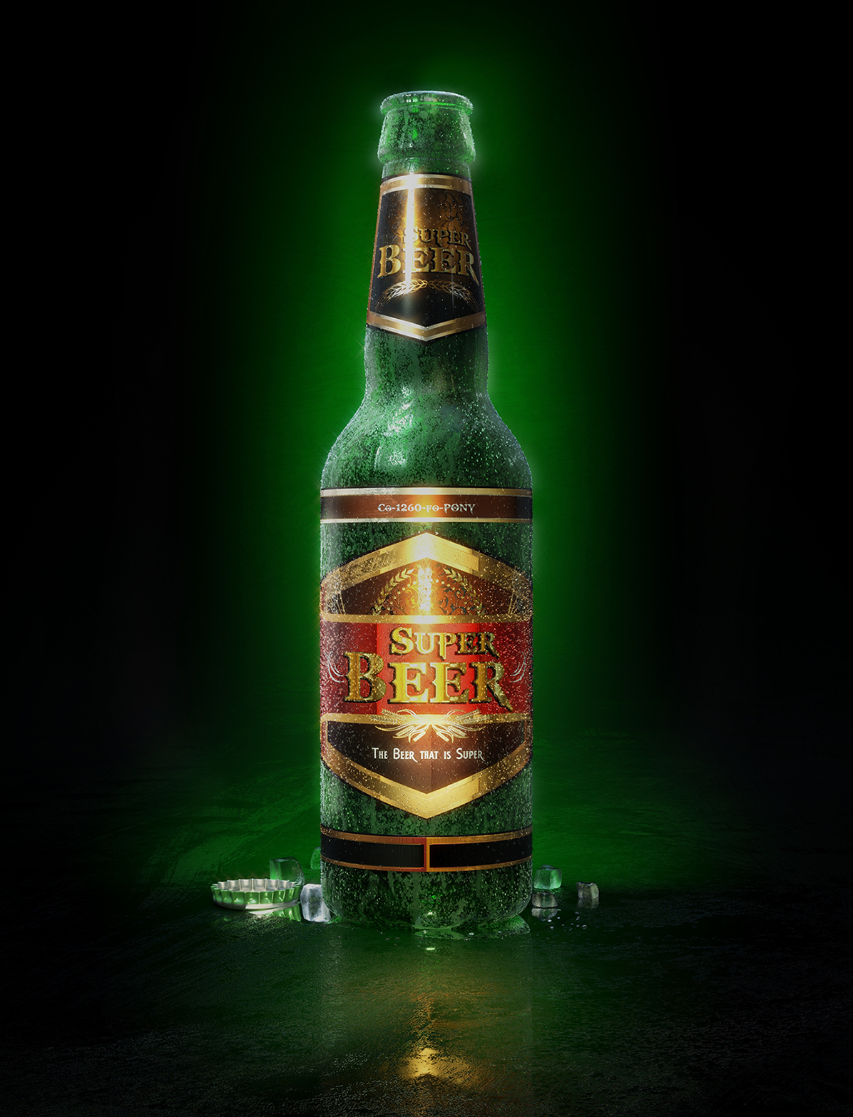
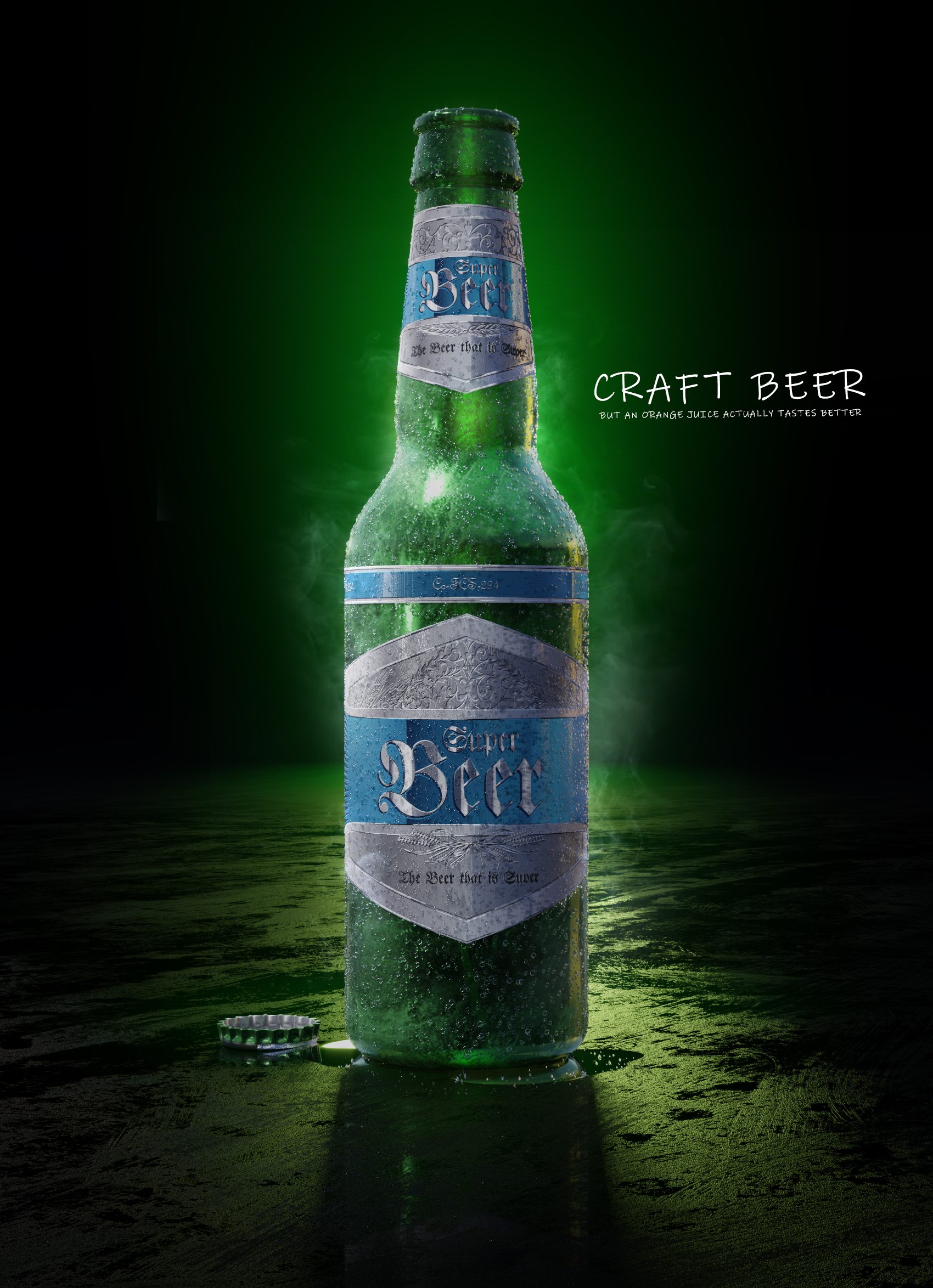
Here's my entry for the Live Critique. "Super Beer, the beer that is super."
EDIT: Made another one, trying to improve it. I don't know why I can't make it realistic enough, they have a cartoony vibe.
![]() dostovel Great work on the kryptonite shader (I assume that is what the bottle is made of)!!
dostovel Great work on the kryptonite shader (I assume that is what the bottle is made of)!!
pprocyonlotor Really? I over did it, didn't I? It's so hard to judge when you're neck deep into an artwork. I guess that's what this critiques are for.
![]() dostovel I think it looks great. I was mostly just making a joke about "Super Beer." It is very glowy, but I don't think that's necessarily a problem.
dostovel I think it looks great. I was mostly just making a joke about "Super Beer." It is very glowy, but I don't think that's necessarily a problem.
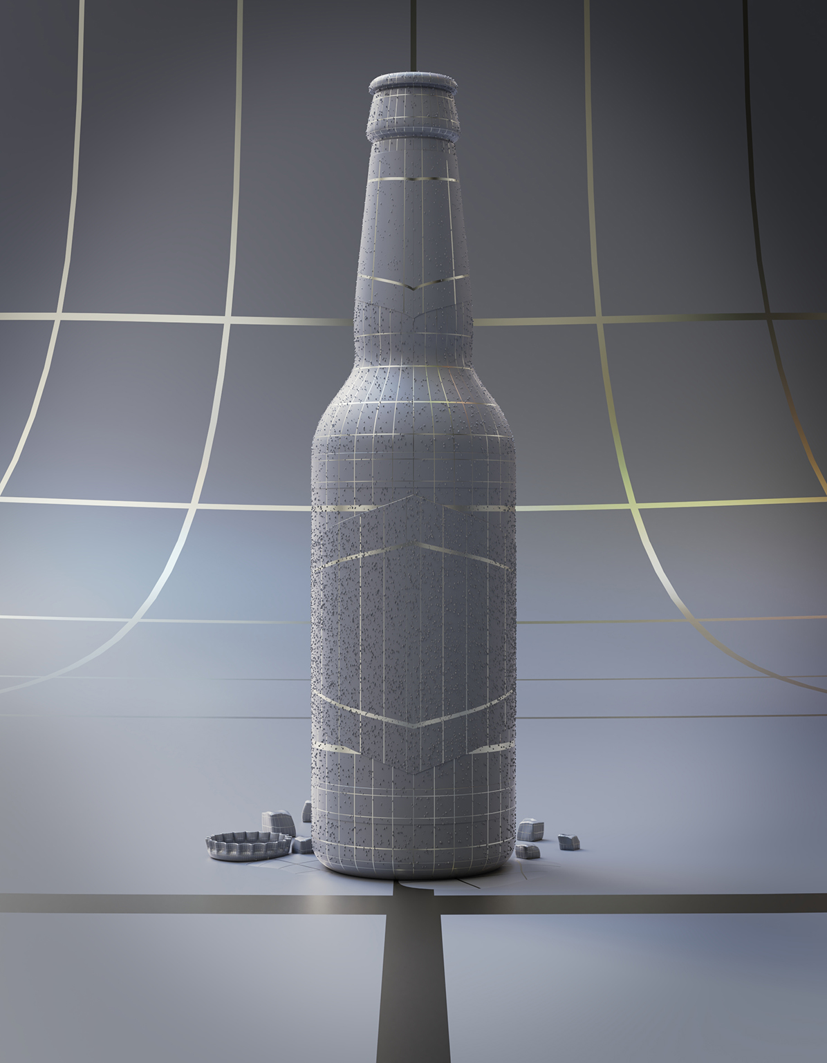
![]() dostovel I did notice that the render looked a little noisy, but then I noticed that same fleck pattern was in the wireframe pic also, and maybe was intentional. If it is intentional, I think you should leave it as is on the glass parts, where it reads pretty well as condensation, but diminish it on the label, where the condensation would be absorbed.
dostovel I did notice that the render looked a little noisy, but then I noticed that same fleck pattern was in the wireframe pic also, and maybe was intentional. If it is intentional, I think you should leave it as is on the glass parts, where it reads pretty well as condensation, but diminish it on the label, where the condensation would be absorbed.
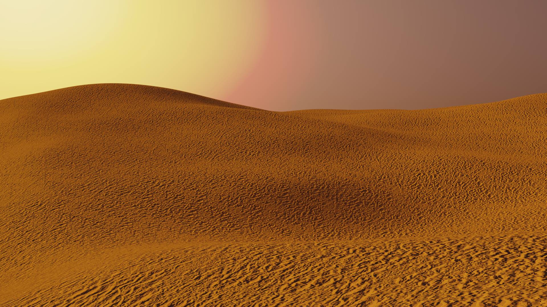
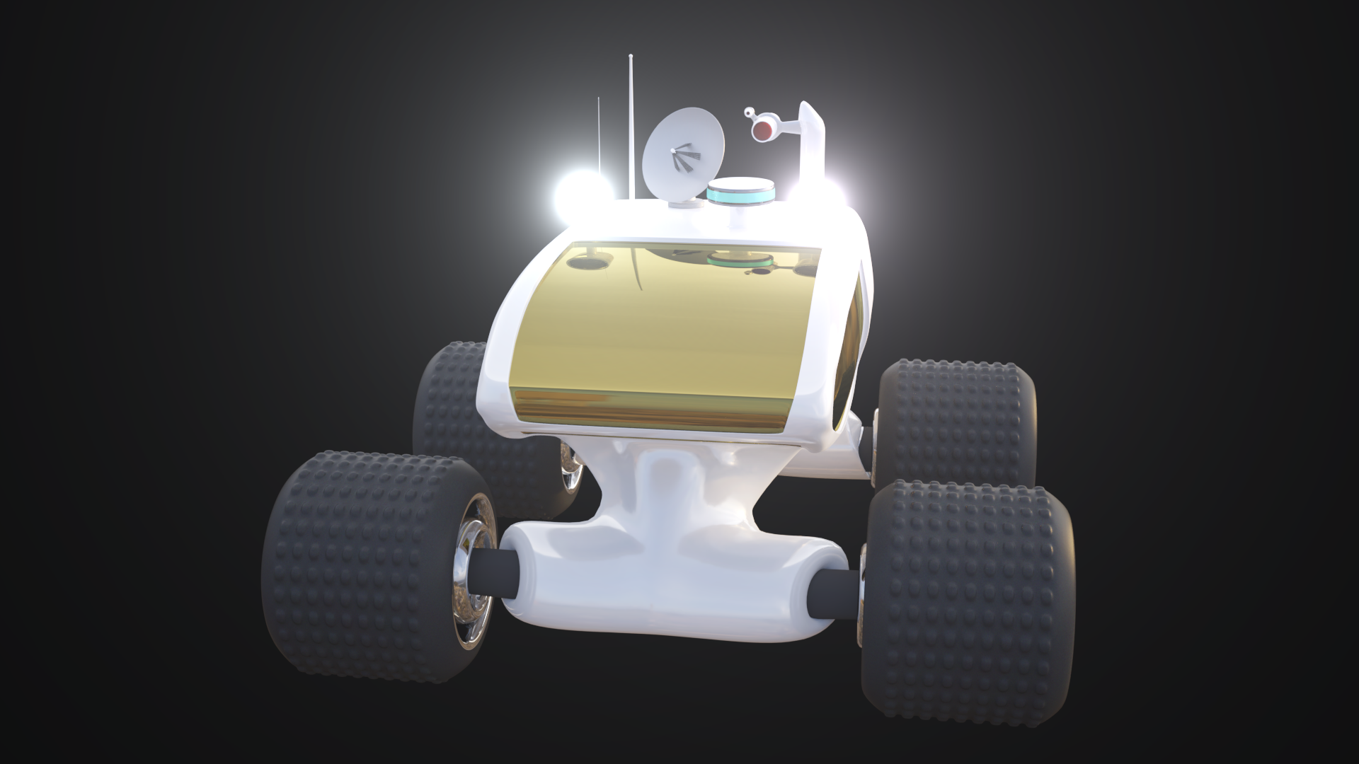
Mars rover.
Can you critique this? With this one i was going for photorealism, but design was also a big subject. Since i had to wipe my hardrive a while back ago i dont have the blend file anymore. I would like to be critiqued for the overall look and get some tips on how to improve it.
I should probably say that i modelled this for a martian landscape i was creating in blender, it was never finished though.
First image is the original render, Middle is a very early render of the martian landscape i meant to put the rover in. The last one is the image after adding glowing ewffects to the spot lights on the I added the landscape to show some of the background, but its the rover i want to have critiqued. 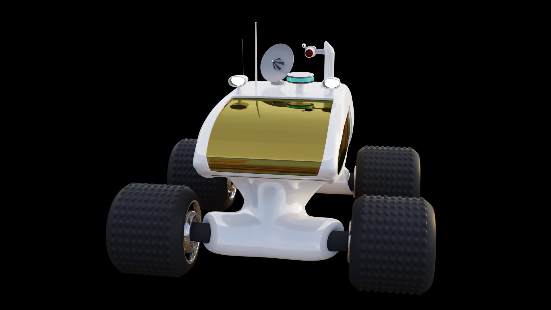 roof. I did that in gimp so its not a 100% blender but very close.
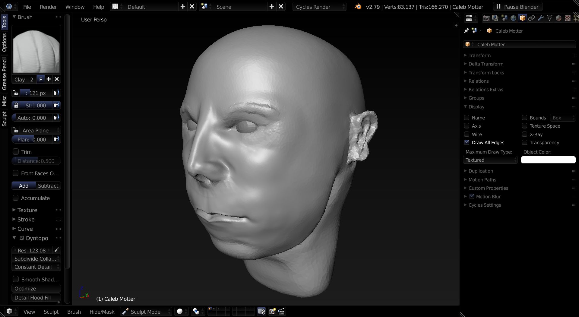
I'm sculpting my friend's head right now and I want the anatomy critiqued. He's an average-looking 16 year old.
OMG My project was on draft I didn't even notice sorry. I published it. Can you see it now? Please let me know
I would like to submit this for the critique. This project was intended to be a bust of the character "Baby" from Baby Driver. I am not intending on rigging/animating this character, but rather going for a good looking still image. Any criticism regarding topology or anatomy/likeness would be great. But I have also been having a lot of trouble with getting the shaders and lighting looking right. My ultimate goal is realism and any tips in that area would also be much appreciated.
Hi I'm a long time lurker here, and I just (not-quite-but-almost) finished a project lately and decided maybe it's time to come out of my manhole and show my stuff to people I don't know on the internet so I can see how it goes.
For this character I wanted to do something Pixar/Dreamworks style. Or in other words something that looks like it could have come out of an animated feature film. I just want to know how convincing it is. Rendering and presentation included.
Since It's not quite finished there's some issues I didn't really fix yet (like the hovering right foot). But the thing that was the most challenging to me here was the clothing. I've redone the jacket from scratch like 3 times. I don't have yet what it takes to do detailed, realistic clothing, that was quite frustrating. Is there any advanced clothing tutorials out there?
The link below is a render test for an animation I'm working on. The animation is heavily WIP and done in Maya but I want to render it in Cycles. The main issue I would love some feedback on is the lighting. I'm going for an early morning feel with the sun just peeking over the hills. If time allows, could you point out anything blatantly distracting about the materials as well? Thanks!
hey sadly i did not get it finished (retopo seems harder then i tought but i got already some shapes done )
but hopefully it will be allowed to be critiqued ?
I really want to know if what i have so far is good or could be better
since its about retopology the eevee model and its not finished i tought it might be better to upload the file .
this is the file
eevee retopo critique.blend
if you prefer images let me know then ill try to add some that might be good
I am here now 2 months and this is the first retopology i did exept from the Orb exercise