My homework thread for the August 2018 Class
I'm somewhere between an Beginner and an Amateur user of Blender. I use it for maybe 2 Years now but with a lot, and long, breaks in between.
I will use this class to get into Blender 2.8
Week 1 Homework Submission
I did this exercice a while ago with Blender 2.79: https://cgcookie.com/exercise_submissions/13647
this is why my exercise with 2.8 looks a lot simpler.
What i noticed the most is that you now can not deselect all whith the ( A ) button. so everytime i have to remember that it now is (Alt + A). and i'm not a fan of the auto Orto/perspective funktion of the View shortcuts ( 1/3/7 ) so i disabled it.
What i like is the Quickmenu and in general the good and fresh new look of Blender.
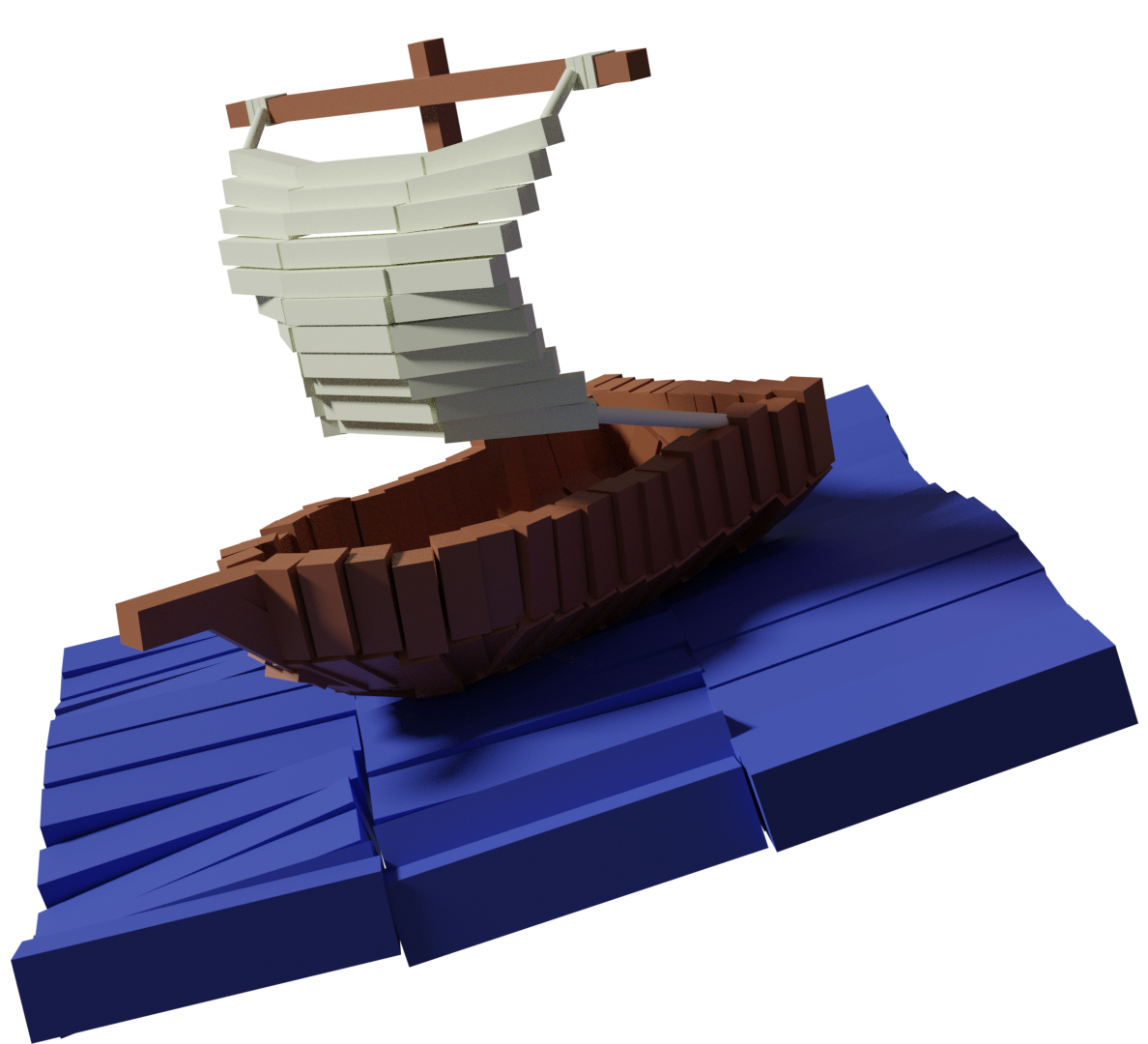
So this is my 2.8 Primitives exercise.

yea agree sometimes one want to rotate and still stay in orto view, would be good to have an easy to access toggle for that.
the alt A also not sure why the change there, but is not that hard to get used to it.
Nice work o nthe hsip and the sea
Somehow I like this model very much, it has some unique style expressing curved shapes by resized cubes, it is super
ssilenthans Oooo this is a nice one, I especially like the water. One point of improvement *could* be a background but this looks like it's supposed to be by itself in which case that works just fine.
![]() thecabbagedetective Thanks. i wanted to make it look like some sort of "Kid's brick toy", if this makes sense to you.
thecabbagedetective Thanks. i wanted to make it look like some sort of "Kid's brick toy", if this makes sense to you.
I wanted to make only a small scene. So the background is missing on purpose. And also I don't know what kind of Background would fit on this model.
Yes, there is a certain appeal to it that is unique, even among low-poly models in general.
Hans.... very appealing and so simple. It immediately reminded me of the movie with the kid and the tiger (funny I can't put a name to that). And the way you've got the blocks placed makes it look like the sea is rolling.
PI - that's it. something Pi. We'll name your model 3.1415.... heeheehee
![]() louhikarme great use of "the Cube"! I wouldn't sail in it, but it's nice to look at.
louhikarme great use of "the Cube"! I wouldn't sail in it, but it's nice to look at.
![]() pffsfs Thanks for your comment. maybe you mean the movie Life of Pi
pffsfs Thanks for your comment. maybe you mean the movie Life of Pi
Nice work. 👍
I shouldn't be lazy with sails on my submission and now I regret about it :(
![]() nekronavt I really like your ship. Even with simpler sails it looks very good. I do not know if it would be a good idea to break them up into small pieces.
nekronavt I really like your ship. Even with simpler sails it looks very good. I do not know if it would be a good idea to break them up into small pieces.
I read somewhere that it is not a good idea to have details everywhere . Your eye needs a place to rest. and your sails are a good place for that. So nothing to regret.
ssilenthans Very interesting approach with using cubes for nearly the entire scene, including water and the sail. That's a really unique approach. Super cool look, Hans! Not really something I'd call "simple" either 😅
Definitely an A+ in my book. Wonderful job 👏
I'm not a big fan of the new Alt + A hotkey for deselect either. However I have found that I appreciate the auto-ortho switch of the 1,3,7 keys. I could see that being annoying though.
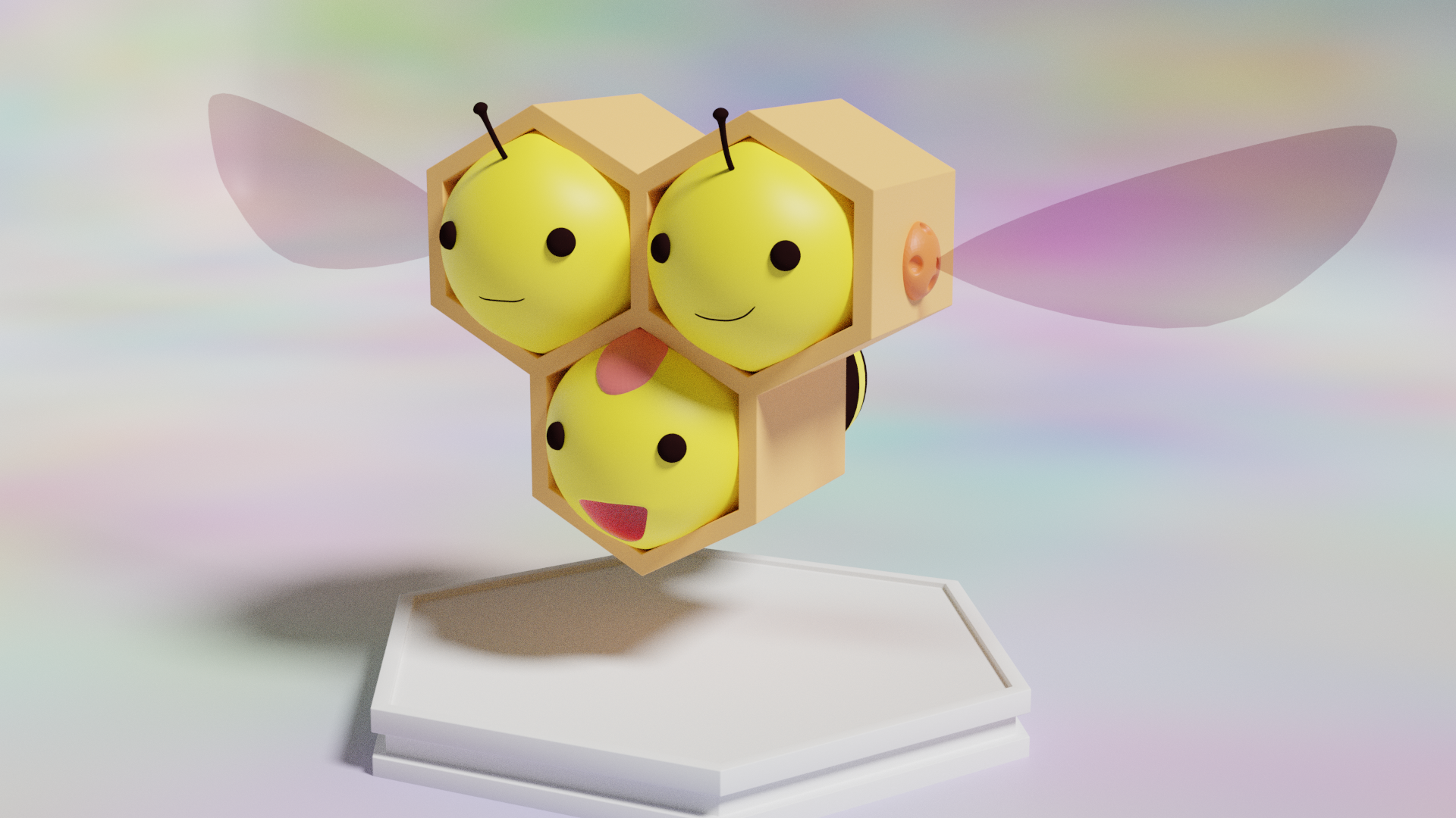
I saw the big picture of your avatar on the stream and thought immediately that this would be cool in 3D. So here it is. :D
I hpoe you like it.
