Hi,
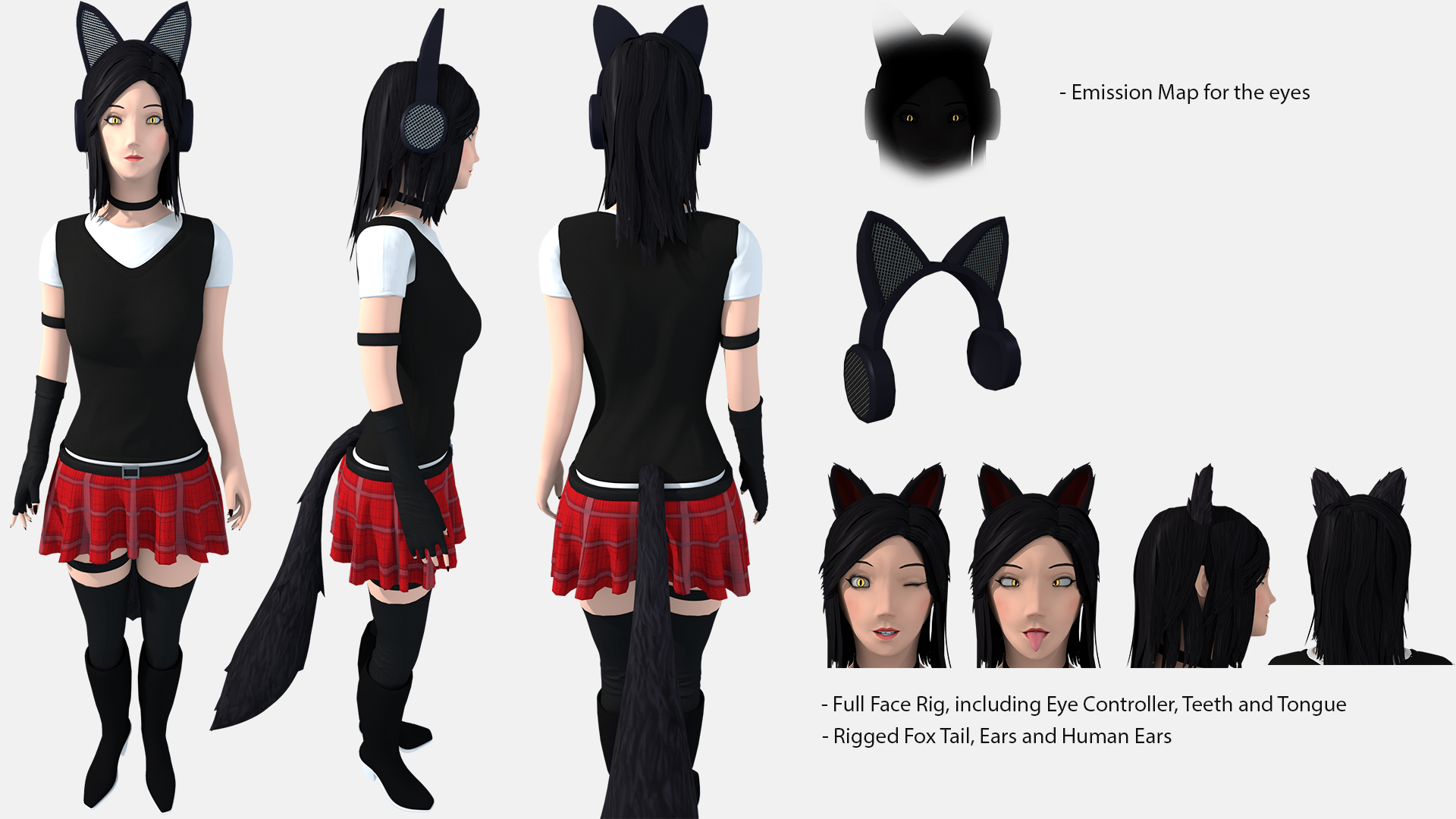
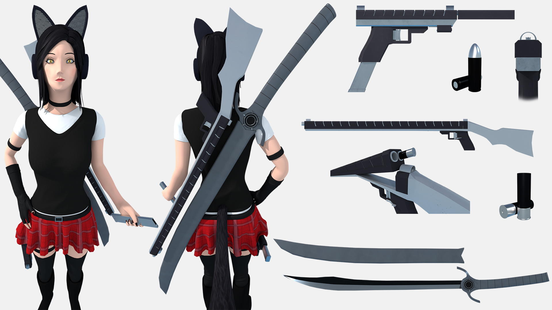
I have just finished my first Character. I mainly look for modeling errors. As style inspirations i used a combination of Oblivion, Skyrim and Overwatch.Everything was modeled to fit into a game engine for a 3rd person perspective. The sheets are a little cramped but i hope it is not too bad. If anything is unclear or you have any questions ask away.


pprojekt154 This might also help: https://www.youtube.com/watch?v=vIKxffo7YsU&t=454s.
![]() baukepost This will definitely help for later projects, thanks.
baukepost This will definitely help for later projects, thanks.
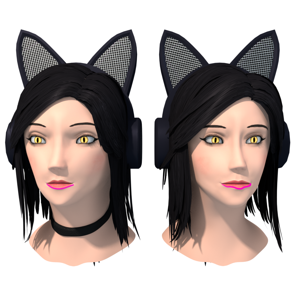
Yeah, the eye spacing looks better. The lower lip shape maybe could be a little more rounded; it looks like it's coming to a pinch than a round lip shape, which I like in the left image.

The nose is better; that weird ridge is less prominent.
The nose still looks a bit generic and the nostrils aren't clearly defined. It's okay, I'm terrible at noses, too. Try adding a harder crease in the nostrils.

Good progress. Maybe you should add skull studies and muscle structure studies to your routine. They don't have to be every day; maybe once a week or every couple of weeks. Practice what you can when you can. You got this.
![]() silentheart00 are we still talking about a cartoon style here ? This doesn't feel right , if you understand. Even in that video the chap was talking a lot about the differences between individuals. I was kinda only looking for really bad errors, "okay" is more then enough for me here in this project, sorry if i miss something here.
silentheart00 are we still talking about a cartoon style here ? This doesn't feel right , if you understand. Even in that video the chap was talking a lot about the differences between individuals. I was kinda only looking for really bad errors, "okay" is more then enough for me here in this project, sorry if i miss something here.
pprojekt154 Yeah, no problem. I tend to push towards realism, and if you think these smaller critiques are going against what you are trying to achieve, then feel free to ignore them. These were more suggestions of personal preference than glaring problems of something fundamental. It's up to you to choose what you think is best in the detail of style.
Do you have any references of the style you're going after? Since my mindset doesn't default to cartoony styles, I think that would help me to know what to look for when critiquing your style.
![]() silentheart00 actually i don't have a direct reference, every piece is sculpted after what i think in my head is perfect. Then i put every piece together. This is the only reference picture i used:
silentheart00 actually i don't have a direct reference, every piece is sculpted after what i think in my head is perfect. Then i put every piece together. This is the only reference picture i used:
and even that i changed a lot along the line.
![]() silentheart00 I started to investigate to truly find the problem because i do feel something is indeed off, i started to look into and study reference material to refine my style and i might have a good idea what went wrong. I am currently trying to adjust my mesh.
silentheart00 I started to investigate to truly find the problem because i do feel something is indeed off, i started to look into and study reference material to refine my style and i might have a good idea what went wrong. I am currently trying to adjust my mesh.
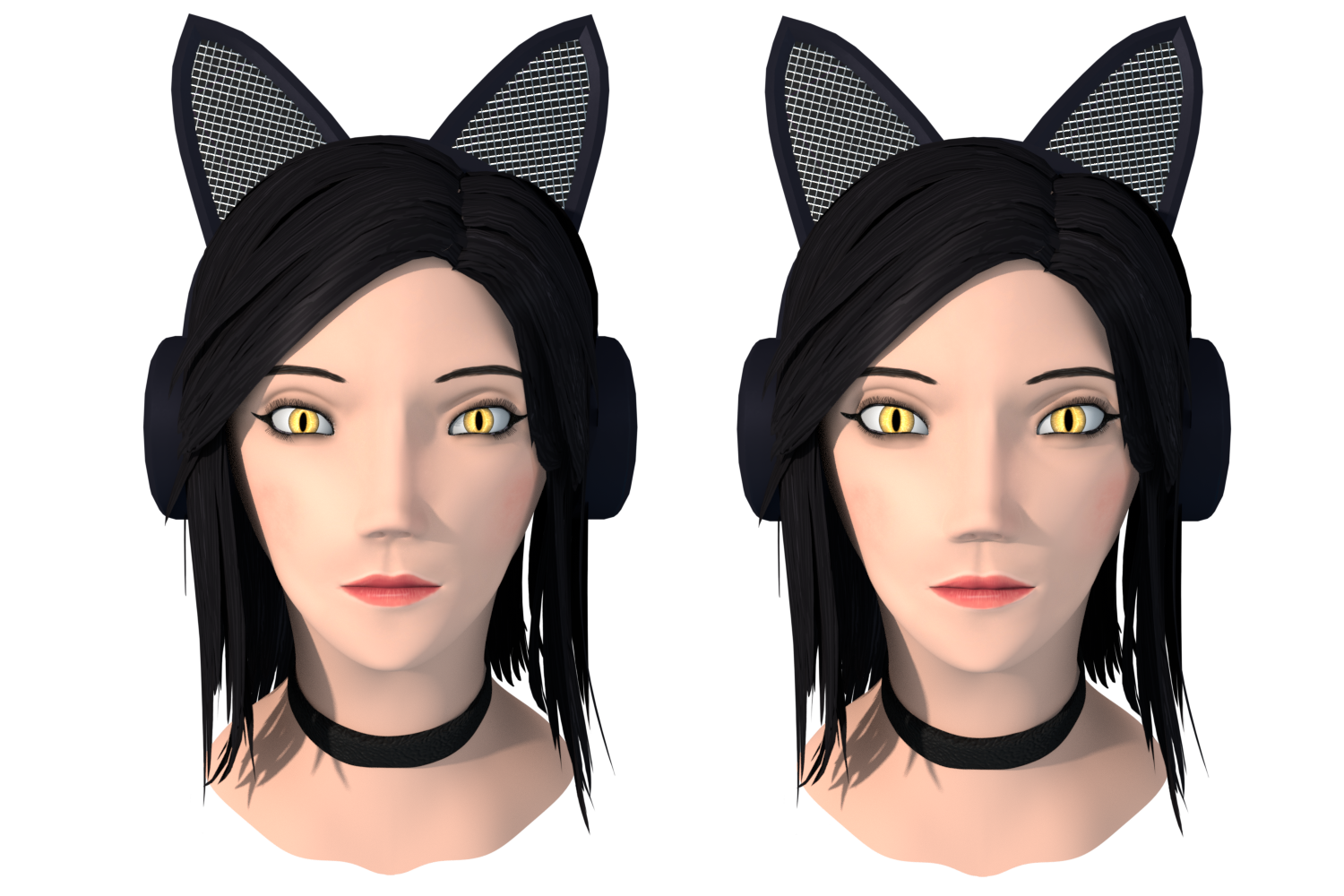
![]() silentheart00 here it is:
silentheart00 here it is:
According to my reference material this is suppose to be "right", still it feels so off. I am confused, normally if my brain sees something as right i see it as good, but not with this model. What am i supposed to do now, go with that what is technically right or what is good in my eyes?
pprojekt154 Hmm, well that's a tough one. Maybe try showing it to someone with a cartoony style and see if they can give some advice.