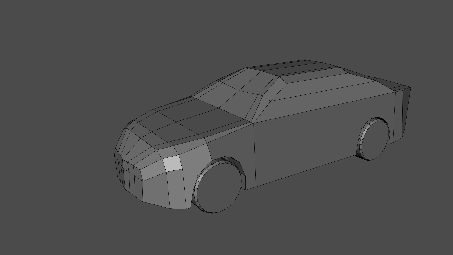
As I have said, I'm practicing hard-surface modeling. Here are some of the things I've made.
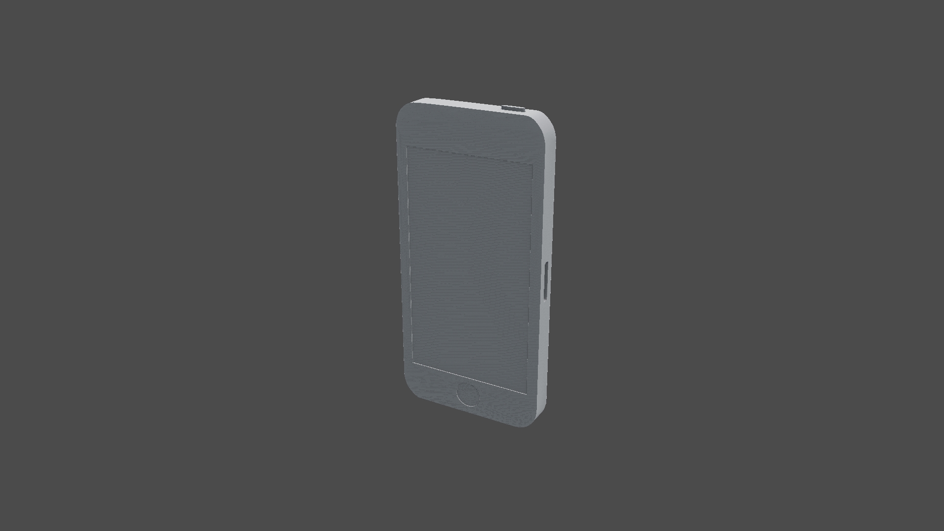
I have no idea what is causing that wavy effect. Right now I'm fine with it, as long as it doesn't interfere with my modeling skills.
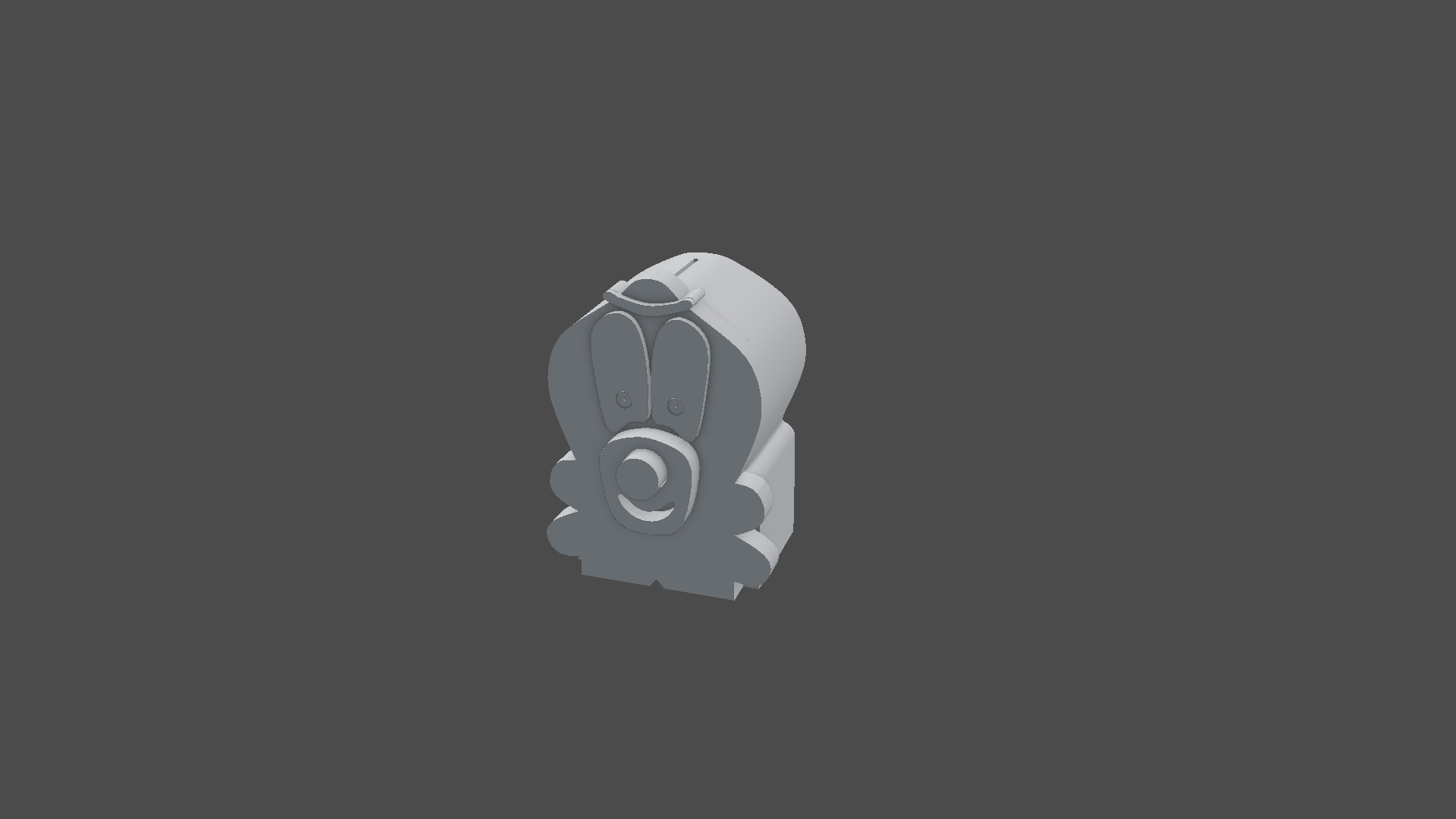
My brother stores his money in a wooden handmade clown bank, and after seeing how neatly layered it is I decided to model it.
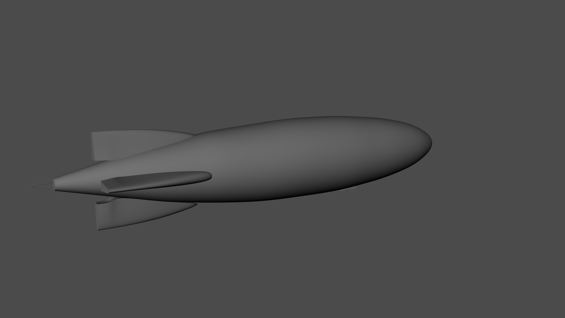
I found some blimp blueprints and said to myself, "Why not?", so I made this.
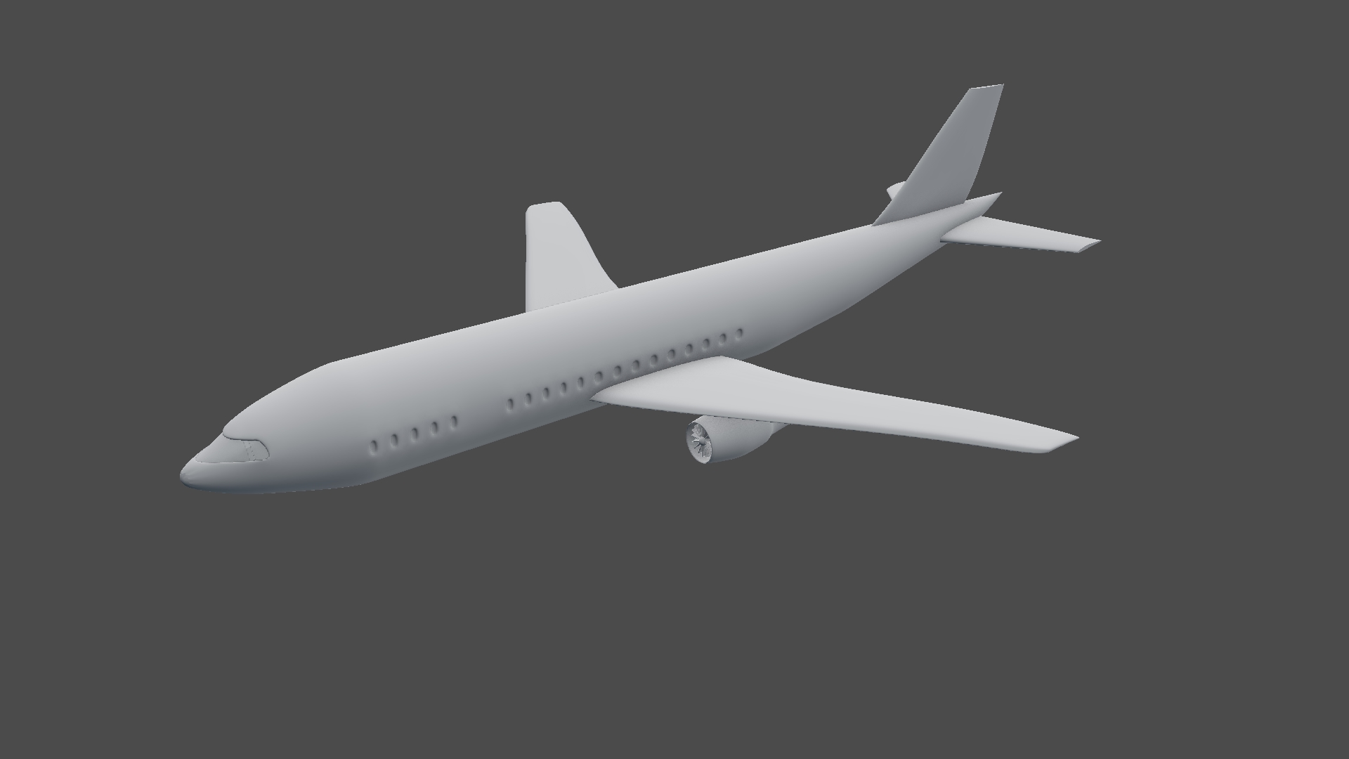
Behold, my latest (and most difficult to model) entry.
Expect more from me soon!
The wavy effect might be duplicate faces overlapping each other. Try selecting all and removing doubles in edit mode.
That looks very nice! One thing I would change is the vertex count on the little cilinder, it's a bit too dense right now in my opinion.
I'm using a subdivision surface modifier. In reality it's less dense.
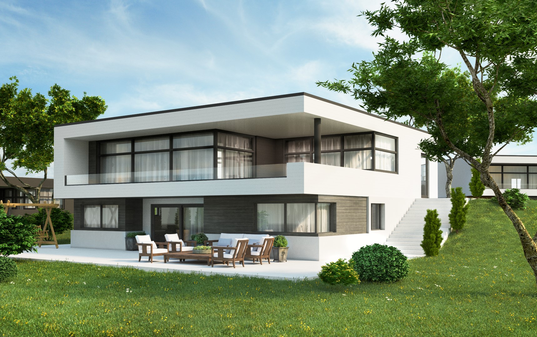
Right now I'm making my own house. Here is the reference image:
And here is my work-in-progress house:
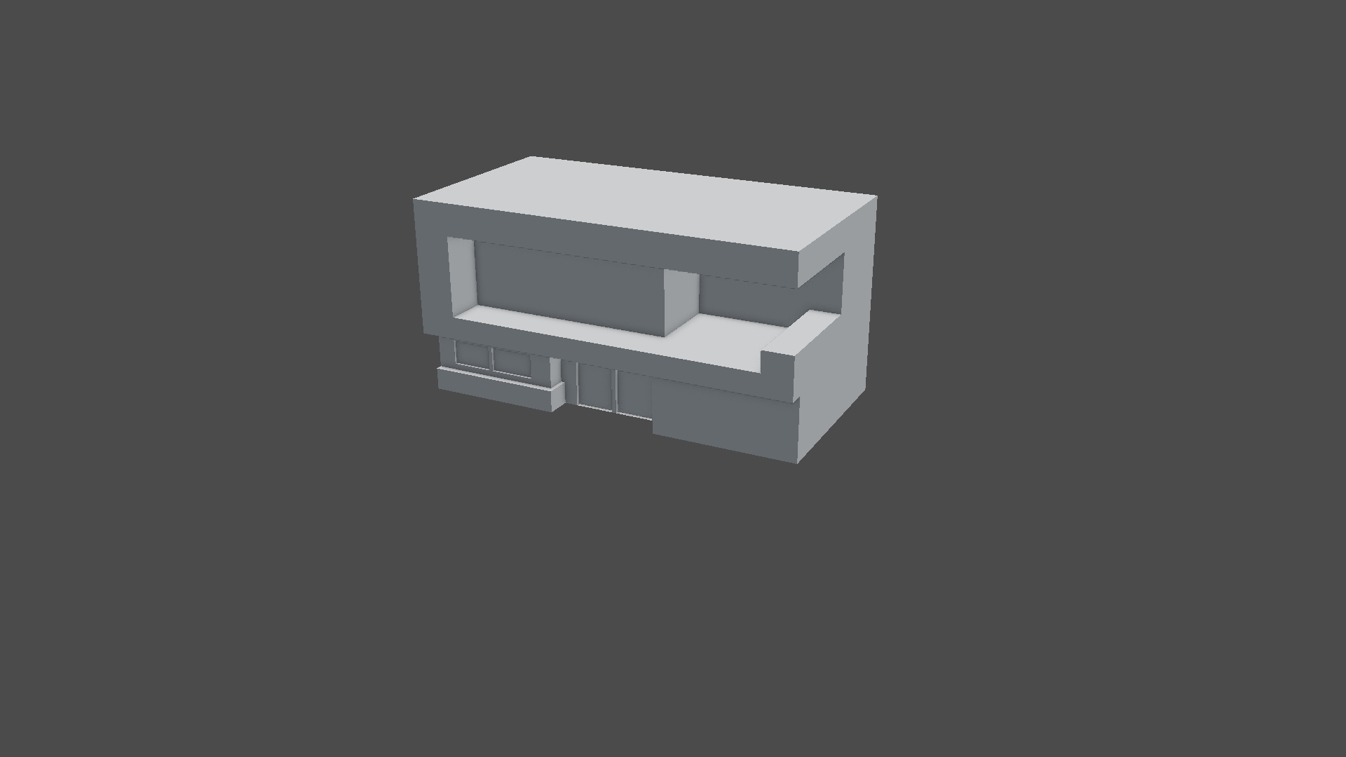 Do you have any advice that could help improve my work?
Nice house William y the way :-) I'm looking forward to see the photo-real-renders of it.
Actually RRonald Vermeij I'm really bad at shading and lighting.
Nice work! For the lighting I think a sunlamp and a environment texture as world-surface will be fine. In the real picture you can see the sun angle.
Best you start with principled shader for glass and some simple diffuse shader for everything else.
After this first settings you can begin with texture the color imput of the shaders.
For more realism change the diffuse shaders also in principled or you train your skills and use just one of them for everything, controlled with vertexgroups, vertexcolors and a combination of textures with colorRamps.
This is just one idea and not the only solution.
sorry for my bad English, it will improve...I be shure.
For the scene behind the windows you could use a plane and something like this:
... and build the backround later, if it impotant for you.
I'm making a car now. I'm watching the Post-Apocalyptic Vehicle course for help out of tough spots.
