[FINAL, FINAL] CLASS ANNOUNCEMENT #7 (Apr 11, 2018): Thanks to those of you who have responded to the Questionnaire. The feedback is extremely helpful. If you haven't responded yet and you participated in the class - or even if you didn't participate - please fill that out and I will gift you 20 Breath of the Wild screenshots from my Switch.
[FINAL] CLASS ANNOUNCEMENT #6 (Apr 9, 2018): We've reached the end of the homework extension period and this class officially comes to end. What a month! It's been a thrill to see each of you forge your characters, learn new things, share tips with each other, and offer critiques along the way.
This thread will be open indefinitely but it's officially at the end of it's "class lifespan" meaning I won't be able to commit weekly time to it anymore and I will unpin it from the forum topics list. I'll pop in occasionally if I see activity but you all are more than welcome to keep working on their characters here if you wish!
UPDATE: Closing post on page 44 and XP has been added to each participating account.
CLASS ANNOUNCEMENT #5 (Mar 28, 2018): Week 4's stream is archived and available via the Past Events button on the Live Event page. Also a reminder that I'm extending the 'deadline' of this month and will be keeping this thread alive through the end of the first week in April. Hopefully that gives you all a bit more time to get your characters done!
CLASS ANNOUNCEMENT #4 (Mar 26, 2018): Week 3, done! Thanks to everyone who submitted by Sunday. I'm quite impressed by the neutralization and retoplogy work I've seen. It's a lot of work and I can see that effort in the WIPs and especially completed submissions.
Week 4 - the final week - dives into adding color to our model, primarily in the form of creating textures. Check out this week's breakdown a little further down in this description and see you tomorrow at the Live Event!
CLASS ANNOUNCEMENT #3 (Mar 19, 2018): Week 2 is accomplished and I'm finally caught up on submissions! Thanks to everyone who submitted by Sunday. We have some impressive character concept sculpts underway. In fact, I have yet to bestow a grade lower than an A this week.
Week 3 continues our 3-week character building production. Specifically we're going to look at pursuing an animation friendly version of our character - both how and why we would do this. See you tomorrow at the Live Event! Don't forget to RSVP.
CLASS ANNOUNCEMENT #2 (Mar 12, 2018): Week 1 is done! Thanks to everyone who submitted by Sunday. It's been a lot of fun seeing your caricature work and concept art choices.
Week 2 begins the 3-week process of building a character based on the concepts we choose. Don't forget to RSVP to the Live Event tomorrow - See you then!
CLASS ANNOUNCEMENT #1 (Mar 5, 2018): Class is in session! Today officially begins the BC2-1803 class. Please check the syllabus below for Week 1's focus and assignments. Begin watching the pre-recorded courses if you haven't already and begin looking for a cool, stylized character design for creating in 3D this month. The first Live Event is tomorrow at 2pm EST - SEE YOU THERE! 😎
Welcome to the CGCookie Class: Creating Stylized Characters with Blender! This class is designed to teach you everything you need to know about building stylized 3D characters. If you’re diligent in watching all content and hitting homework deadlines, by the end you will have a modeled and textured stylized character! It’s an intermediate-to-advanced class which means you’ll do best by having some experience with Blender and 3D modeling before committing to this class.
This is the second "Class" format where Citizen members are invited to focus together on a particular topic/skill for a month. Participation looks like this:
WHEN? The class will take place from March 5th through March 31st
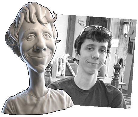 Abstract: Stylization is any deviation from realism. Thus it’s a broad spectrum from slight liberty away from reality to extreme abstraction of reality. This week we're going to sift through various examples of stylized characters, noting their qualities, and categorizing a spectrum of stylization.
Goal of the Week: Train your eye and mind to stylize your perception. Practice simplifying and exaggerating reality. Loosen up your sculpting approach (gestural sculpting).
Pre-recorded course to watch: Art of Sculpting: Caricature Chapter
Week 1 Live Event (Already happened and archived!)
Homework:
 Abstract: Story plays a big part in stylization. Not necessarily ‘narrative’ but background, personality, and purpose. The success of a character is strengthened by its developmental arc. The best artists create characters that are more than the sum of its pixels; more than the sum of its brush strokes and polygons; more than its final render.
Goal of the Week: Develop a story for your character; one that can fuel your creative workflow for the rest of the month. Then channel that story into the first stage of sculpting.
Pre-recorded courses to watch:
Week 2 Live Event (Don't forget to RSVP)
Homework:
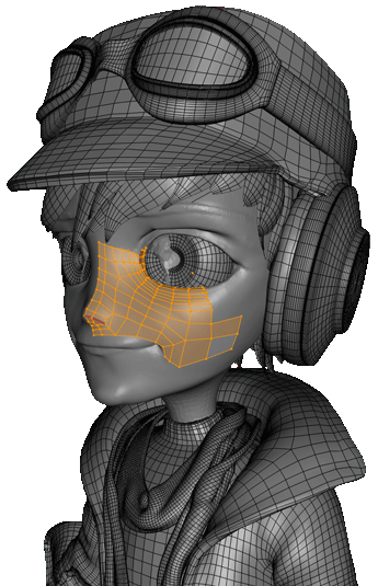 Abstract: At this point a decision needs to be made about our character sculptures: A) Leave it as a sculpture or B) optimize it for ‘production’. Leaving it as a sculpture means it’s a static sculpture that can be painted, rendered, or 3D printed but not animated. Optimizing it for production means you turn your sculpture into a model that’s easiest to work with up to and including animation. If you opt for optimization, this week is mostly a technical and problem-solving task. We need to both retopologize our mesh and also neutralize it if the sculpt is posed.
Goal of the Week: Understand the concept of “production-friendly” and practice retopology.
Pre-recorded courses to watch:
Week 3 Live Event (Don't forget to RSVP)
Homework:
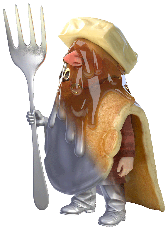 Abstract: Like Dorothy, our characters have so far lived in a black and white world. This week we’re leaving Kansas and adding color. There’s many methods for creating our character texture(s) including hand-painting, baking maps that accent the painting process (great for the less painterly character artists), as well as photo-sourcing. There's also a couple different formats: Vertex Colors and UV/Textures.
Goal of the Week: Get comfortable with painting textures.
Pre-recorded courses to watch:
Week 4 Live Event (Don't forget to RSVP)
Homework:
This thread is reserved for CG Cookie Citizens that are participating in the "Creating Stylized Characters with Blender" class. Its purpose is to serve as central communication for all participating Citizens (excluding Hobby plan Citizens) to ask me and each other questions and to post homework. As the instructor of the class, I will be monitoring this thread on a daily basis (especially Mon-Thurs) throughout the month of March to review homework and answer questions.
Free members are welcome to observe the thread but please respect that communication is reserved for Citizens.
Starting to finally iron out the sculpting quirks. It takes time to get over that steep hurdle, but I'm getting there. Getting into the flow.
Normally you would wanna stay in Subdivide Collapse mode for roughing out the overall shape and form, giving the appropriate geometry density to where it needed.To fix the lumpiness,in Collapse Edges mode, you can try the Flatten + Smooth brushes then use the Grab brush to move and straighten out uneven edges, make sure to move around the viewport and check it on every angle and zooming out to have an overall view of your model from time to time. You may also want to have a look or re-visit Kent's "Sculpting fabric" video to warm you up.
Your model is shaping up nicely, keep up the good work ;)
Excellent sculpt cc0mm0n53nse! So authentic to the art, such polished surface quality. You take home the reward for week 2's smoothest sculpture 👏
And the respect you paid to most details like wrinkle locations/shape and overall pose, it's very commendable. Aside from the seeminlgy missing ponytail and owl, the sculpture alone is easily an A. But no backstory?? I'd love to catch a literary glimpse into this character and his world. As part of the assignment, guess I have to give a C since missing... Unless you write one up! 🙏
What a jump from the last post ![]() lhumungus! Seriously, this looks awesome. The camera angle adjustment, lovely detail additions, her face, and *that* hair. Also the little bit of facial paint for lips and eyes helps her feel so much more human compared to leaving everything grey.
lhumungus! Seriously, this looks awesome. The camera angle adjustment, lovely detail additions, her face, and *that* hair. Also the little bit of facial paint for lips and eyes helps her feel so much more human compared to leaving everything grey.
It looked good before, but this is next level. You've earned a + for you A 👏
Are you planning to do sculpt only or neutralize into an animation-friendly version?
Nice job ![]() jakeblended. I see a very clear correlation from the art to your sculpture. You've done good work being authentic to the details in the design.
jakeblended. I see a very clear correlation from the art to your sculpture. You've done good work being authentic to the details in the design.
The jacket and pants have a little bit of an inflated feel to them, or puffy. A little like these snowboard pants:
It seems to me a situation where the art doesn't give you much in terms of clothing wrinkles. But in 2D it's not bothersome visually, where in 3D the result is more puffy than it is denim/khaki pants and leather.
Aside from that your sculpt feels pretty good. Maybe some additional polishing of shapes like the face, hands, and shoes. But overall it's a B in my book 👍
PS: And thanks for doing Indy's background even though most of probably know about him.
LOVE the backstory types next to the character art. As in combined in one image 👌 And I like the laid back, normal, real-life guy impression it gives. Fits the art well.
Hahaha you had me cracking up with "9th level of clay strips hell" 😂. Who hasn't been there?! Your skin modifier redo is sooo much better. It's even an art in itself to get the skin modifier to begin resembling the character.
Keep up the good work ![]() stonewing!
stonewing!
Funny how neutralizing can reveal proportional issues, right? In that way it's a good metric for character judgement that would never be known if left in pose.
But your neutral proportions looks valid. I'd say it's in the body type category of shorter legs. Plenty of women have this shape. If you're going for 'idealized' woman, I'd say make the legs longer.
Bob is shaping up quite nicely, Ryan 👍 And since everyone has the choice this week of either neutralizing/retopologizing OR sticking with sculpture only, if you choose the latter then you're not that far behind.
One note about your current sculpt is the head and neck shapes. I'd recommend bringing the head forward and eliminating that bump on the back of the head, near the connection to the base:
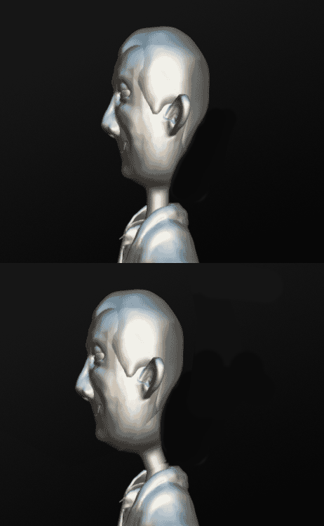
That should make the head-neck connection feel more natural and less lolly-pop.
Thanks for the pro feedback @theluthier and cc0mm0n53nse and mmalhomsi . Looking forward to putting it to practice in Wk 3.
I'm mostly done with my first major pass on the sculpt. There is still a bunch of polishing and refining to do, but before I start working on that I was looking for some feedback. Something about the face feels off, like it's close but not yet there, but I can't seem to figure out what it is. Any help would be much appreciated, both with the face, and any other pointers to improve :)
Edit: Added in the art work to compare the two.
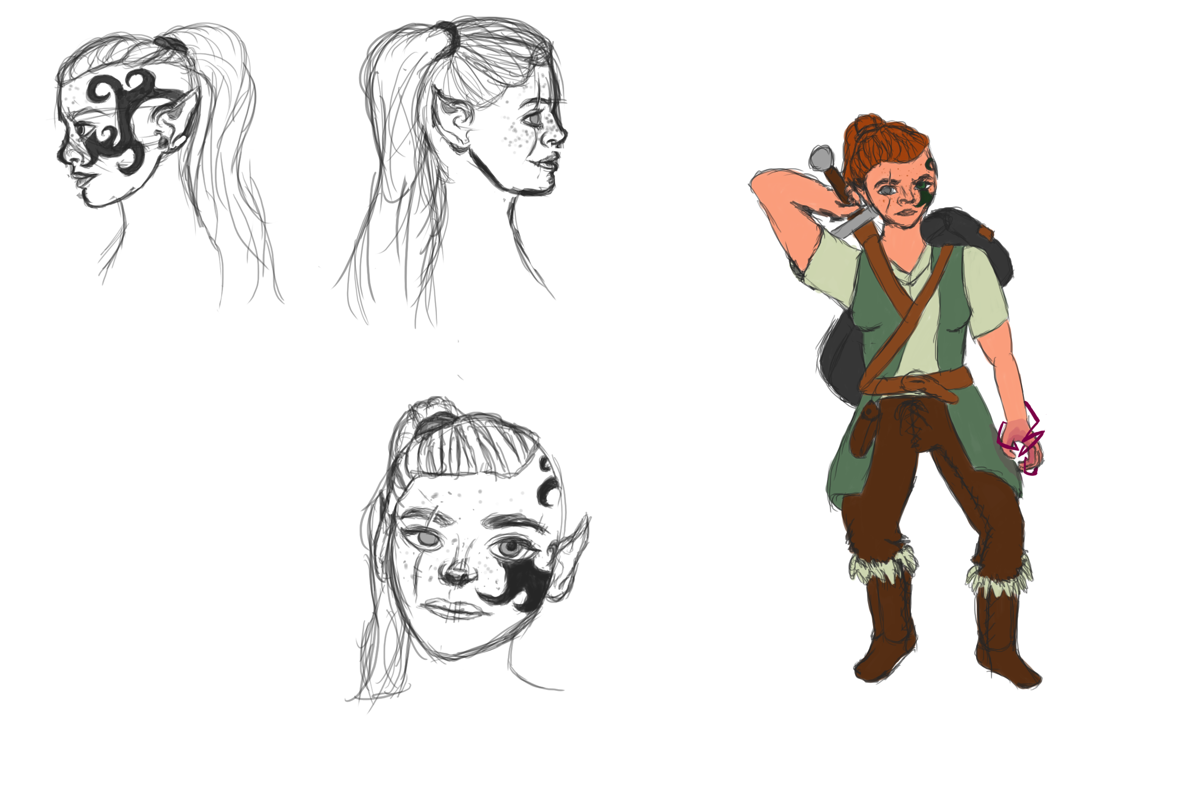
the face doesn't "read" well as to whether is male or female and has tendencies toward either mixed together...
for instance chin and mouth appear female while brow and forehead look male...
![]() valandrath The face isn't striking me as off currently. Possibly the eyes are in that space of staring awkwardly forward, like the "looking through me" gaze. But I'm not 100% sure. Could you update the post with your artwork so we can compare better?
valandrath The face isn't striking me as off currently. Possibly the eyes are in that space of staring awkwardly forward, like the "looking through me" gaze. But I'm not 100% sure. Could you update the post with your artwork so we can compare better?
Good work so far! I marked some stuff that may help you:
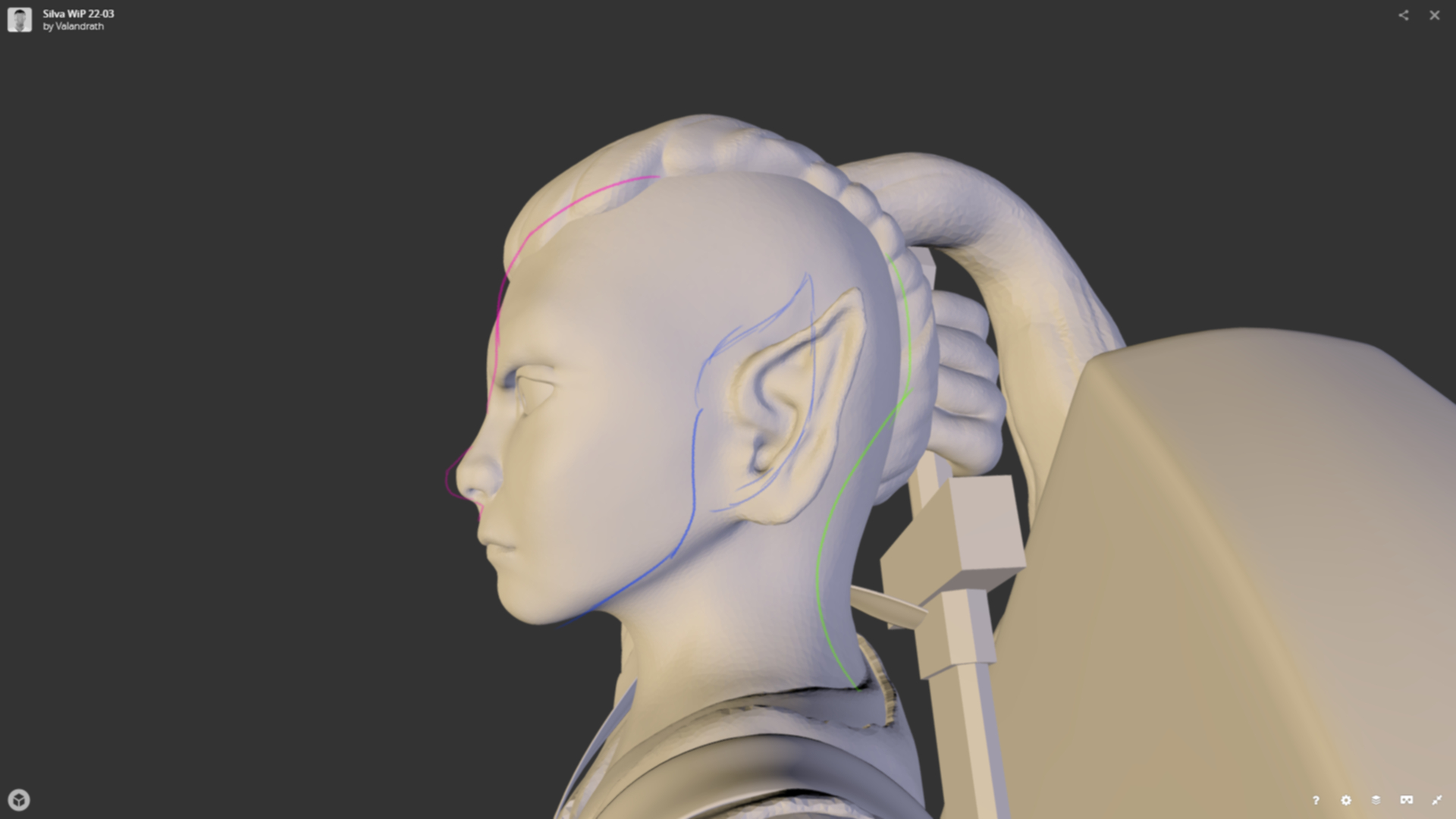
The pink line is for things that don't necessarily need to be changed, they may be your intention. What I would recommend do is to move the nose a little more to the front and pronunciate the angle between her nose and mouth. Her forehead may be too short, with the hairline starting too early, giving her a primitive apparence. This last one may be what's putting you off.
The blue line is simpler, just move her ears a little more to the center of her head. Her jaw may be too straight, they usually curve to connect under the ear. It's not an impossible shape, but uncommon.
Finally the green line, her nape is too thick and the back of her head looks squashed. The neck look fine from the front, but too large from the side.
Overall, still a good job! I hope this helps you identify what's making you feel uneasy!
Also one nitpick, your character may not be able to unsheathe a sword that big from the back :P
Thank you all for some incredible help. I'm gonna see what I can do with everything mentioned. I also added in the artwork I created for the character, it might help figure some more things out :)