[FINAL, FINAL] CLASS ANNOUNCEMENT #7 (Apr 11, 2018): Thanks to those of you who have responded to the Questionnaire. The feedback is extremely helpful. If you haven't responded yet and you participated in the class - or even if you didn't participate - please fill that out and I will gift you 20 Breath of the Wild screenshots from my Switch.
[FINAL] CLASS ANNOUNCEMENT #6 (Apr 9, 2018): We've reached the end of the homework extension period and this class officially comes to end. What a month! It's been a thrill to see each of you forge your characters, learn new things, share tips with each other, and offer critiques along the way.
This thread will be open indefinitely but it's officially at the end of it's "class lifespan" meaning I won't be able to commit weekly time to it anymore and I will unpin it from the forum topics list. I'll pop in occasionally if I see activity but you all are more than welcome to keep working on their characters here if you wish!
UPDATE: Closing post on page 44 and XP has been added to each participating account.
CLASS ANNOUNCEMENT #5 (Mar 28, 2018): Week 4's stream is archived and available via the Past Events button on the Live Event page. Also a reminder that I'm extending the 'deadline' of this month and will be keeping this thread alive through the end of the first week in April. Hopefully that gives you all a bit more time to get your characters done!
CLASS ANNOUNCEMENT #4 (Mar 26, 2018): Week 3, done! Thanks to everyone who submitted by Sunday. I'm quite impressed by the neutralization and retoplogy work I've seen. It's a lot of work and I can see that effort in the WIPs and especially completed submissions.
Week 4 - the final week - dives into adding color to our model, primarily in the form of creating textures. Check out this week's breakdown a little further down in this description and see you tomorrow at the Live Event!
CLASS ANNOUNCEMENT #3 (Mar 19, 2018): Week 2 is accomplished and I'm finally caught up on submissions! Thanks to everyone who submitted by Sunday. We have some impressive character concept sculpts underway. In fact, I have yet to bestow a grade lower than an A this week.
Week 3 continues our 3-week character building production. Specifically we're going to look at pursuing an animation friendly version of our character - both how and why we would do this. See you tomorrow at the Live Event! Don't forget to RSVP.
CLASS ANNOUNCEMENT #2 (Mar 12, 2018): Week 1 is done! Thanks to everyone who submitted by Sunday. It's been a lot of fun seeing your caricature work and concept art choices.
Week 2 begins the 3-week process of building a character based on the concepts we choose. Don't forget to RSVP to the Live Event tomorrow - See you then!
CLASS ANNOUNCEMENT #1 (Mar 5, 2018): Class is in session! Today officially begins the BC2-1803 class. Please check the syllabus below for Week 1's focus and assignments. Begin watching the pre-recorded courses if you haven't already and begin looking for a cool, stylized character design for creating in 3D this month. The first Live Event is tomorrow at 2pm EST - SEE YOU THERE! 😎
Welcome to the CGCookie Class: Creating Stylized Characters with Blender! This class is designed to teach you everything you need to know about building stylized 3D characters. If you’re diligent in watching all content and hitting homework deadlines, by the end you will have a modeled and textured stylized character! It’s an intermediate-to-advanced class which means you’ll do best by having some experience with Blender and 3D modeling before committing to this class.
This is the second "Class" format where Citizen members are invited to focus together on a particular topic/skill for a month. Participation looks like this:
WHEN? The class will take place from March 5th through March 31st
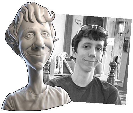 Abstract: Stylization is any deviation from realism. Thus it’s a broad spectrum from slight liberty away from reality to extreme abstraction of reality. This week we're going to sift through various examples of stylized characters, noting their qualities, and categorizing a spectrum of stylization.
Goal of the Week: Train your eye and mind to stylize your perception. Practice simplifying and exaggerating reality. Loosen up your sculpting approach (gestural sculpting).
Pre-recorded course to watch: Art of Sculpting: Caricature Chapter
Week 1 Live Event (Already happened and archived!)
Homework:
 Abstract: Story plays a big part in stylization. Not necessarily ‘narrative’ but background, personality, and purpose. The success of a character is strengthened by its developmental arc. The best artists create characters that are more than the sum of its pixels; more than the sum of its brush strokes and polygons; more than its final render.
Goal of the Week: Develop a story for your character; one that can fuel your creative workflow for the rest of the month. Then channel that story into the first stage of sculpting.
Pre-recorded courses to watch:
Week 2 Live Event (Don't forget to RSVP)
Homework:
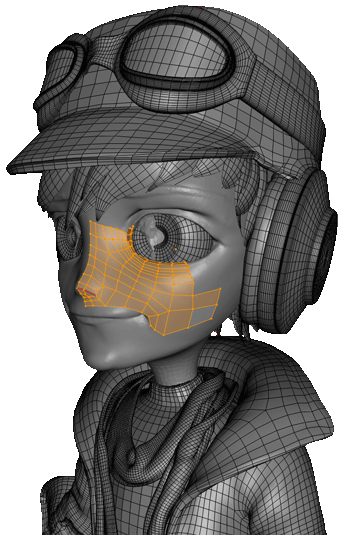 Abstract: At this point a decision needs to be made about our character sculptures: A) Leave it as a sculpture or B) optimize it for ‘production’. Leaving it as a sculpture means it’s a static sculpture that can be painted, rendered, or 3D printed but not animated. Optimizing it for production means you turn your sculpture into a model that’s easiest to work with up to and including animation. If you opt for optimization, this week is mostly a technical and problem-solving task. We need to both retopologize our mesh and also neutralize it if the sculpt is posed.
Goal of the Week: Understand the concept of “production-friendly” and practice retopology.
Pre-recorded courses to watch:
Week 3 Live Event (Don't forget to RSVP)
Homework:
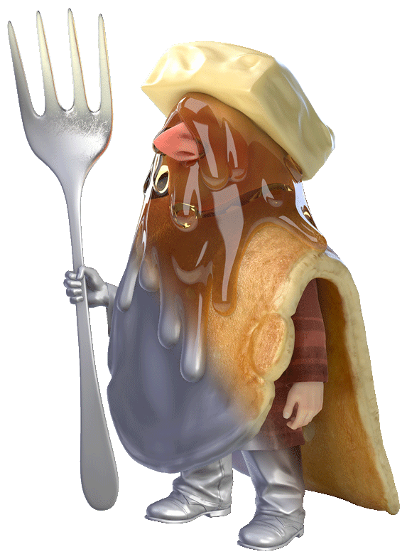 Abstract: Like Dorothy, our characters have so far lived in a black and white world. This week we’re leaving Kansas and adding color. There’s many methods for creating our character texture(s) including hand-painting, baking maps that accent the painting process (great for the less painterly character artists), as well as photo-sourcing. There's also a couple different formats: Vertex Colors and UV/Textures.
Goal of the Week: Get comfortable with painting textures.
Pre-recorded courses to watch:
Week 4 Live Event (Don't forget to RSVP)
Homework:
This thread is reserved for CG Cookie Citizens that are participating in the "Creating Stylized Characters with Blender" class. Its purpose is to serve as central communication for all participating Citizens (excluding Hobby plan Citizens) to ask me and each other questions and to post homework. As the instructor of the class, I will be monitoring this thread on a daily basis (especially Mon-Thurs) throughout the month of March to review homework and answer questions.
Free members are welcome to observe the thread but please respect that communication is reserved for Citizens.
Fashion croquis is a type of stylization, right? I spent all day making the concept for Kilyn (kept getting bogged down in polishing things. Stop it, me!) and really tried to emphasis her gracefulness as a dancer. Tried an asymmetrical design, keeping it somewhat practical but also beautiful. Not a lot of detail, but I want to add wing and raven motifs after brainstorming some more.
Any critiques are welcomed.
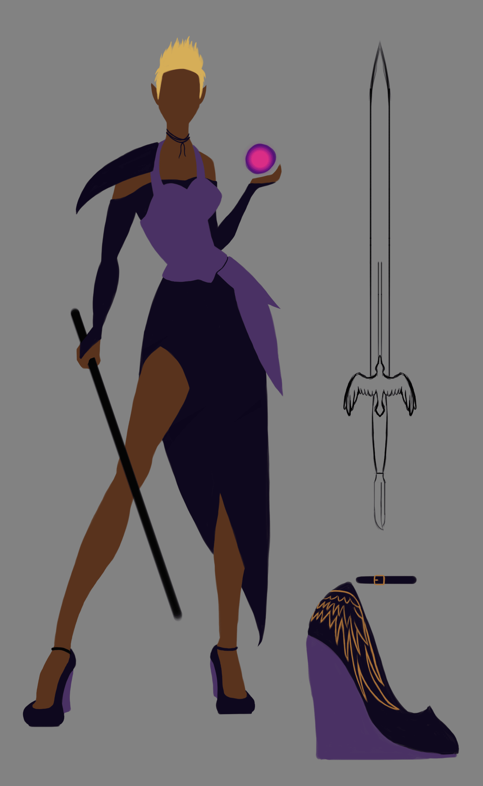
I love that raven theme so much. It's kind of hidden in the cloth shapes but when you see it, it's obviously there and the swords cross-guard is great. Only thing that I'm doubting is the practical side of the high heels but that's just my opinion, great concept :)
Cool design! I read her backstory and I can tell by the design that she's good with magic, but I can't see her as a sword fighter. Maybe you could give her magic armor? Pieces of semi-transparent armor that float over critical body parts. It will reinforce with the idea that she's good with magic and can stand on her own at melee range. Regarding the high heels, there's a reason women take them off for dancing :P
When you were talking about "Bladesinger" it reminded me of The Dancer of the Boreal Valley, the most graceful and beautiful boss in Dark Souls 3...
I like your plan, proportional editing could be your friend here. Just mask or hide the geometry that you want to keep untouched.
Homework Submission Week 1.
A little late to the party, forgot it was March already. I'm gonna try to do the homework for last week and this week, and be up to date before next week.
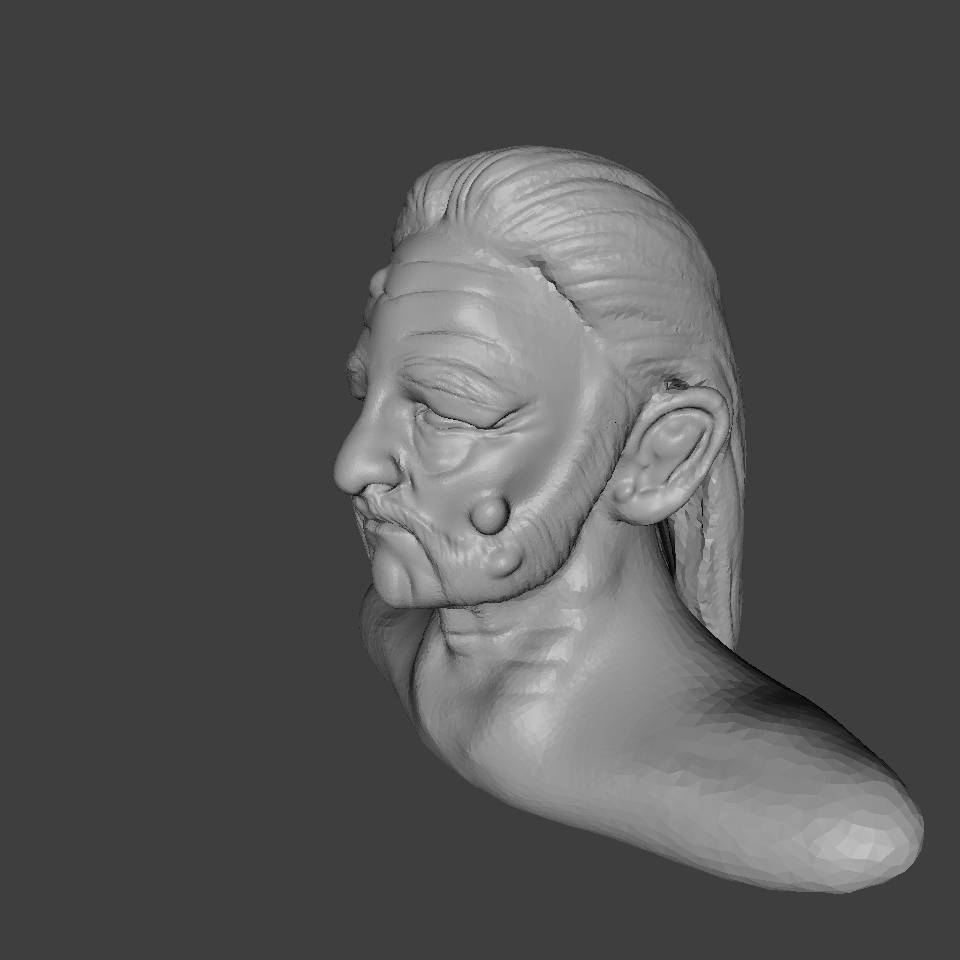
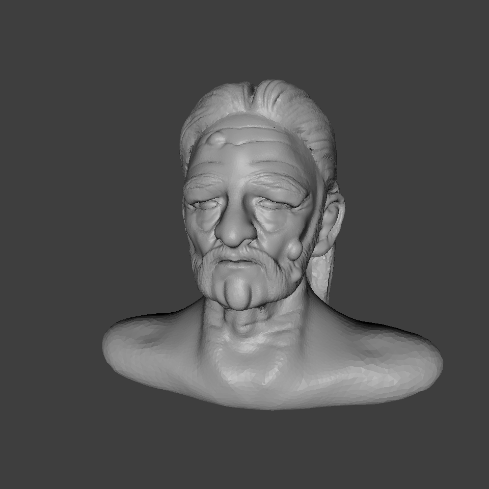
I'm both very excited and scared for this course. I've always wanted to learn more stylised characters, but up untill they've always felt a little "off" to me, not quite realistic enough, or too lost in stylisation. Hoping to develop a style with the help of this course. For this weeks assignment I did a sculpt of a personal hero of mine: Lemmy Killmister, late frontman from the band Motörhead. I feel like I'm getting the likeness in, but I think I could have gone further with the exaggeration. Let me know if you see anything that could be improved upon, or that would make it a better carricature :) Now I'm gonna work on a character to make in the next month.
![]() swikni Thanks! I don't want the heels to actually be 6 inches tall, but this is about stylization, right? So it's an exaggeration, for sure. Ideally, I'd like them to be 1-3 inches tall, that's about my limit before discomfort, pain, and impracticality becomes an issue. I also went with wedges, as well, because stilettos would just be ridiculous and terrible in dirt, sticking into soft ground, whereas wedges would at least spread that PSI along a flat, broad surface and not be so much an issue.
swikni Thanks! I don't want the heels to actually be 6 inches tall, but this is about stylization, right? So it's an exaggeration, for sure. Ideally, I'd like them to be 1-3 inches tall, that's about my limit before discomfort, pain, and impracticality becomes an issue. I also went with wedges, as well, because stilettos would just be ridiculous and terrible in dirt, sticking into soft ground, whereas wedges would at least spread that PSI along a flat, broad surface and not be so much an issue.
![]() jack07 Thanks for the feedback! It really helps me understand where the confusion is when I'm explaining my ideas because I tend to leave some important things out or rely too much in implicity. As for the whole Bladesinger business, it's a prestige class in DND where swordplay and magic are fused into a seamless whole. The non-prestige class for that is the Hexblade, which is pretty much the same thing, but... less impressive, I guess. My character has to meet the requirements for the prestige class, hence the inability to become a Bladesinger from just reading a book lol. But, in regards to your suggestions and what I have in my mind, I think I'll amend the story a bit to throw in some swordplay skills for Kilyn. Maybe her mom or dad or both worked with her to gain some basic swordplay to defend the forge or something...
jack07 Thanks for the feedback! It really helps me understand where the confusion is when I'm explaining my ideas because I tend to leave some important things out or rely too much in implicity. As for the whole Bladesinger business, it's a prestige class in DND where swordplay and magic are fused into a seamless whole. The non-prestige class for that is the Hexblade, which is pretty much the same thing, but... less impressive, I guess. My character has to meet the requirements for the prestige class, hence the inability to become a Bladesinger from just reading a book lol. But, in regards to your suggestions and what I have in my mind, I think I'll amend the story a bit to throw in some swordplay skills for Kilyn. Maybe her mom or dad or both worked with her to gain some basic swordplay to defend the forge or something...
I find it hard to believe that someone who wants to look sexy while dancing would toss the heels. I'll do some research into it, but with heels being a staple sexy trend, I would think there would be practices in place to dance in heels while still being comfortable and non-damaging to your feet. That's my hypothesis, anyway. To the internet!
Homework Submission Week 2
KisZsiraf is the first animal from Noah's Ark who came down from the boat and visited Lara, the one year old little baby on her playground.
He is a giraffe and similarly to Lara, mainly still eating milk as being around in the same age, although having already the ability of walking. This is why they're so good friends, KisZsiraf is able to see interesting things keeping his head high and tell everything for the little girl, by that inspiring her too to do the same.
A giraffe in this young age has not fully formed out proportions, having a little bit bigger head in comparison to his body and his body shapes still less contoured.
They live simple life with Lara focusing always to the present moment with the main drive of the curiosity, what can be outside of this baby room. There are several obstacles to climb through, a pillow here or a mattress there amongst the toys, but one thing is sure - together they are going to manage once and surprise Mum with visiting her in the kitchen.
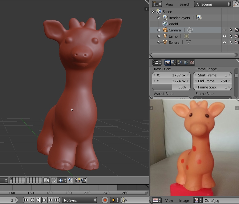
Sketchfab link https://skfb.ly/6xyDs
I know the model is slightly off from the picture, maybe starting from the beginning again next time it would be better. Learnt a lot again of course, my biggest mistake was being not enough careful with the main proportions and later that is harder to change. Anyway started the modelling with symmetry and would like to back to that one with the re-topology exercise, although that is not enough detailed compare to this one, because here worked much more. At least the file name says version 46... :-)
How adorable! It looks like you were working from a picture, but if you could've borrowed the toy when possible, maybe it would've helped with your sculpt. I like to find real life objects and look at them, touch them, rotate them around if I can when sculpting. It helps. Cute backstory, too!
I like the pose and the style. I will agree with the others that high heels seem impractical for a dancer or sword fighter. I personally think the raven hilt is not stylized enough; I think it needs to match the flare she has. Perhaps have it less like a drawing of a bird and more like a sculpting of metal, with harder stylized edges, or maybe florid, ornate and delicate if that's the vibe you want to convey.
I like to help! The thing about high heels is that they are usually impractical regarding combat, especially melee range, (and most of the time for everything else but an elegant party) and rarely used in dancing. Only style I know where is common to use them is Tango, mostly because it's danced with formal attire. So it is possible, sexy and elegant, but for fantasy characters that are involved in combat it becomes distracting.
If your character wants to become the best adventurer in a land of monsters and thieves continue to the next paragraph. If your character wants to entertain people with her abilities go to paragraph 6.
Usually when a character has high heels and is involved in combat, it gives me the idea that either they don't move much in battle (say, support mage) or that they are in an unnecessary disadvantage (as sexy or as skillful they may be, it's more stable with boots).
For a recent example, in Black Panther there's a scene where the main characters have to disguise themselves with formal attire, and the two female characters (who are highly skilled warriors) had to use high heels. As soon as they started fighting they broke them (on someone else's face).
The important thing is that if you feel that she would prefer to use them, that's great! I recommend you try to give a cool reason for it, so people don't go "that's so impractical" and instead go "OOOOH THAT'S WHY". I think 2 inches is the max before it becomes distracting.
(6) So she wants to charm people's hearths with her graceful skills, then you are in the right way, just consider how long is she going to dance, ha! I assumed she was going to be warrior because you mentioned swordplay, but a character that recycles an offensive art into something beautiful to connect with a parent seems more interesting and original. But you may want to consider a different outfit for when she's outside town, dangerous things crawl at night...
So I made some research, let me know if I misunderstood what a Bladesinger is: They are people skilled with swords and magic, whose combat reminds others of a beautiful dance, but deadly. It's not about power, it's about deceiving your enemy with style (Oh God I feel like my grandpa, I butchered it didn't I?).
I have been playing a character in Dark Souls 3 with a similar style based on one of it's bosses (The Dancer of the Boreal Valley, check her she is really cool!), so that's why I got really invested in your character ha!
Hey everybody! Thanks so much for all the feedback on the Dr. Strange sculpt! Sorry to disappear for a bit; this class happened to coincide with a cross-country trip to visit my mom. I'm not out of the game though! :)
I thank you all again so much for all your guidance. The overlays and pointers really helped me figure out where to look, and I learned a LOT. I feel like I advanced leaps and bounds just by this project alone! I'm finally starting to feel more like an artist, and less like a technician. :)
Homework Submission Week 2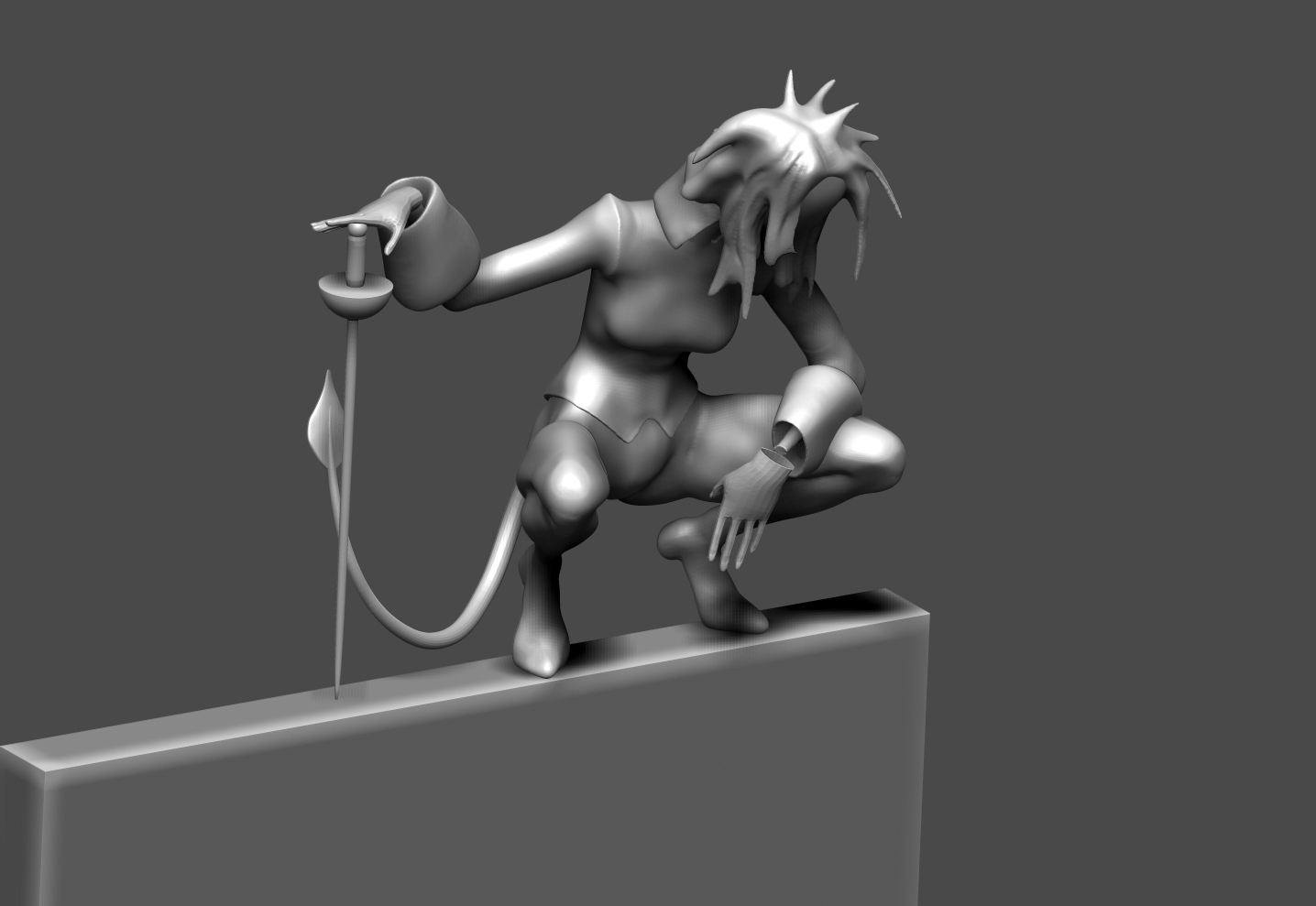
O.V.
Riddleport’s streets were swarming with Scarzni patrols. They crawled its filthy alleys, its patchwork rooftops, looking for her. They would never stop until they had her head. It’s not often they were betrayed by one of their own. And a traitor who managed to kill a captain and five of his sergeants? That never happens. But their unforgiving ways had taught her everything she knew about survival. And payback was part of that.
She had been in and out of the Big Black a few times. Now with her blood-drinking blade, and a few carefully chosen compatriots, she would never fear it nor anyone else again.
It was time to go…
****
Still lots and lots to do, but figured I'd try to get the pose down since it's really hard for me to sculpt without symmetry. But the class is forcing me into the uncomfortable zone, which is good!
Hi everyone!
Some awesome sculpts appearing and I think there are even more to go. Good luck everyone!
Just wanted to share a progress on Boogerman. He appeared to be much more fit guy then I thought. More like sculpting a beefcake then a goofy guy he appears to be.
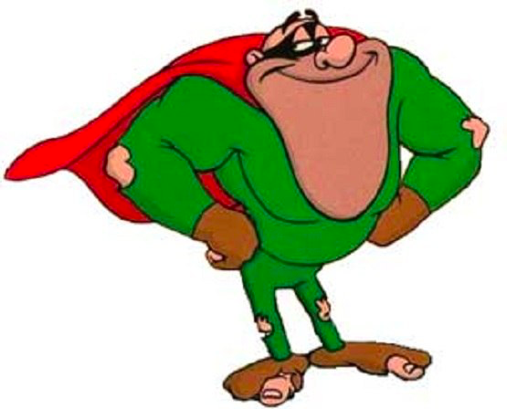
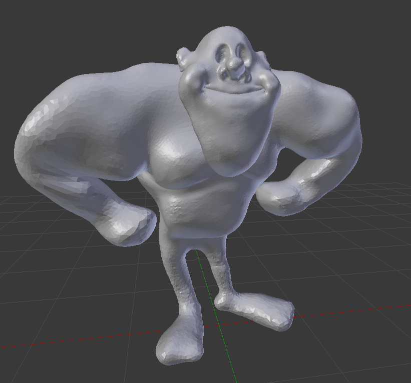
Homework Submission Week 1 Part 2.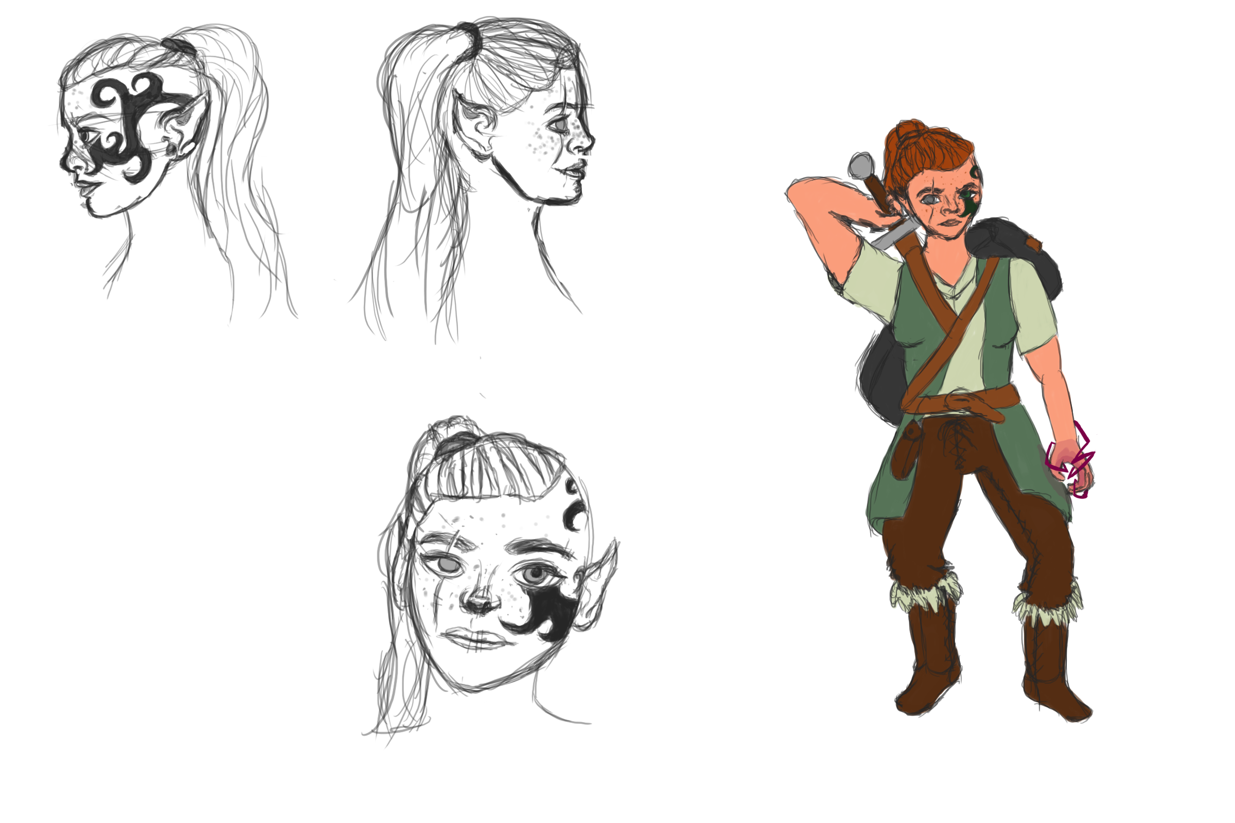
Finished the design for the character I'm gonna try to make. I already tried to push for more stylisation in the drawings, but I kept coming back to a more realistic style, because it felt like it fit the character better. I'm gonna try to push the stylisation further in 3d, with the proportions of the character being pushed further, as well as seeing what can be done with shading.