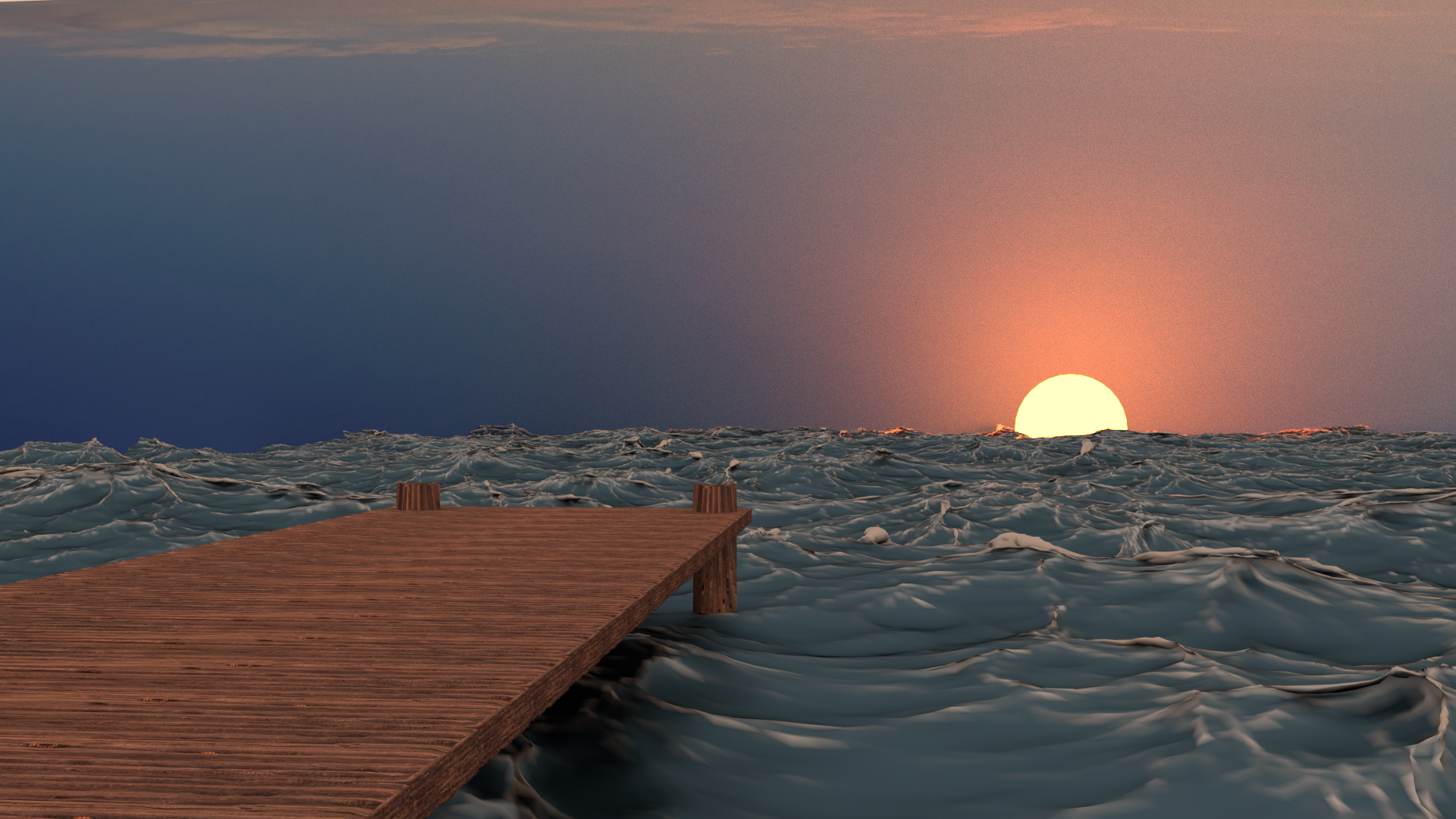
Had this scene critiqued by the awesome @jlampel and Tim, (not sure his username is). They game some really helpful tips and I think that helped me make this scene just a hair better. Over concept never changed, a lot of details did however. Below is the original:

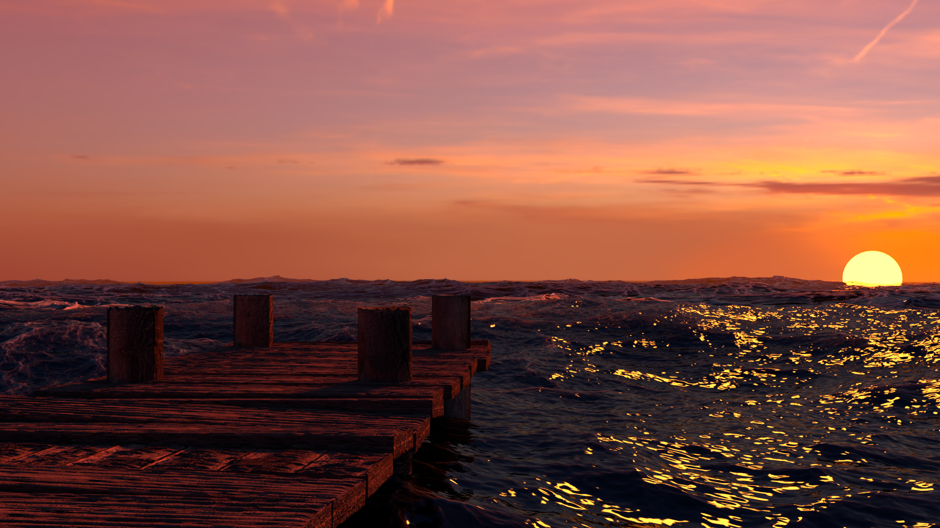
And here is the update:

Hope it's a little better.
P.S. Sorry about the multiposting. Had a couple chrome crashes. Thanks all!
Yes, that is better! I'm so glad you followed up on it, and I hope you learned some things along the way. In fact, it looks like you implemented every single piece of advice Tim and I gave, which is in and of itself fantastic. There are still things that could be improved, but I think you'd be best suited leaving this one as is and focusing on your new scene for now.