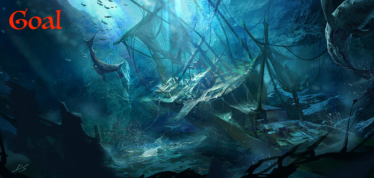
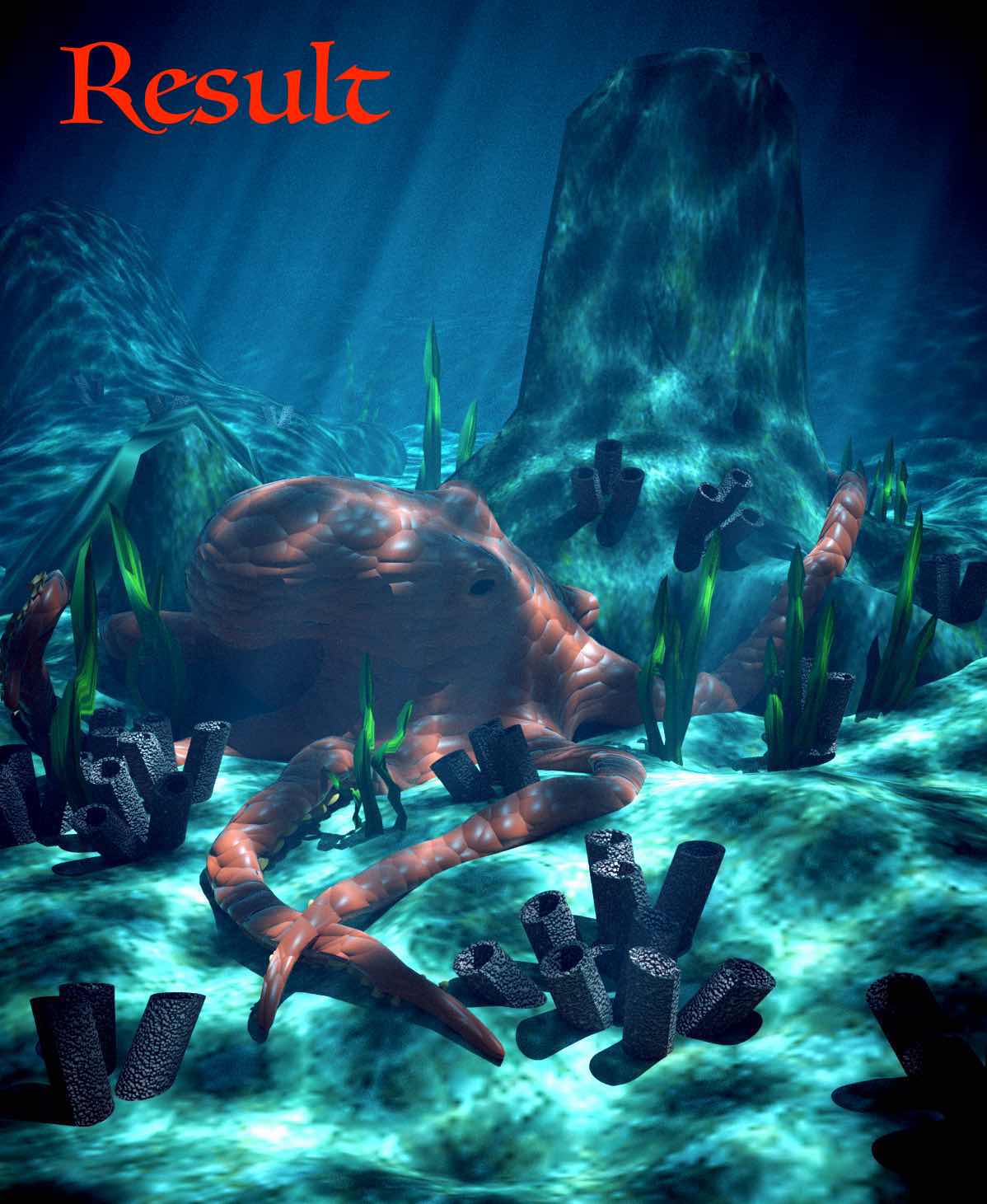
If you're like me, as you scour the internet for inspirational 3D art, you run into some amazing CG lighting setups. You know, the ones that make you want to be better! Well why should we let them have all the fun? Why can't we give it a go?
Therefore, the challenge here is to select one of your favorite lighting examples and do your best to match it in Blender. If you don't keep a collection of your favorites, feel free to use mine. Analyze light colors, number of lights, position, etc and recreate. Use either lamps or HDRi's or both - whatever you need to get the result.
Once you select your favorite, open up one of your models (or download this posed Baker model), do your best to match the lighting and materials, and post it here. Here's my attempts:

Original by Julien Kaspar
Source render by Bruno Ortolland

Image Credit: "Lüfor"by Alexandre Aroul

Image Credit: "Super Mario" by Mark Henriksen

Image Credit: "Sci Fi Pilot" by binqi chen

Image Credit: "Female sculpting session 01" by Daniel Crossland

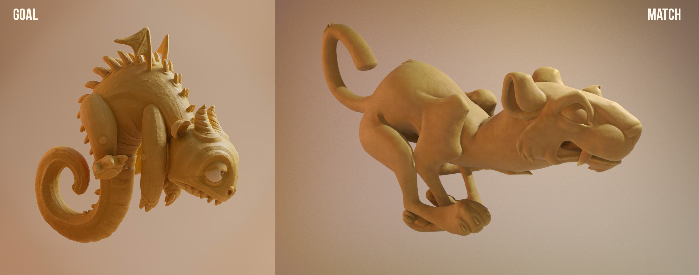
Image Credit: "Tribal Frog" by Paul Braddock

Image Credit: "Danbo in Autumn" by tomatoes
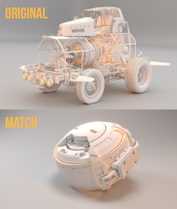
Image Credit: "The Mad Professor's Ride" by Ruairidh MacNeill
Great work Cody :) , also, is that one of your sculpts? Was it done in Blender?
Ahhhh yes, that's an awesome example. Just added it to my pinterest lighting board. And you are so authentic with your recreation! It looks like you even added subtle red SSS. Fantastic job ccodywinch!
My one crit is the singular god-ray coming from the top key light. It seems like your hinting at the effect in your render, with some bloom, but the distinct vertical god-ray in the example is pretty sweet.
Anyhoo, totally a nit-pick, but when you've already done such a good job, why not nitpick? 😜
Dude, Cody, that sculpt is awesome! love it, and the lighting scheme works great in it. Also I bet other werewolf's are jealous of his six pack.
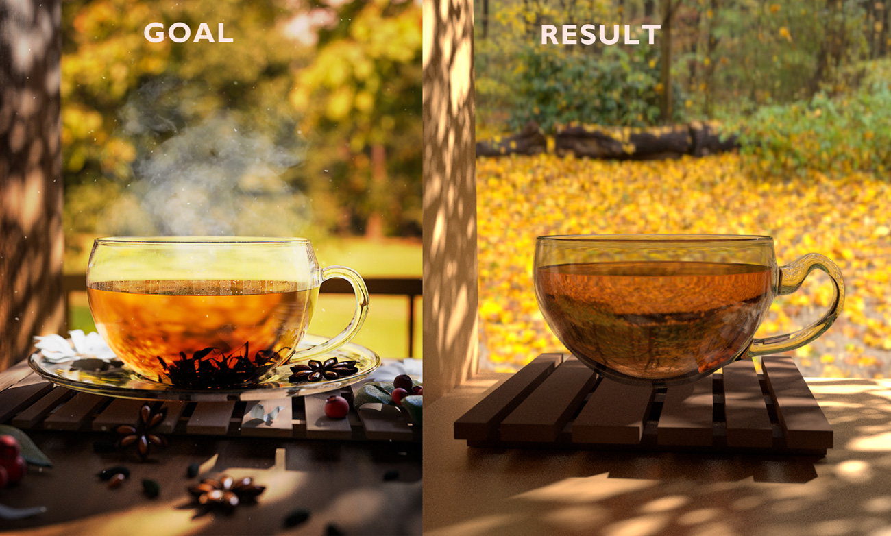
Okay, I did another one, and though it didn't turn out exactly how I wanted it to, I got pretty close!
The original image is from Ewa Wierbik: https://www.artstation.com/artwork/LXQyP
I used an image of rocks for a light texture almost depicting tree leaf shadows. :D That was a creative twist for me! It took a while to really get the right angle as well, and I still was off some. Also, getting an HDRI that could closely match that background, hard stuff. I had to actually use an overcast image! I may try this one again sometime, because the challenge was good! (I even used parts of a black cube to bring out more of the tree shadows' "shadow".
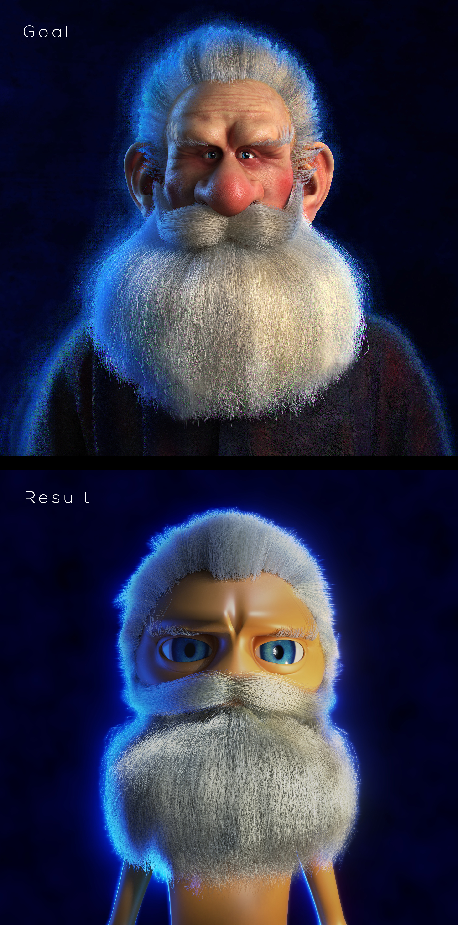
Ok this is exercise #4. Kinda tricky with all the hair particles. Turns out I remembered quite well the old Kent tutorial of stylizing hair with all the curls. Massaging with patience the different layers of hair. The image isn't very faithful to the reference, but it was great practice. This exercise series have been a boss fight, lots of XP to be gained.
Nice one jjazze. The lighting-through-leaves is a tricky thing to pull off, so well done! Not sure I've ever had to use a light texture before. Good solution 👍 Perhaps the mug shader could be critiqued a bit, but that's not really the focus here.
I had to do another one. The utter simplicity and drama of this setup grabbed me. Couldn't help but give it a go!
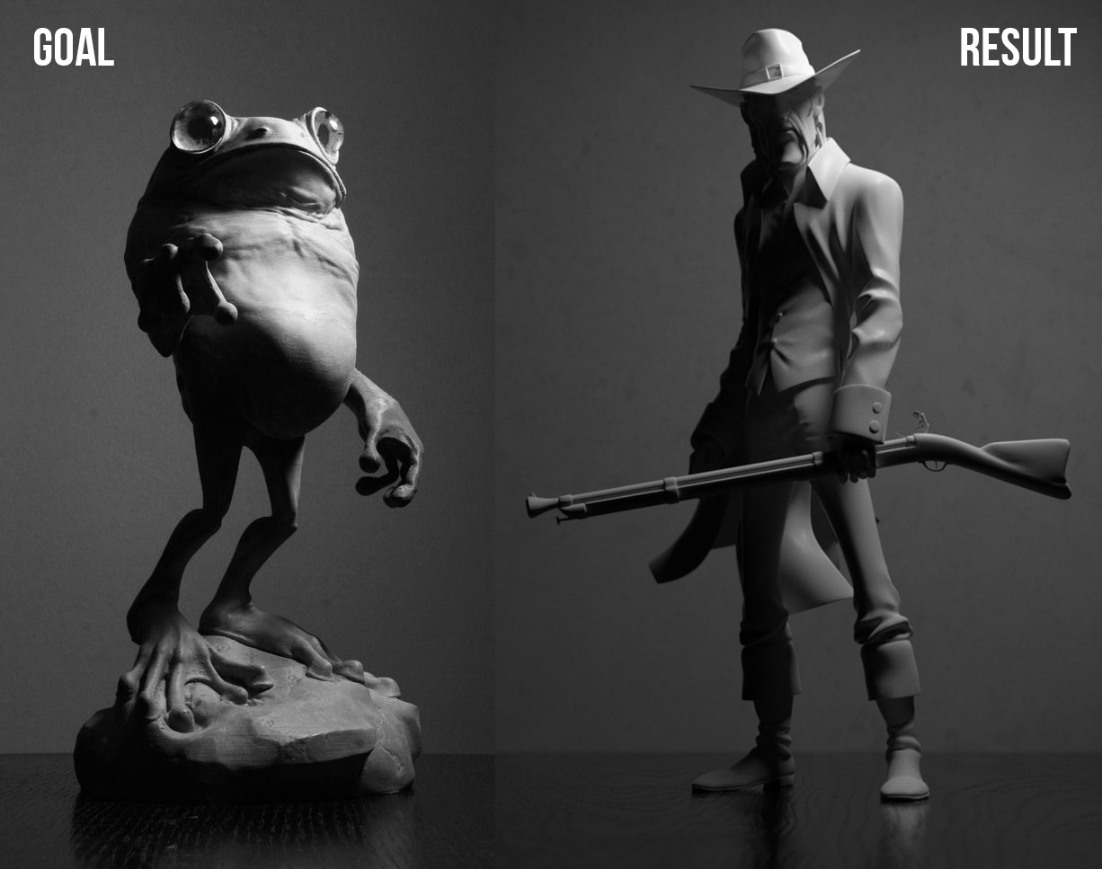
Great work Kent , I love lighting setups like this that are dramatic and have a nice balance of lit detail and form revealing silhouettes. Cool model too!
Haha , cool idea Omar, and really nice hair. Santa-Baker looks great with the blue rim. How much of it was post?
Great work Jazze, Perhaps crank up the exposure and contrast a little to darken the shadows and brighten the highlights? Although that is really post-processing so not technically required :) . I love the light filter you used, you got it spot on!
Yeah I can try that. Is the credit for some legal reason or just common courtesy?
Another lighting attempt. The blue is slightly off as it was hard to really nail down the correct tone and the floor is not as brightly lit.
Based on this piece https://www.artstation.com/artwork/Kz3DR
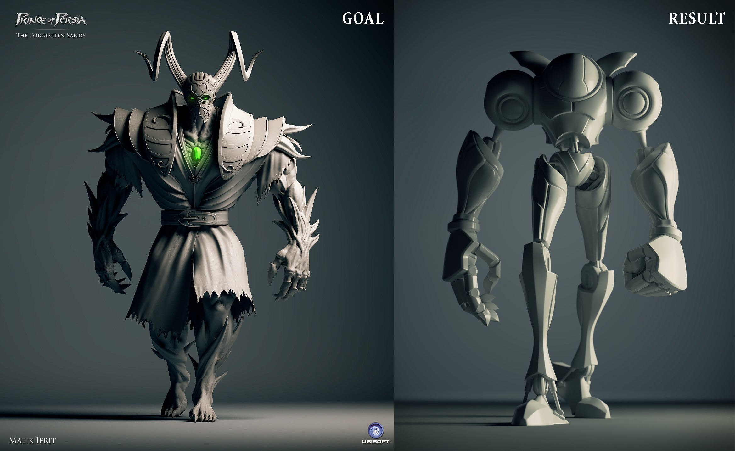
Dude I really like the model, kinda rocks a stylized Samus Aran vibe.
I've been working on a scene which I put in my usual thread and Jonathan Lampel suggested I submit to this challenge. Here it goes!!
