I've decided to make a sketchbook, that will double as a timeline journey of my CG Cookie experience. Showing my learning progress and my final results for some of the amazing courses on here. I will also post my WIP's and personal projects for those who want to take a look.
So without further a-do , I present my Journey, from joining CG Cookie back in early 2015 untill the present 
MAY 2015 - Jonathan Williamson's "Introduction to Hard Surface Modelling" Tutorial - My result :
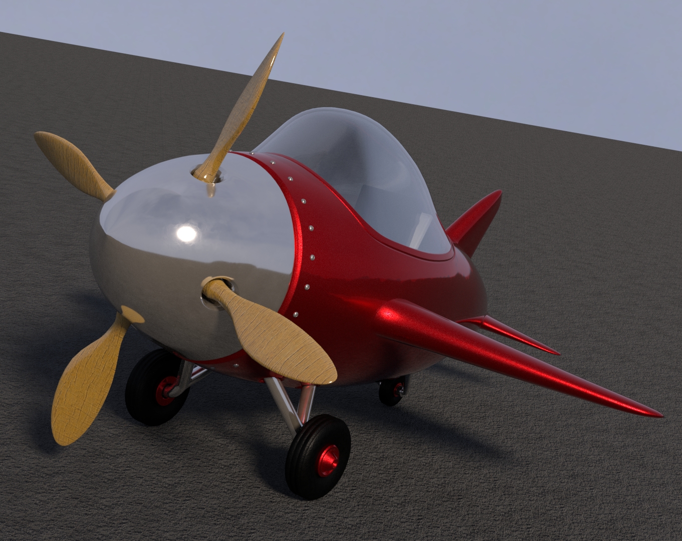 My first adventure into the world of both 3-D Modelling and Blender. At the time, the fundamentals courses did not exist so this seemed like a good place to start. If you are new to this, like I was , then it will seem very overwhelming at first, because there is so much to take in. But stick with it as Jonathon does an excellent job of explaining it all, and this tutorial is so well planned out because It takes you through so many features and techniques of modelling whilst still keeping it as simple as possible.I would thoroughly reccomend doing the following fundamentals courses first for modelling: https://cgcookie.com/course/blender-basics/8
https://cgcookie.com/course/mesh-modeling-fundamentals/3
and then following them up with The Introduction to Hard Surface Modelling tutorial that can be found here : https://cgcookie.com/course/introduction-to-hard-surface-modeling/5
![]() frikkr WONDERFUL result, Matthew! I absolutely love the unique chest design and the key addition is 👌
frikkr WONDERFUL result, Matthew! I absolutely love the unique chest design and the key addition is 👌
On a scale of 1-10 how would you rank the course?
@theluthier Thanks Kent . Its not a completely unique design as I took inspiration from a few chests found on Artstation and only really added a few of my own touches like the key and feet, the rest is just a mashup of other peoples work so I can't take full credit for the overall design.
As for the course , If I were a beginner, who was fairly new to Blender , I would rate it easily a 9 or 10 . But think that although you say at the start that it is aimed at both beginners and experienced users , I personally felt a lot of the content, especially the modelling , was stuff that I already knew and I don't feel like I learnt a great deal from a good portion of it in terms of modelling especially.
But I did learn a lot about 2.8 (which was my primary goal as I have only recently transitioned from 2.79) , However , I think it would have helped if you focussed a bit more on what is new in 2.8 and what has changed from 2.79
So if I was to generalise the slight criticism I have of the course, It is that I feel you have tried to create a course that is aimed towards new users and experienced ones , and also those new to 2.8 , but I don't think it is challenging enough to push the experienced users , especially those who are also familiar with 2.8 - I think something more technical is required to suit that group.
But overall, a great course that will really help out newer Blender users in particular and also , I love the comedy such as the POTC reference , and the bits where you make fun of your own mistakes ...... "shadering" ..... lol
Keep up the great work Kent :)
![]() frikkr Thank you for the feedback, Matthew. As much as I tried to fit the course to beginner and experienced, it makes total sense that there was a ceiling to what you could learn from this one.
frikkr Thank you for the feedback, Matthew. As much as I tried to fit the course to beginner and experienced, it makes total sense that there was a ceiling to what you could learn from this one.
I think it would have helped if you focused a bit more on what is new in 2.8 and what has changed from 2.79
I'm glad to hear this because me, Wayne, and Lampel have been putting together a course specifically about the differences. This thread is part of the effort. We think experienced users especially will appreciate it. It should be published in the 2-3 weeks.
@theluthier That's great to hear Kent , I look forward to working through that course to make sure I know all there is to know about 2.8 and i'ts awesome features.
Also, I have finished rendering the treasure chest now and I have put it in the gallery. I will also post my results to my polybook below too .
Here are my final renders of the treasure chest . An awesome course that I would highly reccomend , especially to newer Blender users.
I wish I had more time to tweak things but I need to move on as I have so many projects to get on with.
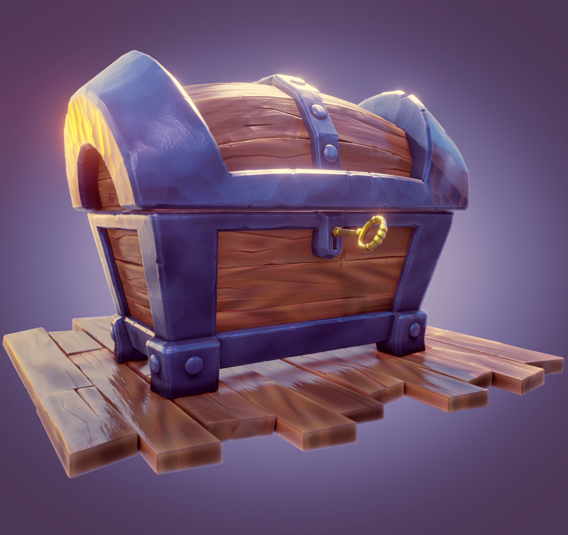
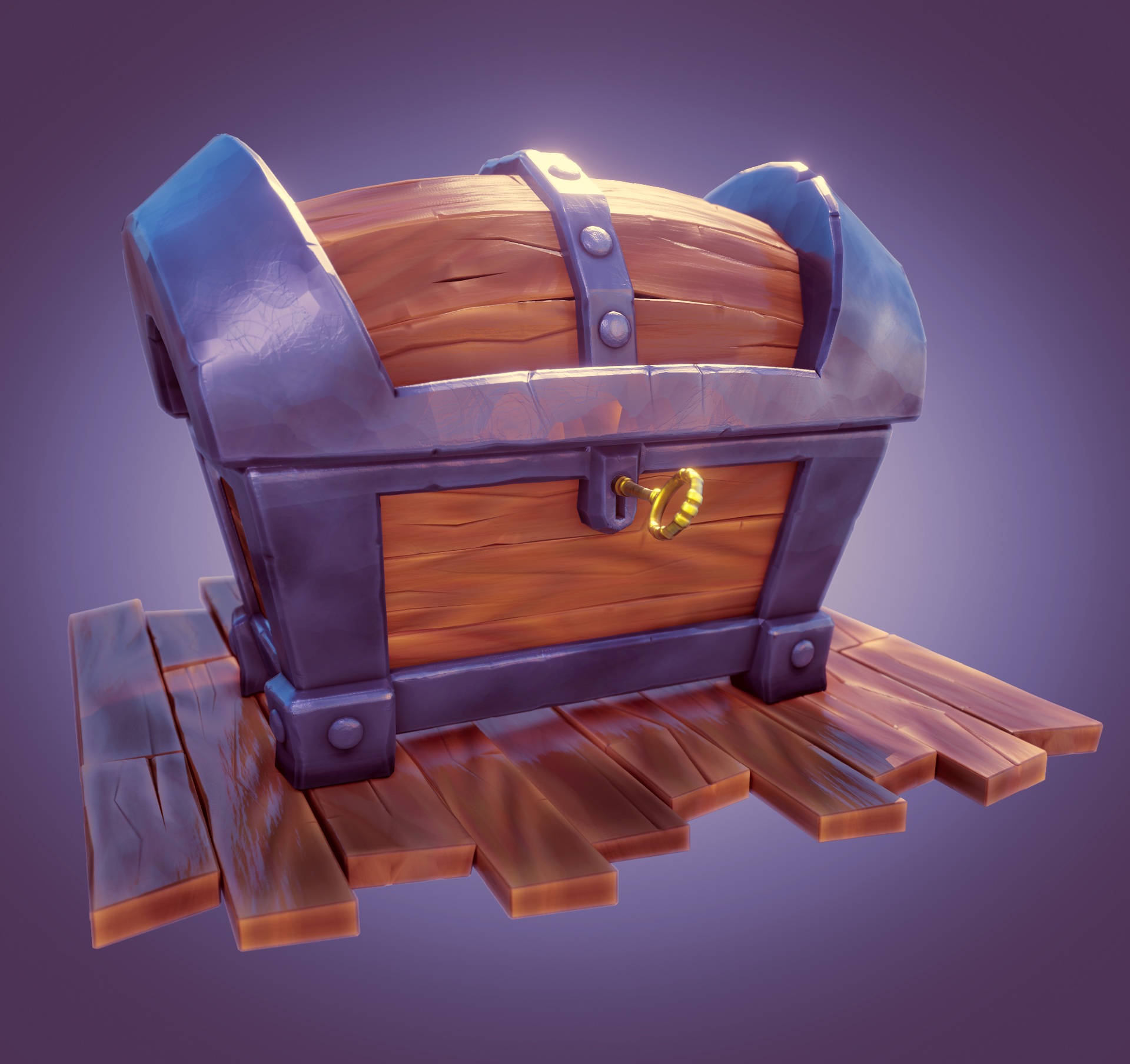
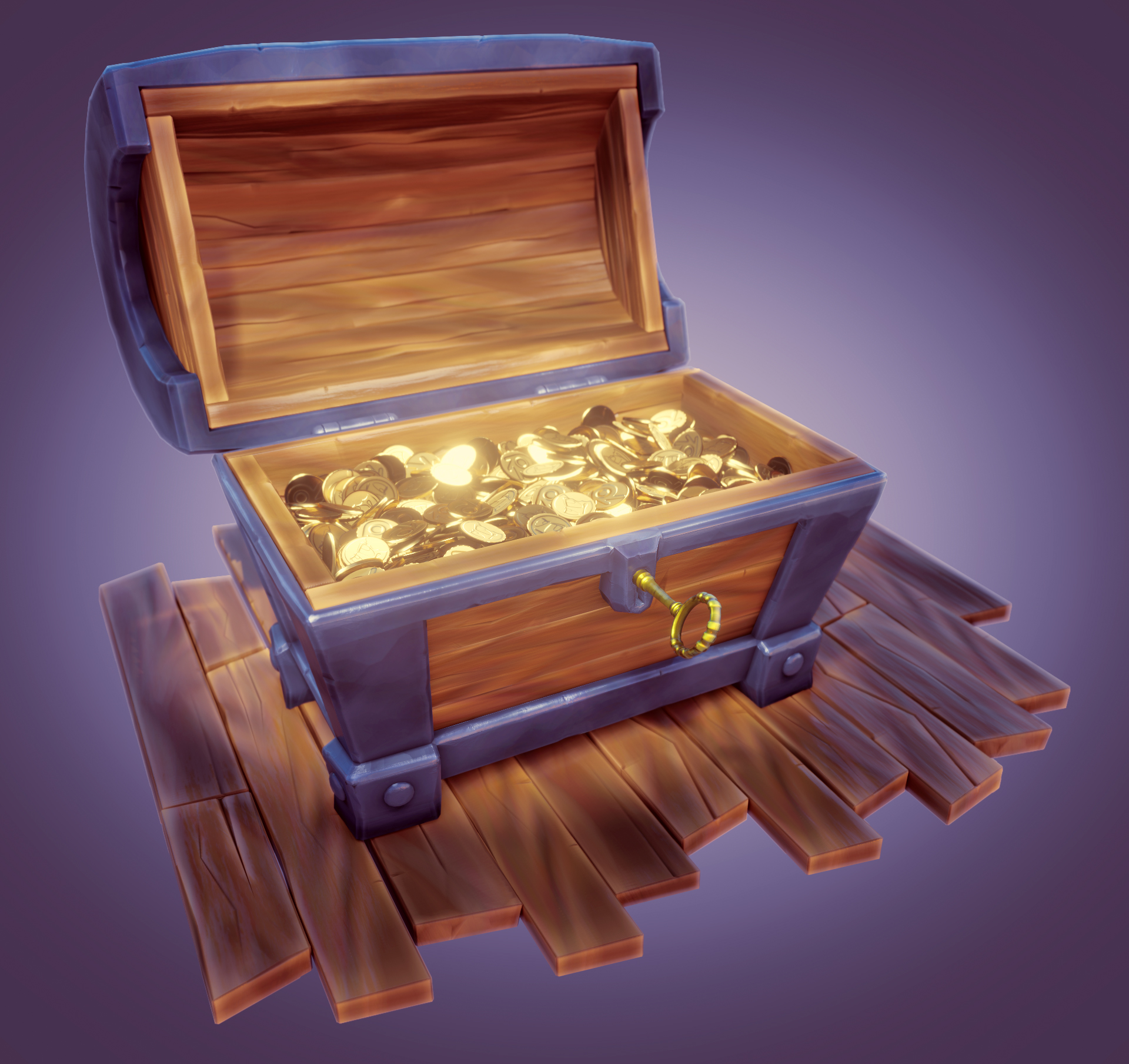
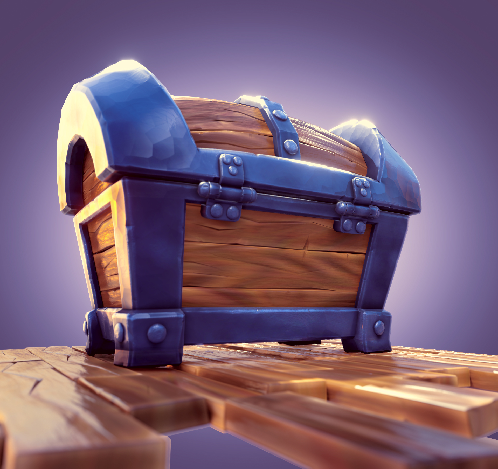
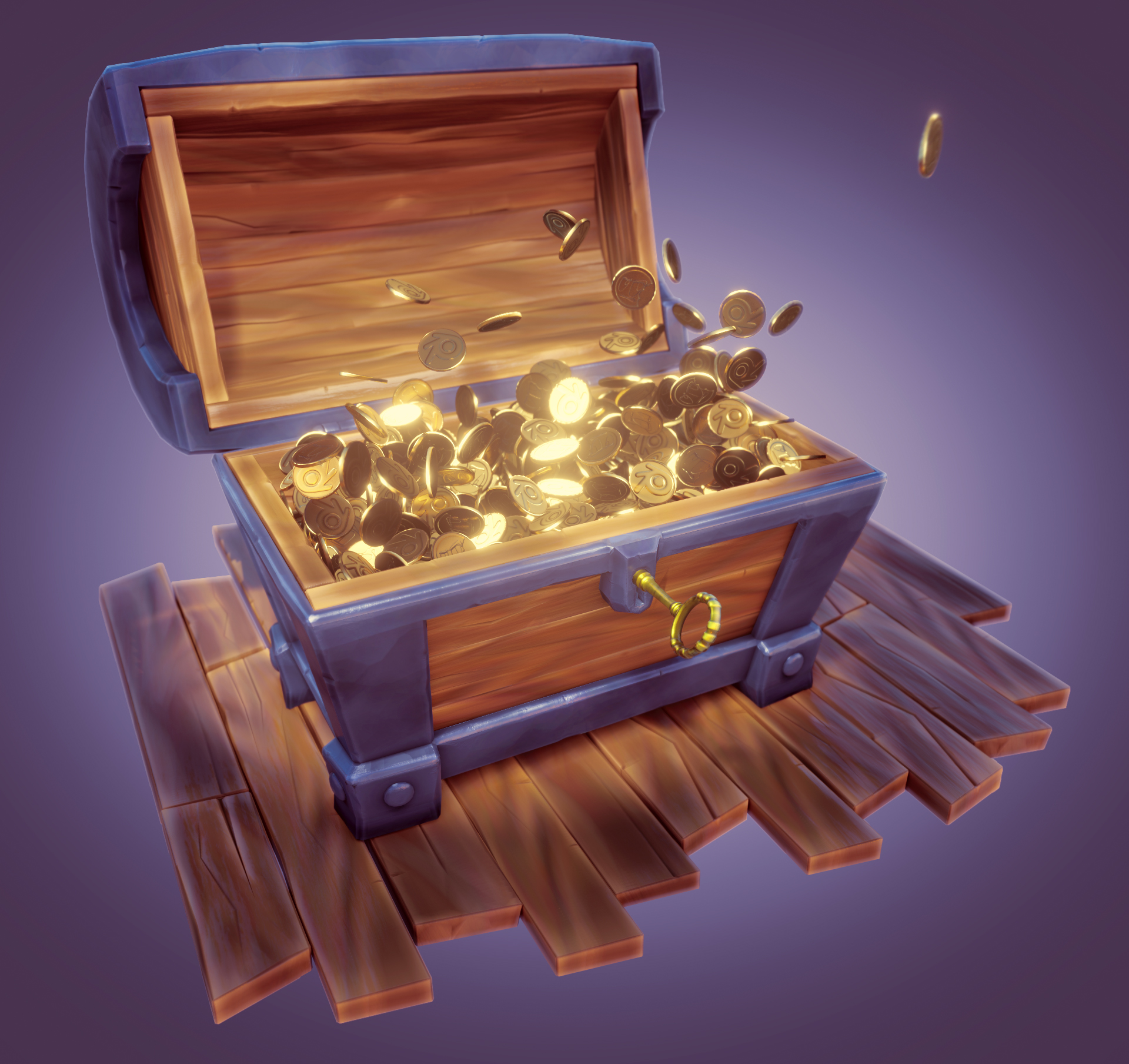
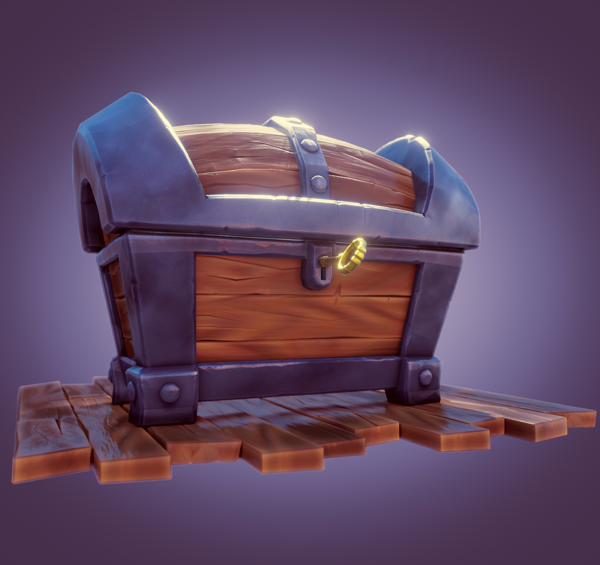
A few old projects that I have re-visited with new camera angles, lighting and post processing
Firstly my sci-fi helmet :

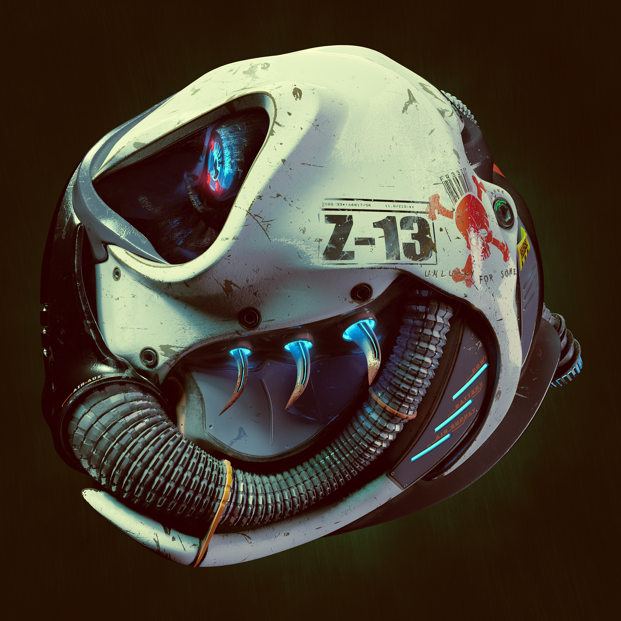
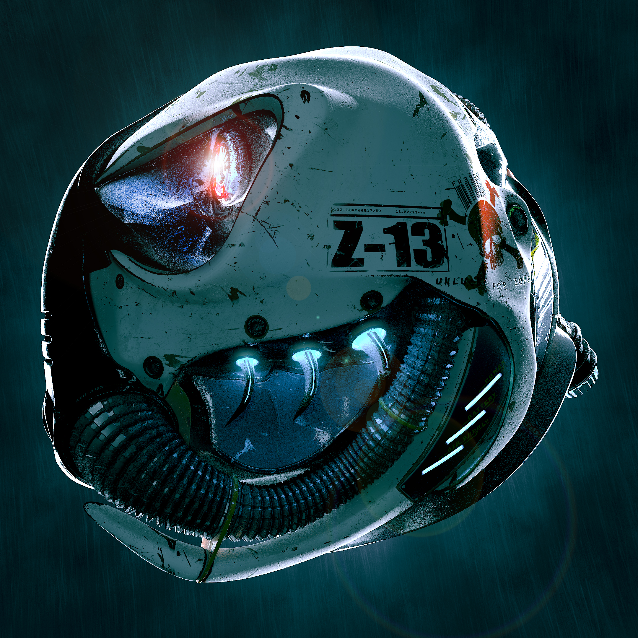
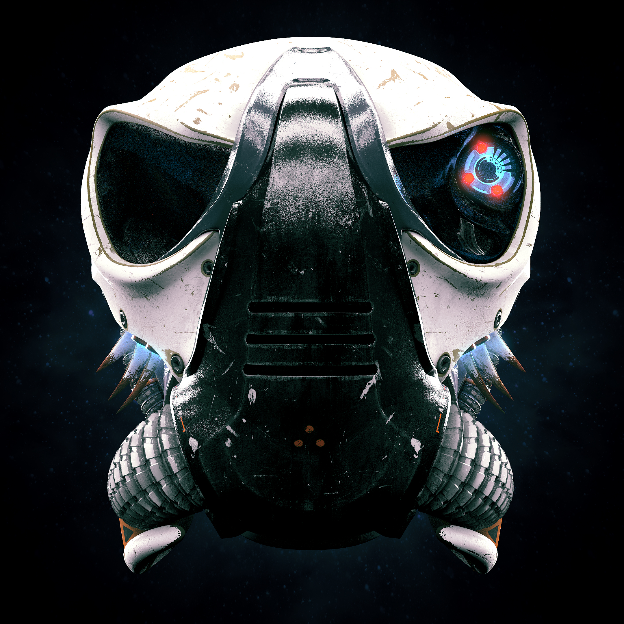
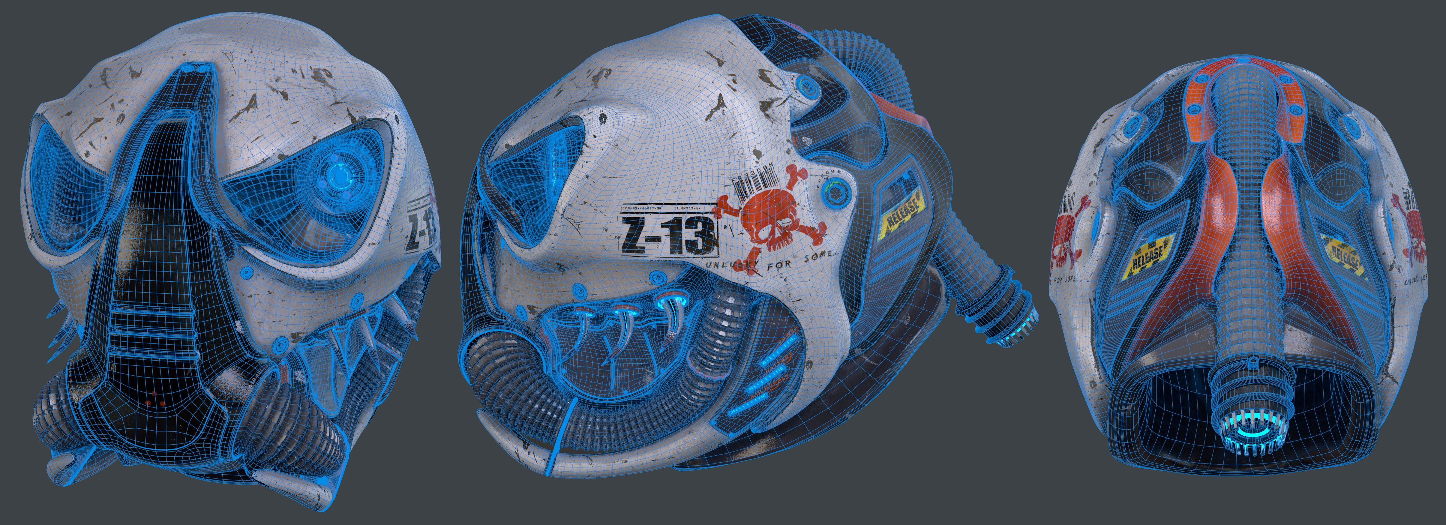
![]() frikkr Holly molly Matt, all those look goooood. It's like I found the helmet inside the treasure chest, and I had my hair clipper with me to cut my hair so the helmet can fit.
frikkr Holly molly Matt, all those look goooood. It's like I found the helmet inside the treasure chest, and I had my hair clipper with me to cut my hair so the helmet can fit.
I love the cartoony style of the chest and the lighting in the helmet and clipper as well.
![]() frikkr that hair clipper looks like an advertisement! Awesome job man, also with the helmet update love it
frikkr that hair clipper looks like an advertisement! Awesome job man, also with the helmet update love it
![]() dostovel Thanks man , that means a lot from a seasoned pro like yourself. I am trying to focus more on making my renders artistic and appealing these days , as I used to just render out plain images with standard lighting and no post processing or DOF because I was always scared that the viewer would not see all the detail if I did that - but thats not art, its just a boring render.
dostovel Thanks man , that means a lot from a seasoned pro like yourself. I am trying to focus more on making my renders artistic and appealing these days , as I used to just render out plain images with standard lighting and no post processing or DOF because I was always scared that the viewer would not see all the detail if I did that - but thats not art, its just a boring render.
Give me the size of your (now bald) head and ill send you a free helmet :P
ssmurfmier1985 Thats great to hear Miranda as an advert was exactly what I was going for. I was trying to do something appealing that mimicked a magazine advert.
Thanks for the kind words :)