So I made this 3d logo but I am not sure what the best practice is here. Is it a better idea to add a new loop cut at the top and let the middle loop cut bend? And of course I would appreciate some topology tips (like if sharpening the concave part like that is fine).
I know this is super simple, but I don't want to learn bad habits :)
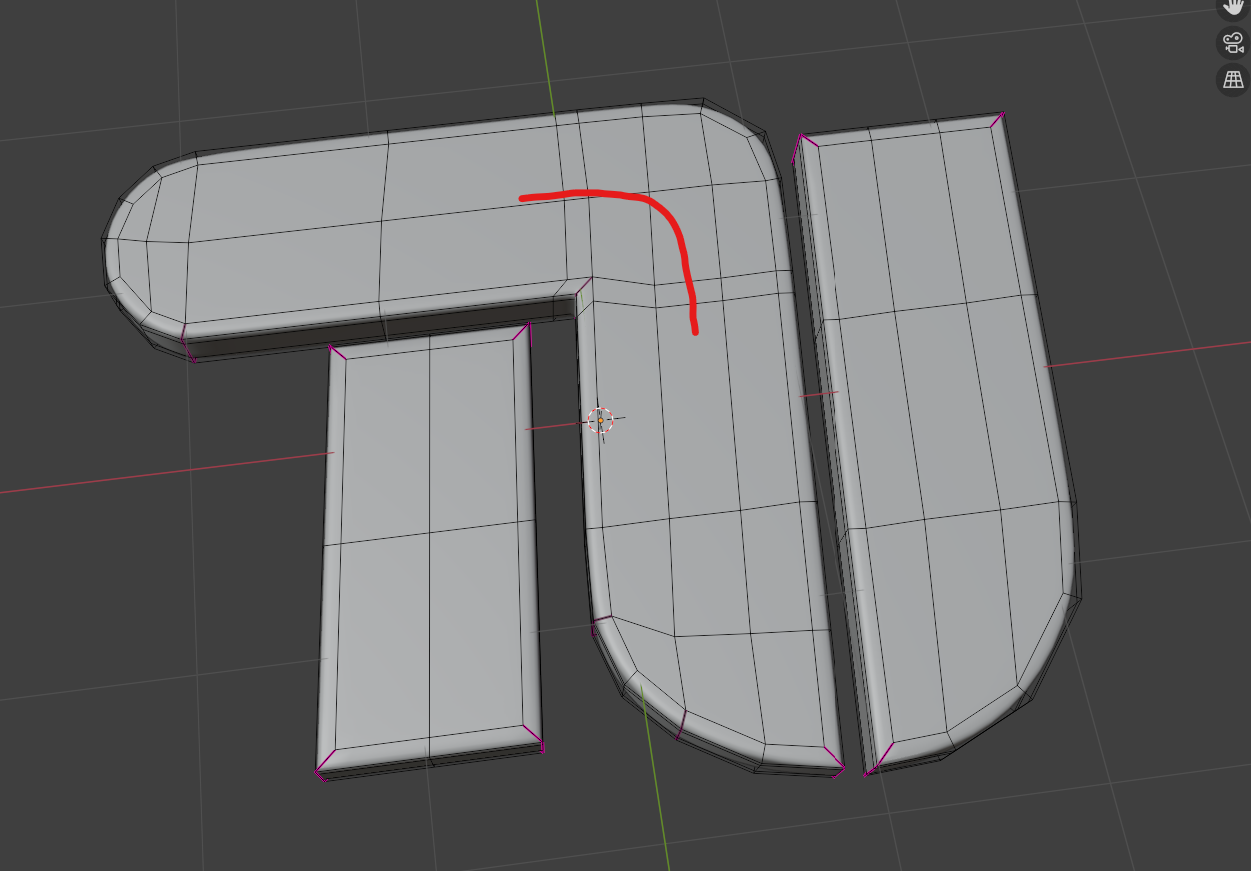
The main reason to bend the loop is if you were going to add some sort of detail along that route. Since the top part has 2 face loops and the side part has 3, If you're not adding some sort of detail around there, you really don't have to turn it unless you just want to.
As above - unless you need to model a detail you don't need it. However it's a good exercise to remodel this so you do get edge flow around your logo so you know how to do it when you NEED to do it - cos eventually you will need to do this sort of thing.
Also - I think you've asked this - you can sharpen your right angles via topology (without using a crease) with cuts shown below then dissolve the purple edge on the top and bottom faces
Huh? He's already got a loop going all the way around the edge of his logo... that 2nd one would remove that loop.
yes but it would sharpen the corner without a crease. That's one of the other questions I'd thought he'd asked "And of course I would appreciate some topology tips (like if sharpening the concave part like that is fine). " the grammar is a bit mangled so I'm not 100%. Sorry if I've misunderstood
Oh.. now that I'm looking I do see some concave in the original.. but I think that's because the verts on the interior faces aren't level with the outer edges.
Thanks for the feedback. With "concave" I meant the part where the T merges into the U. I did the sharpening and it looks pretty good (although the original 2d design has perfectly sharp edges I can only get with a crease).
Yeah... the concave is because some of those verts are lower on the Z axis than the other ones Fix that, and that should get rid of the concave I think